1. How effective is the combination of your main production with ancillary texts?
Throughout creating each individual product I have tried to make a link between all three. I have
effectively combined the visual aspects of our music video with the print production, in a variety of
different ways.
One way throughout each production whether it be print or visual, I was able to make a direct
link between all three of them was the colour techniques. In our music video there is a small clip where
the video page peels to reveal a black and white scene, personally I thought that the way how it flicked
from colour to black and white allows the audience to adapt to the emotion the character is feeling in
each circumstances. I have kept this through each production/print by making the main image ( as seen
below) .
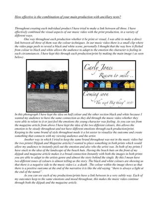
In this photograph I have kept the idea on half colour and the other section black and white because I
wanted my audience to have the same connection as they did through the music video whether they
were able to relate to it or just feel the emotions the young character was feeling. As you can see from
the magazine article from above I have kept the idea of the two different colours, this allows the
emotion to be steady throughout and not have different emotions through each production/print.
Keeping to the same brand of style throughout made it a lot easier to visualize the outcome and create
something that connects with my viewing audience and the artist.
Another way in which I tried to keep the same brand throughout was not in the music video but
the two prints( Dijipak and Magazine article) I wanted to place something in both prints which would
allow my audience to instantly pick out the emotion and also who the artist was. In both of my prints I
have stuck to the idea of the landscape of the beach huts. Having the beach huts on the front of my
dijipak and magazine article makes it a broad connection Instantly with both the images in both prints
you are able to adapt to the artists genre and almost the story behind the single. By this I mean have
two different tones of colours is almost telling us the story. The black and white colours are showing us
that there is a negative side to the music video i.e. a death . The colour within the image shows us that
there is a positive outcome at the end of the narrative it is like the old saying “there is always a light at
the end of the tunnel”.
As you can see each of my productions/prints have a link between in a very subtle way. Each of
my outcomes keep to the same emotions and mood throughout, this makes the music video continue
through both the dijipak and the magazine article.