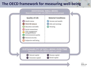
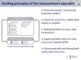
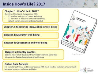
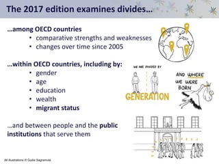
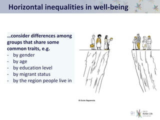
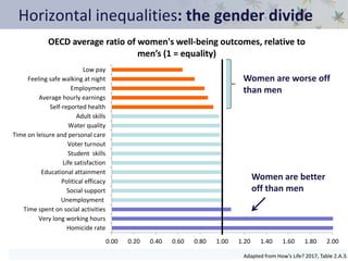
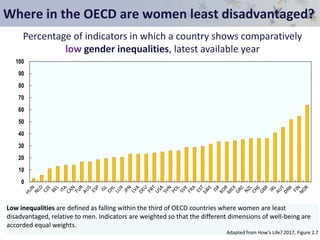
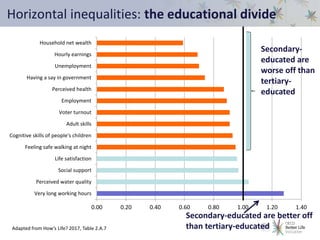
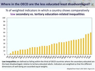
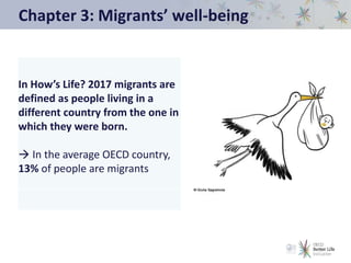
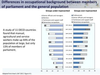
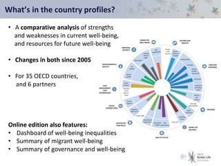
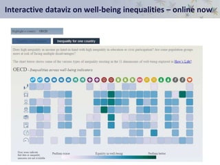
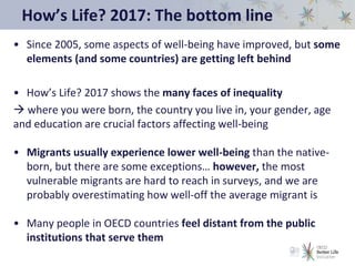
How’s Life? 2017
Measuring Well-Being
OECD Statistics Directorate| 15 November 2017
The OECD framework for measuring well-being
Guiding principles of the measurement approach
 Focus on people, not just the
economic system
 Focus on outcomes, rather than
inputs or outputs
 Reporting both averages and
inequalities
 Capturing both objective and
subjective aspects of life
 Concerned with well-being both
today and tomorrow
Inside How’s Life? 2017
Chapter 1: How’s Life in 2017?
Overview of levels and changes since 2005:
• 25 headline indicators of current well-being
• 32 indicators of resources for future well-being
(natural, human, economic and social capital)
Chapter 5: Country profiles
Detailed notes for 35 OECD countries + Brazil, Colombia, Costa Rica,
Lithuania, the Russian Federation and South Africa
Chapter 2: Measuring inequalities in well-being
Chapter 3: Migrants’ well-being
Chapter 4: Governance and well-being
Online Data Annexes
Full indicator definitions and time-series since 2005 for all headline indicators of current well-
being and resources for future well-being
The 2017 edition examines divides…
…among OECD countries
• comparative strengths and weaknesses
• changes over time since 2005
…within OECD countries, including by:
• gender
• age
• education
• wealth
• migrant status
…and between people and the public
institutions that serve them
All illustrations © Guilia Sagramola
Chapter 1: Changes in well-being since 2005
Change since 2005 in 21 headline
indicators of current well-being
In some aspects of life, the average OECD
resident is better off than in 2005…
… but progress has often been slow, and
unevenly distributed across countries…
… and in some areas, well-being is falling
behind
Examples of change in resources and risks for future
well-being since 2005
• In OECD countries, greenhouse gas emissions per capita have fallen by
around 14% on average since 2005. However, forest area per capita has
also been reduced by around 5%.
• OECD countries now invest a higher share of their GDP in research and
development than in 2005. However, the financial net worth of OECD
governments has fallen by 30 percentage points, and households have
experienced rising debt in over half of all OECD countries.
• Since 2005, the share of people who smoke has fallen from 22% to 18%.
However, the share of people who are obese has risen from 22% to 24%.
• Both voter turnout and trust in government have fallen in more than half
of all OECD countries since 2005.
What is true for the OECD on average is not
necessarily true for individual countries…
Describing change in well-being since 2005 for
the OECD as a whole is difficult due to:
• the diversity of experience across indicators
• the diversity of experience across OECD countries
• (and of course as always, missing data)
How’s Life? 2017 shows results for the OECD average resident
… and the share of countries with gains/losses in well-being
…and provides 41 profiles with detailed country findings
Gains and losses in well-being are not shared evenly among countries
Adapted from How’s Life? 2017, Figure 1.9.
0% 10% 20% 30% 40% 50% 60% 70% 80% 90% 100%
Labour market insecurity
Long-term unemployment
Household net wealth
Housing affordability
Basic sanitation
Job strain
Rooms per person
Employment
Household income
Earnings
Improving Little or no change Worsening Missing
Share of OECD countries in which there have been net improvements since 2005:
material conditions indicators
Life expectancy is the only headline indicator that has improved since
2005 for all OECD countries where it can be measured
Adapted from How’s Life? 2017, Figure 1.16.
0% 10% 20% 30% 40% 50% 60% 70% 80% 90% 100%
Social support
Life satisfaction
Perceived health
Voter turnout
Water quality
Working hours
Air quality
Homicides
Feeling safe
Educational attainment
Life expectancy
Improving Little or no change Worsening Missing
Share of OECD countries in which there have been net improvements since 2005:
quality of life indicators
Which countries have seen the highest number of gains in current
well-being since 2005?
Adapted from How’s Life? 2017, Figures 1.10 and 1.17 combined.
0%
10%
20%
30%
40%
50%
60%
70%
80%
90%
100%
Missing Worsening Little or no change Improving
Share of current well-being indicators that have improved relative to 2005
Chapter 2: Measuring inequalities in well-being
Measuring inequalities in well-being
Many different ways to think about
inequalities in well-being:
• Inequalities of what?
• Inequalities between whom?
• Overall distribution or below a
threshold?
• Snapshot or over time?
• Outcomes or opportunities?
Debates about inequalities
often focus on income and
wealth, but inequality can
touch every aspect of people’s
lives
Vertical inequalities in well-being
…consider the overall dispersion of outcomes
among individuals within a society
(e.g. the Gini Index of income inequality, or
S20/S80 ratio)
How big are vertical inequalities in the OECD?
For the average OECD country, when we compare people in the
top 20% and people in the bottom 20%...
• Time on social activities is over 11 times higher
• Household disposable income is more than 5 times higher
• Feelings of having a say in government are nearly 4 times higher
• Life satisfaction is twice as high
• Time devoted to leisure and personal care is nearly twice as high
And for other measures…
• The standard deviation in age at death is more than 13 years
• Just 10% of households own more than 50% of total wealth
0
10
20
30
40
50
60
70
80
90
100
Which OECD countries have the lowest vertical inequalities?
Percentage of indicators in which a country shows comparatively low
vertical inequalities, latest available year
Low inequalities are defined as falling within the most equal third of OECD countries. Indicators are
weighted so that the different dimensions of well-being are accorded equal weights.
Adapted from How’s Life? 2017, Figure 2.2
Patterns of income inequality are not perfectly mirrored in
other dimensions
Percentage of countries for which performance in income inequality is
similar to performance in vertical inequalities
For a given country, the performance in income inequality is considered “similar to” performance in
other vertical inequalities if they both fall in the same third when OECD countries are divided into least
equal, middle equal and most equal thirds.
Adapted from How’s Life? 2017, Figure 2.4
0
10
20
30
40
50
60
Age at
death
Student
skills
Hours
worked
Adult skills Gross
earnings
Political
efficacy
Net wealth Life
satisfaction
How do vertical inequalities relate to overall performance?
Average well-being performance, plotted against average inequalities
(9 indicators only)
Inequalities are scored from 1 = least equal third in the OECD, to 3 = most equal third in OECD
Performance is scored from 0 = worst performance, to 10 = best performance in OECD
Adapted from How’s Life? 2017, Figure 1.4
AUS
AUT
BEL
CAN
CHE
CHL
CZE
DEU
DNK
ESP
EST
FIN
FRA GBR
GRC
HUN IRL
ISL
ISR
ITA
JPN
KOR
LUX
LVA
MEX
NLD
NOR
NZL
POL
PRT
SVK
SVN
SWE
TUR
USA
1.0
1.2
1.4
1.6
1.8
2.0
2.2
2.4
2.6
2.8
3.0
0 1 2 3 4 5 6 7 8 9 10
High performance, low inequality
Low performance, high inequality
Horizontal inequalities in well-being
…consider differences among
groups that share some
common traits, e.g.
- by gender
- by age
- by education level
- by migrant status
- by the region people live in
Horizontal inequalities: the gender divide
0.00 0.20 0.40 0.60 0.80 1.00 1.20 1.40 1.60 1.80 2.00
Homicide rate
Very long working hours
Time spent on social activities
Unemployment
Social support
Political efficacy
Educational attainment
Life satisfaction
Student skills
Voter turnout
Time on leisure and personal care
Water quality
Adult skills
Self-reported health
Average hourly earnings
Employment
Feeling safe walking at night
Low pay
OECD average ratio of women's well-being outcomes, relative to
men’s (1 = equality)
Women are better
off than men
Women are worse off
than men
Adapted from How’s Life? 2017, Table 2.A.3.
Where in the OECD are women least disadvantaged?
0
10
20
30
40
50
60
70
80
90
100
Percentage of indicators in which a country shows comparatively
low gender inequalities, latest available year
Low inequalities are defined as falling within the third of OECD countries where women are least
disadvantaged, relative to men. Indicators are weighted so that the different dimensions of well-being are
accorded equal weights.
Adapted from How’s Life? 2017, Figure 2.7
0.00 0.20 0.40 0.60 0.80 1.00 1.20 1.40
Very long working hours
Perceived water quality
Social support
Life satisfaction
Feeling safe walking at night
Cognitive skills of people's children
Adult skills
Voter turnout
Employment
Perceived health
Having a say in government
Unemployment
Hourly earnings
Household net wealth
Horizontal inequalities: the educational divide
Secondary-
educated are
worse off than
tertiary-
educated
Secondary-educated are better off
than tertiary-educatedAdapted from How’s Life? 2017, Table 2.A.7
Where in the OECD are the less educated least disadvantaged?
0
10
20
30
40
50
60
70
80
90
100
% of weighted indicators in which a country shows comparatively
low secondary vs. tertiary education-related inequalities
Low inequalities are defined as falling within the third of OECD countries where the secondary educated are
the least disadvantaged, relative to tertiary educated adults. Indicators are weighted so that the different
dimensions of well-being are accorded equal weights.
Adapted from How’s Life? 2017, Figure 2.9.
0.00 0.50 1.00 1.50 2.00
Very long working hours
Time on social activities
Perceived health
Educational attainment
Time on leisure and personal care
Quality of support network
Life satisfaction
Having a say in government
Perceived water quality
Adult skills
Feeling safe walking at night
Household disposable income
Voter turnout
Hourly earnings
Employment
Unemployment
Household net wealth
Horizontal inequalities: the generational divide
Younger are worse
off than middle-aged
adults
Younger are better
off than middle-aged
adults
OECD average ratio of young people’s well-being outcomes, relative to middle-aged
adults (1 = equality)
The age ranges considered vary slightly by indicator, but typically concern persons aged around 15-24, relative to persons aged around 25-54.
For further detailed, see How’s Life? 2017, Table 2.A.4.
Where in the OECD are young people least disadvantaged?
0
10
20
30
40
50
60
70
80
90
100
Percentage of indicators in which a country shows comparatively
low young vs. middle age inequalities
Low inequalities are defined as falling within the third of OECD countries where the younger generation are
the least disadvantaged, relative to middle-aged adults. Data refer to latest available year. Indicators are
weighted so that the different dimensions of well-being are accorded equal weights.
Adapted from How’s Life? 2017, Figure 2.8, Panel A
Deprivations in well-being
…focus on the lower end of the
distribution – i.e. those who fall
below a given threshold/
deprivation line, e.g:
- Poverty rates
- Share of people with no social
support
- Share of overcrowded
households
Deprivation rates in the average OECD country
(selected indicators only)
Air pollution: 37% of people are exposed to PM2.5 higher than 15
micrograms/m3
Voter turnout: 31% did not vote in the last national election
Feelings of security: 26% do not feel safe walking alone at night where
they live
Subjective well-being: 13% of people report more negative than positive
feelings
Housing affordability: 11% spend more than 40% of their disposable
income on mortgages and rents
Social support: 8.5% have no friends or relatives to count on in times of
need
Which OECD countries have the lowest deprivation rates?
0
10
20
30
40
50
60
70
80
90
100
Percentage of indicators in which a country shows comparatively
low deprivation rates
Low deprivation rates are defined as falling within the third of OECD countries with the lowest deprivation
rates. Indicators are weighted so that the different dimensions of well-being are accorded equal weights.
Adapted from How’s Life? 2017, Figure 2.10
More than 10% of people are currently poor, but an additional ~40%
would fall into poverty if they had to forgo 3 months’ income.
0
10
20
30
40
50
60
70
Income and asset poor Income poor but not asset poor Economically vulnerable
Share of individuals who are income poor, asset poor or economically vulnerable, by country,
latest available year.
Adapted from How’s Life? 2017, Figure 2.11
Chapter 3: Migrants’ well-being
In How’s Life? 2017 migrants are
defined as people living in a
different country from the one in
which they were born.
 In the average OECD country,
13% of people are migrants
Migrants are diverse: within and between OECD countries
…and capturing the well-being of the most vulnerable migrants is
difficult, since they are hard to reach in household surveys
Education levels among migrants aged 15-64 years
2012-13, selected OECD countries
0
10
20
30
40
50
60
EST LVA SVK ISR NZL CZE GBR JPN LUX OECD
35
USA DNK SWE NLD DEU BEL FRA GRC ESP ITA
Migrants - Low-educated Migrants - Highly-educated
Adapted from How’s Life? 2017, Figure 3.A.1.
Migrants face multiple well-being disadvantages
Compared to the native-born in OECD countries:
• The median income of migrants is 25% lower, and median wealth
is 50% lower.
• Migrants are more likely to work antisocial hours and be in low-
paid jobs.
• Almost 30% of migrants with a tertiary degree are overqualified
for their jobs, compared to 20% of the native-born.
• 1 in 4 migrants report being exposed to air and noise pollution in
the area where they live compared to 1 in 5 of the native-born.
• Migrants also report worse health, lower social support, and
lower life satisfaction than the native-born in most OECD
countries assessed.
Migrants are more likely to work anti-social hours
Anti-social hours means shift work or usually working in the evening or at night or on Saturdays and Sundays.
* Indicates a statistically significant difference between migrants and the native-born, based on the analysis of the confidence intervals at 90%
Adapted from How’s Life? 2017, Figure 3.8
0
10
20
30
40
50
60
Migrants Native-born
Share of employees working anti-social hours
Migrants are more likely to live in poor conditions
Environmental conditions are assessed based on survey responses to questions about noise and air pollution in the local area.
* Indicates a statistically significant difference between migrants and the native-born, based on the analysis of the confidence intervals at 90%
Adapted from How’s Life? 2017, Figure 3.17
Share of people who live near noise or air pollution
0
5
10
15
20
25
30
35
40
45
50
Individuals living in a migrant household Individuals living in a native-born household
Migrants are more likely feel downhearted or depressed
Data refer to the share of people responding “all of the time” or “most of the time” to a question about feeling downhearted or depressed in
the past four weeks
* Indicates a statistically significant difference between migrants and the native-born, based on the analysis of the confidence intervals at 90%
Adapted from How’s Life? 2017, Figure 3.23
Share of people who feel downhearted or depressed
0
2
4
6
8
10
12
14
16
18
20
Migrants Native-born
Chapter 4: Governance and well-being
Only one in three people in the OECD feel that they have a say in what
the government does
0
10
20
30
40
50
60
70
80
…over half believe that corruption is widespread, and only 38%
have confidence in their national government
Adapted from How’s Life? 2017, Figure 4.11.
Share of people who feel that they have a say in what the
government does
People with fewer economic resources are less likely to feel they have
a say in what the government does
0
0.5
1
1.5
2
2.5
3
3.5
Tertiary
Secondary**
Lessthansecondary**
Employed
Unemployed**
Topquintile
Bottomquintile**
OECD average mean score on a 1 - 5 scale
(higher scores indicate higher feeling of having a say in what the government does)
** indicates a statistically significant difference at the 95% confidence level, with tertiary-educated, employed
and the top income quintile serving as the reference groups, respectively.
Adapted from How’s Life? 2017, Figure 4.12.
Voter turnout is 14 percentage points lower for people in the bottom
20% income bracket, compared to those in the top 20%.
0% 20% 40% 60% 80% 100%
Unemployed
Students
Others
Employed
Retirees
Less than secondary
Secondary
Tertiary
Bottom
Second
Third
Fourth
Top
Income
quintiles
Education
levels
Employment
status
Voter turnout is self-reported and refers to the simple average based on data available for 25 OECD countries.
Adapted from How’s Life? 2017, Figure 4.2.
Differences in occupational background between members
of parliament and the general population
A study of 11 OECD countries
found that manual,
agricultural and service
workers make up 44% of the
population at large, but only
13% of members of
parliament.
Adapted from How’s Life? 2017, Figure 4.5.
Groups under-represented Groups over-represented
0 20 40 60 80
HUN (2010)
IRL (2007)
BEL (2010)
ITA (2014)
CHE (2011)
NOR (2009)
AUS (2010)
DEU (2009)
GBR (2010)
GRC (2012)
PRT (2011)
Professionals
Senior officials and managers
Technicians and support staff
Elementary occupations
-80 -60 -40 -20 0
Senior officials and managers
Workers
Technicians and support staff
Elementary occupations
Chapter 5: Country profiles
What’s in the country profiles?
• A comparative analysis of strengths
and weaknesses in current well-being,
and resources for future well-being
• Changes in both since 2005
• For 35 OECD countries,
and 6 partners
Online edition also features:
• Dashboard of well-being inequalities
• Summary of migrant well-being
• Summary of governance and well-being
Interactive dataviz on well-being inequalities – online now
How’s Life? 2017: The bottom line
• Since 2005, some aspects of well-being have improved, but some
elements (and some countries) are getting left behind
• How’s Life? 2017 shows the many faces of inequality
 where you were born, the country you live in, your gender, age
and education are crucial factors affecting well-being
• Migrants usually experience lower well-being than the native-
born, but there are some exceptions… however, the most
vulnerable migrants are hard to reach in surveys, and we are
probably overestimating how well-off the average migrant is
• Many people in OECD countries feel distant from the public
institutions that serve them
Read How’s Life? 2017
and our country profiles online at:
www.oecd.org/howslife
Any questions?
Please contact wellbeing@oecd.org

How's Life 2017 - Key Findings

  • 1.
    How’s Life? 2017 MeasuringWell-Being OECD Statistics Directorate| 15 November 2017
  • 2.
    The OECD frameworkfor measuring well-being
  • 3.
    Guiding principles ofthe measurement approach  Focus on people, not just the economic system  Focus on outcomes, rather than inputs or outputs  Reporting both averages and inequalities  Capturing both objective and subjective aspects of life  Concerned with well-being both today and tomorrow
  • 4.
    Inside How’s Life?2017 Chapter 1: How’s Life in 2017? Overview of levels and changes since 2005: • 25 headline indicators of current well-being • 32 indicators of resources for future well-being (natural, human, economic and social capital) Chapter 5: Country profiles Detailed notes for 35 OECD countries + Brazil, Colombia, Costa Rica, Lithuania, the Russian Federation and South Africa Chapter 2: Measuring inequalities in well-being Chapter 3: Migrants’ well-being Chapter 4: Governance and well-being Online Data Annexes Full indicator definitions and time-series since 2005 for all headline indicators of current well- being and resources for future well-being
  • 5.
    The 2017 editionexamines divides… …among OECD countries • comparative strengths and weaknesses • changes over time since 2005 …within OECD countries, including by: • gender • age • education • wealth • migrant status …and between people and the public institutions that serve them All illustrations © Guilia Sagramola
  • 6.
    Chapter 1: Changesin well-being since 2005
  • 7.
    Change since 2005in 21 headline indicators of current well-being In some aspects of life, the average OECD resident is better off than in 2005… … but progress has often been slow, and unevenly distributed across countries… … and in some areas, well-being is falling behind
  • 8.
    Examples of changein resources and risks for future well-being since 2005 • In OECD countries, greenhouse gas emissions per capita have fallen by around 14% on average since 2005. However, forest area per capita has also been reduced by around 5%. • OECD countries now invest a higher share of their GDP in research and development than in 2005. However, the financial net worth of OECD governments has fallen by 30 percentage points, and households have experienced rising debt in over half of all OECD countries. • Since 2005, the share of people who smoke has fallen from 22% to 18%. However, the share of people who are obese has risen from 22% to 24%. • Both voter turnout and trust in government have fallen in more than half of all OECD countries since 2005.
  • 9.
    What is truefor the OECD on average is not necessarily true for individual countries… Describing change in well-being since 2005 for the OECD as a whole is difficult due to: • the diversity of experience across indicators • the diversity of experience across OECD countries • (and of course as always, missing data) How’s Life? 2017 shows results for the OECD average resident … and the share of countries with gains/losses in well-being …and provides 41 profiles with detailed country findings
  • 10.
    Gains and lossesin well-being are not shared evenly among countries Adapted from How’s Life? 2017, Figure 1.9. 0% 10% 20% 30% 40% 50% 60% 70% 80% 90% 100% Labour market insecurity Long-term unemployment Household net wealth Housing affordability Basic sanitation Job strain Rooms per person Employment Household income Earnings Improving Little or no change Worsening Missing Share of OECD countries in which there have been net improvements since 2005: material conditions indicators
  • 11.
    Life expectancy isthe only headline indicator that has improved since 2005 for all OECD countries where it can be measured Adapted from How’s Life? 2017, Figure 1.16. 0% 10% 20% 30% 40% 50% 60% 70% 80% 90% 100% Social support Life satisfaction Perceived health Voter turnout Water quality Working hours Air quality Homicides Feeling safe Educational attainment Life expectancy Improving Little or no change Worsening Missing Share of OECD countries in which there have been net improvements since 2005: quality of life indicators
  • 12.
    Which countries haveseen the highest number of gains in current well-being since 2005? Adapted from How’s Life? 2017, Figures 1.10 and 1.17 combined. 0% 10% 20% 30% 40% 50% 60% 70% 80% 90% 100% Missing Worsening Little or no change Improving Share of current well-being indicators that have improved relative to 2005
  • 13.
    Chapter 2: Measuringinequalities in well-being
  • 14.
    Measuring inequalities inwell-being Many different ways to think about inequalities in well-being: • Inequalities of what? • Inequalities between whom? • Overall distribution or below a threshold? • Snapshot or over time? • Outcomes or opportunities? Debates about inequalities often focus on income and wealth, but inequality can touch every aspect of people’s lives
  • 15.
    Vertical inequalities inwell-being …consider the overall dispersion of outcomes among individuals within a society (e.g. the Gini Index of income inequality, or S20/S80 ratio)
  • 16.
    How big arevertical inequalities in the OECD? For the average OECD country, when we compare people in the top 20% and people in the bottom 20%... • Time on social activities is over 11 times higher • Household disposable income is more than 5 times higher • Feelings of having a say in government are nearly 4 times higher • Life satisfaction is twice as high • Time devoted to leisure and personal care is nearly twice as high And for other measures… • The standard deviation in age at death is more than 13 years • Just 10% of households own more than 50% of total wealth
  • 17.
    0 10 20 30 40 50 60 70 80 90 100 Which OECD countrieshave the lowest vertical inequalities? Percentage of indicators in which a country shows comparatively low vertical inequalities, latest available year Low inequalities are defined as falling within the most equal third of OECD countries. Indicators are weighted so that the different dimensions of well-being are accorded equal weights. Adapted from How’s Life? 2017, Figure 2.2
  • 18.
    Patterns of incomeinequality are not perfectly mirrored in other dimensions Percentage of countries for which performance in income inequality is similar to performance in vertical inequalities For a given country, the performance in income inequality is considered “similar to” performance in other vertical inequalities if they both fall in the same third when OECD countries are divided into least equal, middle equal and most equal thirds. Adapted from How’s Life? 2017, Figure 2.4 0 10 20 30 40 50 60 Age at death Student skills Hours worked Adult skills Gross earnings Political efficacy Net wealth Life satisfaction
  • 19.
    How do verticalinequalities relate to overall performance? Average well-being performance, plotted against average inequalities (9 indicators only) Inequalities are scored from 1 = least equal third in the OECD, to 3 = most equal third in OECD Performance is scored from 0 = worst performance, to 10 = best performance in OECD Adapted from How’s Life? 2017, Figure 1.4 AUS AUT BEL CAN CHE CHL CZE DEU DNK ESP EST FIN FRA GBR GRC HUN IRL ISL ISR ITA JPN KOR LUX LVA MEX NLD NOR NZL POL PRT SVK SVN SWE TUR USA 1.0 1.2 1.4 1.6 1.8 2.0 2.2 2.4 2.6 2.8 3.0 0 1 2 3 4 5 6 7 8 9 10 High performance, low inequality Low performance, high inequality
  • 20.
    Horizontal inequalities inwell-being …consider differences among groups that share some common traits, e.g. - by gender - by age - by education level - by migrant status - by the region people live in
  • 21.
    Horizontal inequalities: thegender divide 0.00 0.20 0.40 0.60 0.80 1.00 1.20 1.40 1.60 1.80 2.00 Homicide rate Very long working hours Time spent on social activities Unemployment Social support Political efficacy Educational attainment Life satisfaction Student skills Voter turnout Time on leisure and personal care Water quality Adult skills Self-reported health Average hourly earnings Employment Feeling safe walking at night Low pay OECD average ratio of women's well-being outcomes, relative to men’s (1 = equality) Women are better off than men Women are worse off than men Adapted from How’s Life? 2017, Table 2.A.3.
  • 22.
    Where in theOECD are women least disadvantaged? 0 10 20 30 40 50 60 70 80 90 100 Percentage of indicators in which a country shows comparatively low gender inequalities, latest available year Low inequalities are defined as falling within the third of OECD countries where women are least disadvantaged, relative to men. Indicators are weighted so that the different dimensions of well-being are accorded equal weights. Adapted from How’s Life? 2017, Figure 2.7
  • 23.
    0.00 0.20 0.400.60 0.80 1.00 1.20 1.40 Very long working hours Perceived water quality Social support Life satisfaction Feeling safe walking at night Cognitive skills of people's children Adult skills Voter turnout Employment Perceived health Having a say in government Unemployment Hourly earnings Household net wealth Horizontal inequalities: the educational divide Secondary- educated are worse off than tertiary- educated Secondary-educated are better off than tertiary-educatedAdapted from How’s Life? 2017, Table 2.A.7
  • 24.
    Where in theOECD are the less educated least disadvantaged? 0 10 20 30 40 50 60 70 80 90 100 % of weighted indicators in which a country shows comparatively low secondary vs. tertiary education-related inequalities Low inequalities are defined as falling within the third of OECD countries where the secondary educated are the least disadvantaged, relative to tertiary educated adults. Indicators are weighted so that the different dimensions of well-being are accorded equal weights. Adapted from How’s Life? 2017, Figure 2.9.
  • 25.
    0.00 0.50 1.001.50 2.00 Very long working hours Time on social activities Perceived health Educational attainment Time on leisure and personal care Quality of support network Life satisfaction Having a say in government Perceived water quality Adult skills Feeling safe walking at night Household disposable income Voter turnout Hourly earnings Employment Unemployment Household net wealth Horizontal inequalities: the generational divide Younger are worse off than middle-aged adults Younger are better off than middle-aged adults OECD average ratio of young people’s well-being outcomes, relative to middle-aged adults (1 = equality) The age ranges considered vary slightly by indicator, but typically concern persons aged around 15-24, relative to persons aged around 25-54. For further detailed, see How’s Life? 2017, Table 2.A.4.
  • 26.
    Where in theOECD are young people least disadvantaged? 0 10 20 30 40 50 60 70 80 90 100 Percentage of indicators in which a country shows comparatively low young vs. middle age inequalities Low inequalities are defined as falling within the third of OECD countries where the younger generation are the least disadvantaged, relative to middle-aged adults. Data refer to latest available year. Indicators are weighted so that the different dimensions of well-being are accorded equal weights. Adapted from How’s Life? 2017, Figure 2.8, Panel A
  • 27.
    Deprivations in well-being …focuson the lower end of the distribution – i.e. those who fall below a given threshold/ deprivation line, e.g: - Poverty rates - Share of people with no social support - Share of overcrowded households
  • 28.
    Deprivation rates inthe average OECD country (selected indicators only) Air pollution: 37% of people are exposed to PM2.5 higher than 15 micrograms/m3 Voter turnout: 31% did not vote in the last national election Feelings of security: 26% do not feel safe walking alone at night where they live Subjective well-being: 13% of people report more negative than positive feelings Housing affordability: 11% spend more than 40% of their disposable income on mortgages and rents Social support: 8.5% have no friends or relatives to count on in times of need
  • 29.
    Which OECD countrieshave the lowest deprivation rates? 0 10 20 30 40 50 60 70 80 90 100 Percentage of indicators in which a country shows comparatively low deprivation rates Low deprivation rates are defined as falling within the third of OECD countries with the lowest deprivation rates. Indicators are weighted so that the different dimensions of well-being are accorded equal weights. Adapted from How’s Life? 2017, Figure 2.10
  • 30.
    More than 10%of people are currently poor, but an additional ~40% would fall into poverty if they had to forgo 3 months’ income. 0 10 20 30 40 50 60 70 Income and asset poor Income poor but not asset poor Economically vulnerable Share of individuals who are income poor, asset poor or economically vulnerable, by country, latest available year. Adapted from How’s Life? 2017, Figure 2.11
  • 31.
    Chapter 3: Migrants’well-being In How’s Life? 2017 migrants are defined as people living in a different country from the one in which they were born.  In the average OECD country, 13% of people are migrants
  • 32.
    Migrants are diverse:within and between OECD countries …and capturing the well-being of the most vulnerable migrants is difficult, since they are hard to reach in household surveys Education levels among migrants aged 15-64 years 2012-13, selected OECD countries 0 10 20 30 40 50 60 EST LVA SVK ISR NZL CZE GBR JPN LUX OECD 35 USA DNK SWE NLD DEU BEL FRA GRC ESP ITA Migrants - Low-educated Migrants - Highly-educated Adapted from How’s Life? 2017, Figure 3.A.1.
  • 33.
    Migrants face multiplewell-being disadvantages Compared to the native-born in OECD countries: • The median income of migrants is 25% lower, and median wealth is 50% lower. • Migrants are more likely to work antisocial hours and be in low- paid jobs. • Almost 30% of migrants with a tertiary degree are overqualified for their jobs, compared to 20% of the native-born. • 1 in 4 migrants report being exposed to air and noise pollution in the area where they live compared to 1 in 5 of the native-born. • Migrants also report worse health, lower social support, and lower life satisfaction than the native-born in most OECD countries assessed.
  • 34.
    Migrants are morelikely to work anti-social hours Anti-social hours means shift work or usually working in the evening or at night or on Saturdays and Sundays. * Indicates a statistically significant difference between migrants and the native-born, based on the analysis of the confidence intervals at 90% Adapted from How’s Life? 2017, Figure 3.8 0 10 20 30 40 50 60 Migrants Native-born Share of employees working anti-social hours
  • 35.
    Migrants are morelikely to live in poor conditions Environmental conditions are assessed based on survey responses to questions about noise and air pollution in the local area. * Indicates a statistically significant difference between migrants and the native-born, based on the analysis of the confidence intervals at 90% Adapted from How’s Life? 2017, Figure 3.17 Share of people who live near noise or air pollution 0 5 10 15 20 25 30 35 40 45 50 Individuals living in a migrant household Individuals living in a native-born household
  • 36.
    Migrants are morelikely feel downhearted or depressed Data refer to the share of people responding “all of the time” or “most of the time” to a question about feeling downhearted or depressed in the past four weeks * Indicates a statistically significant difference between migrants and the native-born, based on the analysis of the confidence intervals at 90% Adapted from How’s Life? 2017, Figure 3.23 Share of people who feel downhearted or depressed 0 2 4 6 8 10 12 14 16 18 20 Migrants Native-born
  • 37.
    Chapter 4: Governanceand well-being
  • 38.
    Only one inthree people in the OECD feel that they have a say in what the government does 0 10 20 30 40 50 60 70 80 …over half believe that corruption is widespread, and only 38% have confidence in their national government Adapted from How’s Life? 2017, Figure 4.11. Share of people who feel that they have a say in what the government does
  • 39.
    People with fewereconomic resources are less likely to feel they have a say in what the government does 0 0.5 1 1.5 2 2.5 3 3.5 Tertiary Secondary** Lessthansecondary** Employed Unemployed** Topquintile Bottomquintile** OECD average mean score on a 1 - 5 scale (higher scores indicate higher feeling of having a say in what the government does) ** indicates a statistically significant difference at the 95% confidence level, with tertiary-educated, employed and the top income quintile serving as the reference groups, respectively. Adapted from How’s Life? 2017, Figure 4.12.
  • 40.
    Voter turnout is14 percentage points lower for people in the bottom 20% income bracket, compared to those in the top 20%. 0% 20% 40% 60% 80% 100% Unemployed Students Others Employed Retirees Less than secondary Secondary Tertiary Bottom Second Third Fourth Top Income quintiles Education levels Employment status Voter turnout is self-reported and refers to the simple average based on data available for 25 OECD countries. Adapted from How’s Life? 2017, Figure 4.2.
  • 41.
    Differences in occupationalbackground between members of parliament and the general population A study of 11 OECD countries found that manual, agricultural and service workers make up 44% of the population at large, but only 13% of members of parliament. Adapted from How’s Life? 2017, Figure 4.5. Groups under-represented Groups over-represented 0 20 40 60 80 HUN (2010) IRL (2007) BEL (2010) ITA (2014) CHE (2011) NOR (2009) AUS (2010) DEU (2009) GBR (2010) GRC (2012) PRT (2011) Professionals Senior officials and managers Technicians and support staff Elementary occupations -80 -60 -40 -20 0 Senior officials and managers Workers Technicians and support staff Elementary occupations
  • 42.
  • 43.
    What’s in thecountry profiles? • A comparative analysis of strengths and weaknesses in current well-being, and resources for future well-being • Changes in both since 2005 • For 35 OECD countries, and 6 partners Online edition also features: • Dashboard of well-being inequalities • Summary of migrant well-being • Summary of governance and well-being
  • 44.
    Interactive dataviz onwell-being inequalities – online now
  • 45.
    Interactive dataviz onwell-being inequalities – online now
  • 46.
    How’s Life? 2017:The bottom line • Since 2005, some aspects of well-being have improved, but some elements (and some countries) are getting left behind • How’s Life? 2017 shows the many faces of inequality  where you were born, the country you live in, your gender, age and education are crucial factors affecting well-being • Migrants usually experience lower well-being than the native- born, but there are some exceptions… however, the most vulnerable migrants are hard to reach in surveys, and we are probably overestimating how well-off the average migrant is • Many people in OECD countries feel distant from the public institutions that serve them
  • 47.
    Read How’s Life?2017 and our country profiles online at: www.oecd.org/howslife Any questions? Please contact wellbeing@oecd.org

Editor's Notes