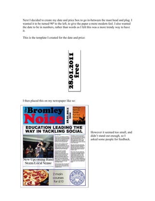
1. Next I decided to create my date and price box to go in-between the mast head and plug. I
wanted it to be turned 90º to the left, to give the paper a more modern feel. I also wanted
the date to be in numbers, rather than words as I felt this was a more trendy way to have
it.
This is the template I created for the date and price:
I then placed this on my newspaper like so:
However it seemed too small, and
didn’t stand out enough, so I
asked some people for feedback.
2. I then edited this as from my audience feedback they said that the font for 'free' should be
different, bolder, and bigger, and in a different colour font so that it stands out, as it is an
important piece of information. I decided to change it to capital red letters, as I thought
this would stand out to people. This was the end result:
I now plan to put this in place on my newspaper. I like it, because I think it does stand out
and it is also in quite modern bouncy fonts.