Again there are even similarities between my double page spread and some professional ones
•Download as DOCX, PDF•
0 likes•114 views


Recommended
More Related Content
Viewers also liked
Similar to Again there are even similarities between my double page spread and some professional ones
Similar to Again there are even similarities between my double page spread and some professional ones (20)
More from Samantha Ratcliff
More from Samantha Ratcliff (20)
Recently uploaded
Recently uploaded (20)
Again there are even similarities between my double page spread and some professional ones
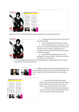
- 1. Again there are even similarities between my double page spread and some professional ones For example both magazines have the artist on the left side of the page. This is to help establish who the article is about. Both of the pages have text on the picture as well. However, in contrast to the professional one I chose to use a pull quote here as it helps to establish that it is an interview and it also makes the reader want to know what the artist is referring to. Another difference between the two is that y photograph is in black and white. I did this to try and make my one look more professional. A similarity between the two artists is both standing up against a white background. This is done to try and achieve a more professional look. A difference between the two double page spreads is that I have included extra photos of the artist on the opposite page. I did this as I thought it would make the page look more appealing to read. The texts in both articles have the same colour scheme. They are kept basic and simple in black but the important bits are in pink or bold. This is to make sure the important parts are eye catching. A difference between the two is the layout as mine is simpler as this makes the reader want to read it more as it doesn’t look like it will take long.