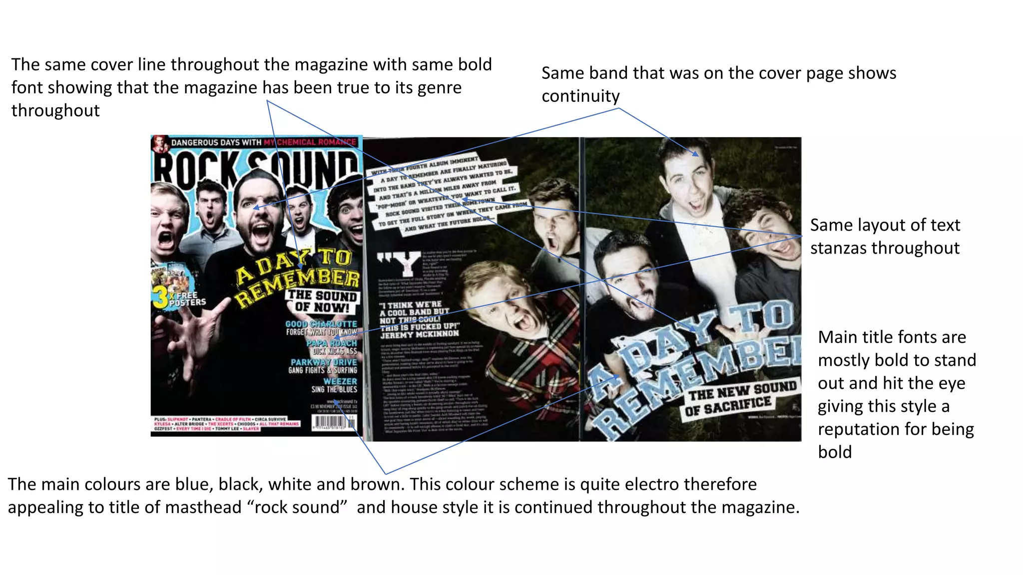
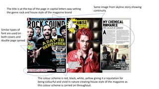
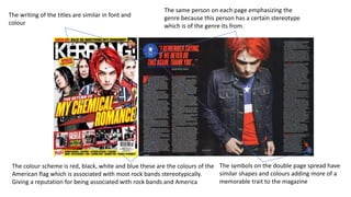
➥🔝 7737669865 🔝▻ jhansi Call-girls in Women Seeking Men 🔝jhansi🔝 Escorts S...
House style
1. The same cover line throughout the magazine with same bold
font showing that the magazine has been true to its genre
throughout
The main colours are blue, black, white and brown. This colour scheme is quite electro therefore
appealing to title of masthead “rock sound” and house style it is continued throughout the magazine.
Same band that was on the cover page shows
continuity
Same layout of text
stanzas throughout
Main title fonts are
mostly bold to stand
out and hit the eye
giving this style a
reputation for being
bold
2. The title is at the top of the page in capital letters way setting
the genre rock and house style of the magazine brand
The colour scheme is red, black, white, yellow giving it a reputation for
being colourful and vivid in nature creating house style of the magazine as
this colour scheme is carried on throughout.
Same image from skyline story showing
continuity
Similar types of
font are used on
both covers and
double page spread
3. The writing of the titles are similar in font and
colour
The colour scheme is red, black, white and blue these are the colours of the
American flag which is associated with most rock bands stereotypically.
Giving a reputation for being associated with rock bands and America
The same person on each page emphasizing the
genre because this person has a certain stereotype
which is of the genre its from.
The symbols on the double page spread have
similar shapes and colours adding more of a
memorable trait to the magazine