
Recommended
More Related Content
What's hot
What's hot (14)
Viewers also liked
Viewers also liked (15)
Similar to College magazine analysis
Similar to College magazine analysis (20)
Recently uploaded
Recently uploaded (20)
College magazine analysis
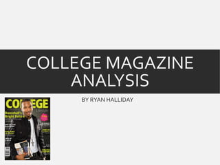
- 1. COLLEGE MAGAZINE ANALYSIS BY RYAN HALLIDAY
- 2. DENOTATION This is a college magazine which looks American and is about colleges in a whole instead of just one single college, its a lifestyle magazine just like something like good housekeeping but for younger people studying at college.The College magazine has a very modern feel to it due to the fonts and colours used, it features a man that looks around 18 holding school books.The magazine is released every season.
- 3. FONT All of the font in this magazine is sans serif which is used a lot more these days due to its modern theme that it has and therefore relates to the audience its targeted at - young teenagers around the age of 16-18.The font is a mixture of bold and standard, the bold font is used to as titles and bigger stories compared to others which then have a font that is standard and thinner and is something you would read when concentrating and not just glancing as its not noticeable.
- 4. COLOURS There is only 3 main colours in the magazine which is a yellowish green, whites and blacks.These colour all blend nicely with each other and I would say are modern colours due to the tone of the yellow, which is only really ever seen digitally.The yellow, white and black all contrast as well making them text stand out from the background.The puff used in the magazine is pink which is used so it stands out from everything else that is on the page.Also the fact this is a summer edition could suggest why yellow was used.
- 5. IMAGE The image features a man who looks around 18 and is carrying books. He links with the colours used, the blacks and white which makes him blend in with the front cover and is not standing out, the fact he is carrying books easily shows that he is studying which obviously relates with the genre of the magazine.The image has soft lighting with thee source being from the left and right side. The camera angle is a medium shot so it captures his outfit and his books and all of the image is in focus along with direct mode address.
- 6. IMAGE A puff is used to display extra information and is in the shape of a paint splat which links to the information that the splat displays (paintballing).This relates to the age that the magazine is targeted at as many teenagers go paintballing for pleasure.The colour contrasts with everything else and does not blend in at all and this is why its so easy to notice and is a topic they obviously want you to notice.
- 7. TOPICS There are many topics on the front cover that link the lifestyle genre to teenagers. ‘make money on campus’ this relates to teenagers as a lot of teens seek jobs and money for their lifestyles. ‘Thank god it’s Fridays’ this also relates to the lifestyle of teenagers and that is clubbing, it’s advertising the ‘hottest night spots’ in Kingston which obviously a lot of teenagers would like to know due to the representation that a lot go partying.