
Recommended
More Related Content
What's hot
What's hot (20)
Similar to Mies van dhe rhoe
Similar to Mies van dhe rhoe (20)
Recently uploaded
Recently uploaded (20)
Mies van dhe rhoe
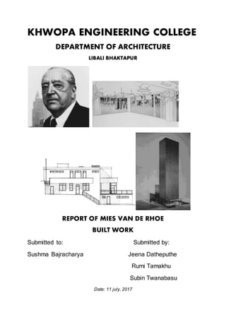
- 1. KHWOPA ENGINEERING COLLEGE DEPARTMENT OF ARCHITECTURE LIBALI BHAKTAPUR REPORT OF MIES VAN DE RHOE BUILT WORK Submitted to: Submitted by: Sushma Bajracharya Jeena Datheputhe Rumi Tamakhu Subin Twanabasu Date: 11 july, 2017
- 2. NEW NATIONAL GALLERY The Neue National galerie (New National Gallery) is the latest work of renowned architect Mies van der Rohe, who died shortly before his inauguration, and first performedin Berlin, his hometown. It is a museum for modern art, with its main focus on the early 20th century. It is part of the National Gallery of the Berlin State Museums. The museum building and its sculpture gardens were designed by Ludwig Mies van der Rohe and opened in 1968. The building features a number of unique highlights of modern 20th- century art. Particularly well represented are Cubism, Expressionism, the Bauhaus and Surrealism. The collection owns masterpieces of artists like Pablo Picasso, Ernst Ludwig Kirchner, Joan Miró, Wassily Kandinsky and Barnett Newman. Concept The building is read as a steel and glass that rises on a stone plinth, generated by the difference in levels of the street. It is a steel structure, severely geometric, which governs the form throughout the building as a computer, since its overall scale, the smallest detail: the deck – support
- 3. – enclosure. Although this is not presented as a building block, but it is quite flexible. Structure This is a great cover 64.8 square meters in length, supported by cross-8 support in its perimeter, 2 on each side, with the corners cantilever. The roof is made up of a web of steel beams. Materials The material is a key issue. Steel and glass out on site. The entire structure is steel, worked with absolute nobility, so that the elements are no longer just something constructive to be somewhat higher. The enclosure is made of glass with stainless steel pillars.
- 4. Architecture The plan of the Neue National galerie is divided into two distinct stories. The upper story serves as an entrance hall as well as the primary special exhibit gallery, totaling 2,683 m2 (28,880 sq ft) of space. It is elevated from street level and only accessible by three flights of steps.Though it only comprises a small portion of the total gallery space, the exhibition pavilion stands boldly as the building’s primary architectural expression. Eight cruciform columns, two on each length placed so as to avoid corners, support a square pre-stressed steel roof plate 1.8 meters thick and painted black. An eighteen- meter cantilever allows for ample space between the gallery’s glazed façade and eight supporting columns. Mies’ office studied this cantilever extensively in various scaled models in order to ensure its structural stability as well as the seeming flatness of the roof plate. The floor-to- ceiling height reaches 8.4 meters, and the space is laid out on a 3.6- meter square dimensional grid. Black anodized aluminum “egg crates” fit within the grid house lighting fixtures, with air ducts suspended above. Black anodized aluminum “egg crates” The lower story serves primarily as housing for the gallery’s permanent collection, though it also includes a library, offices, and a shop and café, and totals about 10,000 m2 (110,000 sq ft) of space. It is three quarters below ground so as to allow for safe storage of the artwork, its sole
- 5. glazed façade looking out on the museum’s sloping sculpture garden and providing ample indirect interior lighting. A rooftop plaza further extends the museum’s exhibition space. Perception of Mies towards New national gallery Mies describes a seemingly floating roof plane, suspended above a single clear-span space punctuated by equidistant columns. This project is now seen as a significant move on Mies’ part toward the alleviation of interior space by both defining and minimizing structural enclosure, thus joining exterior and interior space in a meaningful way. The structure itself, a composite of little more than ground plane, support and roof, thus becomes the building. The aesthetic importance of the clear-span was directly related to Mies’ conception of museum space in general, a “defining, rather than confining space”. The completely open nature of the plan also serves to eliminate the barrier between art and community, simultaneously breaking down the reverence enacted by severely partitioned spaces and inviting interaction between viewer and art. The
- 6. overall aesthetic affect is thus one of vitalizing liberation. Landscape at new national gallery Conclusion To a conclusion we can say that the New National Gallery is an important contribution of Ar. Mies Van Der Rohe in berlin. This is a museum and is influenced by principles and philosophies like Cubism, Expressionism, the Bauhaus and Surrealism. The use of steel structures and glass with amazing use of cantilever has been done in the building probably to provide it a feel of openness and lightness. Seagram building The Seagram Building is a skyscraper, located at 375 Park Avenue, between 52nd Street and 53rd Streetin Midtown Manhattan, New York City. The integral plaza, building, stone faced lobby and distinctive glass and bronze exterior. Johnson designed the interior of The Four Seasons and Brasserie restaurant of the Seagram building. The building stands 515 feet (157 m) tall with 38 stories, and was completed in 1958. It stands as one of the most notable examples of the functionalist aesthetic and a prominent instance of corporate modern architecture.
- 7. Day view Night view Concept Symbol of contemporary industrial world, illustrates the architect’s motto “Less is more” showing that a simple building can be just as surprising that a building with more composite designs. Architecture It had enormous influences on American architecture. One of the style's characteristic traits was to express or articulate the structure of buildings externally. It was a style that argued that the functional utility of the building’s structural elements when made visible, could supplant a formal decorative articulation; and more honestly converse with the public than any system of applied ornamentation. The Seagram Building, like virtually all large buildings of the time, was built of a steel frame, from which non-structural glass walls were hung. Mies would have preferred the steel frame to be visible to all; however, American building codes required that all structural steelbe covered in a fireproof material, usually concrete,because improperlyprotected steel columns or beams
- 8. may soften and fail in confined fires. Structural bronze-toned I- beamshave been used and are visible from the outside of the building, and run vertically, like mullions, surrounding the large glass windows.The building used 1,500 tons of bronze in its construction.On completion, the construction costs of Seagram made it the world's most expensive skyscraper at the time, due to the use of expensive, high- quality materials and lavish interior decoration including bronze, travertine, and marble. Plans of Seagram Building The Seagram Building's plaza was also the site of a landmark planning study by William H. Whyte, the American sociologist. The film, Social Life of Small Urban Spaces,produced in conjunction with the Municipal Art Society of New York, records the daily patterns of people socializing around the plaza. It shows how people actually use space, varying from the supposed intent of the architects.
- 9. Entry to building Sitting space at front of seagram Spaces Mies designed his building to the manner of ancient columns, with bases, shaft and capital.Indeed, the basement, put on a sumptuous marble plaza with fountains dry, houses the lobby, however the ground in the ground floor is cleared and the building is supported on piles, the shaft remains undifferentiated for the succession of office floors, which ends in a triple body height, while continuing strictly the volume of the tower, is expressed plastically as the pinnacle of the whole. To access the plaza area, we must undergo a staircase between two large pillars or pedestals,where they spread sheets of water in symmetry, which is very characteristic of classical antiquity.The building is 157 meters high, spread over 39 floors.
- 10. Lobby spacein Seagram Building Restaurant at Seagram Office space at Seagram Structure The 38-story structure combines a steel moment frame and a steel and reinforced concrete core for lateral stiffness. The concrete core shear walls extend up to the 17th floor, and diagonal core bracing (shear trusses) extends to the 29th floor. According to Severud Associates,the structural engineering consultants, it was the first tall building to use high strength bolted connections, the first tall building to combine a braced frame with a moment frame, one of the first tall buildings to use a vertical truss bracing system and the first tall building to employ a composite steel and concrete lateral frame. Materials Curtain walls of glass and bronze in the front at the time of concrete construction was used as a structural material, both outside and inside. The gray topaz glass was used for sun and heat protection. Use of decorative travertine marble or pink granite. Steel beams and columns of bronze. Elevation of the building achieves its expressive perfection and is vertically emphasized.
- 11. Facade consists of alternating bands of bronze plating and amber- tinted glass windows, which are separated by bronze-toned i- beams running vertically like mullions to the building apex. It was evident that a building of such height would have a huge area of blinds, whose users tend to upload or download as they liked. The Creator's Words "Skyscrapers reveal their bold structural pattern during construction. Only then does the gigantic steel web seem impressive. When the outer walls are put in place, the structural system, which is the basis of all artistic design, is hidden by a chaos of meaningless and trivial forms...Instead of trying to solve old problems with these old forms we should develop new forms from the very nature of the new problems.We can see the new structural principles most clearly when we use glass in place of the outer walls, which is feasible today since in a skeleton building these outer walls do not carry weight. The use of glass imposes new solutions." Seagram in conclusion
- 12. The inescapable drama of the Seagram Building in a city already dramatic with crowded skyscrapers lies in its unbroken height of bronze and dark glass juxtaposed to a granite-paved plaza below. The siting of the building on Park Avenue, an indulgence in open space unprecedented in midtown Manhattan real estate, has given that building an aura of special domain. The commercial office building in this instance has been endowed with a monumentality without equal in the civic and religious architecture of our time.The use of extruded bronze mullions and bronze spandrels together with a dark amber-tinted glass has unified the surface with color.The positioning of the Seagram Building on the site and its additive forms at the rear, which visually tie the building to adjacent structures, make for a frontal-oriented composition. The tower is no longer an isolated form. It addresses itself to the context of the city.
- 13. VILLA TUGENDHAT Villa Tugendhat is a historical building in the wealthy neighbourhood of Cerna Pole in Brno, Czech Republic. It is one of the pioneering prototypes of modern architecture in Europe, and was designed by the German architect Ludwig Mies van der Rohe. Built of reinforced concrete between 1928 and 1930 for Fritz Tugendhat and his wife Greta, the villa soon became an icon of modernism. The Villa Tugendhat, designed by the architect Ludwig Mies van der Rohe is the only example of modern architecture in the Czech Republic inscribed in the list of UNESCO World Cultural Heritage sites. Between 2010 and 2012 the Villa Tugendhat underwent renovation and restoration work, during which both the structure and the adjoining gardens were restored to their original appearance following the completion of the Villa in 1930. The interiors have been equipped with exact replicas of the original furnishings. The technical equipment for the Villa (the air technology rooms, the boiler room, the engine room for the retractable windows, the so-called ”moth” room) was restored in the basement and is newly accessible to the public as part of the guided tours. This area also houses an exhibition presenting the architect, the owners and the family life in the Villa up to 1938 when the Tugendhats were forced to emigrate in connection with the threat of World War II. Visitors can also now enjoy the bookshop.
- 14. The house is detached, built in 1928-1939 in the functionalist style, the greater part of which is offset from the road. It has three storeys, of which each has a different ground-floor plan and façade, as far as can be applied on the slope. On the first storey (basement), accessed from inside the building by a spiral staircase from the food preparation hall, and two exits to the outside, there are utility rooms, which were used for the domestic economy and technical running of the house and a photographic laboratory. Outwardly it appears to form a plinth to the building, divided into three parts by solid doors, a narrow strip of window and a stairway to the garden on one side. The second, main storey (ground floor), to which there is an entrance via a spiral clockwise staircase from the hall, and which is also accessed from the side, north-west front, is made up of three parts: the main living area with a winter garden measuring ca. 280 m2, i.e. almost two-thirds of the entire floor space, with only subtle
- 15. divisions between the other rooms with other functions: reception room, music corner, study with library and seating corner, larger sitting area and dining room. On entering, there is a projection room and guest WC to the left. The second part of this storey, next to the dining area, is formed by the kitchen, food preparation area and food storage space. The adjoining third part consists of servants' quarters and an independent exit leading to the stairway on the northwest side of the building. the south east view The southeast and garden sides are formed by four transparent plate glass windows measuring 3.10 m by 4.80 m, which are adjoined by part of the terrace, a section of white glass into the food preparation room and a wall with a window, which runs around the corner to the second side northwest front with doors and windows, situated in the servants' quarter. The living area is joined to the terrace, which is partly open, partly covered, and has a stairway leading to the garden level, to which there is also a path that runs alongside the winter garden with access from the study. On the street side, the front of which is mostly covered by air and technical network piping, only the upper section of wall with a narrow window strip can be seen. The third storey (first floor) includes a small entrance, hidden from the street, with a hall and communication core, which on the street side leads into the corridor and the two children's rooms, governess' room, bathroom and WC. On the garden side it leads to Mr. Tugendhat's vestibule, Mrs. Tugendhat's suite and bathroom, before which there is a dressing room and, on the opposite side, another vestibule leading onto the terrace. From the hallway there is also a straight stairway leading down to the main storey. The main oblong section of the terrace is directly accessed also from the
- 16. children's rooms and also a narrow joining section from the parents' rooms. On the opposite side past the corner of Mr. Tugendhat's room the terrace continues at the same level to the entry area, partly open, partly covered. To this, parallel to the street, there is a freestanding garage and caretaker's lodgings, which lie opposite to part of the third storey (i.e. hall, family rooms, governess' room and facilities); these are all joined by a flat roof, and are accessed from the northwest front at the end of the through balcony. By the entry to the balcony there is a stairway to lower floors. The fronts of all parts of the third storey are formed by walls with windows and door openings. Part of the street façade from the chimney body and its semi-cylindrical walls above the main stairway is formed by white plate glass. Due to its position on a slope situated under a man-made edge, the possibility to use the weight of its floor space and the use of ground water, the building was constructed on its southeast section on a latitudinal concrete tub, strengthened at its boundaries by a supporting wall, 2.05 m wide at its foot. The construction frame forms a steel skeletal frame over the ground floor grid from the oblong fields - "modules" measuring 4.90 m x 5.50 m. The load-bearing pillars, partly passing through the walls, partly freely through all three storeys, are anchored in concrete bases, which are graduated in size and are at different depths under the tub. Above these bases they are strengthened crossways. They consist of riveted harnessed elements of cross-sectional ferrocarbide, and coated with grey paint or highly
- 17. polished chromium-coated sheet brass covering. The horizontal L- profile cross-beams, bearing the ceramic-lined ceilings, are of a more massive nature. The highly-polished chromium-coated crosspillars, the frames to the glass partitions, internal rails, interior doors and windows (on the top storey of Fenestra - Crittal type), the stairway to the basement, railings in the hall and lower terrace and the floor heating pipes are all of stainless steel. The shell of the building is formed of large plates of transparent and white glass (Umastir) measuring 3.10 m by 4.80 m, the walled sections lined with impregnated turf boards are constructed from panel bricks, covered on the exterior with white Silbal facade plaster and on the interior with white stucco plaster, which also form the ceilings in those places where there are no covering beige ceramic tiles. The floors are cement which in the living and food preparation areas are covered with ivory-coloured PVC; in the bathrooms, WCs and the kitchen they are covered by beige ceramic floor tiles, and light-coloured square and almost square travertine tiles, which also form the flooring of the entrance hall, the upper and lower terraces and the winter garden. The interior spiral staircase and the staircases by the northwest walls of the building are also of travertine. The main living area is split by a five- part partition of honey-yellow onyx, which is partially transparent when the sun shines, measuring 6.27 m in length and 0.07 m in thickness. There is also a semi-circular twelve-part wall diameter 6.90 m surrounding a veneered plywood table replacing the original one of Macassar ebony. Under the ceiling of the main living area there are hanging Hennigsen lights with opal shades, and an almost imperceptible chromium curtain rail. Entrance of building
- 18. The entrance door reaches from the floor to the ceiling, as do the doors into the family and governess' rooms, and is of matt red-brown pallisander. The same material, divided by vertical grooves, form the panelling to the walls opposite the main entrance door and the walls of the corridor leading to the WC in the entrance hall. The doors to the corridor leading to the children's rooms are glass, as are the doors between the spiral clockwise staircase and the main living area and the doors from there onto the terrace. The doors to the less important rooms, for example the children's bathroom, the kitchen and adjoining rooms or the WC are of normal height, wooden, and painted matt white. The doors to the outside, with the exception of the main door and the door leading from the parents' room onto the terrace, are steel, coated with so-called Berlin Grey, as are all the other metal elements, for example the railings, fence, pergolas on the terrace and exterior window frames. The interior window frames, and all metal elements that are not chromium-coated, are painted with a light colour. The wooden Venetian blinds on the windows and doors to the parents' and children's' rooms, the window of the governess' room and the semi-circular bench on the terrace are protected by colourless varnish. The sun blinds, encased in grey-painted steel frames above the windows of the main living floor, including the kitchen, are made of raw linen cloth with wide blue and white stripes. Of the original furniture, both fixed and mobile, the following pieces have remained in situ: The wooden-panelled seating corner and most of the shelves in the library in the main living area, veneered with Macassar ebony The partly built-in cupboard and wardrobe, panelled with pallisander, in Fritz Tugendhat's bedroom The partly built-in cupboard and wardrobe, panelled with pallisander, in Grete Tugendhat's bedroom The partly built-in cupboard and wardrobe, panelled with zebran, in the governess' bedroom The cutlery and table linen cupboard, accessible from both sides, in the food preparation room
- 19. Barcelona tugendhat armchair The semi-circular bench on the terrace is also probably original. Aside from the above items, other pieces of the original furniture are in the
- 20. ownership of the children of Grete and Fritz Tugendhat in Caracas, Zurich and Vienna. Others are in the collection of the Moravska galerie v Brnì (Moravian Gallery in Brno), and the Museum of Modern Art, New York, where there is one item: Barcelona chair (type Bamberg MR 80/9) from the living-room arrangement in front of the onyx wall - family collection, Caracas Tugendhat armchair (type Bamberg MR 70/9) from the living-room arrangement in front of the onyx wall, owned by the Museum of Modern Art in New York C` (type Bamberg 100/4)from the living-room arrangement in front of the onyx wall - owned by the Moravska galerie v Brnì Decorative bench from the living-room arrangement in front of the onyx wall - owned by the Moravska galerie v Brnì Smoked-glass cupboard from main living area - owned by the Moravská galerie v Brnì Body of couch from seating corner in library - private property in storage at the Moravská galerie v Brnì Bridge table from seating corner in library - family collection, Zurich Cupboard by entrance to food preparation room - family collection, Vienna Brno chairs from flat chromium-coated steel with armrests from Grete Tugendhat's room – family collection, Caracas Wardrobe from Grete Tugendhat's suite - family collection, Vienna Vanity table form Grete Tugendhat's suite - family collection, Vienna Writing table from Fritz Tugendhat's suite - family collection, Vienna Glass book-cupboard from Fritz Tugendhat's suite - family collection, Zurich Wardrobe from Fritz Tugendhat's suite - family collection, Zurich The main living area is furnished with replicas of the original mobile furniture. Other living areas are, with the exception of the built-in
- 21. cupboards,in their original condition and have been replaced,empty. The replica furniture was made in 1995 to the design of several original pieces held in the collection of the Moravska galerie v Brnì and with the aid of original photographic documentation. The seats and glass tables were manufactured by the Italian company Alivar, Florence, as were the glass cupboard, bridge table, writing table and decorative bench by the onyx wall, the completion and assembly of which was carried out by a Czech company. The replicas are as follows: Large writing table in the study section of the large living area with legs of chromium-coated steel tubes, veneered with Macassar ebony Two sprung chairs with armrests type Bamberg 20/3 of chromium-coated steel tubing with brown rattan weave Couch in the seating corner of the library upholstered with naturally-coloured pig leather Bridge table, position as above, veneered with Macassar ebony Three Brno chairs with armrests, with chromium-coated tubular frame, covered with white pergamenleather Chaiselongue type Bamberg 100/4 in front of onyx wall, chromium-coated tubular frame, with cushions upholstered with red velvet Three Barcelona chairs type Bamberg MR 90/9 in from of onyx wall, chromium-coated flat steel frame, upholstered with silver- grey material One Barcelona chair type Bamberg MR 90/9 in front of bookshelves, white upholstery, quilted leather Folding table type Bamberg MR 130 in front of onyx wall, chromium-coated flat steel frame, with square pane of clear glass Barcelona chair type Bamberg 80/9 in front of onyx wall, chromium-coated flat steel frame, with green quilted leather upholstery Decorative bench at the centre of the onyx wall, of white layered painted wood Four Brno chairs with armrests in dining area, chromium- coated tubular frame, upholstered with white pergamen leather Four chairs of the same type in front of the white glass wall in the reception area Folding table type Bamberg MR 140 in front of the white glass wall in the reception area, with chromium-coated tubular frame and circular pane of clear glass Piano stool, chromium-coated tubular steel with brown rattan weave
- 22. In the interior of the main living area, in front of the onyx wall there is a bronze bust by Wilhelm Lehmbruck entitled "Torso of girl looking down", which is loaned from the collection of the Moravskag alerie v Brnì, and a small concert piano to the left of the entrance. A writing table stands on a Persian carpet of Meshed type, and the furniture in front of the onyx wall is on a woollen cream-coloured carpet. The house stands in the northern corner of the sloped garden, which is accessedfrom the main front overlooking the garden, and also from the winter garden and the side at the west corner of the house. The main path leads around the periphery of the large lawn and several trees, mostly spreading plane trees and willows. Part of the slope below the main living storey is terraced and planted with hardy flowering and evergreen plants and low conifers.
- 23. ILLINOIS INSTITUTE OF TECHNOLOGY CHICAGO, USA, 1941–58 1. Minerals and Metals Research Building, 1941–43, 1956–58 2. Engineering Research Building, 1943–46 3. Perlstein Hall, 1944–47 4. Alumni Memorial Hall, 1945–46 5. Wishnick Hall, 1945–47 6. Central Vault, 1946 7. Institute of Gas Technology Building, 1947–50 8. Associationof American Railroads ResearchLaboratory, 1948–50 9. Boiler Plant, 1948–50 10. Chapel, 1949–52 11. Test Cell, 1950–52 12. Mechanics Research Building, 1950–52 13. Crown Hall, 1950–56 14. Carman Hall, 1951–53 15. Association of American Railroads Mechanical Laboratory, 1952–53 16. Commons Building, 1952–54 17. Bailey Hall, 1953–55 18. Cunningham Hall, 1953–55 19. Electrical Engineering and Physics Building, 1954–56 20. Association of American Railroads Engineering Laboratory, 1955–57 21. 21 Siegel Hall, 1955–58
- 24. Shortly after Mies moved from Berlin to Chicago, he began working on the design for the university campus at which he was later to teach. As directorof the architecture department, he saw the buildings as part of a programmatic intention. He designed not only the plan for the campus of the future Illinois Institute of Technology (IIT) but also the buildings themselves. “I firmly believe a campus must have unity. Allowing every building or group of buildings to be designed by a different architect is sometimesconsidered democratic, but from my point of view this is just an excuse to avoid the responsibility of accepting one clear idea.”Mies declared that “it was the biggest decision I ever had to make,”and presented an ensemble of building volumes arranged along a symmetrical axis through the central square. The plan takes a tabula rasa approach, disregarding the fact that the site was partially occupied and situated in a densely populated part of the city. Although it was called a slum, numerous buildings by Louis Sullivan that stood there were also demolished in the process. Mies’ first designwent as far as to extend across the historical pattern of streets,but the option of building over the streets was initially refused.In a revised design, he integrated the new buildings in the existing structure of the city. In the revised plan the central square has been retained despite the general simplification of the building volumes, which also stand more freely arranged in space. The central square is framed by the two largest buildings, the Library and Administration Building and the Student Union and Auditorium Building, neither of which were built. In his urban designconcept,Mies concentrated initially on dimensioning a minimum unit that could function as a module out of which the entire campus could be developed.“Whenwe started, I tried to find out what is a classroom, what is a laboratory and what is a shop. We came to a system of 24 feet, which equals 7.32 metres, a measurement which is used in Switzerland and in Sweden for school building. So I drew a network of 24 feet by 24 feet all over the campus. The crossing points were the points where we put columns. Nobody could change that.” The basic grid was also extended upwards where each storey equated to a half-module of 12 feet. This three-dimensional grid served only to provide a degree of orientation. the original site that encompassed eight blocks of Chicago lies between two sets of railway lines in a once fashionable living area and was designed as a park-like greened site with the buildings distributed in easy fashion over the site like pavilions.
- 25. For the design of the outdoor spaces he collaborated with the landscape architect Alfred Caldwell. In the earliest drawings one can already see wide expanses of grass, asymmetrically placed clusters of trees and ivy- clad walls. The architecture and urban design were conceived of as a unit and were intended to blend with the vegetation into a new kind of urban landscape. On the neighbouring site to the east, Mies later designed three high-rise housing towers for the IIT, a commons building and a chapel. Over the course of 15 years he created 21 buildings for the IIT, but the overall campus plan remains fragmentary. “The campus was planned as a unit and, if it cannot be a unit, I have to be satisfied with the torso,” he declared after other architects had beencommissioned to design further buildings. Although they partially adhered quite closely to Mies’ architectural language, the clearly demarcated space in the centre has never been fully realized to the present day. Over the decades, the neighbouring parts of the city became ever less dense so that the intended contrast between the tightly packed building pattern of the surroundings and the carefully ordered placement of buildings in green space and its clearly delineated contour lines became ever less apparent. In 2003,Rem Koolhaas responded in his design for the IIT McCormick Tribute Campus Center to the original concept but also most notably to the changed context. His building increases the density of the campus and alters the urban situation. Koolhaas understands Mies’ urban intention as being “generic”, as a flexible structuring principle that is the antithesis of a definitive master plan. “Mies does not design individual buildings, but a formless condition that can manifest itself as building anywhere and be (re)combined in an infinite number of configurations.” Even though the building volumes have been designed asclear rectangular forms,they are nevertheless proportioned with the utmost of care, as are the spaces between them. People passing through the campus on the road along the symmetrical axis should have originally experienced a rhythmic succession of wider and narrower spaces. The space between the two largest buildings should have measured exactly 24 modules and the space to the south of Perlstein Hall exactly 12.
- 26. RESEARCH BUILDING FOR MINERALS AND METALS East façade Ground floor plan The first building block of the new campus complex of the Illinois Institute of Technology was a research building for minerals and metals with the typological characteristics of a factory shed. The building stands immediately next to the railway lines in a linear zone where all the campus buildings with an industrial character were placed, for
- 27. example the power station or electricity substation. The building was originally designed to match the 24- foot grid that determines the column spacing and volume of the building, but the bay length of the actual building deviates from this grid. The building’s length is instead a factor of the number of bricks. The plinth is articulated as a continuous band laid in Flemish bond and is placed in front of the structural framework of the building. Despite this separation between external skin and supporting constructions, which Mies termed skin and bones, the axes of the structural members are legible on the façade: every sixth vertical profile in the windows is slightly wider. The bay interval of the building’s depth also deviates from the 24-foot grid as the width of the site and the span of the moving crane were predefined. As such, the very first building that Mies built for the complex own rules on the arrangement and proportioning of buildings according to a grid, although this was intended only as guidance. Mies’ description of the building sounds like a list of predefined conditions: For this building, one of the few to be realised during the war, he was even permitted to use steel which was otherwise reserved for armaments production – because the building itself was deemed as being important for the war effort. The building was not only used to investigate the properties of materials but also served as an architectural model,demonstrating par excellence the art of constructing with steel. In this building the steel construction is left unclad. To stiffen the brick panels, special hollow profiles were developed that consisted of two standard U-profiles welded together and incorporated almost flush into the wall. At the corners of the building, wide-flange I-beams are joined to the primary steel structure and frame the façade. Although Mies was later to use suspended ceiling constructions, in this building the structural framework is also visible on the ceiling. The concrete beams of the roof are left exposed as were the drainpipes that ran inside the building: “The exposed beams and girders of the roof,” wrote Philip Johnson, “are arranged as carefully as those of a Renaissance beamed ceiling.” This building has a unidirectional loadbearing structural frame. “Mies referred to the one-way-span structure as a ‘Gothic’ solution,” writes Phyllis Lambert. “As a linear system that could be sliced off at any point, the Gothic was more commonly referred to in Mies’ milieu as a ‘sausage’. At the point where the slice occurs, the end wall became a diagram of the structure. The is expressed directly.”This can, however, only be seen on the end wall. The linear concept of this building is expressed through the use of two different facade systems: a
- 28. continuous band with a hung curtain wall along the long sides and a kind of shell construction on the narrow sides, as if having bricked in a section through the building. From 1956 to 1958, Mies extended the building a further sixbays towards the north. The new addition, however, is a different building type, and this can be seen on its exterior. The windows now stretch to the ceiling and lend the building – like Mies’ unrealized design from 1923 for a high-rise building made of concrete – a sense of horizontality that contrasts, without any attempt at a transition, with the existing building. Glazed façade facing west Corner details Minerals and Metals Research Building 109 WISHNICK HALL Illinois Institute of Technology, Chicago, USA, 1945–46 The IIT Chemistry Building was designed together with the buildings around it. The buildings employ the same facade design and the corner detail is identical to the indented “negative corner” of the Alumni Memorial Hall. The staircases likewise follow the model of those in the Alumni Memorial Hall with brick masonry corners placed at an angle of 45 degrees, emphasising the direction of movement on the stair
- 29. landings. Peter Behrens employed a similar device in yellow brickwork for the AEG High Tension Factory in Berlin. The rectangular floor plan of the buildings incorporates the stairs and an auditorium within its envelope. This arrangement only came about through a process of simplification: in the first campus plan, in which the pair of buildings is already marked, the auditoria were shown as separate building volumes and the stairs were also located outside the structural plan. From 2006 to 2008, the building underwent comprehensive restoration. The steel construction was cleaned and the sliding windows replaced. While the reconstructed aluminum window frames closely resemble the originals, the interior spaces have been modified more significantly: the height of the rooms has changed to accommodate the installation of a modern central air conditioning system. Ground floor plan West facade
- 30. Staircase ELECTRICAL ENGINEERING AND PHYSICS BUILDING Constructed out of reinforced concrete, the building was designed for the Institute of Gas Technology. The open panels in the skeleton frame construction have a masonry infill laid in stretcher bond. This brick bond, which is one brick thick, emphasises the non-loadbearing character of the infill panel, which is arranged flush with the outer face of the loadbearing structure. A shadow line marks the division between the loadbearing and the non-loadbearing elements. The building has no façade in the sense of an applied frontage, and a front or back has not been articulated: the structure is made visible in the same way on all sides of the building. The building stands exactly within the urban grid, with a width of three modules and a length of nine. The articulation of the structural framework as a visible net of lines can be seen as a diagram that not only describes the internal structure of the building but also the structure of the overall constellation of the surroundings. Until the end of the 1970s, the building contained the first industrial nuclear reactor. The building has since been extended and most of the larger glazing panels have been replaced with small panes. Corner of the building Facade SIEGEL HALL
- 31. Togetherwith the neighbouring Wishnick Hall, the Electrical Engineering and Physics Building forms a gateway, as shown in the site plan on page 102.1 The two almost identical buildings stand next to one another, adjoining an openspace in the centre of the campus. While the plans vary slightly, the basic spatial configuration is the same with an auditorium arranged internally in the centre of the plan. Although built almost a decade after Wishnick Hall, the design is almost unchanged, demonstrating Mies’ intended continuity of architectural language. The arrangement of a pair of essentially identical building volumes emphasises the urban configuration. Today, the building stands more isolated than was originally planned. Ground floor plan Corner of the building
- 32. 860–880 N. LAKE SHORE DRIVE Built between1949-1951,the 860-880 Lake Shore Drive towers by Mies van der Rohe are two iconic skyscrapers on the Chicago skyline that redefined highrise living for the post-war generation. The 26-story towers border Lake Michigan, giving residents a beautiful waterfront view. Mies' reason for the scheme involved his concept that architecture should be independentof the site, and the towers did indeed follow their own rules by being the first step towards the industrialization of architecture. More on 860-880 Lake Shore Drive after the break. Mies approached the triangular site by arranging the two apartment buildings at cross axis towards one another, delivering views of the lake, Lake Shore Drive, and the busy inner city Chicago Loop which is southwest of the towers. The ninety degree angle that the buildings are situated in also enclose a plaza at ground level. Mies' concept of independent architecture is also seen in the rise of the ground floor of 860-880 Lake Shore Drive which make the towers appear as if they are floating above the ground. On the entrance level, a Location 860–880 N. Lake Shore Drive Chicago, Illinois Coordinates 41°53′55″N87°37′7″WCoordinates: 41°53′55″N 87°37′7″W Address: Area N Lake Shore Drive 860-880, CHICAGO- ILLINOIS, United States 1.2 acres (0.49 ha) Built 1949 Architect Ludwig Mies Van der Rohe Architectural style International Style
- 33. horizontal roof is the sole connector between the two high-rise apartments towers and does not have any function other than to "mark the spirituality of this specific place." The plan for the towers was organized in a 21 foot grid that was represented with steel columns placed at the intersections of the grid. By using it for structure, Mies simplified the steel frame to its purpose while using it to express the grid. Because of its purpose Mies wanted the inner character of the steel skeletons to show. This became a problem due to fire regulations, but Mies made it his goal to make these skeletons visible despite this fact. He achieved this by covering concrete shells with steel plates, thus keeping the uniformity of the steel columns.
- 34. Another important feature of these towers is that they were built with prefabricated parts. For example, during the construction of the facade four-window units were assembled onthe roof and fastened from above from column to column. The same vertical standard T-profile that the window units were made of was fastened to the columns and corner pillars. The structure therefore consists of a system of filling and framework that created a beautiful pattern of contrasting black steel against the glass surface. The mullions of 860-880 Lake Shore Drive were also well thought out in a 5'3" grid system and were made of standard 8" wide-flange steel. These standard steel sections were manufactured for general use and also made the building easy to put together, since they simply attached to the exterior frame.
- 35. By making the construction of the buildings the design priority, Mies created a system that led his perfect grid from structure, to windows, and finally interior partitions. "From outside to inside, from permanent to temporary, the architecture evolved in the sequence of construction." The perfect order found in the modern 860-880 Lake Shore Drive led the buildings to become landmarks in Chicago, and was perhaps the reason why Mies and his wife even resided in one of the apartments for several years. The 26 floor, 254 ft (82 m) tall towers were designed by the architect Ludwig Mies van der Rohe, and dubbed the "Glass House" apartments. Construction was by the Chicago real estate developer Herbert Greenwald, and the Sumner S. Sollitt Company. The design principles, first expressed in the 1921 Friedrichstrasse Skyscraper competition in Berlin and built thirty years later in 860–880 Lake Shore Drive, were copied extensively and are now considered characteristic of the modern International Style as well as essential for the development of modern High-tech architecture. The towers were not entirely admired at the time they were built, yet they went on to be the prototype for steel and glass skyscrapers worldwide. Initially, it was difficult to acquire financing for the project, turned down by lenders like Baird & Warner, who considered the design scheme to be too extreme. 860–880 Lake Shore Drive Apartments embody a Modernistic tone with their verticality, grids of steel and glass curtain walls (a hallmark of Mies’ skyscrapers), and complete lack of ornamentation. Tenants had to accept the neutral gray curtains that were uniform throughout the buildings;no other curtains or blinds were permitted lest they mar the external appearance. Since Mies was a master of minimalist composition,his principle was “less is more” as it is demonstrated in his self-proclaimed “skin and bones” architecture.