
Recommended
Recommended
More Related Content
What's hot
What's hot (20)
Similar to Does your email pass the ABC test?
Similar to Does your email pass the ABC test? (20)
Recently uploaded
Recently uploaded (20)
Does your email pass the ABC test?
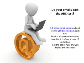
- 1. Do your emails pass the ABC test? 3.7 billion email users send and receive 269 billion emails each day. Email is a key communica:on tool. But it is also a source of frustra:on. Get the basics right and you bypass the irrita:on!
- 2. Appearance Emails need to look good, be easy to read and make sense to the reader. Appearance covers your design, use of colour, copy font, and anything else that readers see when they receive, and hopefully open, your email.
- 3. A funky new font can make make you stand out for the wrong reasons – if the font isn’t widely used it may translate into interes:ng characters when the reader receives it. Well known fonts are widely used because they move from system to system and device to device without changing. Fonts
- 4. Colours Colours add interest, portray your brand, set a mood. Be careful they don’t obscure the message and make content hard to read. White on grey might look good on a big design screen, but can be a challenge for a mobile reader. Some readers may also want to print your mail – if you have these readers make your email print friendly and fit it to a standard A4 page size on a white background.
- 5. Mobile readers Everly:c say 61% of emails are opened on mobile devices. We’re quite quick to move our aPen:on to the next thing so if your email requires a lot of up and down and side to side swiping users will become irritated and move on. Big screens are great – but they’re not what most readers are using to read their mails.
- 6. Bytes Get the sizes right. Fonts must be readable, banners and signatures not too big, and your email shouldn’t break a reader’s data bank.
- 7. Font size Ever had an email where you had to zoom several :mes to read? That’s unnecessary –and unprofessional. 10 – 12 points has been suggested as ideal – but ideal depends on your chosen font. Do a test mail to see how your font looks on other devices. Don’t be tempted to go too small – it looks like you are hiding something. Too big on the other hand can look like shou:ng.
- 8. Signatures and banners take up a lot of physical space, and they look messy when emails start going back and forth. Your email style should be consistent throughout -‐ using use a completely different style for a signature or banner is confusing. You want banners and images to en:ce, explain and enhance – not overwhelm. Signatures and banners
- 9. Image size Not every reader has a hi-‐ speed connec:on and unlimited data, especially in South Africa. Don’t clog their devices with 5 megabyte images – it’s unnecessary. Especially when you’re sending emails to a group. Keep it down to a reasonable size, and watch out for aPachment size. The minute an email to a group hits over 1MB, stop, think and trim.
- 10. Content Content starts with the email address and subject line and ends with your signature, and if necessary disclaimers, terms and condi:ons.
- 11. Address Readers want to know who is emailing them. The easier an address is to iden:fy, the faster your message is reached. Be careful, even if you’re sending bulk, of an email address that ends in do not reply. Before the reader’s even got to the subject line you’ve told them you don’t want to speak to them and won’t take any ques:ons.
- 12. Subject line Subject lines can make or break your read rate. Stats suggest a personalised subject line can increase the open rate by 6 – 17%. Subject lines need to be clear (so the reader knows what they’re going to read) and interes:ng (so they want to read) -‐ but not over the top.
- 13. Tone Email is friendly and formal so you want to be relevant and personal, but not too personal or intrusive. Connec:ng with readers requires a balance, some knowledge of who your email readers are, and confidence that what you are saying is important, interes:ng and useful. Say what you want to say, why you are saying it, and why you are saying it to this reader.
- 14. Disclaimers, terms, condiAons, opt outs The days of small font for the fine print are over – but don’t make this longer than it needs to be. People are either suspicious of long disclaimers or don’t read them.
- 15. Some of these may seem quite simple – but there are too many emails that aren’t read, are deleted or cause frustra:on because they pay no aPen:on to basics. Just take a look at your inbox – scan through those that raised your eyebrows or made you look twice! Make sure your next mail doesn’t get that reac:on. Get the basics right