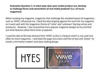
1. When creating my magazine, magazines that challenge the standard layout of magazines,
such as ‘HYES’, influenced me. I liked the idea of going against the norm for my magazine
as it went well with the magazines theme of ‘niche’ and ‘unknown’ hip-hop artists and
producers. However, I also researched more popular magazine designs to try and find
out what features allow them to be so popular.
I used the idea of the box element from ‘HYES’ as this is a feature which is not used very
often on most magazines. I also kept the page very clean and free of text and ‘clutter’ to
create a minimalist modern and clean looking design.
Evaluation Question 1: In what ways does your media product use, develop
or challenge forms and conventions of real media products? (i.e. of music
magazines)
3. Although I used the same concept, I changed certain elements in order to make it fit my desired
style, such as creating a translucent center to the box. This along with other techniques helped
me to create a much more aesthetically pleasing design. I followed this theme on throughout my
other pages, such as the title font. This was a font that I created myself which makes the
magazine original, something that I found worked well in other magazines.
Another feature which I found works well across the magazines I researched was using a shorter
title looks more aesthetically pleasing, as well as sounding better. Magazines that follow this
pattern include The WIRE, HYES, XXL and Clash. These all have titles consisting of characters from
3-5 in length. All 4 are popular and sought-after magazines, showing me that I should consider
using a short title for my magazine. My title ‘WAVE’ does indeed follow this rule as it consists of 4
letters. It is also a word which is associated with hip hop, which makes it stand out to my target
audience and make in memorable.
The layout throughout my magazine is simplistic and minimal, using text and pictures only where
needed, and keeping the colour palette as monotone as possible. The font used for ‘WAVE’ is
continued across the 4 pages which gives the magazine it’s own theme and ‘branding’. Although
many of my magazines components do not conform to the rules of traditional magazines – such
as the title on the contents page – the fact that there is a running theme throughout the
magazine stays, which is something that is used in many existing professional magazines and
media products. The images I chose to include hold the readers interest somewhat more than a
generic white backdrop picture might do in a normal photo shoot, which is one reason I chose to
keep these pictures.
Layout
4. Artist representing genre
My artist is supposed to be a rapper in his early twenties, who is on the come up and
knows it. This is reflected by his confident body language in the pictures he features in,
and the mise en scene also shows he is from the streets. Street rat rappers are
stereotypically more ‘streetwise’, so his arrogance may spark from there. Although my
magazine takes a more literate approach generally, the interview I featured with
RAPTUM has to reflect his opinions and his ego, so a much more informal tone has
been set.
The idea of a young underground rapper stemmed from the idea of Bishop Nehru, an
American rapper who is just breaking through the rap scene, although he would still be
considered underground my many hip hop followers. I chose to leave out any large
product placement or brand endorsing from my magazine and from the artists
RAPTUM, especially in his interview. It is a very common ting to find in stereotypical
mainstream hip hop magazines, so because ‘WAVE’ is supposed to be aimed at a more
niche market who would not particularly be fond of such a thing, I chose to leave it
out.