W.H.Bender Quote 61 -Influential restaurant and food service industry network...
User interface Mario
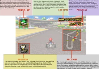
1. The power up image is bordered with a yellow frame
and black transparent background to distinguish it
from the scenery. The power up is an essential element
in the player’s game strategy so they need to be able to
see it within their vision so that they can think fast
and use them effectively.
The Lap Time, referred to as ‘Time’ in the game, is the
colour of dark yellow, to distinguish it from the scenery,
textured lightly with a dark shadow and emphasized by a
black drop shadow, to catch the player’s eye. The numbers
are shown in retro, digital font and are held by smaller
drop shadows than their title.
The position marker is in a very bold yet clear font, textured with a white
and cold mixture of colour and amplified by a large drop shadow. This
feature highlights the competitive nature of the game which motivates
players, meaning it has to be within their immediate eyesight.
The Lap progress title is laid out in the same format
as the ‘Time’ title. The numbers feature in the
progress section are, like the Lap time, in a digital
font. However, the number which represents the lap
that the player is on is held by a stronger drop
shadow, to make it clear to the player what lap they
are on.
The race map is a transparent screen that features a basic
outline of the track with all players represented by just their
faces. The player is highlighted by a bold outline and a bigger
size than the other players, that are smaller and slightly more
transparent, to make it clear of the player’s position.