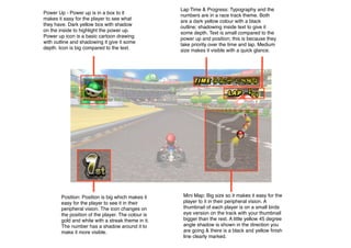
1. Power Up - Power up is in a box to it
makes it easy for the player to see what
they have. Dark yellow box with shadow
on the inside to highlight the power up.
Power up icon is a basic cartoon drawing
with outline and shadowing it give it some
depth. Icon is big compared to the text.
Position: Position is big which makes it
easy for the player to see it in their
peripheral vision. The icon changes on
the position of the player. The colour is
gold and white with a streak theme in it.
The number has a shadow around it to
make it more visible.
Lap Time & Progress: Typography and the
numbers are in a race track theme. Both
are a dark yellow colour with a black
outline; shadowing inside text to give it
some depth. Text is small compared to the
power up and position; this is because they
take priority over the time and lap. Medium
size makes it visible with a quick glance.
Mini Map: Big size so it makes it easy for the
player to it in their peripheral vision. A
thumbnail of each player is on a small birds
eye version on the track with your thumbnail
bigger than the rest. A little yellow 45 degree
angle shadow is shown in the direction you
are going & there is a black and yellow finish
line clearly marked.