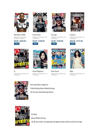
2. Typography:The typography’sused
inthismagazine coverare all sans
serif,thisconnotesthe ideaof
seriousnessanddoesnotpromote
the ideaof fungivenoff bya serif
font,alsoit fitsthe targetaudience
as it isaimedat rocky teenagers
whowouldappreciate thissans
serif fontandfinditmore
appealingthanamagazine with
serif fonts.The word‘Kerrang’
whichisthe name of the magazine
isin a large bolddistressedfont
whichhelpstocatch the eye of a
potential buyer, thisisalsoa
contemporaryandmoderndesign
whichfitsthe modernmusic
magazine itisusedon.
Layout:The magazine coveruses
the conventional Zlayoutwhich
followsthe natural route of the
eye.Alsoalot of the contentlike
the ‘Exclusive’interview are onthe
lefthandside of the coverfor when
itsstackedon a self,thislayout
methodiscalledthe leftthird. The
magazine usesitsownhouse style;the coverisverycluttered,forexample the title of the magazine
iscovered,thiscan onlybe achievedbecause Kerrangisawell-knownknownmusicmagazine and
can be easilyidentifiedwithonlypartsof the title.
Colour:The maincoloursusedon thiscoverare black and yellow.Blackiscommonlyrelatedtothe
rock genre andalso connotesthe ideaof death,anideacommonlyrelatedtothe rockmusicgenre.
The yellowcolourconnotes the ideaof danger. Thismagazine coverusesalotof white fontsforthe
more importantthingssotheystandout more than the otherlessimportantthingsdisplayedonthe
cover(the thingsthat standout are the magazine title so it’smore memorable,andthe main
interview.) Alsoalotof yellow isusedbecauseitcontrastswell with the blackusedanditisvividso
standsout fromthe backgroundblacks,thiscolouralsoconnotesthe ideaof the magazine being
modern.
Images:The imagesusedonthisfrontcover are verydark whichfitsthe genre of magazine,itisa
mid-shotof the band‘bringme the horizon’,the midshotusedmeansthatthe bandcan be easily
identifiedbythe reader.