
Recommended
More Related Content
What's hot
What's hot (20)
Similar to Malaika Pettigrew
Similar to Malaika Pettigrew (20)
Recently uploaded
Recently uploaded (20)
Malaika Pettigrew
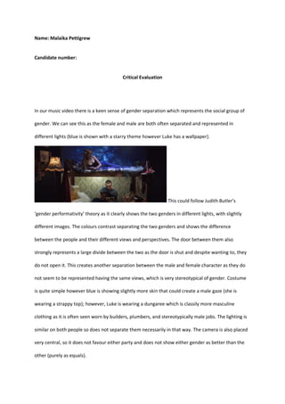
- 1. Name: Malaika Pettigrew Candidate number: Critical Evaluation In our music video there is a keen sense of gender separation which represents the social group of gender. We can see this as the female and male are both often separated and represented in different lights (blue is shown with a starry theme however Luke has a wallpaper). This could follow Judith Butler’s ‘gender performativity’ theory as it clearly shows the two genders in different lights, with slightly different images. The colours contrast separating the two genders and shows the difference between the people and their different views and perspectives. The door between them also strongly represents a large divide between the two as the door is shut and despite wanting to, they do not open it. This creates another separation between the male and female character as they do not seem to be represented having the same views, which is very stereotypical of gender. Costume is quite simple however blue is showing slightly more skin that could create a male gaze (she is wearing a strappy top); however, Luke is wearing a dungaree which is classily more masculine clothing as it is often seen worn by builders, plumbers, and stereotypically male jobs. The lighting is similar on both people so does not separate them necessarily in that way. The camera is also placed very central, so it does not favour either party and does not show either gender as better than the other (purely as equals).
- 2. I’d argue another social group is the average young consumer. The artists are not shown in a high light as they wear normal clothing (jeans, tops) that is accessible to everyone. The sets are also locations most people can relate to (a bedroom and a hallway etc). This shows the artist as more humble and down to earth and that they are not some famous, rich, or flashy group that we often see in music. The two characters in the video seem to be disconnecting which is also something normal people can relate to in terms of relationship and how they are not always easy or positive. This is also represented in the colour choices of the digipak and website are they are more youthful and vibrant that appeals to the average younger audience. This is likely to draw the eye of the consumer and catch their interest in the album in stores or on Spotify etc as it looks vibrant (stands out). If the cover was dull people would not be as drawn to the image and would scroll past it. Again, the two people are represented differently as they have diverse backgrounds (not the same). However, they are in the same bedroom so they must get along somehow and show similar interests despite being on separate bunks (not on the same level). Luke is in a more natural position than blue (she seems to be posing rather than being able to lie normally).
- 3. My intention across the campaigns was to show the pair as mysterious and almost curious in the way the audience may not know if they are friends, relatives, or in a relationship. The music video suggests tension which is often in relationships and is for a love song so suggest a relationship between the two although it is not clear enough for the audience to be sure. However, the use of bunkbeds and fun youthful colours throughout the digipak, Tik Tok and Insta it could prompt the audience that they are a childhood friendship or even possibly siblings (as they are on separate bunks of the same bed). This could prompt the audience to be intrigued on how the two know each other and could cause a creation of fan theories and opinions. This would spread the word about the band and create publicity for them as everyone will want to see their opinion for themselves. Because there are two members, I think it could also be branded in the way that they are different (shows separation in the two in the video) but they share the passion of music and that is what brings them together. This could cause the audience to want to pick a favourite and could appeal to both genders, female, and male, as there are two members of the opposite sex (however the overall video has a more feminine feel as Luke is not necessarily shown as extremely masculine. The way Luke is branded however almost suggests a slightly androgynous being, as he is not necessarily masculine or feminine (neutral haircut, nail polish
- 4. worn, pierced ears). This could according to Maslow’s theory represent a lot of people and make them feel like they have a voice (safety). This could attract a more bi-sexual audience as there is not a powerful sense of either gender represented largely (it is left unclear). This would potentially make the band seem more diverse and accepting of people and their backgrounds (will make their audience feel represented). We also tried to use similar fonts throughout so that the audience begins to connotate the font with the band (becomes their font). Our product through Instagram, Tik Tok, website and YouTube, is targeted towards a teen/young audience a similar age to the artists (16/17/18). This is because a more youthful audience is reflected as not only is the song about a youthful love, but sets are used such as the bunkbed that reflect this
- 5. (childlike furniture). It is also set in a family home due to the elderly lamp and slightly aged furniture. The artist has a cool slightly indie feeling that would easily attract this age group. This indie image could relate to lots of people this age in their clothing style as well as music taste and attitude to the point where the audience would almost feel like they know the artist. Indie genre seems to be trending on Tik Tok now not only in terms of style but also music and the sounds people are using. This could mean the audience could use the song to create their own content on Tik Tok, spreading the song around through people making styling videos and doing creative things. This is because the artists are more relatable than your average music star (are not extremely different, bold, or unusual). The Tik Tok features videos of the band that show them talking and interacting in ways that make the audience feel comfortable with the artists and get to know them more. This creates Para social interaction as the audience begins to feel like they know the artist. This could create a large loyalty from the fans and over time would build a strong fanbase that are trustworthy and supportive that the artists can continue to sell products to. Our website is also very inclusive with fans. It asks them to join the mailing list as soon as they go onto it. This will make them feel like they are closer with the artists as they get sneak peaks of new
- 6. material and exclusive updates. As they can get BTS footage, discounts, or presales of tickets etc it will make them feel special and like they know the artists as they get messages from them (even though it is just an email list that anyone can sign up to). The digipak strongly follows the normal conventions for a CD/Vinyl. It shows a logo of a production company (DISC) which artists normally have. There are also conventions such as a barcode, track names, album name, band name, pictures of the artist, a note from the band etc. We researched other indie style album covers to see the conventions we had to follow. Some examples we looked at where
- 7. Beebadoobea, Orla Gartland, Rhys Lewis and many more as they reflected a similar music style, and all had indie vibes throughout their clothing and music similarly to the Blue. They all showed interesting colours and images and the common conventions of albums that we also followed, and the branding was clearly attached to the artists through font and colour themes. We took inspiration from this and made our digipak very on-brand of the artists by including the same blue and yellow colouring reflected not only in the music video but the social media and using fun imagery. Our video shows an intertextual reference in the door scene as the artists are either side of a door and disconnecting. We saw this representation in the movie Frozen in which there are two sisters that are not connected however are still connected in the way that they are sisters, a part of the same family and must rule the same kingdom. This reflects the blue as they do not necessarily align personality wise and are not the same, however the music and creating music brings them together and causes them to create music. This goes against common conventions of bands as they normally get along at least to begin with however there is already tension between the members of the blue making them different and intriguing. This also brings up the question as to whether they are sibling or not to the audience (even though they are not) and gets them talking about the band and prompting conversation. In terms of genre, we have reflected the indie style of the song in the video using conventional items such as fairy lights, vinyl, and warm
- 8. colours. This helps the audience to establish the genre and ensures the band is consistent and the music matches their image. On our Instagram and Tik Tok we have used hashtags which is commonly done on artists social medias to boost engagement as well as making frequent posts to keep the audience engaged. This follows the conventions of social media and shows the band is in the modern age and keeps up with current hashtags and trending posts. It also helps to boost the artists engagement and allow their posts to be discovered by others with interests in indie music. Our music video and bond between the two members of the band almost goes against conventions. Bands are often shown to be getting along (for example one direction and little mix always look happy and are together in videos) and normally break up when the members begin to disagree. However, as the blue already disagree but decide to work together it is the reverse of the normal bands as they may not get along to begin with but over time as they get familiar and bond over music, they become closer (making music is a very vulnerable thing). Overall, we tried to create something different that has not been seen. Indie duos are unusual (especially with two different genders). As well as this the tension in their relationship keeps them interesting and gives them opportunity for interpretation. This and the fact that they follow normal indie conventions and do not stray too far will keep them relevant however more entreating than your normal band. As people crave something different and the industry is so repetitive, I think this band could be successful and grow a substantial following due to its branding.