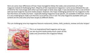
- The document describes a food magazine project focused on desserts. It follows the conventions of food magazines in its design, layout, and visuals rather than challenging the genre.
- Care was taken to include elements commonly found in food magazines like pastel colors, appetizing images, handwritten fonts, and background items related to food. Research was done on existing magazines.
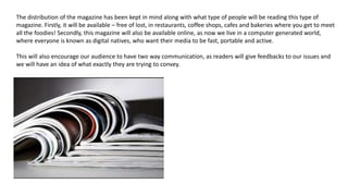
- The magazine aims to engage its target audience of women and girls through its appealing visual design and coverage of recipes, restaurants, chefs and food-related topics not widely covered in existing Pakistani magazines. It would be distributed both physically in cafes and bakeries and digitally online.
- The creator's photography, editing and production skills improved