
Recommended
More Related Content
Similar to Process Book
Similar to Process Book (20)
Recently uploaded
Recently uploaded (20)
Process Book
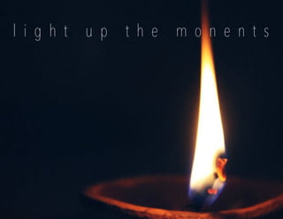
- 1. l i g h t u p t h e m o n e n t s
- 3. Amber & Wood Co Amber & Wood Co Process Book Process Book
- 5. T A B L E O F C O N T E N T S Inspiration ...................................................................................pages 1-3 Logotype .....................................................................................pages 4-7 Style Guide ......................................................................................page 8 Stationary ..................................................................................pages 9-12 Website ...................................................................................pages 13-15
- 6. 1inspiration B R A N D I started this semester with a love for a brand and a story to back it.When deciding on what brand to choose I began to look at all the small businesses that I had bought from during quarantine and the story behind them.From this process I landed on Amber & Wood Co. I loved how it was based on making eco-friendly products with a story centered in the woods.
- 7. I N S P I R A T I O N 2 amberandwoodco process book I chose Amber & Wood Co.because of the love of the outdoors that lies in the company but also the love of the outdoors that lies within my own heart.The color combination of green and brown with a hint of orange left me in a peaceful state of mind.A flame was to help symbolize light and to light up all of the memories that were to come through the products from Amber & Wood Co.
- 8. 3mood board woodsy homey serene M O O D B O A R D The mood board was created to simply showcase the aesthetic of the company.Amber & Wood Co.comes from the owner’s love story with her husband and how they got engaged and married in the woods.I wanted to represent their love story in the mood board and create an aesthetic that resembles just that.The color combination came from pine trees,bark and a flame of a fire/ candle.I wanted it to feel cozy and homey with a sense if the outdoors.Some components are larger than others and that was for the sole purpose of bringing those to a higher priority in the aesthetic for the company.
- 10. 4thumbnails L O G O S K E T C H E S
- 11. 5 amberandwoodco process book L O G O R O U G H S
- 12. 6logo inspiration and description L O G O T Y P E The logo stemmed from a tree trunk and all of the symbols that come from a tree.Trees are strong and sturdy,but they have a story.The tree is in reference to the logo that Amber & Wood Co.currently has.Rings of a tree can help tell a story.I wanted to use the tree rings to help symbolize the story that was about to unfold through the entire semester long project.I first was looking at doing an entire tree stump but quickly realized that it was not going to work.The entire stump was a good starting point however we were instructed to us both the name and a symbol.The name was too long to fit with a large circle of a logo.It was too much in one space and did not look good as a logo when sized to fit different things.To get the same effect I decided to cut the ring in half and set it on top of the company name.This was a lot of easier to work with as well as worked with different sizes.
- 13. 7 amberandwoodco process book L O G O T Y P E DRAFT 1 FINAL
- 15. S T Y L E G U I D E DRAFT 1 DRAFT 2 FINAL 8 amberandwoodco process book The style guide was created to use the brands aesthetic and set out what can and cannot be done with the company in terms of design.It was important to understand what was wanted in the beginning so that it could be used according to the style guide for the rest of the projects.I knew that I wanted to incorporate the tree rings into the design some- where because that has been a key element to the brand aesthetic.I needed to lay out all the information in a proper manner without it being to compacted and hard to read.This was a lot of trial and error to make sure I had the right opacity for the rings as well as determining the number of rings that were showcased.
- 17. S O C I A L M E D I A P O S T DRAFT 1 DRAFT 2 FINAL 9 amberandwoodco process book The stationary took from elements that had already been created for this project.I wanted to highlight the rings that had been used on all other projects.I t was sort of an additional element that was used to add a new look to the stationary.Sizing was a big struggle for this project as I would make everything too big or too small for the size of the stationary item.All stationary and social media posts were used as a great resource and way to show what my designs would look like if i were to develop it into physical products.Each change from drafts to final was small yet effective.The changes needed to be done in order for the stationary to be the best it could be.
- 18. 10stationary DRAFT 1 FINAL L E T T E R H E A D
- 19. 11 amberandwoodco process book DRAFT 1 DRAFT 2 FINAL FRONT BACK
- 20. 12stationary DRAFT 1 FINAL S T A T I O N A R Y M O C K U P S
- 22. W E B S I T E 13website WIREFRAME I had no true sense of direction in terms of what I wanted to do for the website.Once I sat down and really looked at all the elements that I had created I was able to find some sort of direction.I wanted to bring in elements of the mood board and stationary. I decided to keep it white for the most part to align with the cover letter.This was also a way to keep it as clean as possible.I didn’t want to add to much extra elements because of how much information was going to be added.It was all about putting the piec- es that were needed on the page and then linking them to one another.From draft to final I was able to make small changes that only helped with the us- ability and look of the entire website. Prototype: https://xd.adobe.com/view/c5b72686- 6b3b-47f2-9178-529a14fb3906-90e4/
- 23. 14 amberandwoodco process book DRAFT 1 FINAL W E B S I T E H O M E P A G E
- 24. 15website ABOUT FINAL CONTACT FINAL W E B S I T E
- 26. AMBER & WOOD CO