1. Evaluation 2
My magazine represents a specific social group which we call
‘geek cheek’ as my magazine has been designed to fit this
social groups needs. The style of my magazine is similar to the
NME and dazed magazines as they use the same kind of layout
like the dazed magazine and uses the same genre of music as
the NME magazine which link to mine. The colours I use like
white black and yellow work well together making the sort of
genre of music I’m going for stand out and also connects with
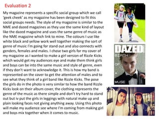
genders, females and males. I chose two girls for my cover of
my magazine as I wanted to make a girl version of Rizzle Kicks
which would get my audiences eye and make them think girls
and boys can be into the same music and style of genre, even
if they don’t want to acknowledge it. This is how my band is
represented on the cover to get the attention of males and to
see what they think of a girl band like Rizzle Kicks. The pose
the girls do in the photo is very similar to how the band Rizzle
Kicks look on their album cover, the clothing represents the
genre of the music as there simple and don’t try hard to stand
out but iv put the girls in leggings with natural make up and
plain looking faces not giving anything away. Using this photo
will make my audience see where I’m coming from making girl
and boys mix together when it comes to music.
2. The way I’ve laid out my contents page represents the genre of
music I’m going for as its simple but catch’s you eye when you look
at it. When the audience look at my magazine they will know the
kind of music I have gone for as it’s written in an aspect of what
they would understand and which it relates to the genre of music
I’m using in my magazine. The written style is to the point and
simple for the readers to read which is focussed on the music side
of the magazine. I have made it this way so it will interest the social
group I’m targeting as if it was laid out in this context then they
might find it dull and boring which would lead to less people buying
the magazine. The pictures I’ve used on my contents page show the
main band which you find on the front cover also on here but
shown in a different shot and pose, furthermore I’ve added a few
new pictures of other bands you will read about in the magazine as
they are mentioned on the contents page. They are also the same
age as the market I’m going for so they will associate with each
other and will keep the readers attentive. On the contents page I
talk a lot about the new style of fashion that they are into and how
it came about which will get the reader attention as they will enjoy
hearing about new trends of fashion and how to stand out from the
crowd. Likewise telling them about the festivals they do and live
performances as well as what gets into the charts which all relates
to the social group I’m producing my magazine too.
3. The double page spread shows what all teens do,
relaxing with their friends with a cup of tea or
coffee gossiping about what’s been happening
which relates with the social group I’ve chosen
which is shown in the photo on my double spread.
The picture shows people growing up and finding
what they want to do in life as dreams can come
true even when you’re young and naïve. The way I
have got the models to stand and the props I use in
the photo would associate with my audience too as
they can communicate to the style of clothing they
are wearing and the placing of the background their
in which would interest them and would make them
want to read the interview to see what they have to
say about how they got to this point in their lives.
The artists I have used would fit perfectly in the
social group I have chosen which makes it even
better for the target audience. The way she speaks
in the interview is how the audience would too, also
using the words that they would understand so they
would relate to the article easily and would already
have a relevant knowledge on the music in the
magazine.