Dubai Call girls Service 0524076003 Call girls services in Dubai
Digipack research
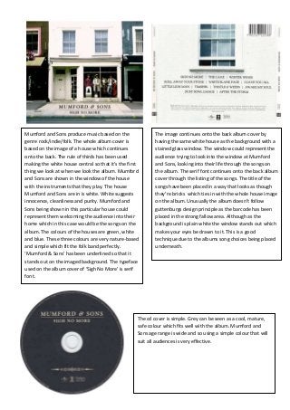
1. Mumford and Sons produce music based on the
genre rock/indie/folk. The whole album cover is
based on the image of a house which continues
onto the back. The rule of thirds has been used
making the white house central so that it’s the first
thing we look at when we look the album. Mumford
and Sons are shown in the window of the house
with the instruments that they play. The house
Mumford and Sons are in is white. White suggests
innocence, cleanliness and purity. Mumford and
Sons being shown in this particular house could
represent them welcoming the audience into their
home which in this case would be the songs on the
album. The colours of the houses are green, white
and blue. These three colours are very nature-based
and simple which fit the folk band perfectly.
‘Mumford & Sons’ has been underlined so that it
stands out on the imaged background. The typeface
used on the album cover of ‘Sigh No More’ is serif
font.
The image continues onto the back album cover by
having the same white house as the background with a
stained glass window. The window could represent the
audience trying to look into the window at Mumford
and Sons, looking into their life through the songs on
the album. The serif font continues onto the back album
cover through the listing of the songs. The title of the
songs have been placed in a way that looks as though
they’re bricks which ties in with the whole house image
on the album. Unusually the album doesn’t follow
guttenburgs design principle as the barcode has been
placed in the strong fallow area. Although as the
background is plain white the window stands out which
makes your eyes be drawn to it. This is a good
technique due to the albums song choices being placed
underneath.
The cd cover is simple. Grey can be seen as a cool, mature,
safe colour which fits well with the album. Mumford and
Sons age range is wide and so using a simple colour that will
suit all audiences is very effective.
2. Emilie Sande’s music focuses on soul and RnB. The
housetyle colour used on this particular album is grey
and faded. The image of Emilie Sande on the front
album cover uses the rule of thirds. Emilie has been
placed in the middle of the front album cover with
nothing else around her so that she is the main focus
of the album. Emilie herself has been shown using
slight use of colour to allow her to stand out even
more. The image of Emilie would make the album
more recognizable through the recognition and
therefore increase sales. Although there is little use of
colour used on the album there are different shades
of grey which have been used. The light and dark grey
have been split so that the light grey is mainly in the
primary optical area and diagonally follows the
reading gravity gradually getting darker until it
reaches the terminal area. This could suggest that
Emilie’s album has a soft happy side but also an
emotional sad side. The image itself looks like it has
been taken in the past due to their being no use of
colour and the background looking somewhat
damaged. This links in with Emilie’s album title of
‘Our Version Of Events’ which is past tense. The text
used on the front album cover is sans-serif which
gives the album an informal look.
The old vintage picture look continues onto the back
of the album cover. As the background is quite plain
and simple it makes the titles of the songs stand out
more. The song list has been placed in the middle of
the album which makes this the first thing we see.
The gutternburgs design principle has been used
here by the song list starting in the primary
optical/strong follow area following down to the
weaker areas.
The cd cover is a similar colour to the album itself, black. The
black background allows Emeli’s name to stand out. The
simple cd cover matches Emeli’s voice as it speaks for itself.
The cd cover doesn’t need anything fancy on it as the songs
on the cd arewhat’s important.
3. The disk inside the album uses a cream colour for the base
and images of 3 roses. The roses are coloured red. The
colour red is seen as love, passion and danger. The red on
this cover could suggest the love individuals have for Lana
Del Rey’s music and the passion she has for music.
Lana Del Rey’s produces ‘Indie POP’ style of music which has
a big influence on the way Lana herself must be portrayed.
For example on the front cover of Lana’s album you can see
how the record label has dressed her in a vintage fashion
which would appeal to Lana’s audience as this kind of
fashion is seen as being ‘indie’. The white coloured top Lana
is wearing portrays innocence. The rule of thirds has been
used on the front cover. Being placed in the middle allows
Lana to be the main focus and is easier recognition for the
artist. A medium close up shot of Lana is used whilst being
stood in an upright position with her head tilted up. This
position has been chosen to give a more dominant feel to
the image. The whole album cover is based on the war and
past. The position Lana is stood in, the clothes and text of
‘Born To Die’ resembles an army based image. Posters such
as ‘Your country needs you’ follow similar layouts to this
front cover making the album more recognisable and
familiar to audiences. Guttenberg’s design principle has
been used on the front album cover as ‘Lana Del Reys’ name
has been placed across the primary optical areadue to this
area being when people look first. All of the text used on the
front album cover is written in large bold capital letters
making it eye-catching for the public eye. The main colours
in the image are blue, white and green which are all very
nature based colours. These three colours are very positive
and all give the album a ‘fresh’ look.
The large font shown on the front of the album is
also used on the back which links into the
albums housestyle. The titles of songs have been
made the main focus by the housestyle colour
blue standing out on the pale cloudy blue
background. Guttenberg’s design principle has
been used again by the song titles being placed
in the primary optical area continuing onto the
strong fallow area. As our eyes naturally read
from the top left corner across the right whilst
moving down the song titles will be the first
thing individuals will see when reading the back
of the album. This is an easy way for individuals
to see which songs are on the album making it
more appealing to customers. In one of the
weaker areas such as the terminal area the
barcode price has been cleverly placed. The
barcode will have been placed here so that the
individual will look at the whole album want to
buy it and then be less likely to be put off by the
price. If the barcode was placed in the strong
fallow area an individual may look at the price
tag and then put the album back down without
looking at it more due to the price being too
high.