Hot Call Girls In Goa 7028418221 Call Girls In Vagator Beach EsCoRtS
Question 2
1. Question2
How effective is the combination of your main product and ancillary tasks?
The two ancillary tasks that I created were a film review and three posters, I knew that these
ancillary tasks had to match the short film they need to work together in order to allow them
to sell the film. They need to be able convince the audience to watch the film I will make sure
that it attracts the correct target audience.
I decided to choose the ‘Total Film’ magazine for my review as after planning and research I
found that it was the most popular and well known magazines plus if there was to be a film
review written about my short film I would love it to be in the ‘Total Film’ magazine. This is
because of it is a well recognised magazine and readers are more likely to follow and listen
to what has been said, therefore if it is a positive review written about the short film then the
readers a going to believe that it is.
The language on the film review helps to promote the short film as the descriptive language
on the review encourages the audience to watch the film.
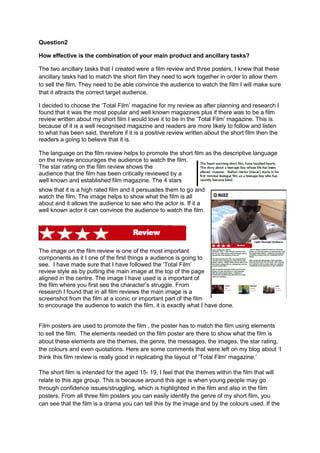
The star rating on the film review shows the
audience that the film has been critically reviewed by a
well known and established film magazine. The 4 stars
show that it is a high rated film and it persuades them to go and
watch the film. The image helps to show what the film is all
about and it allows the audience to see who the actor is. If it a
well known actor it can convince the audience to watch the film.
The image on the film review is one of the most important
components as it I one of the first things a audience is going to
see. I have made sure that I have followed the ‘Total Film’
review style as by putting the main image at the top of the page
aligned in the centre. The image I have used is a important of
the film where you first see the character’s struggle. From
research I found that in all film reviews the main image is a
screenshot from the film at a iconic or important part of the film
to encourage the audience to watch the film, it is exactly what I have done.
Film posters are used to promote the film , the poster has to match the film using elements
to sell the film. The elements needed on the film poster are there to show what the film is
about these elements are the themes, the genre, the messages, the images, the star rating,
the colours and even quotations. Here are some comments that were left on my blog about ‘I
think this film review is really good in replicating the layout of 'Total Film' magazine.’
The short film is intended for the aged 15- 19, I feel that the themes within the film that will
relate to this age group. This is because around this age is when young people may go
through confidence issues/struggling, which is highlighted in the film and also in the film
posters. From all three film posters you can easily identify the genre of my short film, you
can see that the film is a drama you can tell this by the image and by the colours used. If the
2. colours were bright and the images were was a high action photo this would show that the
film would be about an action film.
One of the themes in our film is blindness this is shown in the second film poster where you
can see that the main character is wearing dark glasses. This can also be suggested in the
other two film posters also as in the image you can see that the characters eyes are closed
tight. The other theme our film heartbreak this is shown on the images on the photos of film
poster 1 , film poster 2 and the film poster 3 with the emotions on the characters face.
There are many things that I have put on my film posters to attract the audience’s eye, so
that they will come and watch the film. The use of colours is important on a film poster the
main colours that I have used for my posters are the colours grey, black and white. I have
used these colours as they represent the colours of shadows and light, these ties in with title
of the film. I wanted the poster to stand out and I feel that these colours are bold enough to
catch the audience’s eye, this is the main purpose of a film poster so I believe that I have
done this in all three of my posters. Here is a comment made on the film poster about the
colour ‘the simple clever grey and white colouring is very effective, well done’
Images are arguably the most important element on a film poster this is why the main image
of the background of my film posters is the main character, I have used him as he is the
main focus within the film so it is important to have him on the poster. This is because it
allows the audience to have idea of who is in the film and maybe what it can be about. On
my second film poster the use of symbols are the dark glasses that the character is wearing
gives hints of what the story could be about. This is important for the audience to see as it
needs to be able to show what the film is going to be about. Here is a comment made on the
film poster about the image ‘The image used in this poster successfully represents the
theme of struggle and the monochrome colour theme makes everything seem quite dull and
gloomy.’
The message in all of the film posters that I have created are primarily visual the images are
dominant as it stands out and it is in the centre of the poster. The text on all of my film
posters are situated at the top of the film poster and as it is just as important as the image.
The audience will look at both image and text so it is important that the message comes
across in both.
On all three of my film posters I have used quotations from film critics these are ways that
will persuade audiences to see the film as it has been recognised. I have used names from
well-kwon and established film magazines these were ‘TOTAL FILM’ and ‘EMPIRE’
magazine. I also used stars on the film posters, these are unique selling points which as they
allow the audience to see quickly how the film has been rated. The tagline in the film is
emotive and touching and gives the audience an idea of the film.