2. THE ARTIST~KONNICHIWA
• Skepta, is an English Grime artist, songwriter and record producer of Nigerian descent. He is
the brother of fellow musician Jme and radio presenter Julie Adenuga.
• Konnichiwa is the fourth studio album by British grime artist Skepta. After numerous delays,
it was released on 6 May 2016 by Boy Better Know. The album was launched with a party in
Tokyo on 5 May 2016 arranged and broadcast globally by live streaming platform Boiler
Room, featuring Skepta performing the whole album live with supporting performances
from Japanese artists Kohh, Dutch Montana, Loota, and DJ Riki. On 9 May 2016, the album
was at number 1 on the UK Official Chart Update and was only 2,000 copies ahead of
Beyoncé's album Lemonade. The album entered the UK Albums Chart at number 2, behind
Radiohead's album A Moon Shaped Pool.
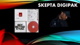
3. FRONT COVER• The albums front cover features a white background with attention
drawn towards the stamp in the middle. The bright red colour draws
your eye towards the stamp which contrasts with the white
background. The front cover portrays stereotypical conventions of the
grime industry as I feel it rebels against contemporary Britain's society.
A stamp usually features a king or queen on the face as a figure head
however this stamp shows Skepta dressed in bucket hat (A cap hat is
associated with the youth of today, a trendy item of clothing). This
maybe shows us that he is against the royally family but that he views
him self as a king within the grime industry. The “1st” class sign on the
stamp is tilted upside down to show rebelliance against society, for
example flying the American flag upside down is an officially
recognized signal of distress I feel this shows the same message. The
stamp is sent in first class which shows his importance and power
within the grime industry. The ink stamp shows us that its being sent
form London representing he still cares about roots. There is also his
signature located at the bottom making it personal towards the artist.
4. INSIDE
• On the inside the designer has gone for a
very simplistic design for the fold out. White
and red is predominantly used to contrast
against each other. I feel the red has been
used represent Skeptas vibrant personality
breaking away from the plain white. On the
left hand side is a bold Logo of his crew and
record label “BOY BETTER KNOW”. This logo
stands out against the white foreground and
instantly brings your attention towards this.
This logo is stereotypical for the grime
industry to have your crews name imprinted
on the inside cover. This helps to promote
the record label and crew effectively being a
piece of free advertising.
5. BACKCOVER
• The back cover continues the white background theme
keeping it simple and easy on the eye. The back cover lists all
the songs that are contained within the album this helps to
promote and inform the public. All the track names are
written out in a graffiti style which represents the Antisocial
behaviour inside the grime industry. Graffiti is stereotypical
of Gangs and violence within British youth culture which I feel
Skepta is directly linked with. Lots of slang language is also
used throughout the back cover again showing to have direct
links with the youth of today, relating to them and almost
speaking there own language. The bad English grammar
shows the lack of care towards education and vale of
contemporary society. Other grime artists such as JME have
also used this effect of Graffiti on their digipaks. In the top
right corner “Boy Better Know” is shown again to increase
publicity for the group.
6. HOW THIS HELPS ME
• This has given me a strong basis to start planning my own digipak. Skepta is centre
of the grime industry so is a perfect example stereotypical grime digipaks. Some of
the strong features digipak such as the graffiti I will definitely be looking to take on
for my own. Also not just using Digipak to promote the Album but the record label
and/or the crew as it could be a missed chance in advertising.