Make Your Data Count: New, Visual Approaches to Evaluation Reporting
•Download as PPTX, PDF•
3 likes•5,244 views

Charts and graphs built on dataviz principles are transforming evaluation reporting and increasing the evaluator's communication power. At YNPNdc's 2015 Annual Conference in Washington DC, Johanna Morariu and Katherine Haugh will provide principles and case studies of new, visual approaches to evaluation reporting. The session will provide examples, such as incorporating a wealth of visuals in text reports, using large format hand-outs to emphasize findings, and designing slide reports.

Recommended
Recommended
More Related Content
Similar to Make Your Data Count: New, Visual Approaches to Evaluation Reporting
Similar to Make Your Data Count: New, Visual Approaches to Evaluation Reporting (20)
More from Innovation Network
More from Innovation Network (20)
Recently uploaded
Recently uploaded (20)
Make Your Data Count: New, Visual Approaches to Evaluation Reporting
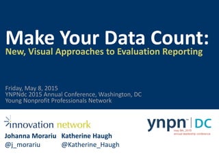
- 1. Make Your Data Count:New, Visual Approaches to Evaluation Reporting Johanna Morariu @j_morariu Katherine Haugh @Katherine_Haugh YNPNdc 2015 Annual Conference, Washington, DC Young Nonprofit Professionals Network Friday, May 8, 2015
- 2. Visual Reporting InfographicsDataviz Dataviz in a report Slide reports Dataviz placemat
- 3. Visual Reporting Elements 1 2 3 4 5 Pick a purpose Make a blueprint Do good design Test Refine
- 4. Pick a purpose1 Flickr CC/dmjames58
- 10. Make a blueprint2 Flickr CC/wscullin
- 16. Do good design3
- 19. Header 1 Header 2 Header 3
- 23. Test4
- 24. Refine5
- 25. Visual Reporting Elements 1 2 3 4 5 Pick a purpose Make a blueprint Do good design Test Refine
- 32. Make Your Data Count:New, Visual Approaches to Evaluation Reporting Johanna Morariu @j_morariu Katherine Haugh @Katherine_Haugh
Editor's Notes
- JM
- JM What forms does visual reporting take? Well, it can look like a lot of things. A one-off dataviz… or data placemats… or infographics… or dataviz or information design in reports… or slide reports. Regardless of the product, at the core of visual reporting are 5 elements of visual report design.
- JM Those 5 elements of visual report design are: Decide on purpose, audience, and use Chunk out the information that will be used in the visual report Design the visual report, paying attention to architecture, color, font, text, charts, pictures, and white space Test the communication ability of the visual report – does it communicate the ideas you designed it to communicate? Is it clear? Where do people get stuck? And 5, refine the visual report paying special attention to fact-checking, copyediting, and formatting. Now we’re going to go into each of these elements in more detail.
- JM Purpose, audience, and delivery The first element is clarifying purpose, which includes audience and delivery. What is the visual report meant to do? Who is the visual report meant for? Will the visual report be presented or will it speak for itself? These are all elements of deciding on the purpose before diving into design. Most of our visual reports are designed to be presented, but to also be comprehensive enough that they have good communication power on their own. This is different from a situation in which a visual report would need to entirely stand alone. Here are some examples of visual reports that were made to be presented, but also come pretty close to being a stand-alone document. https://www.flickr.com/photos/dmjames58/12694978975
- Jm This visual report was created to share the results of a conference evaluation. The primary audience was the working group of organization leaders who organized the conference together. This was a group of very busy people who expected succinct communications. The evaluation was one of many other things on their plate. So, we designed the report to be a slide presentation. We expected to have time to present to them in person. As the project evolved, however, there was also an interest in publicly sharing the conference evaluation findings on the collaborative’s website. So as we were designing the report, we knew that the content would need to work in two settings: first, to present personally to these individuals; and second, as a stand-alone document on the collaborative’s website.
- JM So throughout this report, we made sure there was enough explanatory text that, once uploaded and out there for the world to look at, it still made sense. We did this by including a headline message, supporting explanatory text, and supporting data and images throughout the report.
- JM
- JM
- JM
- KH The next element of visual reports is to make a blueprint. Before we dive into putting titles, text, and data on a page, we need to know how it will all fit together. Depending on the type of information you’re presenting in your visual report, your blueprint will look a little different. At the blueprint stage, you might not even be working in Word, PowerPoint, or another program. You might be sketching things out by hand. https://www.flickr.com/photos/wscullin/3770015203
- KH This is an example of a slide blueprint You might also make a blueprint for a chart, or for a report to indicate where visual elements will be placed on the page and what they will contain. This blueprint names the major sections of the slide, indicates about how much space they will take up, and prepares the way for laying out the slide in PowerPoint.
- KH This slide blueprint was built from a presentation outline. Depending on what kind of visual report you’re making, your blueprint might look different. If your visual report is slide-based, you would want to outline the report content, then sketch out blueprints for the different slides in your presentation. If your visual report is something like an infographic or a poster, you would outline the content you intend to include, and then make one blueprint to lay the groundwork for the infographic.
- KH Title
- KH Top panel picture
- KH Title text
- JM The third element of visual reports is to do good design. Within design, we need to pay attention to things like font, color, contrast, and white space. Has anyone seen this before? Can anyone point out the information this visual report is communicating? [ask the audience] This is an infographic by Charles Minard of Napolen’s march into and out of Moscow in 1812 and 1813. The brown area represents the amount of troops marching toward Moscow, and the black area represents the amount of troops marching away from Moscow, after the defeat. The graphic displays 6 types of information: -the number of Napoleon's troops -the distance traveled -temperature -latitude and longitude -direction of travel -and location relative to specific dates Good design helps you clearly communicate your data and findings.
- JM Let’s start with type. Research and gurus disagree…but most advice—and my advice—is to primarily use sans serif fonts, like this one. There are thousands of fonts out there.
- JM For the most part, you can’t go wrong by going with simple, uncomplicated, worker-bee fonts like calibri, gill sans, or arial.
- JM Headers. In our visual reports, we use a header system to systematically use the same sized fonts throughout for consistency, and to give the reader or viewer a reliable system to navigate information.
- JM Color https://www.flickr.com/photos/design-dog/13475762343
- JM
- JM B/W view of those color palettes to look at their B/W printing and visual difference Some of these would be good to use (top left, bottom center, top right) because you can still tell the difference between the colors if printed in black and white. However, for the others: you run the risk of having too similar of colors when you print it out in black and white. It’s generally a good rule of thumb to look at how your design seed colors look in B&W version before using them in your report!
- KH
- KH
- KH Alright, time for a quick recap of the 5 elements of visual report design: Decide on purpose, audience, and use Make a blueprint of how information will be used in the visual report Design the visual report, paying attention to architecture, color, font, text, charts, pictures, and white space Test the communication ability of the visual report – does it communicate the ideas you designed it to communicate? Is it clear? Where do people get stuck? And 5, refine the visual report paying special attention to fact-checking, copyediting, and formatting.
- JM Okay, here’s how you get started. We have some of the best resources put together for you in the handout.
- JM These are example, inspirational slides from Nancy Duarte…
- JM These are example, inspirational slides from Nancy Duarte…
- JM These are example, inspirational slides from Nancy Duarte…
- JM These are example, inspirational slides from Nancy Duarte… Resources: talk through handout
- JM These are example, inspirational slides from Nancy Duarte…
- This slide up for the last 10 minutes of the session—during Q&A.