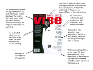
1. The name of the magazine is in big bold red font, the contrast of colors make it stand out, The Font is Thick and cover a lot of space also bringing attention and making the magazine title catchy and appealing Barcode is a convention to all magazines Long shot to make the strong body language identifiable and represents the sense of power. It shows the audience that the person is a powerful figure in the music industry The scarface color scheme is very appealing as the film is very popular therefore the design will bring in a lot of interest Well structured to put focus on the image this is the reason why there is no overlapping of the image and is placed in the front and everything else is removed to the background 50 Cent name is enhanced to grab emphasis, it sets itself apart from the rest of the text The contrast of colors from one side to the other makes the cover overall unique and eye-catching
2. Celebrities name blends in well with the whole colour scheme and make it stand out Bold large font placed in the background to make the celebrities look important and intimidating Barcode Red lettering to bring attention and make the information important Medium shot to show the strong body language The colour scheme of red, white and black are used throughout the piece
3. Barcode is a convention for all magazines Long shot to show the figure of the person and attractiveness engages readers. Also it slightly tilted low which can be said is a low angle shot this brings out and emphasis's the glamour Color scheme is mostly yellow this includes lettering and background (Furniture) The main information is in a larger font and in yellow showing Mariah Carey is main focus, The writing beneath indicates it was intended to draw in audience because of inviting picture, also it anchors the title with the image There are a variety of fonts used all around the image so reader have a certain perspective on the writing The magazine name is in the background show the importance of the image and the power it contains Few articles are referenced Layout is less structured however still effective as it attracts attention to the image
4. Simple split into 3 part picture texts heading(content) this allows the page to look very organised and professional Combination of black, grey and white go together well and contrast off each other to stand out. The black lettering is clear and easy to read because of the white background The effective of lighting is used as the outside is a dark grey and as it get closer to the image it gets brighter adding emphasis and drawing in attention to the image The image is taking up most of the page showing that the person is a big part of the magazine The styling of the images with the clothing and the body language gives the page a sexy and sophisticated look and making the genre very identifiable The lettering is done in a very classy and sophisticated style the most important information is clear to see as it is emphasised bold text
5. The issue is shown so the readers understand exactly what the are reading The date to evident the latest of its copies Pictures at the side reveal articles featured in magazine and gives you a hint of what is to be found inside The masthead is clear big bold lettering to establish itself on the page making it clear and easy for the audience to remember and recognise Well structured gives list in chronological order in what the magazine features Gives page number article name and a little info to help readers understand there choice off topic and making it easier to navigate around the magazine
6. Masthead clear stand out and styles in a creative way to express its brand and make it identifiable “ content” in huge bright lettering to make the confusion of the purpose of the page Structured in a simple but effective way as it looks fun and excited revealing maybe it target audience . Easy to see what to look for therefore making it more user friendly Follows its colour scheme of pink black, yellow and white very accurately Picture featured blends in with the genre and age group Light blue tab grabs attention as it contasts from the rest of the page Page reference and article names help's with navigation around the magazine
7. The artist with the main attention has dressed and edited to be the main focus as the others has been faded out The font relates back to clothing and sets the colour theme of the page The white background allows most of the material to stand out including the black lettering Structured very well looks very organised and spacious looks good on the eye Follows the colour scheme arrows
8. This editing technique of capturing the picture in black and white combining with the font technique makes it unique and adds a bit more colour to make all the focus on the star name The picture on each side shows the importance of the person The black translucent background is effective as the picture is not disturbed as well as the text is easy to read The colour scheme of white and red for the font make the information very organised and noticeble in what matters the most The layout is structured well( brakes up info in parts) and needed to as there is a lot of information