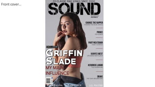
SlideShare a Scribd company logo
1 of 15
Front coverā€¦
Masthead and Taglineā€¦
I placed my masthead across the top of my page as that is where most mastheads are placed on music magazines. It is the
biggest typography on the cover. The masthead is slightly eroded as it fits in with my genre it is also capitalised as it allows it
to stand out more. Other than putting it in a different colour I kept it black as it is a colour used a lot for R&B. The masthead
name is related to music as it is a music magazine and the codes and conventions of the magazines will show a clear
indication that it R&B. My tagline has gone along side the masthead, this will show that it is the tagline as it is on the side
connected to the masthead. This will create a logo for the magazine so if the magazine becomes well known the magazine
will get easily recognised. Both the tagline and masthead are related to music which I like as it shows that the magazine is all
about music.
Dominant imageā€¦
For my main image I got the inspiration of Billboard. Even though I wanted a mid
shot Billboard gave me the idea of the facial expression and pose. Making my
model look into the camera draws the audience attention as it is like she is
looking straight at you. I was always going to use a female for my artist to draw
attention to female side of my target audience other than having a muscular
man with a lot of chains. This also, might make a connection with my female
target audience as they may see the artists as somebody to look up to. Instead
of having the artist in the middle on the front cover I placed her further to the
left so all my cover lines are together. The artist is covering the masthead
showing she is more important and well known than the magazine itself.
Top bannerā€¦
I got the inspiration from Vibe magazine with Hard Edge on the front for my top banner, the only thing I changed was love
songs to R&B songs to fit into my genre. I included a top banner as I like the look of them on other magazines and I like
how they tell readers what are going to be in the magazine other than being a sell line. The banner may also bring back
memories to people as it is songs since 2000.
Bottom bannerā€¦
The bottom banner is three artists that is also going to be included in the magazine but, there was not enough room for a
cover line on the side. It is also, a different way that Vibe showed cover lines. This idea was from Vibe's magazine but instead
of putting it at the top I put the banner at the bottom so it looked more involved with the other cover lines. It is also different
and allows me to add more artists that people might be interested in and may by my magazine. However, I made them a
different colour so, they stand out from the black text around it. They are also, a different font so it doesnā€™t clash.
Date and websiteā€¦
I wanted the date below the masthead as I have only seen this on one magazine which would be Vibe. I copied the
layout of Vibe as I really liked it and didnā€™t see anything to change. I didnā€™t put the weekday as it will be available through
the full length of the month until the next issue comes out the next month. I have included the year so people who
collect them or keep a magazine will know which year it was made in when they look back. Underneath the date I added
the magazines website so people no where to go if they want anymore information about the issue of the magazine they
have purchased or even just about the magazine itself. On the website there is also a yearly description for the magazine.
I liked how Vibe made the date and website stand out if a different way. By having the one writing black and the other
having white writing and black background.
Barcodeā€¦
I decided to place my barcode on the front of my magazine other than the back as I prefer the look of other music
magazines that have done this. I got the inspiration for my barcode of NME as they have quite detailed barcode and I
wanted mine to be as detailed as possible. I included the prices in three different currencies, the date, website and
institution. I have put it on the left hand side because all the cover lines are on the right and I think there will be too much
in that corner.
Main sell line and Sub headingā€¦
The main sell line, subheading and puff I copied of XXL. I liked the style as the typography stands out on the white background
and looks 3D. I put the main sell line across the body of the artist as it clearly indicates who she is as the sell line is her name. It
gives a name to the artists on the front cover and since her name is one of the biggest text on the front cover shows she is
important. For the main sell line I copied the typography as it stood out with the 3D effect and the white text on a grey
background. The subheading is telling readers what the article will be about and gives them an indication if they would want to
read it. I wanted to make the article slightly personal as more people are interested about information that they donā€™t know. I
included the word ā€˜myā€™ to show readers that it is all about her. I put the main sell line a darker different colour so it doesnā€™t take
the attention away from the main sell line. The sub heading will also be in capitals as It makes it stand out in a different way
other than having it a bright colour
or having large text. I included a slug
like XXL as it shows people that, that
article is exclusive to the magazine.
So, having exclusive above the main
artist will make more people what to
read that particular article. It also
means that no other magazine has
done an interview with that person
yet which could make more people
pick up the magazine.
Sell linesā€¦
I put all of my cover lines together as it makes it easier for people to view all of them if
they are all together as they wont have to look all over the front cover to see who is
going to be featured in the issue. Having them all next to each other means not one of
the sell lines stand out more than the other one. Here you can see I have placed the
artists name and a little description of what the article inside will be about. I had the
artists name in bold and capitalised so there name would catch peoples eyes, this is so
people will know who will be featured inside the issue of the magazine. The
description underneath is a normal font and around half of the size of the artists
name, this is because people will only want to know about the article if they are
interested in the artists. I put both text in different shades of black because, I have
already made them different sizes to stand out. I included various different artist to
suit everybody's interest in R&B. I done this because people who like R&B music like
various different artists and makes more of a chance of people picking up my
magazine Because, I have included artists from all aspects of R&B. Some of the artists
are in the charts and others are popular within the industry. In between each sell line I
have put a thin line to divide them, to show a clear separation. I also think it makes it
look neat and professional as other magazines have done this as I have copied of the
XXL magazine.
Contents pageā€¦
Layoutā€¦
When looking for my inspiration to create my contents page I came across Qā€™s contents page and I really like the layout
as the text and images are noticeable and stand out. I copied of the layout completely as it allowed me to include all of
the text I wanted and made room for a dominant image and a sub image which I originally wanted to include. I have
made it so the contents page is a lot more simple and less crowded as I think that will work better with my target
audience.
Headingā€¦
The heading is the same typography as the masthead on the
front cover as it will make the magazine pages match and
make people remember the magazines name as the
typography will be recognisable to the reader. Since it is the
same font as my logo it is similar to having my logo on the
page. I made the heading across the top big and named it
contents as it means people who are flicking through the
magazine will be able to see quickly where the content page
in so they can find the article hey are looking for quicker.
Editors noteā€¦
For the editors note I copied of Kerrang as I liked the look of there's editors note the most. I put it at the bottom of
the page as it did not clash with the rest of the text. I started the same way as Kerrang by saying hello readers and
copied the way he numbered his points. In the text the editor talks about what is in the issue and what is her
favourite part. I made the image much smaller as the text is more important than image. Also, not many people
read the editors notes to look at the image of the editor. I added in the editors signature as it shows that it is by the
editor and that it is his work. The signature, date and an image is all common things included in the editors note.
Social mediaā€¦
I included social media on my contents page as I thought it was the
best page to put my social media on this page as it is all about
information in the magazine. Putting the magazines social media
inside the magazine allows SOUND to get publicity on other
platforms as people may check out the social media if they are
interested more in the magazine, want to keep up to date with
everything or even to interact with the magazine more. Some
readers might not know what other platforms the magazine is on
so having them in the magazine shows readers that they have
social media.
Imagesā€¦
For the dominant image I used a full body Image of the same person
that is on my front cover, this was because she was the main
attraction in the magazine of this issue so a lot of people would read
the article on her. The model has the same outfit on as it makes it
noticeable for the readers. For my dominant image I got the
inspiration of a Vouge contents page that I came across and really
liked the image. So the model is not creating eye contact as I do not
need to draw the audience in on a contents page as the front cover
has already done that. The poses on the models are the same except
I have used a full body image. I also included a sub image on my
contents page as I never added a sub image on the front cover. I
added the image on an artist that was also featured in my magazine
and I chose this particular image as her article was about her music
video and the image I chose looks like a music video type of lighting.
The sub image is a different camera shot as I did not want there to be
two shots that are the same as it would not attract people to both
images if they were the same. So, I made the sub image a close up. A
close up worked well with the sub image as it concentrated on the
artists face and showed the colours well which linked in with the
article that was about her.
Textā€¦
There are three different banners that feature articles, features, editor notes and every month but, four different
sections on the page. All of the headings are capitalized as they are the title of each section. I got two of the headings
names of Q. Two of the banners are burgundy with the other one being black this is to show a clear separation of the
articles and other information on the page and the banners are for each new section. Underneath the features and
article title there are a variety of artists to attract people to read certain pages. All the artists names and main
information is in capitals as they are the main thing to do with that page. But, the text underneath the artists name is
much smaller because, people will only read what the article is about if they like the artist. The numbers are mixed
up because, if it was in chronological order it would be boring and repetitive so mixing it up makes it more appealing
and more eye catching.
Double page spreadā€¦
Imageā€¦
The dominant image is looking down, meaning she is not creating eye contact
but the artists is looking at the text instead, so she is drawing people into
reading the article that is about her as she is looking down on it. This looks like
the artist is interacting with her text. Her posture makes her look relaxed which
creates a calm atmosphere for the page and links in with the article as it is
calm and about her life. I used a waist shot as it means I have used three
different camera shots so none of the images of the artists are similar. She
takes up half of the double page spread as it shows her importance and status.
Heading and Straplineā€¦
The typography for the heading is the same as the masthead on the front cover and the headline for the contents page.
This is because, it is the main article of this issue of the magazine so, having the same typography shows it is important.
The article title is the name of the artist so people know that it is all about her. Also, the article title is going across the top
of the page and into the dominant image which I got the idea of Billboards magazine. The strapline is going to be centred
underneath the heading because it makes it stand out and is more clearer to readers. I put the strapline the same as what
the subheading was on the front cover so it is repetitive. The colour of the text is black as It matches the rest of the article.
Both heading and strapline is in capital letters to catch the readers eyes and make it dominant on the page.
Drop capā€¦
The way I have placed the drop cap makes it take up a lot of space on my double page spread and it grabs the
readers attention more. I got my drop crap inspiration is of Q. The drop cap is the beginning letter of my text and I
have slightly faded it so the black text will stand out better which is on the drop cap. I have made the drop cap the
same typography as the rest of the text so it links and does not look fully out of place. Just like the heading it
overlaps with the image so there is not a clear separation with the photo and the rest of the article.
Textā€¦
Since, my magazine is aimed slightly towards the sophisticated side of the music industry. So, my article is
aimed more towards the more mature audience as there is a lot of text as it is more detailed other than a
question and answer as that is seen for the younger audience who donā€™t like to read detailed paragraphs
unless they are really interested in the artist. As, the interview is exclusive a lot of people are more likely to
read the article. The gutter lines on the page are inspired by the article on the right of Jessie J. I liked the
look of the separation that the lines created in the article so, I also added the lines in-between the
separation in the paragraphs as I thought it improved the look of the double page spread. I also added a pull
quote which I got the inspiration of NMEā€™s magazine. I put it in the middle of the article and overlapped the
other text at the side to make the pull quote stand out from the text around it. The colour is not black and is
burgundy as it would have clashed with the other text to much. Since, the pull quote grabs so many peoples
attention on the page I wanted to make it quite personal to the artists so more people would be intrigued
about why she is saying it.

More Related Content

What's hot

Evaluation 1
Evaluation 1  Evaluation 1
Evaluation 1 Najat Hachem
Ā 
R&b magazine evaluation
R&b magazine evaluationR&b magazine evaluation
R&b magazine evaluationMiz_A
Ā 
Draft contents magazine process
Draft contents magazine processDraft contents magazine process
Draft contents magazine processCeri Lewis
Ā 
Contents page anlysis
Contents page anlysisContents page anlysis
Contents page anlysisAlessia Teresko
Ā 
Written Evaluation First Draft
Written Evaluation First DraftWritten Evaluation First Draft
Written Evaluation First DraftRyanDenner
Ā 
Magazine cover process
Magazine cover processMagazine cover process
Magazine cover processCeri Lewis
Ā 
Evaluation question 1
Evaluation question 1Evaluation question 1
Evaluation question 1Beth Ivison
Ā 
Media evaluation steffan
Media evaluation steffanMedia evaluation steffan
Media evaluation steffansteffharris123
Ā 
Evaluation blog
Evaluation blogEvaluation blog
Evaluation blogamber davies
Ā 
Evaluation question 1
Evaluation question 1Evaluation question 1
Evaluation question 1sana0001
Ā 
Evaluation question 1
Evaluation question 1Evaluation question 1
Evaluation question 1leahwatts
Ā 
Analysis of double page spread
Analysis of double page spreadAnalysis of double page spread
Analysis of double page spreadAlessia Teresko
Ā 
Front Cover Analysis
Front Cover AnalysisFront Cover Analysis
Front Cover AnalysisAlessia Teresko
Ā 
Question 1- Laurelle Duah-Nantwi
Question 1- Laurelle Duah-NantwiQuestion 1- Laurelle Duah-Nantwi
Question 1- Laurelle Duah-Nantwilduah
Ā 
Preliminary task evaluation
Preliminary task evaluationPreliminary task evaluation
Preliminary task evaluationAlessia Teresko
Ā 

What's hot (18)

Evaluation
EvaluationEvaluation
Evaluation
Ā 
Evaluation 1
Evaluation 1  Evaluation 1
Evaluation 1
Ā 
R&b magazine evaluation
R&b magazine evaluationR&b magazine evaluation
R&b magazine evaluation
Ā 
Draft contents magazine process
Draft contents magazine processDraft contents magazine process
Draft contents magazine process
Ā 
Evaluation new
Evaluation newEvaluation new
Evaluation new
Ā 
Contents page anlysis
Contents page anlysisContents page anlysis
Contents page anlysis
Ā 
Written Evaluation First Draft
Written Evaluation First DraftWritten Evaluation First Draft
Written Evaluation First Draft
Ā 
Magazine cover process
Magazine cover processMagazine cover process
Magazine cover process
Ā 
Q1
Q1Q1
Q1
Ā 
Evaluation question 1
Evaluation question 1Evaluation question 1
Evaluation question 1
Ā 
Media evaluation steffan
Media evaluation steffanMedia evaluation steffan
Media evaluation steffan
Ā 
Evaluation blog
Evaluation blogEvaluation blog
Evaluation blog
Ā 
Evaluation question 1
Evaluation question 1Evaluation question 1
Evaluation question 1
Ā 
Evaluation question 1
Evaluation question 1Evaluation question 1
Evaluation question 1
Ā 
Analysis of double page spread
Analysis of double page spreadAnalysis of double page spread
Analysis of double page spread
Ā 
Front Cover Analysis
Front Cover AnalysisFront Cover Analysis
Front Cover Analysis
Ā 
Question 1- Laurelle Duah-Nantwi
Question 1- Laurelle Duah-NantwiQuestion 1- Laurelle Duah-Nantwi
Question 1- Laurelle Duah-Nantwi
Ā 
Preliminary task evaluation
Preliminary task evaluationPreliminary task evaluation
Preliminary task evaluation
Ā 

Viewers also liked

Viewers also liked (20)

Question 6
Question 6Question 6
Question 6
Ā 
Compare and contrast
Compare and contrastCompare and contrast
Compare and contrast
Ā 
Evaluation question 7
Evaluation question 7Evaluation question 7
Evaluation question 7
Ā 
Q5
Q5Q5
Q5
Ā 
Evaluation question 2
Evaluation question 2Evaluation question 2
Evaluation question 2
Ā 
Evaluation question 4
Evaluation question 4Evaluation question 4
Evaluation question 4
Ā 
Location scout
Location scoutLocation scout
Location scout
Ā 
Photoshoot planning
Photoshoot planningPhotoshoot planning
Photoshoot planning
Ā 
Name ideas
Name ideasName ideas
Name ideas
Ā 
Reader profile
Reader profile Reader profile
Reader profile
Ā 
Recce
RecceRecce
Recce
Ā 
Recce
RecceRecce
Recce
Ā 
Font ideas
Font ideasFont ideas
Font ideas
Ā 
Question 1
Question 1Question 1
Question 1
Ā 
Calender
CalenderCalender
Calender
Ā 
Target audience
Target audienceTarget audience
Target audience
Ā 
Katie Target Audience
Katie Target AudienceKatie Target Audience
Katie Target Audience
Ā 
Target audience 2
Target audience 2Target audience 2
Target audience 2
Ā 
Question5
Question5Question5
Question5
Ā 
Question 5
Question 5Question 5
Question 5
Ā 

Similar to Question 1

My Music magazine project
My Music magazine projectMy Music magazine project
My Music magazine projectMeganLydia
Ā 
Evaluation
EvaluationEvaluation
EvaluationSarah Vera
Ā 
In what ways does your media product use, develop or challenge forms and conv...
In what ways does your media product use, develop or challenge forms and conv...In what ways does your media product use, develop or challenge forms and conv...
In what ways does your media product use, develop or challenge forms and conv...charlotte_abbott
Ā 
Music magazine presentation
Music magazine presentationMusic magazine presentation
Music magazine presentationkomal_media1
Ā 
Music magazine presentation
Music magazine presentationMusic magazine presentation
Music magazine presentationkomal_media1
Ā 
Music magazine presentation
Music magazine presentationMusic magazine presentation
Music magazine presentationkomal_media1
Ā 
Music magazine presentation
Music magazine presentationMusic magazine presentation
Music magazine presentationkomal_media1
Ā 
Music magazine presentation
Music magazine presentationMusic magazine presentation
Music magazine presentationkomal_media1
Ā 
Music magazine presentation
Music magazine presentationMusic magazine presentation
Music magazine presentationkomal_media1
Ā 
Evaluation
EvaluationEvaluation
Evaluationjackhales
Ā 
Evaluation, 1
Evaluation, 1Evaluation, 1
Evaluation, 1PopSap
Ā 
Media evaluation
Media evaluationMedia evaluation
Media evaluationSaskia Healy
Ā 
Magazine evaluation presentation
Magazine evaluation presentationMagazine evaluation presentation
Magazine evaluation presentationoliviageib
Ā 
Evaluation Question 1
Evaluation Question 1Evaluation Question 1
Evaluation Question 1Josh Webb
Ā 
Media
MediaMedia
Mediareisslee
Ā 
Question 1 - Evaluation MEDIA
Question 1 - Evaluation MEDIAQuestion 1 - Evaluation MEDIA
Question 1 - Evaluation MEDIAnicolanightingale
Ā 

Similar to Question 1 (20)

My Music magazine project
My Music magazine projectMy Music magazine project
My Music magazine project
Ā 
Evaluation
EvaluationEvaluation
Evaluation
Ā 
In what ways does your media product use, develop or challenge forms and conv...
In what ways does your media product use, develop or challenge forms and conv...In what ways does your media product use, develop or challenge forms and conv...
In what ways does your media product use, develop or challenge forms and conv...
Ā 
Evalution1
Evalution1Evalution1
Evalution1
Ā 
Music magazine presentation
Music magazine presentationMusic magazine presentation
Music magazine presentation
Ā 
Music magazine presentation
Music magazine presentationMusic magazine presentation
Music magazine presentation
Ā 
Music magazine presentation
Music magazine presentationMusic magazine presentation
Music magazine presentation
Ā 
Music magazine presentation
Music magazine presentationMusic magazine presentation
Music magazine presentation
Ā 
Music magazine presentation
Music magazine presentationMusic magazine presentation
Music magazine presentation
Ā 
Music magazine presentation
Music magazine presentationMusic magazine presentation
Music magazine presentation
Ā 
Evaluation
EvaluationEvaluation
Evaluation
Ā 
Evaluation, 1
Evaluation, 1Evaluation, 1
Evaluation, 1
Ā 
Media evaluation
Media evaluationMedia evaluation
Media evaluation
Ā 
Magazine evaluation presentation
Magazine evaluation presentationMagazine evaluation presentation
Magazine evaluation presentation
Ā 
Evaluation Question 1
Evaluation Question 1Evaluation Question 1
Evaluation Question 1
Ā 
Evaluation 2.4
Evaluation 2.4Evaluation 2.4
Evaluation 2.4
Ā 
Question 1
Question 1Question 1
Question 1
Ā 
Media
MediaMedia
Media
Ā 
Mood boards
Mood boardsMood boards
Mood boards
Ā 
Question 1 - Evaluation MEDIA
Question 1 - Evaluation MEDIAQuestion 1 - Evaluation MEDIA
Question 1 - Evaluation MEDIA
Ā 

More from Ellie Freckleton

More from Ellie Freckleton (6)

In what ways does your media product use
In what ways does your media product useIn what ways does your media product use
In what ways does your media product use
Ā 
Question 1
Question 1Question 1
Question 1
Ā 
Question3
Question3 Question3
Question3
Ā 
Question 1
Question 1Question 1
Question 1
Ā 
Article homework
Article homeworkArticle homework
Article homework
Ā 
Mood board
Mood boardMood board
Mood board
Ā 

Recently uploaded

ESSENTIAL of (CS/IT/IS) class 06 (database)
ESSENTIAL of (CS/IT/IS) class 06 (database)ESSENTIAL of (CS/IT/IS) class 06 (database)
ESSENTIAL of (CS/IT/IS) class 06 (database)Dr. Mazin Mohamed alkathiri
Ā 
POINT- BIOCHEMISTRY SEM 2 ENZYMES UNIT 5.pptx
POINT- BIOCHEMISTRY SEM 2 ENZYMES UNIT 5.pptxPOINT- BIOCHEMISTRY SEM 2 ENZYMES UNIT 5.pptx
POINT- BIOCHEMISTRY SEM 2 ENZYMES UNIT 5.pptxSayali Powar
Ā 
Introduction to AI in Higher Education_draft.pptx
Introduction to AI in Higher Education_draft.pptxIntroduction to AI in Higher Education_draft.pptx
Introduction to AI in Higher Education_draft.pptxpboyjonauth
Ā 
Enzyme, Pharmaceutical Aids, Miscellaneous Last Part of Chapter no 5th.pdf
Enzyme, Pharmaceutical Aids, Miscellaneous Last Part of Chapter no 5th.pdfEnzyme, Pharmaceutical Aids, Miscellaneous Last Part of Chapter no 5th.pdf
Enzyme, Pharmaceutical Aids, Miscellaneous Last Part of Chapter no 5th.pdfSumit Tiwari
Ā 
Capitol Tech U Doctoral Presentation - April 2024.pptx
Capitol Tech U Doctoral Presentation - April 2024.pptxCapitol Tech U Doctoral Presentation - April 2024.pptx
Capitol Tech U Doctoral Presentation - April 2024.pptxCapitolTechU
Ā 
DATA STRUCTURE AND ALGORITHM for beginners
DATA STRUCTURE AND ALGORITHM for beginnersDATA STRUCTURE AND ALGORITHM for beginners
DATA STRUCTURE AND ALGORITHM for beginnersSabitha Banu
Ā 
Final demo Grade 9 for demo Plan dessert.pptx
Final demo Grade 9 for demo Plan dessert.pptxFinal demo Grade 9 for demo Plan dessert.pptx
Final demo Grade 9 for demo Plan dessert.pptxAvyJaneVismanos
Ā 
Blooming Together_ Growing a Community Garden Worksheet.docx
Blooming Together_ Growing a Community Garden Worksheet.docxBlooming Together_ Growing a Community Garden Worksheet.docx
Blooming Together_ Growing a Community Garden Worksheet.docxUnboundStockton
Ā 
call girls in Kamla Market (DELHI) šŸ” >ą¼’9953330565šŸ” genuine Escort Service šŸ”āœ”ļøāœ”ļø
call girls in Kamla Market (DELHI) šŸ” >ą¼’9953330565šŸ” genuine Escort Service šŸ”āœ”ļøāœ”ļøcall girls in Kamla Market (DELHI) šŸ” >ą¼’9953330565šŸ” genuine Escort Service šŸ”āœ”ļøāœ”ļø
call girls in Kamla Market (DELHI) šŸ” >ą¼’9953330565šŸ” genuine Escort Service šŸ”āœ”ļøāœ”ļø9953056974 Low Rate Call Girls In Saket, Delhi NCR
Ā 
Procuring digital preservation CAN be quick and painless with our new dynamic...
Procuring digital preservation CAN be quick and painless with our new dynamic...Procuring digital preservation CAN be quick and painless with our new dynamic...
Procuring digital preservation CAN be quick and painless with our new dynamic...Jisc
Ā 
Computed Fields and api Depends in the Odoo 17
Computed Fields and api Depends in the Odoo 17Computed Fields and api Depends in the Odoo 17
Computed Fields and api Depends in the Odoo 17Celine George
Ā 
Solving Puzzles Benefits Everyone (English).pptx
Solving Puzzles Benefits Everyone (English).pptxSolving Puzzles Benefits Everyone (English).pptx
Solving Puzzles Benefits Everyone (English).pptxOH TEIK BIN
Ā 
Presiding Officer Training module 2024 lok sabha elections
Presiding Officer Training module 2024 lok sabha electionsPresiding Officer Training module 2024 lok sabha elections
Presiding Officer Training module 2024 lok sabha electionsanshu789521
Ā 
How to Make a Pirate ship Primary Education.pptx
How to Make a Pirate ship Primary Education.pptxHow to Make a Pirate ship Primary Education.pptx
How to Make a Pirate ship Primary Education.pptxmanuelaromero2013
Ā 
ECONOMIC CONTEXT - LONG FORM TV DRAMA - PPT
ECONOMIC CONTEXT - LONG FORM TV DRAMA - PPTECONOMIC CONTEXT - LONG FORM TV DRAMA - PPT
ECONOMIC CONTEXT - LONG FORM TV DRAMA - PPTiammrhaywood
Ā 
Framing an Appropriate Research Question 6b9b26d93da94caf993c038d9efcdedb.pdf
Framing an Appropriate Research Question 6b9b26d93da94caf993c038d9efcdedb.pdfFraming an Appropriate Research Question 6b9b26d93da94caf993c038d9efcdedb.pdf
Framing an Appropriate Research Question 6b9b26d93da94caf993c038d9efcdedb.pdfUjwalaBharambe
Ā 
Meghan Sutherland In Media Res Media Component
Meghan Sutherland In Media Res Media ComponentMeghan Sutherland In Media Res Media Component
Meghan Sutherland In Media Res Media ComponentInMediaRes1
Ā 
Employee wellbeing at the workplace.pptx
Employee wellbeing at the workplace.pptxEmployee wellbeing at the workplace.pptx
Employee wellbeing at the workplace.pptxNirmalaLoungPoorunde1
Ā 
Gas measurement O2,Co2,& ph) 04/2024.pptx
Gas measurement O2,Co2,& ph) 04/2024.pptxGas measurement O2,Co2,& ph) 04/2024.pptx
Gas measurement O2,Co2,& ph) 04/2024.pptxDr.Ibrahim Hassaan
Ā 

Recently uploaded (20)

ESSENTIAL of (CS/IT/IS) class 06 (database)
ESSENTIAL of (CS/IT/IS) class 06 (database)ESSENTIAL of (CS/IT/IS) class 06 (database)
ESSENTIAL of (CS/IT/IS) class 06 (database)
Ā 
POINT- BIOCHEMISTRY SEM 2 ENZYMES UNIT 5.pptx
POINT- BIOCHEMISTRY SEM 2 ENZYMES UNIT 5.pptxPOINT- BIOCHEMISTRY SEM 2 ENZYMES UNIT 5.pptx
POINT- BIOCHEMISTRY SEM 2 ENZYMES UNIT 5.pptx
Ā 
Introduction to AI in Higher Education_draft.pptx
Introduction to AI in Higher Education_draft.pptxIntroduction to AI in Higher Education_draft.pptx
Introduction to AI in Higher Education_draft.pptx
Ā 
Enzyme, Pharmaceutical Aids, Miscellaneous Last Part of Chapter no 5th.pdf
Enzyme, Pharmaceutical Aids, Miscellaneous Last Part of Chapter no 5th.pdfEnzyme, Pharmaceutical Aids, Miscellaneous Last Part of Chapter no 5th.pdf
Enzyme, Pharmaceutical Aids, Miscellaneous Last Part of Chapter no 5th.pdf
Ā 
Capitol Tech U Doctoral Presentation - April 2024.pptx
Capitol Tech U Doctoral Presentation - April 2024.pptxCapitol Tech U Doctoral Presentation - April 2024.pptx
Capitol Tech U Doctoral Presentation - April 2024.pptx
Ā 
DATA STRUCTURE AND ALGORITHM for beginners
DATA STRUCTURE AND ALGORITHM for beginnersDATA STRUCTURE AND ALGORITHM for beginners
DATA STRUCTURE AND ALGORITHM for beginners
Ā 
Final demo Grade 9 for demo Plan dessert.pptx
Final demo Grade 9 for demo Plan dessert.pptxFinal demo Grade 9 for demo Plan dessert.pptx
Final demo Grade 9 for demo Plan dessert.pptx
Ā 
Blooming Together_ Growing a Community Garden Worksheet.docx
Blooming Together_ Growing a Community Garden Worksheet.docxBlooming Together_ Growing a Community Garden Worksheet.docx
Blooming Together_ Growing a Community Garden Worksheet.docx
Ā 
call girls in Kamla Market (DELHI) šŸ” >ą¼’9953330565šŸ” genuine Escort Service šŸ”āœ”ļøāœ”ļø
call girls in Kamla Market (DELHI) šŸ” >ą¼’9953330565šŸ” genuine Escort Service šŸ”āœ”ļøāœ”ļøcall girls in Kamla Market (DELHI) šŸ” >ą¼’9953330565šŸ” genuine Escort Service šŸ”āœ”ļøāœ”ļø
call girls in Kamla Market (DELHI) šŸ” >ą¼’9953330565šŸ” genuine Escort Service šŸ”āœ”ļøāœ”ļø
Ā 
Procuring digital preservation CAN be quick and painless with our new dynamic...
Procuring digital preservation CAN be quick and painless with our new dynamic...Procuring digital preservation CAN be quick and painless with our new dynamic...
Procuring digital preservation CAN be quick and painless with our new dynamic...
Ā 
Computed Fields and api Depends in the Odoo 17
Computed Fields and api Depends in the Odoo 17Computed Fields and api Depends in the Odoo 17
Computed Fields and api Depends in the Odoo 17
Ā 
Solving Puzzles Benefits Everyone (English).pptx
Solving Puzzles Benefits Everyone (English).pptxSolving Puzzles Benefits Everyone (English).pptx
Solving Puzzles Benefits Everyone (English).pptx
Ā 
Presiding Officer Training module 2024 lok sabha elections
Presiding Officer Training module 2024 lok sabha electionsPresiding Officer Training module 2024 lok sabha elections
Presiding Officer Training module 2024 lok sabha elections
Ā 
How to Make a Pirate ship Primary Education.pptx
How to Make a Pirate ship Primary Education.pptxHow to Make a Pirate ship Primary Education.pptx
How to Make a Pirate ship Primary Education.pptx
Ā 
ECONOMIC CONTEXT - LONG FORM TV DRAMA - PPT
ECONOMIC CONTEXT - LONG FORM TV DRAMA - PPTECONOMIC CONTEXT - LONG FORM TV DRAMA - PPT
ECONOMIC CONTEXT - LONG FORM TV DRAMA - PPT
Ā 
Framing an Appropriate Research Question 6b9b26d93da94caf993c038d9efcdedb.pdf
Framing an Appropriate Research Question 6b9b26d93da94caf993c038d9efcdedb.pdfFraming an Appropriate Research Question 6b9b26d93da94caf993c038d9efcdedb.pdf
Framing an Appropriate Research Question 6b9b26d93da94caf993c038d9efcdedb.pdf
Ā 
TataKelola dan KamSiber Kecerdasan Buatan v022.pdf
TataKelola dan KamSiber Kecerdasan Buatan v022.pdfTataKelola dan KamSiber Kecerdasan Buatan v022.pdf
TataKelola dan KamSiber Kecerdasan Buatan v022.pdf
Ā 
Meghan Sutherland In Media Res Media Component
Meghan Sutherland In Media Res Media ComponentMeghan Sutherland In Media Res Media Component
Meghan Sutherland In Media Res Media Component
Ā 
Employee wellbeing at the workplace.pptx
Employee wellbeing at the workplace.pptxEmployee wellbeing at the workplace.pptx
Employee wellbeing at the workplace.pptx
Ā 
Gas measurement O2,Co2,& ph) 04/2024.pptx
Gas measurement O2,Co2,& ph) 04/2024.pptxGas measurement O2,Co2,& ph) 04/2024.pptx
Gas measurement O2,Co2,& ph) 04/2024.pptx
Ā 

Question 1

  • 2. Masthead and Taglineā€¦ I placed my masthead across the top of my page as that is where most mastheads are placed on music magazines. It is the biggest typography on the cover. The masthead is slightly eroded as it fits in with my genre it is also capitalised as it allows it to stand out more. Other than putting it in a different colour I kept it black as it is a colour used a lot for R&B. The masthead name is related to music as it is a music magazine and the codes and conventions of the magazines will show a clear indication that it R&B. My tagline has gone along side the masthead, this will show that it is the tagline as it is on the side connected to the masthead. This will create a logo for the magazine so if the magazine becomes well known the magazine will get easily recognised. Both the tagline and masthead are related to music which I like as it shows that the magazine is all about music. Dominant imageā€¦ For my main image I got the inspiration of Billboard. Even though I wanted a mid shot Billboard gave me the idea of the facial expression and pose. Making my model look into the camera draws the audience attention as it is like she is looking straight at you. I was always going to use a female for my artist to draw attention to female side of my target audience other than having a muscular man with a lot of chains. This also, might make a connection with my female target audience as they may see the artists as somebody to look up to. Instead of having the artist in the middle on the front cover I placed her further to the left so all my cover lines are together. The artist is covering the masthead showing she is more important and well known than the magazine itself.
  • 3. Top bannerā€¦ I got the inspiration from Vibe magazine with Hard Edge on the front for my top banner, the only thing I changed was love songs to R&B songs to fit into my genre. I included a top banner as I like the look of them on other magazines and I like how they tell readers what are going to be in the magazine other than being a sell line. The banner may also bring back memories to people as it is songs since 2000. Bottom bannerā€¦ The bottom banner is three artists that is also going to be included in the magazine but, there was not enough room for a cover line on the side. It is also, a different way that Vibe showed cover lines. This idea was from Vibe's magazine but instead of putting it at the top I put the banner at the bottom so it looked more involved with the other cover lines. It is also different and allows me to add more artists that people might be interested in and may by my magazine. However, I made them a different colour so, they stand out from the black text around it. They are also, a different font so it doesnā€™t clash.
  • 4. Date and websiteā€¦ I wanted the date below the masthead as I have only seen this on one magazine which would be Vibe. I copied the layout of Vibe as I really liked it and didnā€™t see anything to change. I didnā€™t put the weekday as it will be available through the full length of the month until the next issue comes out the next month. I have included the year so people who collect them or keep a magazine will know which year it was made in when they look back. Underneath the date I added the magazines website so people no where to go if they want anymore information about the issue of the magazine they have purchased or even just about the magazine itself. On the website there is also a yearly description for the magazine. I liked how Vibe made the date and website stand out if a different way. By having the one writing black and the other having white writing and black background. Barcodeā€¦ I decided to place my barcode on the front of my magazine other than the back as I prefer the look of other music magazines that have done this. I got the inspiration for my barcode of NME as they have quite detailed barcode and I wanted mine to be as detailed as possible. I included the prices in three different currencies, the date, website and institution. I have put it on the left hand side because all the cover lines are on the right and I think there will be too much in that corner.
  • 5. Main sell line and Sub headingā€¦ The main sell line, subheading and puff I copied of XXL. I liked the style as the typography stands out on the white background and looks 3D. I put the main sell line across the body of the artist as it clearly indicates who she is as the sell line is her name. It gives a name to the artists on the front cover and since her name is one of the biggest text on the front cover shows she is important. For the main sell line I copied the typography as it stood out with the 3D effect and the white text on a grey background. The subheading is telling readers what the article will be about and gives them an indication if they would want to read it. I wanted to make the article slightly personal as more people are interested about information that they donā€™t know. I included the word ā€˜myā€™ to show readers that it is all about her. I put the main sell line a darker different colour so it doesnā€™t take the attention away from the main sell line. The sub heading will also be in capitals as It makes it stand out in a different way other than having it a bright colour or having large text. I included a slug like XXL as it shows people that, that article is exclusive to the magazine. So, having exclusive above the main artist will make more people what to read that particular article. It also means that no other magazine has done an interview with that person yet which could make more people pick up the magazine.
  • 6. Sell linesā€¦ I put all of my cover lines together as it makes it easier for people to view all of them if they are all together as they wont have to look all over the front cover to see who is going to be featured in the issue. Having them all next to each other means not one of the sell lines stand out more than the other one. Here you can see I have placed the artists name and a little description of what the article inside will be about. I had the artists name in bold and capitalised so there name would catch peoples eyes, this is so people will know who will be featured inside the issue of the magazine. The description underneath is a normal font and around half of the size of the artists name, this is because people will only want to know about the article if they are interested in the artists. I put both text in different shades of black because, I have already made them different sizes to stand out. I included various different artist to suit everybody's interest in R&B. I done this because people who like R&B music like various different artists and makes more of a chance of people picking up my magazine Because, I have included artists from all aspects of R&B. Some of the artists are in the charts and others are popular within the industry. In between each sell line I have put a thin line to divide them, to show a clear separation. I also think it makes it look neat and professional as other magazines have done this as I have copied of the XXL magazine.
  • 8. Layoutā€¦ When looking for my inspiration to create my contents page I came across Qā€™s contents page and I really like the layout as the text and images are noticeable and stand out. I copied of the layout completely as it allowed me to include all of the text I wanted and made room for a dominant image and a sub image which I originally wanted to include. I have made it so the contents page is a lot more simple and less crowded as I think that will work better with my target audience. Headingā€¦ The heading is the same typography as the masthead on the front cover as it will make the magazine pages match and make people remember the magazines name as the typography will be recognisable to the reader. Since it is the same font as my logo it is similar to having my logo on the page. I made the heading across the top big and named it contents as it means people who are flicking through the magazine will be able to see quickly where the content page in so they can find the article hey are looking for quicker.
  • 9. Editors noteā€¦ For the editors note I copied of Kerrang as I liked the look of there's editors note the most. I put it at the bottom of the page as it did not clash with the rest of the text. I started the same way as Kerrang by saying hello readers and copied the way he numbered his points. In the text the editor talks about what is in the issue and what is her favourite part. I made the image much smaller as the text is more important than image. Also, not many people read the editors notes to look at the image of the editor. I added in the editors signature as it shows that it is by the editor and that it is his work. The signature, date and an image is all common things included in the editors note. Social mediaā€¦ I included social media on my contents page as I thought it was the best page to put my social media on this page as it is all about information in the magazine. Putting the magazines social media inside the magazine allows SOUND to get publicity on other platforms as people may check out the social media if they are interested more in the magazine, want to keep up to date with everything or even to interact with the magazine more. Some readers might not know what other platforms the magazine is on so having them in the magazine shows readers that they have social media.
  • 10. Imagesā€¦ For the dominant image I used a full body Image of the same person that is on my front cover, this was because she was the main attraction in the magazine of this issue so a lot of people would read the article on her. The model has the same outfit on as it makes it noticeable for the readers. For my dominant image I got the inspiration of a Vouge contents page that I came across and really liked the image. So the model is not creating eye contact as I do not need to draw the audience in on a contents page as the front cover has already done that. The poses on the models are the same except I have used a full body image. I also included a sub image on my contents page as I never added a sub image on the front cover. I added the image on an artist that was also featured in my magazine and I chose this particular image as her article was about her music video and the image I chose looks like a music video type of lighting. The sub image is a different camera shot as I did not want there to be two shots that are the same as it would not attract people to both images if they were the same. So, I made the sub image a close up. A close up worked well with the sub image as it concentrated on the artists face and showed the colours well which linked in with the article that was about her.
  • 11. Textā€¦ There are three different banners that feature articles, features, editor notes and every month but, four different sections on the page. All of the headings are capitalized as they are the title of each section. I got two of the headings names of Q. Two of the banners are burgundy with the other one being black this is to show a clear separation of the articles and other information on the page and the banners are for each new section. Underneath the features and article title there are a variety of artists to attract people to read certain pages. All the artists names and main information is in capitals as they are the main thing to do with that page. But, the text underneath the artists name is much smaller because, people will only read what the article is about if they like the artist. The numbers are mixed up because, if it was in chronological order it would be boring and repetitive so mixing it up makes it more appealing and more eye catching.
  • 13. Imageā€¦ The dominant image is looking down, meaning she is not creating eye contact but the artists is looking at the text instead, so she is drawing people into reading the article that is about her as she is looking down on it. This looks like the artist is interacting with her text. Her posture makes her look relaxed which creates a calm atmosphere for the page and links in with the article as it is calm and about her life. I used a waist shot as it means I have used three different camera shots so none of the images of the artists are similar. She takes up half of the double page spread as it shows her importance and status.
  • 14. Heading and Straplineā€¦ The typography for the heading is the same as the masthead on the front cover and the headline for the contents page. This is because, it is the main article of this issue of the magazine so, having the same typography shows it is important. The article title is the name of the artist so people know that it is all about her. Also, the article title is going across the top of the page and into the dominant image which I got the idea of Billboards magazine. The strapline is going to be centred underneath the heading because it makes it stand out and is more clearer to readers. I put the strapline the same as what the subheading was on the front cover so it is repetitive. The colour of the text is black as It matches the rest of the article. Both heading and strapline is in capital letters to catch the readers eyes and make it dominant on the page. Drop capā€¦ The way I have placed the drop cap makes it take up a lot of space on my double page spread and it grabs the readers attention more. I got my drop crap inspiration is of Q. The drop cap is the beginning letter of my text and I have slightly faded it so the black text will stand out better which is on the drop cap. I have made the drop cap the same typography as the rest of the text so it links and does not look fully out of place. Just like the heading it overlaps with the image so there is not a clear separation with the photo and the rest of the article.
  • 15. Textā€¦ Since, my magazine is aimed slightly towards the sophisticated side of the music industry. So, my article is aimed more towards the more mature audience as there is a lot of text as it is more detailed other than a question and answer as that is seen for the younger audience who donā€™t like to read detailed paragraphs unless they are really interested in the artist. As, the interview is exclusive a lot of people are more likely to read the article. The gutter lines on the page are inspired by the article on the right of Jessie J. I liked the look of the separation that the lines created in the article so, I also added the lines in-between the separation in the paragraphs as I thought it improved the look of the double page spread. I also added a pull quote which I got the inspiration of NMEā€™s magazine. I put it in the middle of the article and overlapped the other text at the side to make the pull quote stand out from the text around it. The colour is not black and is burgundy as it would have clashed with the other text to much. Since, the pull quote grabs so many peoples attention on the page I wanted to make it quite personal to the artists so more people would be intrigued about why she is saying it.