
Recommended
More Related Content
What's hot
What's hot (16)
Viewers also liked
Viewers also liked (18)
Similar to Magazine evaluation presentation
Similar to Magazine evaluation presentation (20)
Recently uploaded
Recently uploaded (20)
Magazine evaluation presentation
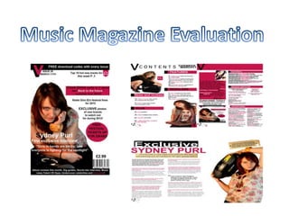
- 2. One element that a magazine must have is a masthead. A masthead establishes the name of the magazine and often reveals the genre. It was essential that my masthead was relevant to the genre of music that I wanted for my magazine. Firstly I chose an appropriate name for my magazine that would suite my target audience, and called it a simple name “V”. The “V” is short for Volume. I chose not to include the full name because I wanted an iconic masthead that was simple but effective and easy to remember. Another vital element to a front cover is a lead image. The lead image shows readers who the magazine will contain and who the lead article will be about. I put the image to the left third of my front cover because people will be able to see it when it is on the shelf. On any lead image you have a pull quote which is a quote from the artist, which gives readers an insight into what the interview inside will include. A pull quote is a good way of encouraging people to pick up your magazine and read it because they will want to find out more and see if anything interesting is said. A menu bar is located at the bottom of the front cover; this tells readers what other topics the magazine will include. If the magazine’s main article doesn’t interest certain people, they can look at the menu bar and they can see if anything else in the magazine will.
- 3. Cover lines are similar to the menu bar. They give readers a bit of insight into what other articles the magazine will include. I put my cover lines on the right third of my front cover because they are not as important as the lead image and the pull quote. A flash is used to draw the attention of the readers to either a competition of a free give away. It makes people want to buy the magazine to receive something exciting. I used a flash at the right third of my front cover, with a circle around it so it draws attention to the magazine and makes people want to buy it. 'Barcode' usually at the bottom of the page is used to show that the magazine is legitimate for sale. 'Lead article' was used on my front cover to give a bit of information into the content of the magazine, it was relevant to the main image.
- 4. Masthead Cover lines Lead image flash barcode Pull quote Menu bar
- 5. How have you presented/represented your band in your magazine? My music artist is presented as an appealing character to my target audience. She is presented well, not too controversial but interesting and people will want to read the magazine. I made sure my artist suited my target audience, for example I have chosen A pop artist to feature on my magazine, therefore people who are interested in pop music will read my magazine. In what ways do the photos of your band offer a constructed representation of the bands personality? The photos of my artist used in my magazine are suited for the storyline in my magazine. The front cover image shows an insight into my artists personality, that she is nice, but she doesn't let anyone walk over her. It also shows a seductive side to my artist, and how she has matured which readers wouldn't of seen before and it shows she is now a solo artist and has more attitude. How does the use of pull quotes and writing in the DPS reinforce this representation? The use of pull quotes and writing in my DPS reinforce this representation because although it's not too controversial (swearing in every sentence) it is still interesting. I made sure the storyline and content inside the magazine had a good story to write about.
- 6. Magazine publishers in the UK might want to distribute my magazine because my magazine has all the vital elements that a magazine needs. The layout is how a magazine should be and the layout is set out nicely. Many people use a site called www.issuu.com to publish their magazines online, the reason being it is free, and people will be going on this site to look at magazines so they will get attention. They may even find magazine publishers looking at this site as it is well known, and could get their magazine published.
- 8. I have included "Top 10 hot new tracks this week“ which will interest readers because it's a music magazine and it tells them the latest music they need to listen too. I also included "Free download codes with every issue" so again, that will be to do with music and it will give readers a chance to get music for free. Also included are the chance for readers to get "Free festival tickets" this will interest readers because if you're buying a music magazine you're more than likely interested into going to music festivals and watching artists and bands.
- 9. Justify your design choices - state the ways in which your magazine has been designed for a specific target audience: I did research on popular magazines which included artists that appeared on the radio a lot, I looked at the layout, the text style, the positioning of the images and I took that on board and included these elements throughout my magazine.
- 10. Before doing this media project, I didn't know a lot about Photoshop. By doing this project I've learnt how to make a photo have a white background. I've learnt more about the layout of magazines, and the vital elements needed for a magazine. I used the city college media blog to look through previous students magazine work, and it gave me ideas and tips on how to make my magazine and what to include. I have posted my work onto Facebook, and asked people to do surveys on my magazine work, and have also sent out messages to people asking them to comment on my magazine and what they thought was good and what they would improve. This was a really helpful process because it helped me make the final decisions for my magazines, and I believe make it better.
- 11. I have improved a lot since the start of media, I have learnt more about how to use Photoshop and use different effects. I've learnt how to layout pages, and what elements to include. I've learnt how to use other websites, such as Facebook, survey monkey to get feedback from people and this helped because I was able to make the relevant changes and improve my magazine. This project has encouraged me to study A2 media, although it has been a lot of hard work, and it has been hard meeting deadlines for work, it has been a lot of fun and the end product has definitely been worth all the hard work.