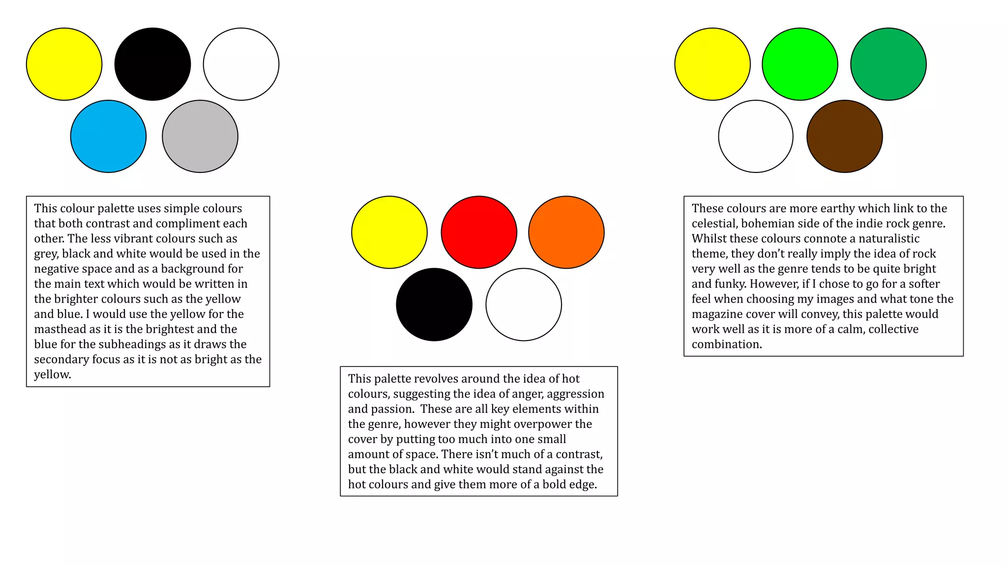
This document discusses and evaluates multiple color palettes for use on an indie rock magazine cover. It considers whether the colors imply the genre of rock, are too bright or dull, suit different age groups, provide enough contrast, and create a calm or bold feel. The author ultimately selects a palette using pink, blue and white as the main text colors as they are complimentary, universal, not too bright on the eyes, and will likely compliment the chosen center image.


![[BROCHURE] Italy Tour Project | @SlideON](https://cdn.slidesharecdn.com/ss_thumbnails/brochure8-251215152319-2805af68-thumbnail.jpg?width=640&height=640&fit=bounds)


