
Recommended
Recommended
More Related Content
Viewers also liked
Viewers also liked (16)
Recently uploaded
Recently uploaded (20)
Designing great Publications
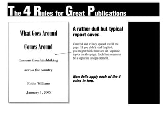
- 1. The 4 Rules for Great Publications A rather dull but typical Cont report cover. rast Centred and evenly spaced to fill the Repet page. If you didn't read English, you might think there are six separate ition topics on this page. Each line seems to be a separate design element. Alignment Now let’s apply each of the 4 Proxi rules in turn. mity
- 2. The 4 Rules for Great Publications PROXIMITY Cont If items are related to each other, group them into closer proximity. Separate rast items that are not directly related to one another. Repet Vary the space in between to indicate ition the closeness or the importance of the relationship. Al By putting the title and ignment subtitle close to each other, we now have one well-defined unit rather than six apparently Proxi Unrelated units. It is now clear that those mity two topics are closely related to each other.
- 3. The 4 Rules for Great Publications ALIGNMENT Be conscious about every element you Cont place on the page. To keep the entire page unified, align every object rast with an edge of some other object. If your alignments are strong, then you Repet can choose to break an alignment occasionally and it won't look like a ition mistake. Al Even though the author's name is far from the title, there is a visual connection between the ignment two elements because of their alignment. The example on the previous page is also aligned with centred alignment. As you can see, though, a left or right alignment (as Proxi shown in the example on this page) gives a stronger edge, a stronger line for your eye to mity follow. A left or right alignment also tends to impart a more sophisticated look than does a centred alignment.
- 4. The 4 Rules for Great Publications REPETITION Cont Repetition is a stronger form of being consistent. Look at the elements you rast already repeat (bullets, typefaces, lines, colours, etc.); see if it might be appro- priate to make one of these elements Repet stronger and use it as a repetitive ele- ment. Repetition also helps strengthen ition the reader's sense of recognition of the entity represented by the design. Al The distinctive typeface in the title is ignment repeated in the author's name, which strength- ens their connection even though they are physically far apart on the page. The small triangles were added specifically to Proxi create a repetition. Although they each point in different direction, the triangular shape is mity distinct enough to be recognized each time. The quot;colourquot; of the triangles is also a re- peated element. Repetition helps tie separate parts of a design together.
- 5. The 4 Rules for Great Publications CONTRAST Would you agree that the example on Cont this page attracts your eye more than the example on the previous page? rast It's the contrast here, the strong black versus white that does it. You can add contrast in many ways - rules (lines), Repet typefaces, colours, spatial relationships, directions, etc. ition Adding contrast to this was simply a matter of Al adding the black box. I added a bit of contrast in the type by making the subtitle italic vs. the ignment roman of the title and by-line.(The title is Bodoni Poster compressed; the subtitle is Bodoni Italic.) Proxi Can you describe where the principles of proximity. alignment, and repetition mity are also being used in this example?
- 6. Great Publications For don’t forget to use... Cont Repet Al Proxi rast ition ignment mity