FULL ENJOY Call Girls In Mahipalpur Delhi Contact Us 8377087607
Coventions used within my poster
1. The ‘Hollyoaks’ poster used the
convention of having the same front
used throughout the poster, I found this
when researching. For my poster I
mainly followed this convention but I
used a different font of the quote being
that I felt that this would make it
standout more effectively.
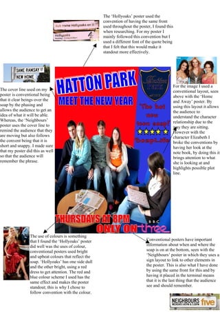
For the image I used a
The cover line used on my conventional layout, seen
poster is conventional being above with the ‘Home
that it clear beings over the and Away’ poster. By
soap by the phasing and using this layout it allows
allows the audience to get an the audience to
idea of what it will be able. understand the character
Whereas, the ‘Neighbours’ relationship due to the
poster uses the cover line to way they are sitting.
remind the audience that they However with the
are moving but also follows character Elizabeth I
the convent being that it is broke the conventions by
short and snappy. I made sure having her look at the
that my poster did this as well note book, by doing this it
so that the audience will brings attention to what
remember the phrase. she is looking at and
highlights possible plot
line.
The use of colours is something
that I found the ‘Hollyoaks’ poster Conventional posters have important
did well was the uses of colour, information about when and where the
conventional posters used bright soap is on at the bottom, seen with the
and upbeat colours that reflect the ‘Neighbours’ poster in which they uses a
soap. ‘Hollyoaks’ has one side dull sign layout to link to other elements in
and the other bright, using a red the poster. This is also what I have done
dress to get attention. The red and by using the same front for this and by
blue colour scheme I used has the having it placed in the terminal means
same effect and makes the poster that it is the last thing that the audience
standout; this is why I chose to see and should remember.
follow convention with the colour.