
Recommended
More Related Content
What's hot
What's hot (20)
Similar to Legacy Brand Identity
Similar to Legacy Brand Identity (20)
Recently uploaded
Recently uploaded (20)
Legacy Brand Identity
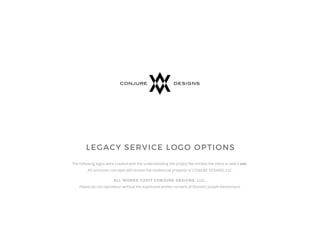
- 1. LEGACY SERVICE LOGO OPTIONS The following logos were created with the understanding the project fee entitles the client to select one. All unchosen concepts will remain the intellectual property of CONJURE DESIGNS, LLC. ALL WORKS ©2017 CONJURE DESIGNS, LLC. Please do not reproduce without the expressed written consent of Dominic Joseph Venticinque.
- 2. OVERVIEW All of the following options utilize the same green/black combination of your most current, existing logo, which helps tie the new logos to the existing logo. An optional teal/black variation of each option is also shown for your consideration. If so desired, other color combinations can be explored based on your specific feedback. Each logo option is presented on both a white and black background. It’s worth noting that various layouts (ie: horizontal, stacked, centered, left-justified, etc.) may be created of the final selection depending on your needs. All symbols were created by hand in Adobe Illustrator (no clip art was used), and are accompanied by descriptions. The goal of each option was to utilize some of the basic components of the existing logo, but in a much cleaner, simplified manner. This end-goal has been achieved by creating the basic shapes of your existing logo (a rectangle and triangle) from the “LS” ligature itself. This results in a more iconic and sophisticated logo, that will work well in all mediums, sizes, and capacities.
- 3. OBSERVATIONS OF EXISTING LOGO The symbol has way too much detail which gets lost, when logo is at small sizes, such as on a business card, website, etc. The puffy looking “LS” in the center is barely legible, doesn't work with the angular nature of the rest of the symbol, and adds to the complexity of the logo. The square tool is barely recognizable at small sizes, and also adds to the complexity of the logo. Too much variation thicknesses in all of the symbol’s elements. The triangle inside the square looks forced, like it’s an afterthought, that doesn’t fit. The gradient is only on the triangle portion, so it looks out of place with all of the rest of the symbol’s elements (which have solid colors). There are way too many angles going in different directions. The script font looks dated and is more applicable to a wedding invitation. The curvy, light weight lines don’t work well with the heavy, linear, geometric shapes of the existing symbol. The center-justified logotype being to the right of the symbol makes it look disconnected. The name itself is a mouthful, and for the purposes of a logo, it is much more memorable and cleaner listed simply as LEGACY SERVICE.
- 4. © CONJURE DESIGNS, LLC. Option 1-1 | The LS ligature makes for a simple, yet highly sophisticated symbol. No longer is the LS a small, illegible part of a busy logo, but rather it is now the logo itself. The original colors combined with heavy, square shapes help tie it to the original logo. It just looks like it was built with precision, which ties directly to your services. LEGACY SERVICE is set in a very clean, upright font to compliment the tall nature of the symbol. Together, they resemble a tall building. The logo just looks solid and professional, which is exactly what customers want from a construction company.
- 5. © CONJURE DESIGNS, LLC. Option 1-2 | A variation of option 1-1, this version utilizes a teal color in place of the green.
- 6. © CONJURE DESIGNS, LLC. Option 1-3 | Variations of options 1-1 and 1-2, where the symbols utilizes a gradient instead of solid colors.
- 7. © CONJURE DESIGNS, LLC. Reversed Out Logos | All of the option 1 logos shown reversed out on a black background.
- 8. © CONJURE DESIGNS, LLC. Option 1 Business Card Mockup | This mockup shows what logo 1-2 would look like on the front of a black business card. The contact information could go on the back. This is just to provide one example of how the logo may be used, and is not intended to be your final business card design.
- 9. © CONJURE DESIGNS, LLC. Option 2-1 | As in option 1, the LS ligature makes for a simple, yet highly sophisticated symbol, and the original colors combined with heavy, shapes help tie it to the original logo. However this logo utilizes the triangular portion of the original logo, which resembles a pyramid (some of the most precise, well built, longest lasting structures on earth. LEGACY SERVICE is set in a compli- mentary, heavy font. An optional tag-line is shown with this option. Once again the logo just looks solid and professional, which is exactly what customers want from a construction company.
- 10. © CONJURE DESIGNS, LLC. Option 2-2 | A variation of option 2-1, this version utilizes a teal color in place of the green.
- 11. © CONJURE DESIGNS, LLC. Option 2-3 | Variations of options 2-1 and 2-2, where the symbols utilizes a gradient instead of solid colors.
- 12. © CONJURE DESIGNS, LLC. Reversed Out Logos | All of the option 2 logos shown reversed out on a black background.
- 13. © CONJURE DESIGNS, LLC. Option 2 Business Card Mockup | This mockup shows what logo 2-1 would look like on a business card and mug. Obviously all of the information is not accurate and is simply intended to provide one example of how the logo may be used.
- 14. © CONJURE DESIGNS, LLC. Option 3-1 | As in the previous options, the LS ligature makes for a simple, yet highly sophisticated symbol, and the original colors combined with heavy, shapes help tie it to the original logo. However this logo combines the letters in a fashion resembling a building block. Of all the options, this may be the most simplistic. LEGACY SERVICE is set in an elongated, complimentary font. Once again the logo just looks solid and professional, which is exactly what customers want from a construction company.
- 15. © CONJURE DESIGNS, LLC. Option 2-2 | A variation of option 3-1, this version utilizes a teal color in place of the green.
- 16. © CONJURE DESIGNS, LLC. Option 2-3 | Variations of options 3-1 and 3-2, where the symbols utilizes a gradient instead of solid colors.
- 17. © CONJURE DESIGNS, LLC. Reversed Out Logos | All of the option 3 logos shown reversed out on a black background.
- 18. © CONJURE DESIGNS, LLC. Option 3 Business Card Mockup | This mockup shows what logo 2-1 would look like on a business card. Obviously all of the contact information is not accurate and is simply intended to provide one example of how the logo may be used. This is just to provide one example of how the logo may be used, and is not intended to be your final business card design.
- 19. © CONJURE DESIGNS, LLC. Side-by-side Mockups | All the options with the two color variations are ganged together for comparison.
- 20. CONCLUSION A brand is the most valuable asset for any successful organization. The ideas or feelings conjured in the minds of consumers is ultimately what a brand is. A great deal of time, effort, and money goes into creating, maintaining, and promoting a brand. A company’s logo is often the first visual projection of it’s brand, and is integral to consumer perception. Your company would be served well into the future with any one of the above logo options. All symbolize strength, precision, and professionalism. I might be able to tell you which one I like best, but it really won’t be beneficial, as ultimately you must select the logo that speaks to the vision of your company. Looking forward to your feedback. Sincerely, Dominic J. Venticinque