Gantt excel
•
0 likes•246 views

Using a stacked bar chart in Excel, you can create a Gantt chart to plan and track projects over time. The steps are: 1) Enter task data including descriptions, start dates, and durations in columns; 2) Create a stacked bar chart from the data and manually set the category and data series labels; 3) Format the chart axes to display tasks in order from top to bottom spanning the earliest to latest dates. Hide the start date data series to resemble a Gantt chart. Adjusting the project schedule will automatically update the chart.

Recommended
More Related Content
What's hot
What's hot (20)
Similar to Gantt excel
Similar to Gantt excel (20)
Gantt excel
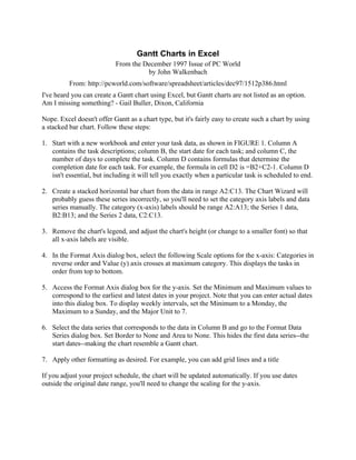
- 1. Gantt Charts in Excel From the December 1997 Issue of PC World by John Walkenbach From: http://pcworld.com/software/spreadsheet/articles/dec97/1512p386.html I've heard you can create a Gantt chart using Excel, but Gantt charts are not listed as an option. Am I missing something? - Gail Buller, Dixon, California Nope. Excel doesn't offer Gantt as a chart type, but it's fairly easy to create such a chart by using a stacked bar chart. Follow these steps: 1. Start with a new workbook and enter your task data, as shown in FIGURE 1. Column A contains the task descriptions; column B, the start date for each task; and column C, the number of days to complete the task. Column D contains formulas that determine the completion date for each task. For example, the formula in cell D2 is =B2+C2-1. Column D isn't essential, but including it will tell you exactly when a particular task is scheduled to end. 2. Create a stacked horizontal bar chart from the data in range A2:C13. The Chart Wizard will probably guess these series incorrectly, so you'll need to set the category axis labels and data series manually. The category (x-axis) labels should be range A2:A13; the Series 1 data, B2:B13; and the Series 2 data, C2:C13. 3. Remove the chart's legend, and adjust the chart's height (or change to a smaller font) so that all x-axis labels are visible. 4. In the Format Axis dialog box, select the following Scale options for the x-axis: Categories in reverse order and Value (y) axis crosses at maximum category. This displays the tasks in order from top to bottom. 5. Access the Format Axis dialog box for the y-axis. Set the Minimum and Maximum values to correspond to the earliest and latest dates in your project. Note that you can enter actual dates into this dialog box. To display weekly intervals, set the Minimum to a Monday, the Maximum to a Sunday, and the Major Unit to 7. 6. Select the data series that corresponds to the data in Column B and go to the Format Data Series dialog box. Set Border to None and Area to None. This hides the first data series--the start dates--making the chart resemble a Gantt chart. 7. Apply other formatting as desired. For example, you can add grid lines and a title If you adjust your project schedule, the chart will be updated automatically. If you use dates outside the original date range, you'll need to change the scaling for the y-axis.
- 2. Note – The vertical divisions represent weeks – not some other meaningless division of dates! 12/28/97 1/4/98 1/11/98 1/18/98 1/25/98 2/1/98 2/8/98 2/15/98 2/22/98 3/1/98 3/8/98 3/15/98 Planning Meeting Develop Questionnaire Print and Mail Questionnaire Receive Responses Data Entry Data Analysis Write Report Distribute Draft Report Solicit Comments Finalize Report Distribute to Board Board Meeting