Miletti Gabriela_Vision Plan for artist Jahzel.pdf
Question 1evealuation
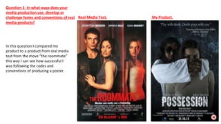
1. In this question I compared my
product to a product from real media
text from the move “the roommate”
this way I can see how successful I
was following the codes and
conventions of producing a poster.
Real Media Text. My Product.
Question 1- In what ways does your
media production use, develop or
challenge forms and conventions of real
media products?
2. Title
The title is another very important conventions and
one that we followed as it’s essential, in this real
media text the size of the font it the same, we even
positioned it in a similar area.
A difference between my font and the font used in
most real media text is I went for a font much more
different it’s textured I didn’t follow the conventions
here because I wanted my font to stand out and be
different.
3. Tag line
A tag line is a very important convention and
maybe one of the most important when looking
at posters it’s important to keep them short and
snappy but also interesting enough to attract an
audience.
We followed this conventions because it’s
important to catch an audience’s attention, ours
is just as short with just one added letter more.
4. The main image is almost the most important part
of this poster as it takes up most of the poster, in
the real media text the image shows a narration
you can see the girl lurking suggestion she’s the
antagonist and its very obvious who the
protagonist in this poster is.
The image we generated is very similar in the fact
that we showed narrative and the antagonist and
protagonist are very obvious, because of its
importance, we followed the convention as it
attracts people to watching the film. Due to our
genre similar to the real media text product we
have used low lighting following the conventions of
real media text.
Image
5. Production Logo’s
Another convention is production logos
the are usually put at the bottom they
are there to let people know the
companies that work towards the film.
So as you can see I done the same
however I do not have as much as them
as I only added distribution company,
my logo and sound logo. Because I
didn’t want my poster to be too
clustered.
6. Actor’s Names
Another convention I followed was put the actors
on the posters names this is too attract the
audience too as the audience usually watch films
with known actors in.
However the names on my poster are not as bold as
real media text as you do usually find that they have
the surnames in bold, but I found that my poster had
a better look like this having it bold was not really
necessary in this case so her I have challenged the
conventions.
7. Actor’s Names
Another convention I followed was put the actors
on the posters names this is too attract the
audience too as the audience usually watch films
with known actors in.
However the names on my poster are not as bold as
real media text as you do usually find that they have
the surnames in bold, but I found that my poster had
a better look like this having it bold was not really
necessary in this case so her I have challenged the
conventions.