Download as PDF, PPTX


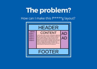
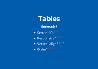

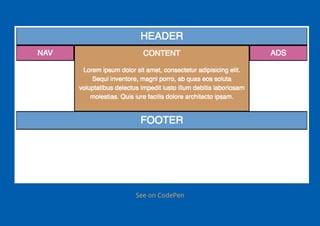
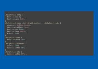
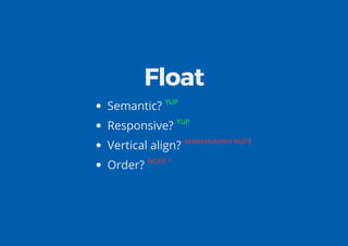
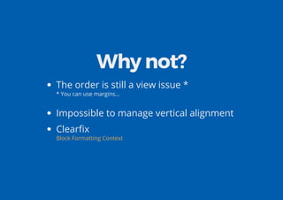
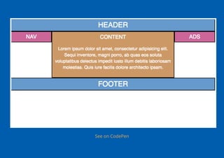
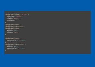
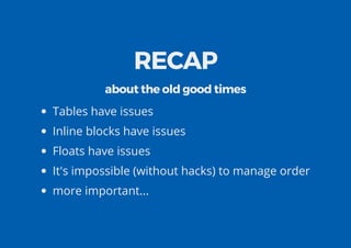

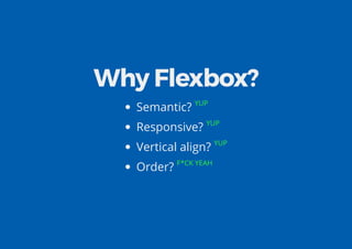
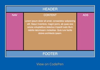
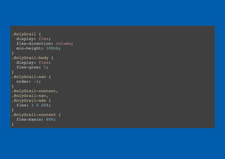


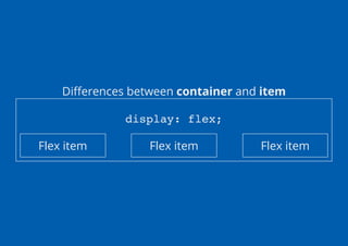
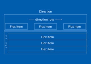


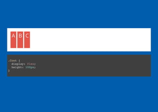
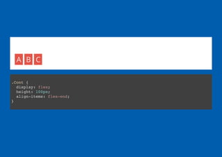
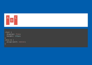


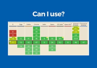
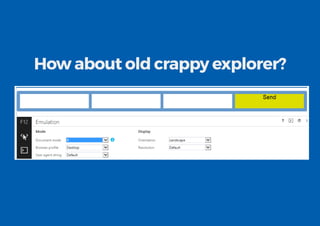
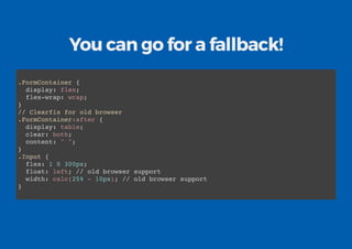

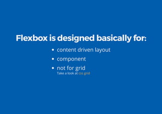
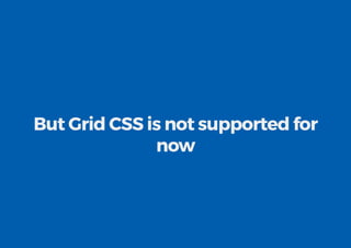
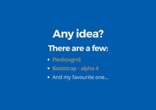


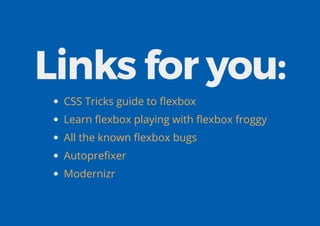


Flexbox is a modern layout method in CSS that allows for flexible and responsive page layouts. It addresses shortcomings of older methods like floats, tables, and inline blocks by allowing for full control over alignment, order, and distribution of space between items. Flexbox makes it easy to create complex responsive layouts that were previously difficult to achieve without hacks. While not a silver bullet, flexbox excels at component-based and content-driven page layouts. Tools like autoprefixer and fallbacks help provide support for older browsers.


