Initial Prototypes - Connections
•Download as PPTX, PDF•
1 like•161 views

Descriptions and images of my thoughts and discoveries when taking my own photographs as well as designing a logo. I also compared my photographs to Egon Schiele's paintings to create a connection.

Recommended
More Related Content
What's hot
What's hot (17)
Viewers also liked
Similar to Initial Prototypes - Connections
Similar to Initial Prototypes - Connections (20)
More from Courtney Grant
More from Courtney Grant (11)
Recently uploaded
Recently uploaded (20)
Initial Prototypes - Connections
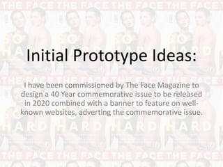
- 1. Initial Prototype Ideas: I have been commissioned by The Face Magazine to design a 40 Year commemorative issue to be released in 2020 combined with a banner to feature on well- known websites, adverting the commemorative issue.
- 2. Idea 1: Logo Design After looking at the past The Face Magazine logo images, I decided that it had to be bold and eye-catching due to it being the focus point of the magazine. I selected 9 different fonts from Word, Photoshop and the Internet (DaFont), after analysing them for their formal qualities, I decided to use the font Britannic Bold because it held the bold element as well as an elegant feel with the contrast of thick and thin lines. Above are three prototypes for my logo in which I edited in Photoshop, I combined the triangle element for the ‘a’ from the older The Face Logo and the bold and big nature of the newest and most well known logo. I came up with three different combinations which are above. A full filled ‘a’ triangle shape, an outline and a design in which used the existing line on the ‘a’ to create an unusual shape.
- 3. Idea 1: Composition I have inserted my logo in which I designed into a magazine sized (proportion) rectangle. I used an image of The Face Magazine and opened up in Photoshop, using the square tool I was able to get the correct proportion for the magazine size. I inserted The Face logo in four different positions, the fourth one was in the middle, however I thought that the position would be too distracting and would take the focus from the main image on a magazine. Above I have displayed the three other compositions in which I came up with to place the logo where it looks best suited. I tried these three different positions to give a variety of ideas in which I could work with. I still think the stereotypical logo at the top of the page works best.
- 5. Idea 2: My Photographs and Logo This is my first composition idea using my own photographs. I wanted to represent the way Egon Schiele uses naked bodies in his paintings in awkward and unusual positions. I thought the pose above was unique in the way that at first glance you would not know what the image is of. Egon Schiele uses imagery like this to capture the attention of his audience and make them think, this would be a good technique to use on a magazine cover as its job is to attract attention. The photograph I have taken above again reminds me of Egon Schiele’s use of figures with interesting muscles and skinny frames – in the image above you can see the shoulder blades produces by the dark shadows as well as back muscles. The use of space around the image is also influenced by Shiele’s work due to his plain background which draws attention to the striking image. Inserting The Face logo in white makes it easily recognisable due to the high contrast – the bold nature is well suited to a front cover of a magazine.
- 6. Idea 3: My Photographs and Logo Above is my second prototype idea where I have taken the image in colour myself and then converted it to black and white on Photoshop, changing the contrast and saturation. I think this way of creating a monochrome iamge is better as you will always have the original in colour if you need it. If you take the image in black and white, there is no way of changing it to colour. I have again linked this to Schiele due to the use of a naked model as well as visible muscles – for example the shoulder blades above. The use of black and white colour (monochrome) has been devised from Edqard Paolozzi’s machinery work as well as the photographs I have collected as research. The use of the bold pure white logo in which I designed against the dark background creates a visually interesting and pleasing bold contrasting design which is well suited for a front cover of a magazine.
- 7. Idea 4: My Photographs and Logo With these other two images, I tried something different and out of the ordinary for a magazine cover. I took the images landscape to create a unique and different design of a m standard magazine. I have also left the logo in black to make the image more prominent, rather than the logo screaming ‘look at me’. I like the high contrast within these images, however I do feel that the logo gets slightly lost, to improve the design I could make it bigger and more bold. The use of a landscape image has worked well as it is different to any other magazine, however on the other hand I think portrait images work more successfully.
- 8. Egon Schiele Comparison/Connection: My image above compared to some of Schiele’s work with the human back.