
Recommended
More Related Content
Similar to Describing the style and layout in detail (moodboard and sketches).pdf
Similar to Describing the style and layout in detail (moodboard and sketches).pdf (20)
More from ClaraHennig
More from ClaraHennig (20)
Recently uploaded
Recently uploaded (20)
Describing the style and layout in detail (moodboard and sketches).pdf
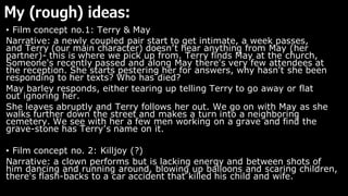
- 1. My (rough) ideas: • Film concept no.1: Terry & May Narrative: a newly coupled pair start to get intimate, a week passes, and Terry (our main character) doesn’t hear anything from May (her partner)- this is where we pick up from. Terry finds May at the church, Someone's recently passed and along May there's very few attendees at the reception. She starts pestering her for answers, why hasn't she been responding to her texts? Who has died? May barley responds, either tearing up telling Terry to go away or flat out ignoring her. She leaves abruptly and Terry follows her out. We go on with May as she walks further down the street and makes a turn into a neighboring cemetery. We see with her a few men working on a grave and find the grave-stone has Terry’s name on it. • Film concept no. 2: Killjoy (?) Narrative: a clown performs but is lacking energy and between shots of him dancing and running around, blowing up balloons and scaring children, there's flash-backs to a car accident that killed his child and wife.
- 2. Zooming in on idea one; Terry and May • I've decided to do Terry and May as it fits more into the romance sub genre than kill joy ( I couldn’t really build on anything there). • As a concept I don’t think there's nearly enough LGBTQ+ representation in film and media as there should be in this day and age- nor discussion of subsequent internal homophobia that is delt with by people in the community, so my first idea felt a little more relevant in that respect. • Moreover, I feel this will more-so hit the brief as the target demographic that the brief intends for (that is teens and up) will hopefully resonate and be more responsive towards queer representation and the drab story it takes place in- something a little darker than average teen rom coms today that have shown to not go down so well with mass audiences. • The themes of love, death, self-hatred)- deep heavy hitting topics I feel will be interesting to incorporate into a visual design than a simple rom com of two people standing back-to-back or a hero running from an explosion in an action and more so (in my opinion) fits channel four’s indie, cynical catalogue of movies that they stream and produce.
- 3. Colour mood board: For my colour mood board I took heavy inspiration from my analysed posters ( persona, Mikey and Nicky and lobster) as the simplistic yet effective colours not only allow focus on the main imagery but also sets up the tone of the film, where deep reds or blues set up the horrific or woeful tone of a film, I hope that the beige(y) greys and whites give off an isolated and mystifying attitude.
- 4. Photos mood board: For my main image I wanted to emulate the intimacy of the relationship whilst pertaining to each character’s ‘loneliness’ having the pair physically close but never looking at each other.
- 5. Fonts mood board : the type of fonts I wanted to utilize consists of thin flowing text that’s embolic of handwriting for a romantic intimate effect for the tagline and a thicker but tall font to grab attention for the title
- 6. Colours/ images and font (sum up) : • I wanted to go with neutral/ soft colours to pull more focus onto the subject matter, the use of solid, bland colours makes the characters really stand out, and allows more focus into their relationship dynamic. It more so adds to the ‘indie cult’ theme I want my film to have, emulating the slow burn/ intense dramas shown on 4- trainspotting/ the love witch etc. • The images I'm looking at are inspired mostly on the composition of posters like persona and talk to her, it effectively conveys the pairings relationship whilst incorporating interesting and captivating imagery. I wanted to incorporate an ‘one in the same’ metaphor that alludes to a deeper meaning/ twist to the tale. • font wise I was looking towards more flowy scrawny text most commonly associated with ‘romance’- since technically it is a love tale- whilst being ghostly and faint with the thinness of the text- more so embodying the pairs withering love.
- 7. Sketches ( getting ideas down on paper) Wanted a running theme of the pairs colours correlation Red: terry ( more domineering and intimidating; open with her sexuality and feelings) Brown: May (more neutral, calm and conserved; reluctant to move forward or accept herself)
- 8. Development on the landscape poster (Reference) Inspiration: Title Billing block Date Age rating Logo Developing sketches digitally
- 9. Development on the theatrical poster Inspiration: Early sketches Title Tagline Date Logo Developing sketches digitally
- 10. Development on the teaser poster Inspiration: persona poster/ blue is the warmest colour (2013) (and the eventual colour scheme from talk to her (2002)) Early sketches & final sketch up (reference photo) Early sketches Title Billing block Tagline Logo Age rating Date Developing sketches digitally