
Recommended
More Related Content
What's hot
What's hot (18)
Viewers also liked
Viewers also liked (20)
Similar to Font research
Similar to Font research (20)
Recently uploaded
Recently uploaded (20)
Font research
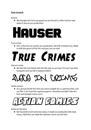
- 1. Font research Hauser We thought this font was good, but we found it a little hard to read when it was on our production. True crimes This is the font we used in our production. We felt it looked nice, fitted in with the genre of the film and was nice to read. 2loco in crime We felt this font fitted with the film plot as we have ‘hit men’ but after trying the font we felt it looked childish. Action comics As a group wefelt this font was moresuitable for a superhero film, and our film is far fromthe superhero genre. Thereforewe didn’t like this font and decided not to useit. Action of the time We found this font to be too tacky, it made our production title look messy. With this we made the decision not to use the font.
- 2. Drama type This font was incredibly hard to read, we felt it was distracting from the film. !The trouble We saw this font as tacky, untidy and unprofessional. Itwas also hard to read and interrupt. Bloody We liked this font, but then soon felt the font was childish and unprofessional. Wealso thought it wouldn’tfit with the film and the genre of the film.