SlideShare a Scribd company logo
1 of 49
SI MP LICITY DESIGN
                      Multiple Choice Tests


                           in ee spac

                       SEAN CONNOLLY


Sean Conno y Mumbai                           1
SI MP LICITY DESIGN
                                     Multiple Choice Tests

Intro
Simplicity for the user is damned complex for a designer. This paper will review the design
solution to a multiple choice test taking interface on the Apple’s brand new iPod touch.


Executive Summary
As a class project, my teammate and I were tasked to design an multiple choice interface
that leveraged the new power of the Apple made iPod touch. To address this assignment, we
brainstormed, drank a lot of co ee, sketched personas, and user tested.

The original project paper was close to 50 pages including paper prototypes . This
portfolio sized reflection upon that larger project is a summary document to reflecting upon
how I address such this. This reflection has five pages.


Context
Beloved professor, Marty Siegel, likes not only to assign contemporary design problems, he
likes to flesh out real world environments within which the designing takes place:
                “..there were rumors flying around that Apple was to unveil a new se-
                ries of iPods, particularly one that include touch and Wi-Fi. And yes-
                terday, September 5, 2007, that’s exactly what happened.”

                “Our company, InteractiveFuture, knew that the iPod would inherit
                some of the features of the iPhone, but no one anticipated that it
                would come this soon. Our CEO, Marissa Sanders, called us together
                and told us that the quiz interface we had been developing for the web
                should now be for an iPod touch.” 1

That was Dr Siegel’s assignment. We had to re design the long standing multiple choice test
interface to leverage any new a ordances an iPod Touch provides. We had two weeks.


1   Actually, I add the boldface on touch.

Sean Conno y Mumbai                                                                           2
Day I
On Day One, we play with the iPhone because it has such a similar interface. We brain
storm. We each have ideas. We decide it would help to have some personas. However, we
don’t want to stop the brainstorming so we sketch two quick user profiles profiles with at
tributes opposite each other and continue to run with our first inspired impressions.


Step II
We build out meaningful personas. My partner builds out a technophile teenager. I am
stuck working on the crotchety old male persona who rejects technology yet, for some rea
son, buys the cutting edge of technology iPod Touch so he can take multiple choice tests .


Step III
We break the multiple choice test into as many coherent pieces as possible:

1. Question & Answers : the test first breaks down into two parts:
   a the space within which the Question is presented, and;
   b the space within which the Answers are presented.

2. The Answers : Answers can be further deconstructed because they consist of two parts.
   a the meaningful content of the answer, and;
   b the signifier ‘A’,’B’, etc of the answer.

3. The Signifier : Signifiers can be broken down yet again. Signifiers are composed both:
   a the sign ‘A’, ‘B’, etc , and;
   b the selector. The selector is that which shows the audience that a choice has been made.


Insight s
At this point, I will refrain from adding new insights. I will talk only about events that hap
pened during this project. However, after summarizing our experiences in the next few
paragraphs, I would like to add my current insights into the design space of this problem:

1. The interface disappears : what distinguishes the iPhone interaction from other multiple
   choice tests is that you “reach out and touch” the information. You don’t bubble in an
   swer ‘B’ with your pencil, and, you don’t click answer ‘B’ with a mouse either. You touch
   it. Both of us noticed an immediate delight that arose simply from touching the informa
   tion directly. We realize there is no tool necessary during this action no pencil no
   mouse to click. Somehow that brings us enjoyment. We begin to wonder what other con
   ventions we might remove from the interaction, and, if removing them will bring delight.

Sean Conno y Mumbai                                                                              3
2. Sliding around : another paradigm of the iPhone interaction is that we can slide and move
  information around almost at will. Because we can expand and slide and shrink and shift,
  we task ourselves to consider possibilities where the multiple choice test itself is no longer
  a stuck in static time in a static medium.

3. Multi touch : we note that we do not simply have a touch screen here. Touch screens
   have been around for quite awhile. What makes the iPod touch an innovation is that it
   reads a number of touch & gestural cues, many of which are universal action cues
   throughout the menus of the device. We understand that it will be helpful to leverage al
   ready existent cues and tendencies.


Reconstruction
Before reconstructing a solution, let us pause for a moment to ask, “What’s the big deal?”

The multiple choice test question is harder than it originally seems. For questions with sin
gle, discrete answers, like, “What is the largest city in India?”, the test is simple. There is
one answer. Any user who chooses this answer gets it correct perhaps we signal correct
ness to them with a flash and any user who did not choose this answer gets it wrong per
haps signaling incorrectness with a large, red x mark X .

But what if you can get partial credit on a question? Do you get half of flash then? Do you
get a half large, half red x mark? We need a simple, meaningful way to communicate this.


My partner and I would desperately like to use color. We feel that color and visuals add to a
fun audience experience. However, we soon realize that appropriating common color signs
will not fit our needs. We map out for ourselves common color signage:


Sean Conno y Mumbai                                                                               4
Red is always wrong. Red always signifies wrong. In contrast, green will often mean “go”
when placed against red and these opposing colors sign “wrong” and “correct.” However,
what is “partially correct?”

Is it yellow, like a stoplight? It cannot be. Using yellow as the partially correct color means
the user will still have to look at the partially correct answer and discern HOW did they get
it partially correct. Did they miss an answer they should have picked? Or, did they pick an
answer they should not have picked.

My partner and I chart the formal logic of our answer possibilities and prove to ourselves
that we will need to clearly present four di erent types of responses to the audience:

                   x/y                 CORrect answer      Answer NOT CORrect
              Answer chosen               An, Cor               An, - Cor
            Answer NOT chosen            - An, Cor             - An, - Cor


There is no common color signage that addresses such a plurality of uses. So my partner
and I know that color cannot answer this question coherently, and, seek a new direction.


Space
Since we have already deconstructed the problem into parts, we wonder if reassembling
them in a piecemeal fashion will lead us to any new conclusions. We rearrange the multiple
choice test into a wild variety of new test types all detailed in attached report :


Since digital objects can move around this new innovative interface, we like playing with the
idea of question “fields” and answer “fields.” We spend much of the time moving the basic,
universal facets of the multiple choice test itself around. What if the Question goes in the
middle? What if answers group towards corners?

We like this idea of answers “grouping” because it smacks of Gestalt design and cognitive
association “chunking” strategies. However, we realize that our second persona our
crotchety old man won’t understand that this is a multiple choice test if the original pres


Sean Conno y Mumbai                                                                           5
entation is too unfamiliar. Because of our understanding of this user, we hesitate to change
the original presentation of the multiple choice question too far from the common.

However, because it is likely that our crotchety old man has had experience with the multi
ple choice test framework, we KNOW he is expecting to find out whether he is right or
wrong. So therefore, if we present this second step in a NEW way, he will be expecting this
new way to present him with the same type of information “correct” vs “incorrect” . This
is what we do. We simply group the correct answers near the question whether the user got
the answer correct or not and let the user see which answers she picked in relation.


User Tests
We build a paper prototype complete with sliding interface and ‘selectable’ icons and run
user tests in the library commons. When we run our questions by the test audience, there is
no confusion as to what our questions mean, and, to what our answers mean. We do note
that no one clicks “why” to find out more information about the question, but, test partici
pants explained that they understood what “why” probably meant, and, since they had no
interest in finding out more information on our test questions, ignored looking up “why?”


Results
Therefore, as every other interface in the class becomes some complex display of multi
colored signage, our multiple choice interface becomes a simple presentation of what the
user did right and what the user did wrong. Furthermore, by “grouping” the correct answers
near the question, we hope to amplify in some small way the user’s learning curve.

Furthermore, it was interesting to note how aggregating simple signs can simply convey
complex information. It was interesting to note too with how much light elegance the user
can di erentiate between a one pixel dotted line and a one pixel solid line.


Next Steps
What I do especially like about this bland, unusual interface, is that it puts no prior con
straints as to what the “top level” of the interface “looks like.”

Meaning, if the company wanted to do some cross promotions with this interface, they can.
Imagine having the selection sign be Spider Man or Batman or Sponge Bob Square Pants.
In this interface, it will present no confusion to have colorful, branded iconography replace
the simple, dotted ‘A’ and ‘B’ boxes on the test. The test is still conducted and presented in
the same, unique way, and, the experience of certain user groups is enhanced because they
get to play with the interface “skin” iconography of their own, customizable choice.

Sean Conno y Mumbai                                                                            6
END OF SUMMARY


Sean Conno y Mumbai        7
BEGINNING OF
         ORIGINAL REPORT


Sean Conno y Mumbai        8
PART 1 – RESEARCH:
   DEVELOPING AN OBJECTIVE CRITERIA FOR
                  DESIGN

PERSONA SKETCHWORK
To address the design, we wanted personas. However, when addressing the personas we contin-
ued to talk about the design. Certainly our excitement for the design became a problem: it was
taking our time away from crafting fully fleshed out personas.

To address this problem we decided to lock-down two 'sketch' personas. We wouldn't fully de-
velop their motivations for using the interface, or the context in which they used it. But we saw
a value in locking-down their attitude toward technology and their past experiences with iPod
Touch, as well as, similar digital artifacts.

To cover our bases, we placed our 'sketch' users as far apart on the 'user' spectrum as possible.
Below are the sketches we worked with:

       Persona #1 is a teenage techno-freak who knew everything about modern
       technology and who carried many mental assumptions about digital-touch
       artifacts.
       Persona #2 is a crotchety older user unfamiliar with technology in general, as well as, un-
       familiar with the iPod Touch touch-screen.


BRAINSTORMING
While the brainstorming continued over many days, and (likely) right up until the
delivery of this design proposal, we will present the raw data of all the brainstorm-
ing here, up front, so the reader has a clear mental model of our intentions as we
progress through the iteration of this design. Because this information is “raw
data” (in the Ebling & John sense), we do not seek to analyze the imagery intro-
duced here, nor assess the patterns within it. We do not even attest that all the im-
ages will be useful to the final design, nor to the core question we are to address.

Sean Conno y Mumbai                                                                                 9
We only introduce these images here – and title them – so they may be logged in as
data, and addressed by name later in the paper.


A. Test at a glance


Much of the original work focused on the techno-persona's need for information
and flexibility. We figured this persona would want to 'bounce around' in the test
and, say, skip ahead, or go back to earlier questions, or see which questions he/she
had or had not answered (correctly?) in the past. To address this, we began to
model our interface after the 'cover art' browsing interface of the iPod Touch.


Sean Conno y Mumbai                                                                    10
The idea was that our fickle test taker could skip ahead on the test – as say one
might do on the S.A.T. test – and still be able to navigate quickly back to the first
question. We assumed some color coding would be in order to signify which ques-
tions were answered (say they were red), and which were unanswered (say they
were white).


The test taker would then just tap on the appropriate question and 'open' it.


The Question piece would be placed at the top of this 'opened page,' and the an-
swers would be present in a left-aligned column below it.


Sean Conno y Mumbai                                                                     11
Sean Conno y Mumbai   12
B. Four Corner Controls


Early on, we wondered if there might be some advantage to 'stabilizing' the more
universal controls of the test by placing one in each of the far corners of the inter-
face.


While these 'four corner controls' seem to be a natural part of the iPod's already estab-
lished 'cover art' search functionality, we thought we could separate this functionality
into its own modular piece – no matter what our final design looked like.


Sean Conno y Mumbai                                                                         13
Again, our thought was that having four controls – say, 'preferences', 'confirm', 'ex-
plain', and 'flexible' (whatever we later need it to be) – that remained stable in the
fluctuating test-space would afford a sense of stability and control to the user.


C. Geographically Placed Answers (Outside or Inside)


Hoping to 'break free' of the traditional linear multiple-choice test format, we be-
gan to play with a more geographic separation of answers. We first experimented
with placing answer buttons in our four corners.


We then experimented with a user interface with the answers grouped around a
question at center. We felt this would be easy to thumb-touch, as well.


Sean Conno y Mumbai                                                                      14
In both of the above cases, we felt that this geographic reorganization of the test
display would enable the device to show a large number of answers.


Sean Conno y Mumbai                                                                   15
D. Geometric Layout Design


The following illustrates our experiments with geometric design. While the above
category, (C) Geographic Layout, focuses on placing the buttons in certain unify-
ing and stable “places” on the screen. The current category, (D) Geometric Layout,
will focus on equitably dividing the shape of the answer fields relative to the shape
(and space) of the question field. For example:


Sean Conno y Mumbai                                                                     16
We gained much insight from this experiment. First of all, using such a geometric
device would allow us to clearly present many more answer choices to the user:


Also, because we felt that a good answer system would respond uniquely to all
four degrees of “correctness,” we could use the geometric layout design to 'group'
the different classes of answers together.


We could even use an animation to move from the geometrically designed ques-


Sean Conno y Mumbai                                                                  17
tions, and then provide 'feedback' on which of the answers were correct or incor-
rect.


Taking this approach to the extreme, we realized that we might merely place a “layer” of
geometric lines over a field of “real space” with the question being the connector space in
the middle of the top “layer” of geometry. This would mean that each answer field could
have an infinite amount contained within it:


Sean Conno y Mumbai                                                                           18
In saying that each answer field can contain an infinite amount of information, we mean
only that the answer field could be an open ended field.

E. Buttons

Much of our approach focused on deconstructing the mental model embedded in the mul-
tiple choice quiz format itself. Were there presuppositions built into the model? What
were they? What are the essential bits to a multiple choice test? What are the assumed
bits? What does it mean that “the correct answer is 'B'?” What is B??


We wondered if we might erase these signifiers. We asked if it would be equally accept-
able to use blank dots:


Sean Conno y Mumbai                                                                       19
Furthermore, we asked that if we didn't need letters to signify specific answer choices, did
we really require numbers to specify which question is being asked?


We also wondered whether this avenue had been explored before – over the history of de-
signing multiple choice tests – and, if it had, were the current alpha-numeric signifiers of
multiple choice tests an iterated, proven, and succinct way to organize multiple choice
test information?


We also wondered, is filling in a blank dot substantially equivalent to filling in any other
form of boundary whether that boundary contained a letter within it or not?


Sean Conno y Mumbai                                                                            20
Sean Conno y Mumbai   21
F. Hardware Button


We also wondered if it might not be the most efficient to only use the iPod Touch hard-
ware button, meaning, find some way to use the one external button for everything.


G. Question and Answer Fields


To help ourselves break the test apart, we broke the multiple choice test down into two
basic fields.

Every multiple choice test needs a place to display its question and answers.


Sean Conno y Mumbai                                                                       22
We also wanted to create a visual language for ourselves that signified 'scrolling,' so we
used dotted lines extending beyond the plane of the question and answer fields.


When taking paper-and-pencil multiple choice tests, the medium (paper) is static and can-
not be altered by the user. However, with a dynamic digital interface, we experimented
with this barrier. Perhaps “correctness” on a question could be signified by moving the
correct answer OUT of the field of “multiple answers” and INTO the field with the ques-
tion.


Blending this idea with some of the previous notions, we experimented with moving the
answer fields around the display to indicate incorrectness (on left) or correctness (at right).


Sean Conno y Mumbai                                                                               23
Essentially, we experimented with using physical proximity as a sign for correctness.


H. Themes

Throughout the brainstorming, we understood that we may end up with a large amount of
signifiers. Being that these would be difficult to organize in a list of linear importance, we
experimented with different “themes” for the visualization that would not necessarily im-
pact the technical efficacy of the interface; but, that may make the combination of com-
plex symbology more accessible to the new user. For example:

THE BOOK


In using the BOOK theme, we thought that we could cognitively persuade the user to 'flip through'
the pages, and that this would coordinate to our test-at-a-glance concept. Furthermore, upon
'opening' a 'page,' the user would be cognitively accustomed to taking the test on this 'surface.'

Sean Conno y Mumbai                                                                                  24
UNDERWATER

We also experimented with another theme that was not as easy to draw out. The question
was underwater and the answers were selected with bubbles which floated to the surface if
correct and ‘popped’ if incorrect.


I. Frames and Layers


Lastly, because of the necessity of providing an explanation in this project, and, also in
part due to our thoughts about the test-at-a-glance functionality, we thought we might at
some point have to employ a series of 'frames' or borders to signify points of entry into the
multiple choice test. Meaning, we strove to differentiate between when someone was ‘us-
ing’ the test interface – the use of the interface being the core of the problem – and, when
someone was using different pieces ‘around’ the interface – say, when the explanation was
being provided (not part of the core), or when they flipped through the test-at-a-glance
(not part of the core).

DESIGN OF GOALS AND MANTRA
MANTRA:

Sean Conno y Mumbai                                                                             25
“ Reach out and touch it.”

       As much as possible, we would like to minimize the number of “tools” and “signs” that

       might otherwise be employed.


PHASES:

   Phase I:            Reduce preconceptions of the pencil-and-paper Multiple Choice Quiz

   Phase II:           Reduce preconceptions of the designers

   Phase III:          Reduce preconceptions of display (reduce all tools and signs)


DESIGN GOALS:

To elucidate, it is goal of this design to deconstruct the presuppositions that may have be-
come invisibly embedded in the multiple choice test taking “culture” after its history of
use in academia and the market. After seeking the primitive concepts of multiple choice
test-and-response systems, we then seek to reassemble these 'naked' pieces of sign into an
elegant and simple interface that delivers all answers requested.


PERSONAS
PERSONA #1: JACOB BENSON


Sean Conno y Mumbai                                                                            26
Jacob Benson is a 17-year-old student in his junior year at High School North in Bloomington,
Indiana. He has decided to stay in Bloomington for his undergraduate education, and has already
been accepted into the computer science program at Indiana University’s School of Informatics.
Jacob was exposed to computers at a very young age by his father Jeff, who was involved with
several start-up software companies in the 1980s and 1990s.

Jacob’s values are typical for any 17-year-old in America. He can be considerate and thoughtful,
and enjoys helping others, but often exists “in his own world,” often represented by a hand-held
digital device, a video game, or something that he finds interesting on the web.

Jacob labels himself as a “techophile.” Since his father has the same affliction, Jacob’s knowl-
edge of computers and technology was fostered at an early age, and the appropriate “gadgets”
were always lying around the house. As Jacob took on a part-time job, the money he earned al-
lowed him the opportunity to buy new “gadgets” for himself. He keeps himself extremely in-
formed about the technology market, what new products are coming out, and when they are go-
ing to be released. It is Jacob’s personal mission to be one of the first people to get these new
technologies. For example, he saved his money for six months and stood in line for 16 hours in
order to have a chance at getting the iPhone.

Jacob was ecstatic when his math teacher at High School North informed the class that future
multiple-choice tests were going to be administered on the new iPod Touch. The school received
a grant through the Indiana New Technology into Classrooms program, which would provide the
school with enough iPod Touch devices to distribute to each member of a particular class for the
purpose of administering tests. Many of Jacob’s teachers already know that they will be the ones
learning from him when it comes to using the iPod Touch.


Sean Conno y Mumbai                                                                                 27
PERSONA #2: DR ARMANDO REYES


Dr Reyes emigrated to the United States from Chile in 1942. He was already twelve years old
and had already been working in the fields for seven years. When his family moved to the Mid-
west, he saw that agriculture was already a declining industry and chose to approach the factories
for work. They did not want twelve year old boys working in their factories. He dismissed their
response proudly and said he could accomplish what any two grown men could accomplish.
They persisted in rejecting Armando and he persisted in politely rebuffing their rejections. He
showed up at the office door for seven weeks straight until they gave him a job.

He was a gopher in the office. As a “go for” boy, Armando was tasked with delivering informa-
tion from the boss to the managers and from the managers to the boss. On occasion, he would
get special assignments which would take him to the factory floor.

He loved being in the factory. He loved the big machines. He loved the fiery sparks. He loved
the choreographed chaos of the factory and loved to watch the big iron machines create other big
iron machines.

But his job was in the office, and, most days, in the office is where stayed, running to and fro be-
tween executives. But Armando soon realized that the executives never had time to read the
memos he was bringing them; they always asked Armando.

“Just tell me what this says,” they would say to him. Unfortunately, at that time, Armando
couldn't read.

But he did not let this become a short coming. And so, at nights after work, in the office and fac-
tory, Armando taught himself to read. He was not successful at first and it frustrated him. He


Sean Conno y Mumbai                                                                               28
had no teacher. Yet Armando was certain that the ability to read would allow him to advance,
and so, he fought through the frustration. Armando learned to read.

Soon he was telling the executives what the memos said. And soon enough, Armando was so
well informed that the executives would tell Armando what to say, and, Armando would transmit
the new information to the other executives verbally. Armando became so aware of the affairs of
the company that they began informally inviting him into the business meetings. When he had
just turned sixteen, they formalized his importance to the company by making him an adminis-
trative assistant. It wasn't long, though, before he was an executive.

Armando continued his business learning, but his heart remained in the factory. As an executive,
he convinced the boss that it was important to have a “man on the floor” in the factory to accu-
rately assess the goings-on of the plant and to accurately communicate the needs of the execu-
tives to the supervisors there. He would ask inquisitive questions and the supervisors and plant
workers were excited to finally have someone from the office taking an interest. So they showed
him everything he wanted to know about the plant. He began to love the big machines more and
more – and he began to talk with the engineers. And this is how Armando became a mechanical
engineer.

As he aged, Dr Reyes became a very prominent figure in his industry. He helped develope the
first automated machines at his factory when he brought his plant's real world problems into
class, and he helped optimize the process of construction by bringing the real world problems of
his plant to his school – where he had already finished his Masters degree and was now working
on his Doctorate.

In the late 1970s, Armando was on the top of his game. He was successful and happy. When the
“new age” of computers really took hold in the 1980s, Armando was able to hire many new
“computer people” from prominent colleges to work at the factory. He was always amused by
them because they all believed that the simple language of computers would someday be as im-
portant as the big mechanical machines that Dr Reyes knew so well.


Sean Conno y Mumbai                                                                                29
It is now the year 2007. Dr Reyes begrudgingly bought a cell phone about three years ago be-
cause his granddaughter wanted to be able to call him wherever he may be. He complained at
first, but enjoyed this new communication device immensely. When his granddaughter bought a
new phone last year, it had a camera built into it and she wanted to send him some pictures of
herself. But his outdated cell phone had no camera, and he hated the idea of spending fifty more
dollars to buy a new phone just to be able to take picture.

Imagine his surprise when he heard about the iPhone. When he played with it in the store, he
was amazed at its functionalities: Armando proudly admits that he had never before had to use
the internet to find information – he remembers things. And so, as unlikely as it may seem, Dr
Reyes – who doesn't even use the Internet – bought an iPhone and brought it home the other day.
He doesn't really understand much of the functionality yet, but, he has found one 'techno-
gimmick' that he thinks he would like to try on this ‘techno-gimmick’ of a phone: it's a multiple
choice trivia test.

Armando is very proud of his memory. He has used his memory as a 'weapon' many times ver-
sus the 'kids' with their computers who think they know so much. He has never used the Inter-
net.

However, being a very proud man, Armando is just going to force his way blindly through this
obstacle and try to learn as much about its inner workings as he can. It's how he has always ap-
proached new problems.


                             PART 2 – MODELING:


Sean Conno y Mumbai                                                                              30
IMPLEMENTING AND ITERATING OUR
                     CHOICES

DESIGN GOALS AND ASSUMPTIONS
Having had broken down the Multiple Choice Test as much as possible, and, having fleshed
out our disparate personas, we can now begin to construct an interface for the iPod iTouch.


GOALS

Task:         The goal of the project task is to create a universal multiple choice test inter-
              face for the iPod Touch that can be used in any situation

Design:       The goal of our design is to make this interface as simple as possible.


ASSUMPTIONS

           we do assume that using one sign to signify an action is better than using two signs to
           signify an action
           we do assume that it is more simple to use a single sign with multiple facets than it is use
           multiple signs with fewer facets
           we do assume that by maximizing the simplicity of signifiers in this feedback signaling
           system, we will be able to afford the most complexity of response


ROAD(S) NOT TAKEN
PURPOSE

The purpose of this section is to illustrate how young Jacob Benson and Dr Armando
Reyes – our two fully fleshed personas – affect the choices we make as designers.

LAYOUT

The geometric and geographic layouts that we experimented with in our design had to be
decided against because they did not accord with the conventional and established mental
model of a generic Multiple Choice Question Test. The designers feel that before any us-


Sean Conno y Mumbai                                                                                       31
ers begin to interact with our MCQT interface, they must first recognize that it is indeed a
Multiple Choice Question Test. We feel that there must be some “Multiple Choice Ques-
tion”ness to the design that communicates clearly the user is indeed about to engage in a
Multiple Choice Question Test. And furthermore, that it would be correct and beneficial if
the user were to pull his mental model of MCQ tests to the fore.

We will use the standard mental model of the paper-and-pencil MCQ test to our advantage.

Dr Armando Reyes was instrumental in making these decisions. While Jacob had a
digital-cultural facility that likely would have enabled him to engage with any interface,
Armando would have too difficult a time even understanding what this interface was. Not
that he is not smart – he is. Not that he is not technologically inclined – he is. But he is
not digitally savvy, and being a man immersed in mechanical engineering, he likely places
much faith in familiar, concrete objects.

But, because he does have a facility with concrete objects, and because he is familiar with
manipulating concrete objects in new and familiar ways, we did figure that if we could
somehow stabilize Armando and ground him in a familiar setting, then, he would be able
to accept change from that point. If we could make him comfortable, and remind him that
he is familiar with this MCQT interface – if we could make it an island of familiarity
within this unfamiliar iPhone – then Armamdo may feel some initial reassurance that he
will be able to navigate the rest of this device.

Unfortunately, this meant that many of our “fun” designs were inappropriate to this mo-
ment of interaction. The geographic placement of the answers at the iPod's four corners
was not familiar to Armando – and so, not acceptable. The geographic placement of the
answers around a question in the center of the page was not familiar to Armando – and so,
it was not acceptable. The geometric placement of the answers in 'fields' around the ques-
tion would not be familiar to Armando – and so, it was not acceptable.

Being that our goal is to construct a simple, and universal multiple choice test that can be
used in any situation, we had to dismiss most of our clever ideas.


Sean Conno y Mumbai                                                                            32
SELECTION OF ANSWERS

The selection of answers actually breaks down into several parts. The user must:

         be able to understand that a selection needs to be made
         be able to understand how he is to make his selection
         touch (in this case) the selection
         understand that his selection has been made, and
         confirm (in this case) his selection


Also, for our goals, the user must be able to select more than one answer in the appropri-
ate situation and the user should be aware when such situations are presented.

Because of our mantra - “to reach out and touch” - our inclination was to do away with all
'selection buttons' on the interface and let the user directly touch the answer. We hoped
that allowing the user to directly touch the information would allow for a more seamless
experience between questioning and answering.

There were several flaws with this logic.

A quick consultation with Jacob Benson will reveal that there is a pervasive functionality
of the iPod touch-screen where users “touch-scroll” through linearly presented informa-
tion. This “touch-scroll” ability is used widely in applications on the iPod Touch.

This comes into conflict with our design because our Answers are presented to the user in
an analogously linear fashion. Because this “touch-scroll will be a familiar paradigm in
the mental model of iPhone-friendly people like Jacob Benson, we felt it was best not to
allow our answers to be selected just by touching any portion in the answer field, for a user
may accidentally choose unwanted answers every time they are scrolling through the an-
swer list.

Furthermore, as much as we still commit to the mantra of “reach out and touch” for this
device, there is a certain part of the MCQT mental model, we feel, that actually doesn't

Sean Conno y Mumbai                                                                             33
care what the answer to the question is. Not the *user* but the *model* itself. Though a
Multiple Choice Question test has concrete answers, the MCQT mental model does not
have concrete answers to questions built into it. It is an abstraction. There is no answer
for the mental model, there is only “A, B, or C.” The model knows the test is to be taken
in this format.

With Dr Reyes, we find that the familiar mental model of the MCQT is the only thing
keeping him attached to this test. If the familiar parts of the layout or selection criteria
veer out into unfamiliarity, we fear he may become lost.

This insight also suggested that we further choose against our experiment signifying an-
swers through blank dots. While our experimental analysis of a blank dot MCQT showed
no test-centric reason that the answers had to be coded with additional signifiers (like “A,”
“B,” or “C,”), we did feel that there was a user-centric loss of control when the buttons of
choice were just blank dots. This was even more apparent when we experimented with
taking away the Question numbers as well (i.e. Question #1, Question #2, etc). While for
many MCQ tests, there might be no reason for the user to know which question he/she is
on, there is just too much of a tremendous loss of stability, orientation, and order when no
signifiers are present inside blank selection dots.

After running these experiments past our personas, we were forced to choose against them
as well.

DISPLAY OF INTERFACE ANSWERS

Our original decision was to signify correct answers with a green color, and, wrong an-
swers with a red color.

Because some users will be color-blind, it was decided to add a customization in our “con-
trols” button that would allow color-blind users to choose a graphic-pattern signifier that
would alert them as to which answers were correct and which were not.


Sean Conno y Mumbai                                                                             34
However, even though we passed this color-blind issue, we could not wrap our minds
around a way to represent all the different “types of wrong” a user could be in an MCQ test
situation.

When displaying the answers to a multiple choice question, there are two binary issues at
play. The first issue is, which answer(s) did you choose? The second is, which answer(s)
is correct? Let us call the answer you chose, “An” (with the corresponding negation “-
An”), and, the correct Answer being “Co” (with the corresponding negation “- Co”). The
combinatorial permutations are summarized below:

                    x/y                    Correct answer       Answer NOT correct
               Answer chosen                  An, Cor                An, - Cor
             Answer NOT chosen               - An, Cor              - An, - Cor


It is easy to see in this table that there is only one case where the user picks the completely
correct answer case (An, Cor). However, there are three cases where the MCQT answers
are in some fashion “incorrect.”

It is important to recognize further that the above table only says that there are three de-
grees of wrong. It does not mean there can only be a maximum of three wrong answers.
There can be as many wrong answers as there are Answers to the Question (actually, one
less) – however, all of the wrong answers will be one of three different types of wrong.
This is what the table states.

Clearly then, more colors would be needed than just red to signify different types of
wrong.

However, adding additional colors to the red & green schema reduces the effectiveness of
the red & green mental model. Meaning, if you put green in a field of orange, yellow, and
pink, green doesn't necessarily mean “correct,” “good,” “go,” “move ahead,” and all the
other things we intended to connote with our “green is correct” coloration. Likewise, red
is less of a “danger,” “stop,” “wrong,” color when place among blue, white, and pink. It is


Sean Conno y Mumbai                                                                               35
only in the relative binary duality that red & green communicate “yes” and “no” effec-
tively.

Clearly then, adding more colors to signify which type of wrong is being addressed
*weakens* the ability of the original colors to communicate effectively at all.

Still though, we tried to continue using color. We experimented with putting different per-
centages of red or green in the field of our Question. So if, say, the user got seventy per-
cent of the Answer correct and the rest of it some types of wrong, the Question field would
'fill up' with green to seventy percent; and the rest would be the different colors or patterns
that would signify different types of wrong.

We saw both Mr Benson and Dr Reyes being frustrated by this onslaught of uncommon
colors.

However, when stuck with trying to imagine how to makes sense of displaying all these
different types of wrong along with the correct answer, it occurred to us to ask: Do we
really have to signify all the different types of wrong?

Because no matter how hard we tried, we could not get color to work as an option in this
interface.

To further address this (perceived) 4-pronged division of answers, we tried using the geo-
metric layout design as a 'Answer feedback' layout rather than a 'Question asking' format.
This geometric approach – pushing the four different answers to four different corners –
finally satisfied our goal of separating the four different types of answers (1 completely
correct, and 3 different types of wrong) to four different corners of the page. The quadrant
which held the completely correct response was then colored green, and, the remaining
quadrants were left black. We left the “wrong” coloration out because this “field” ap-
proach allowed us to visually segregate the different types of wrong that grid-quadrants
dictate.


Sean Conno y Mumbai                                                                               36
Both of our personas liked this. While Jacob has an affinity for most things unusual or
unconventional, Dr Reyes enjoyed the strength and breadth of feedback response. Neither
persona was particularly excited by this new development, but, neither objected.

Unfortunately, after doing all this work to find a way to meaningfully convey all four types
of response, we began to feel it was wrong to place all of the questions and answers in an
equal relationship. Meaning, we had four size-set quadrants, and every answer went into
one of them. While this may indeed be a fine feedback system, it does not really connote
the ideals of a “test.” There is no clear “winner” or “most correct choice” out of all of
these. The interface visualization does not echo the goal of the instrument. There was the
potential for cognitive dissonance to arise.

So, after successfully achieving a model which could meaningfully convey all four types
of “incorrectness” through geometry, we chose against using this.

TEST-AT-A-GLANCE

While much of our early research experiments focused on fitting the Multiple Choice Quiz
format into the test-at-a-glance ability described earlier, we finally decided this functional-
ity did not actually address the core needs of this particular interface. Because of this, the
test-at-a-glance feature will not become a function of our final design.

However, the young persona Jacob Benson reminded us that tests like the S.A.T. allow the
user to skip ahead and answer questions in any order. Because they could skip ahead, he
would want the functionality to show him which questions he had previously skipped.

However, as discussed, this functionality was discovered to not be part of the core re-
quirements and, as such, we will not comment further.

ABILITY TO SEE AN EXPLANATION


Sean Conno y Mumbai                                                                               37
Regarding giving the user an ability to get an explanation about the answers to the ques-
tions, there were really ever only two issues:

      1.Do we impose explanations on the user?
      2.If not, how do we make the ability to see an explanation apparent?


Number One was quickly addressed by our persona Jacob Benson. Jacob hated having the
information imposed on him. He was a technical user of the younger generation and he
considers the impositions placed on him by inconsiderate digital media to be intolerable.
Furthermore, in our persona world, Jacob and teenagers like him will be taking the S.A.T.
on this iPod Touch interface. Given their mental state at this time, and, their need for
speed, Jacob would be frustrated even more by the intrusion of unwanted explanations.

Since our personas helped us choose against imposing explanations on the user, we then
had to find a way to signify access to an explanation. Since we did actually end up using
this approach in our initial design, we will transition now to the rationale, functionality,
and design of our initial design.


EXPLANATION OF INITIAL DESIGN
The design of the multiple choice test interface is compatible with both the horizontal and verti-
cal positioning of the iPod Touch. The display will adjust based on the position in which the de-
vice is being held. If at any time during the test, the test participant wishes to change the view
from vertical to horizontal, or vice versa, they can do so by physically changing the orientation
of the device in their hands. Effort was made in the test’s screen layout, to make sure both orien-
tations displayed the test with equal clarity and functionality. In other words, we didn’t want the
vertical or horizontal orientation of the device to be a factor in how affectively the participant
could take the test. To do this, we included a “control panel” on the screen that houses three but-
tons; the ‘control’ button, the ‘confirm’ button, and the ‘next’ button. When the orientation of the
iPod Touch is vertical, the control panel runs across the bottom of the screen. When the orienta-


Sean Conno y Mumbai                                                                                  38
tion is horizontal, the control panel is in the same location, now on the left or right side of the
screen, depending on whether the participant turned the iPod Touch clockwise or counterclock-
wise. If the test is started with horizontal orientation, the default position for the control panel is
on the right side.

Initially, all touch buttons in the test consist of a letter or a word outlined with a dotted-line box,
which indicates that the button is unselected (all buttons except the ‘why?’ button). When a but-
ton is selected the dotted-line box becomes and solid-line box (with the exception of the ‘con-
firm’ button. The confirm button automatically activates (solid-line box) after any other button is
selected. The confirm button must then be touched to perform the desired function. If the par-
ticipant chooses the press one or more answer choice buttons, they will activate, the confirm but-
ton will activate, and then the confirm button must be touched to finalize the selection of the an-
swer or answers. The same function applies to the ‘control’ and ‘next’ buttons. If the participant
wishes to proceed to the next question, they must activate the ‘next’ button, which will activate
the ‘confirm’ button, and then by touching the ‘confirm’ button, the screen will display the next
question. The participant can select the ‘control’ button in the same manner. The importance in
the ‘confirm’ button is in alleviating participant confusion or frustration with the accidental se-
lection of buttons, given the nature of touch interface.

The ‘control’ button will provide the test participant with a separate ‘control screen,’ where they
can alter the test settings (display settings, button size, font size) and view the ‘test-at-a-glance,’
allowing them to go back to previous questions, see which questions might have been skipped,
and see how many questions remain in the test. This feature is outside of the “core” of this de-
sign issue, and in a real-world design setting, another team would be focusing on it. We only in-
clude a brief explanation as a means to justify the placement of the ‘control’ button on our test
screen.

SELECTION OF ANSWER(S)

In addition to the ‘control panel,’ the screen is divided into two other sections; the question field
and the answer field. The question field is always located across the top of the screen (whether
the iPod Touch is oriented horizontally or vertically). The answer field is always located directly

Sean Conno y Mumbai                                                                                   39
below the question field. The two fields are separated by a solid line and are independent of each
other with regards to touch. If the question is lengthy and is not entirely displayed, the partici-
pant can navigate the question by touching the question field, without producing any response in
the answer field. Similarly, if the answers are lengthy or it there are several answers and they
cannot all be displayed on one screen, the participant can navigate the answer field by touching
it, with no response occurring in the question field.

Once the participant has read the question, they select their answer choice(s), indicated by the
selected buttons becoming solid instead of dotted. It is our thinking that the difference between
the dotted line and solid line is a more universal display of ‘selected’ and ‘unselected’ than the
use of color, shading or symbols, particularly when addressing questions with multiple answers.

For instance, in a simple multiple choice question with four answer choices (A, B, C, and D),
with only one answer being the correct one, the approach is not so complicated. If one box was
selected, it could be shaded, or change color, or have a symbol or icon applied to it and it would
be clear which answer was the selected one. In a question with six possible answer choices (A,
B, C, D, E, and F), with three correct answers, the solution is more complicated. If three answers
are selected by the participant, and only indicated by a change in color or shading, the participant
could become confused with which answers were selected and which answers are unselected,
especially after taking time to reread the question, think about the answers, or alter the test set-
tings.

After the answer(s) is selected and ‘confirm’ is selected, the results are displayed.

DISPLAY OF CORRECT ANSWER(S)

As a question result is being displayed to the test participant, an animation moves the correct an-
swer(s) (both letter button and text), to the top of the answer field, positioned directly below the
question. The incorrect answer(s) (only letter button – text is dropped), move to the bottom of
the answer field.

Again, our goal was to alleviate the need for color or symbols to indicate right and wrong. Col-
ors and symbols can be very effective when dealing with only one correct answer. In the event

Sean Conno y Mumbai                                                                                    40
of multiple correct answers, the solution is more complicated. Red and green can represent a
natural indicator of right and wrong, but do not stand alone when dealing with multiple answers,
where answers marked correct lead to the overall question being correct. This could require ad-
ditional colors or symbols.

We sought to display correct and incorrect answers through a spatial relationship. Correct an-
swers are elevated, and separated from the incorrect answers. When the separation takes place,
the selected answers are still indicated by a solid-line box, while the unselected answers are indi-
cated by a dotted-line box. The participant can clearly see the correct answer(s) elevated to the
top of the answer field, the incorrect answer(s) dropped to the bottom of the answer field, and
which answers from either group were selected or unselected.

EXPLANATION ABILITY

After the correct and incorrect answers are separated in the answer field, a button appears be-
tween the two groups that simply asks ‘why?’ The ‘why?’ does not require the use of the ‘con-
firm’ button and, when selected, opens a window in the answer field (positioned in the space be-
tween the correct and incorrect answers) that provides an explanation of the correct answer(s).
What is displayed in the window depends on the test, the specific question, and who is adminis-
tering the test. The window might display a link to a Wikipedia entry on the subject, a picture or
diagram that represents the correct answer(s), or some explanatory text entered by an instructor
or test administrator. Selecting the ‘why?’ button is optional, and if the participant is not inter-
ested in any explanation or the test is being timed and the participant feels that they need to move
on quickly, they simply touch ‘next’ and ‘confirm’.


                          PART 3 – EVALUATION:

Sean Conno y Mumbai                                                                                    41
USABILITY TESTING AND RESULTS

For the initial test of our design mock-up, we conducted a standard usability test on two different
participants, starting with a brief description of the iPod Touch interface. We then guided them
through a set of multiple choice questions, gathering feedback on the functionality of our test de-
sign, and concluded with a post-test interview to gather overall user reaction and feedback.

One team member facilitated the test, asking the participant to navigate the multiple choice test,
prompting the participant to provide feedback, and gathering concluding insights from the par-
ticipant after the multiple choice questions were completed. The other team member observed
and recorded the participant’s use of the multiple choice test interface, the feedback provided
during the test, and any concluding remarks.

Our initial design mock-up used in usability testing was a low-fidelity paper test with graphics
created in Microsoft Paint. The participant was presented with a piece of paper with a graphic of
an “actual-size” iPod Touch containing the test interface on the screen. Individual buttons were
cut out and placed on the interface when the participant made the decision to select (touch) a par-
ticular button. Another piece of paper would be presented to show a result or reaction by the in-
terface. Whenever the participant was required to scroll through lengthy questions, answers, or
explanations, the appropriate part of the piece of paper was cut out, and another piece of paper
with the desired information was placed underneath. This was a low-fidelity method of mimick-
ing the touch interface and allowed the participant to touch the screen and scroll through infor-
mation (question, answers, explanation) as they would on an actual iPod Touch.

For each usability test, the participant navigated three multiple choice questions, each question
representing a different question type in regards to how it was presented on the interface (please
see Sketches and Mock-Up for Initial Design).

The first question is very standard. It asks “The largest city in India (according to population
size) is:” The question is short and fits easily into the question field. The answers choices are:
A – Dehli, B – Mumbai, C – Chennai, and D – Calcutta. Again, the answers are short and fit eas-

Sean Conno y Mumbai                                                                                  42
ily into the answer field. An answer is selected, the correct answer elevates to the top of the an-
swer field, the incorrect answers drop to the bottom of the answer field, and the ‘why?’ button
appears in the answer field between the correct answer and incorrect answers. The device orien-
tation for this question is vertical, so the ‘control panel is along the bottom with the ‘control’ but-
ton, ‘confirm’ button, and ‘next’ button.

The second question is more complicated. The question asks: “Which is this artist’s self-
portrait?” (There is a picture of Picasso in the question field, below the question. The answer
field includes four (A, B, C, and D) images of paintings, all portraits. The four images of por-
traits are too large to be display all at once, so the participant must scroll through the answers
using the touch interface. The results of Question 2 transpire in a way similar to Question 1.

The third question is perhaps the most complicated. The question asks: “The colors of the South
Korean flag are (select all that apply):” In this question, there are multiple answers; A – Red, B –
Blue, C – Green, D – Orange, E – Black, F – White, and G – All of the Above. Multiple answer
buttons may be selected, and multiple answer buttons may remain unselected. The correct an-
swer(s) still elevate to the top of the answer field and the incorrect answers still drop to the bot-
tom. The spatial differential between the correct and incorrect answers, along with the indication
of selected or unselected answers, not only illustrates to the participant whether the overall an-
swer is correct or not, but illustrates partial correctness as well.


USABILITY TEST PARTICIPANTS
TEST PARTICIPANT #1: KATE
Kate is an Indiana University graduate student. She exhibited an awareness of the iPhone touch
interface, but was not fully familiar with its functionality. She indicated that she was
comfortable and familiar with a standard multiple choice test format.


Sean Conno y Mumbai                                                                                  43
TEST PARTICIPANT #2: MOLLY
Molly is an Indiana University undergraduate student. She said that she had never seen an
iPhone and had essentially no knowledge of its functionality. She also indicated that she was
comfortable and familiar with a standard multiple choice test format.


USABILITY TEST RESULTS
PARTICIPANT #1: QUESTION #1
Kate reacted in a very intuitive manner when seeing the initial interface and when presented with
the first question. She decided on an answer choice and immediately touched the button
representing that answer choice. This action activated the ‘confirm’ button, which she promptly
touched.
Kate had a negative reaction to the next screen. She had answered the question incorrectly, and
her answer choice dropped to the bottom of the answer field, while the correct answer elevated to
the top. She was confused by this and felt that her answer choice should have elevated to the top
of the answer field. She remarked that “it was confusing to have an answer that I didn’t pick
highlighted by the system.”
Kate showed little reaction to the ‘why?’ button. She said that, upon seeing it, she assumed that
it might offer some more explanation of the answers, but she was relatively uninterested.


PARTICIPANT #1: QUESTION #2
Kate also reacted in a very intuitive answer to the second question. She scrolled through the
answer choices using the method that we constructed to mimic the actual movement of the touch
screen. She selected her answer choice and touched the ‘confirm’ button.
Kate made the correct answer choice on this question, but was still uninterested in pursuing an
explanation using the ‘why?’ button. She clearly saw the button, understood its function, but
remarked, “As a first-time user, I would ignore any explanations.”


PARTICIPANT #1: QUESTION #3
Kate answered the third question with no trouble at all. After reading the instructions and


Sean Conno y Mumbai                                                                               44
realizing that multiple answer choices applied to the question she intuitively selected her answer
choices and touched the ‘confirm’ button. In this instance, she was eager to select the ‘why?’
button because she assumed that the explanation for this question would be the form of an image,
an assumption that was correct.


PARTICIPANT #1: CONCLUDING REMARKS
Kate’s overall impression of the multiple choice test interface was that it was “really
straightforward and really simple.” She intuitively navigated the test questions with overall ease
and confidence. Her level of understanding of the interface grew noticeably with each question.
When we asked her for feedback on what she didn’t like and what could be improved upon, she
provided us with some very insightful remarks.
She didn’t initially respond well to the correct answer elevating to the top of the answer field,
especially when she answered the question incorrectly. Following the first question, she
understood what the elevation of an answer indicated and was no longer confused.
Kate’s overall lack of interest in the ‘why?’ button was partially rooted in the term “why” itself.
She indicated that a term such as “explanation” would be a better fit. Kate also remarked that
she would like explanation built into the incorrect answers, not just the correct ones.


PARTICIPANT #2: QUESTION #1
The multiple choice test interface was entirely intuitive to Molly. On the first question, she
immediately selected an answer button and then touched the ‘confirm’ button. When the correct
answer elevated to the top of the answer field (even though she selected an incorrect answer
choice), she quickly understood that the spatial differential between the two sets of answers
indicated which of the answer(s) were correct and which of the answer(s) were incorrect. She
indicated that she understood the purpose and function of the ‘why?’ button, but was relatively
uninterested in pursuing it for any further explanation.


PARTICIPANT #2: QUESTION #2
On the second question, Molly very easily scrolled through the answers choices, representing the


Sean Conno y Mumbai                                                                                 45
only significant formatting difference between the first and second questions.


PARTICIPANT #2: QUESTION #3
The third question represented the most complicated set of answer choices, but posed no real
threat to Molly’s understanding. She answered the question with partial correctness and, upon
viewing the results, remarked, “There were four correct answers. The two I selected activated
but there were two others that should have been selected. The wrong answers were at the
bottom.”


PARTICIPANT #2: CONCLUDING REMARKS
Molly found our design relatively simple. When asked about the ‘why?’ button, she indicated
that if the multiple choice test was a study tool, she would be more inclined to seek additional
explanation. “Like the SAT prep test,” she said. Molly concluded with stating that, “anyone
using this test interface already knows the iPod Touch and wouldn’t have any problems.”


USABILITY TESTING ANALYSIS
Overall, the user testing was successful in illustrating the straightforward and simplistic elements
we had hope to achieve with this design. Both participants were able to easily navigate the test
interface and felt that is was easy to understand.


CONSIDERATIONS FOR DESIGN CHANGE

Through the usability test results and the test participant’s concluding remarks (based on our
post-test questions), as well as, collaboration with colleages, we have identified some main
issues we would like to address in regards to our final design. They are as follows:
       We need to address the explanation function (the ‘why?’ button) and how its functionality
       could change, making it a more appealing feature to the user.
       We need to consider a means of displaying explanation for answers that are incorrect and
       at the bottom of the answer field.


Sean Conno y Mumbai                                                                                46
We need to further consider how the interface functions when answer choice are large,
       when there are multiple answer choices, and a combination of the two.


                          PART 4 – EVALUATION:
      SUMMATION OF FINAL PROJECT DESIGN

We have addressed, and even attacked, the core problem in question with our design. The screen
layout is simple and intuitive to users, and the test-taker is provided with adequate feedback that
addresses the core problem. Even in the event of a complex multiple choice question with mul-
tiple answers, we succeed in signaling feedback to the test-taker about the overall correctness of
the answer, signaling which of the multiple answers was correct, incorrect, or unmarked, signal-
ing the correct answer(s), and providing the test-taker with a means to an explanation; within the


Sean Conno y Mumbai                                                                              47
size constraints of the iPod Touch and with a design that minimizes (and sometimes alleviates
altogether) a dependency on “tools” such as color and symbols.

Our usability test results suggested that we should consider a new direction for the explanation
feature, represented in our interface by the ‘why?’ button. However, the issue was not with the
usability of the explanation feature, but with how interested the test-taker was in pursuing any
further explanation. We have decided to leave the feature in our design, relatively intact, with
the hope that certain question types or testing scenarios (a study guide for example), will result in
the explanation feature receiving more attention.

The ‘why?’ button was a feature that was embedded in our design from the beginning. We
haven’t changed it, but have opened it up to a fuller extent of possibilities. The ‘why?’ button
and the window that its selection leads to, is how we have chosen to address the explanation of
incorrect answers (an issue outlined by one of our user test subjects) and the explanation for
complex and lengthy answers that cannot be effectively grouped and displayed in the answer
field. The explanation window has become an open-ended feature, ultimately controlled by the
test instructor or administrator, that displays and organizes information in a variety of ways.

In our initial design, the correct answer(s) was elevated to the top of the answer field, but was
still represented by both the corresponding answer button and the answer text itself. The incor-
rect answers at the bottom of the answer field were only represented by the answer button, the
text having disappeared.

In our redesign, the ‘why?’ button will allow for explanation of the incorrect answers. Also, in
the event of correct answers that are complex and lengthy and can’t effectively fit at the top of
the answer field, the correct answers will only be displayed by the corresponding answer button.
Explanation will be provided for those answers in the explanation feature.

Thinking back to our personas, the simplicity of our design coupled with our intuitive interface
to a highly-recognizable test format will lead Dr. Reyes to explore this new technological device
with ease and comfort. Jacob Benson will adapt very quickly to the interface’s functionality and
greatly appreciates the opportunity for this device to enter his classrooms.


Sean Conno y Mumbai                                                                                 48
Any question displayed on this multiple choice test interface, no matter how simple or how com-
plex, is addressed by the design in the same manner. The amount of information displayed on
the screen by the test interface may vary with the complexity of the question, but how the inter-
face addresses that constraint is the same method it uses to address a question that is less com-
plex, and so on and so forth, until it is apparent that the simplest and the most complex questions
aren’t that different from each other in the eyes of our design.

We began this design process with a goal that represented, above all else, simplicity. After
matching the design with our personas, conducting usability tests, analyzing usability test results,
and redesigning, we can simply state that the answers to the core problem are embedded in the
constraints that we placed on our design.


Sean Conno y Mumbai                                                                                 49

More Related Content

Similar to iPhone (iPod Touch) Interface Development

Microsoft.com Usability broken.
Microsoft.com Usability broken.Microsoft.com Usability broken.
Microsoft.com Usability broken.None None
 
Enable talk project
Enable talk projectEnable talk project
Enable talk projectslmnsvn
 
The Role of Research in Digital Development (Presentation to Digital business...
The Role of Research in Digital Development (Presentation to Digital business...The Role of Research in Digital Development (Presentation to Digital business...
The Role of Research in Digital Development (Presentation to Digital business...Angela Obias
 
Designing for the Right Audience (with notes)
Designing for the Right Audience (with notes)Designing for the Right Audience (with notes)
Designing for the Right Audience (with notes)Danielle Arvanitis
 
Co plan - Chris James, UX Academy Project
Co plan - Chris James, UX Academy ProjectCo plan - Chris James, UX Academy Project
Co plan - Chris James, UX Academy ProjectMobileUXLondon
 
Lean UX Secrets: 5 UX Hacks to Build Better Experiences, Faster
Lean UX Secrets: 5 UX Hacks to Build Better Experiences, FasterLean UX Secrets: 5 UX Hacks to Build Better Experiences, Faster
Lean UX Secrets: 5 UX Hacks to Build Better Experiences, FasterSarah Weise
 
How to Pitch Your First AR Project
How to Pitch Your First AR ProjectHow to Pitch Your First AR Project
How to Pitch Your First AR ProjectFITC
 
Handout_WolfVision_Webinar-Visualizer_20200430_upload
Handout_WolfVision_Webinar-Visualizer_20200430_uploadHandout_WolfVision_Webinar-Visualizer_20200430_upload
Handout_WolfVision_Webinar-Visualizer_20200430_uploadThomas Zangerle
 
WORKSHOP: Making the World Easier with Interaction Design
WORKSHOP: Making the World Easier with Interaction DesignWORKSHOP: Making the World Easier with Interaction Design
WORKSHOP: Making the World Easier with Interaction DesignCheryl Platz
 
Adventure On A Magic Carpet Essay. Online assignment writing service.
Adventure On A Magic Carpet Essay. Online assignment writing service.Adventure On A Magic Carpet Essay. Online assignment writing service.
Adventure On A Magic Carpet Essay. Online assignment writing service.Kris Colorado
 
Monday Night, March 3rd, Visual Rhetoric
Monday Night, March 3rd, Visual RhetoricMonday Night, March 3rd, Visual Rhetoric
Monday Night, March 3rd, Visual RhetoricMiami University
 
Métodos y Proceso de Diseño de Información para una GUI en un Cliente IM bajo...
Métodos y Proceso de Diseño de Información para una GUI en un Cliente IM bajo...Métodos y Proceso de Diseño de Información para una GUI en un Cliente IM bajo...
Métodos y Proceso de Diseño de Información para una GUI en un Cliente IM bajo...Research into Interaction Design Practice
 
Our story - Who's In
Our story - Who's InOur story - Who's In
Our story - Who's Inweresicc
 
Multi-Device Digital Product Design
Multi-Device Digital Product DesignMulti-Device Digital Product Design
Multi-Device Digital Product Designprodactive
 
Orta Therox
Orta TheroxOrta Therox
Orta TheroxCodeFest
 
C# o basico
C#   o basicoC#   o basico
C# o basicoTiago
 
Scott Dodson - The gamification of journalism - motivational design
Scott Dodson - The gamification of journalism - motivational designScott Dodson - The gamification of journalism - motivational design
Scott Dodson - The gamification of journalism - motivational designAlessandro Iacovangelo
 

Similar to iPhone (iPod Touch) Interface Development (20)

Microsoft.com Usability broken.
Microsoft.com Usability broken.Microsoft.com Usability broken.
Microsoft.com Usability broken.
 
Enable talk project
Enable talk projectEnable talk project
Enable talk project
 
The Role of Research in Digital Development (Presentation to Digital business...
The Role of Research in Digital Development (Presentation to Digital business...The Role of Research in Digital Development (Presentation to Digital business...
The Role of Research in Digital Development (Presentation to Digital business...
 
Designing for the Right Audience (with notes)
Designing for the Right Audience (with notes)Designing for the Right Audience (with notes)
Designing for the Right Audience (with notes)
 
Programming ideas
Programming ideasProgramming ideas
Programming ideas
 
Co plan - Chris James, UX Academy Project
Co plan - Chris James, UX Academy ProjectCo plan - Chris James, UX Academy Project
Co plan - Chris James, UX Academy Project
 
Lean UX Secrets: 5 UX Hacks to Build Better Experiences, Faster
Lean UX Secrets: 5 UX Hacks to Build Better Experiences, FasterLean UX Secrets: 5 UX Hacks to Build Better Experiences, Faster
Lean UX Secrets: 5 UX Hacks to Build Better Experiences, Faster
 
How to Pitch Your First AR Project
How to Pitch Your First AR ProjectHow to Pitch Your First AR Project
How to Pitch Your First AR Project
 
Handout_WolfVision_Webinar-Visualizer_20200430_upload
Handout_WolfVision_Webinar-Visualizer_20200430_uploadHandout_WolfVision_Webinar-Visualizer_20200430_upload
Handout_WolfVision_Webinar-Visualizer_20200430_upload
 
Designing bots
Designing botsDesigning bots
Designing bots
 
WORKSHOP: Making the World Easier with Interaction Design
WORKSHOP: Making the World Easier with Interaction DesignWORKSHOP: Making the World Easier with Interaction Design
WORKSHOP: Making the World Easier with Interaction Design
 
Project Dressup App
Project Dressup AppProject Dressup App
Project Dressup App
 
Adventure On A Magic Carpet Essay. Online assignment writing service.
Adventure On A Magic Carpet Essay. Online assignment writing service.Adventure On A Magic Carpet Essay. Online assignment writing service.
Adventure On A Magic Carpet Essay. Online assignment writing service.
 
Monday Night, March 3rd, Visual Rhetoric
Monday Night, March 3rd, Visual RhetoricMonday Night, March 3rd, Visual Rhetoric
Monday Night, March 3rd, Visual Rhetoric
 
Métodos y Proceso de Diseño de Información para una GUI en un Cliente IM bajo...
Métodos y Proceso de Diseño de Información para una GUI en un Cliente IM bajo...Métodos y Proceso de Diseño de Información para una GUI en un Cliente IM bajo...
Métodos y Proceso de Diseño de Información para una GUI en un Cliente IM bajo...
 
Our story - Who's In
Our story - Who's InOur story - Who's In
Our story - Who's In
 
Multi-Device Digital Product Design
Multi-Device Digital Product DesignMulti-Device Digital Product Design
Multi-Device Digital Product Design
 
Orta Therox
Orta TheroxOrta Therox
Orta Therox
 
C# o basico
C#   o basicoC#   o basico
C# o basico
 
Scott Dodson - The gamification of journalism - motivational design
Scott Dodson - The gamification of journalism - motivational designScott Dodson - The gamification of journalism - motivational design
Scott Dodson - The gamification of journalism - motivational design
 

Recently uploaded

Artificial intelligence in cctv survelliance.pptx
Artificial intelligence in cctv survelliance.pptxArtificial intelligence in cctv survelliance.pptx
Artificial intelligence in cctv survelliance.pptxhariprasad279825
 
Nell’iperspazio con Rocket: il Framework Web di Rust!
Nell’iperspazio con Rocket: il Framework Web di Rust!Nell’iperspazio con Rocket: il Framework Web di Rust!
Nell’iperspazio con Rocket: il Framework Web di Rust!Commit University
 
Streamlining Python Development: A Guide to a Modern Project Setup
Streamlining Python Development: A Guide to a Modern Project SetupStreamlining Python Development: A Guide to a Modern Project Setup
Streamlining Python Development: A Guide to a Modern Project SetupFlorian Wilhelm
 
SAP Build Work Zone - Overview L2-L3.pptx
SAP Build Work Zone - Overview L2-L3.pptxSAP Build Work Zone - Overview L2-L3.pptx
SAP Build Work Zone - Overview L2-L3.pptxNavinnSomaal
 
Story boards and shot lists for my a level piece
Story boards and shot lists for my a level pieceStory boards and shot lists for my a level piece
Story boards and shot lists for my a level piececharlottematthew16
 
Tech-Forward - Achieving Business Readiness For Copilot in Microsoft 365
Tech-Forward - Achieving Business Readiness For Copilot in Microsoft 365Tech-Forward - Achieving Business Readiness For Copilot in Microsoft 365
Tech-Forward - Achieving Business Readiness For Copilot in Microsoft 3652toLead Limited
 
Ensuring Technical Readiness For Copilot in Microsoft 365
Ensuring Technical Readiness For Copilot in Microsoft 365Ensuring Technical Readiness For Copilot in Microsoft 365
Ensuring Technical Readiness For Copilot in Microsoft 3652toLead Limited
 
Tampa BSides - Chef's Tour of Microsoft Security Adoption Framework (SAF)
Tampa BSides - Chef's Tour of Microsoft Security Adoption Framework (SAF)Tampa BSides - Chef's Tour of Microsoft Security Adoption Framework (SAF)
Tampa BSides - Chef's Tour of Microsoft Security Adoption Framework (SAF)Mark Simos
 
SIP trunking in Janus @ Kamailio World 2024
SIP trunking in Janus @ Kamailio World 2024SIP trunking in Janus @ Kamailio World 2024
SIP trunking in Janus @ Kamailio World 2024Lorenzo Miniero
 
AI as an Interface for Commercial Buildings
AI as an Interface for Commercial BuildingsAI as an Interface for Commercial Buildings
AI as an Interface for Commercial BuildingsMemoori
 
Advanced Test Driven-Development @ php[tek] 2024
Advanced Test Driven-Development @ php[tek] 2024Advanced Test Driven-Development @ php[tek] 2024
Advanced Test Driven-Development @ php[tek] 2024Scott Keck-Warren
 
New from BookNet Canada for 2024: BNC CataList - Tech Forum 2024
New from BookNet Canada for 2024: BNC CataList - Tech Forum 2024New from BookNet Canada for 2024: BNC CataList - Tech Forum 2024
New from BookNet Canada for 2024: BNC CataList - Tech Forum 2024BookNet Canada
 
Unleash Your Potential - Namagunga Girls Coding Club
Unleash Your Potential - Namagunga Girls Coding ClubUnleash Your Potential - Namagunga Girls Coding Club
Unleash Your Potential - Namagunga Girls Coding ClubKalema Edgar
 
Commit 2024 - Secret Management made easy
Commit 2024 - Secret Management made easyCommit 2024 - Secret Management made easy
Commit 2024 - Secret Management made easyAlfredo García Lavilla
 
Unraveling Multimodality with Large Language Models.pdf
Unraveling Multimodality with Large Language Models.pdfUnraveling Multimodality with Large Language Models.pdf
Unraveling Multimodality with Large Language Models.pdfAlex Barbosa Coqueiro
 
APIForce Zurich 5 April Automation LPDG
APIForce Zurich 5 April  Automation LPDGAPIForce Zurich 5 April  Automation LPDG
APIForce Zurich 5 April Automation LPDGMarianaLemus7
 
Powerpoint exploring the locations used in television show Time Clash
Powerpoint exploring the locations used in television show Time ClashPowerpoint exploring the locations used in television show Time Clash
Powerpoint exploring the locations used in television show Time Clashcharlottematthew16
 
Pigging Solutions in Pet Food Manufacturing
Pigging Solutions in Pet Food ManufacturingPigging Solutions in Pet Food Manufacturing
Pigging Solutions in Pet Food ManufacturingPigging Solutions
 
SQL Database Design For Developers at php[tek] 2024
SQL Database Design For Developers at php[tek] 2024SQL Database Design For Developers at php[tek] 2024
SQL Database Design For Developers at php[tek] 2024Scott Keck-Warren
 

Recently uploaded (20)

Artificial intelligence in cctv survelliance.pptx
Artificial intelligence in cctv survelliance.pptxArtificial intelligence in cctv survelliance.pptx
Artificial intelligence in cctv survelliance.pptx
 
Nell’iperspazio con Rocket: il Framework Web di Rust!
Nell’iperspazio con Rocket: il Framework Web di Rust!Nell’iperspazio con Rocket: il Framework Web di Rust!
Nell’iperspazio con Rocket: il Framework Web di Rust!
 
Streamlining Python Development: A Guide to a Modern Project Setup
Streamlining Python Development: A Guide to a Modern Project SetupStreamlining Python Development: A Guide to a Modern Project Setup
Streamlining Python Development: A Guide to a Modern Project Setup
 
SAP Build Work Zone - Overview L2-L3.pptx
SAP Build Work Zone - Overview L2-L3.pptxSAP Build Work Zone - Overview L2-L3.pptx
SAP Build Work Zone - Overview L2-L3.pptx
 
Story boards and shot lists for my a level piece
Story boards and shot lists for my a level pieceStory boards and shot lists for my a level piece
Story boards and shot lists for my a level piece
 
Tech-Forward - Achieving Business Readiness For Copilot in Microsoft 365
Tech-Forward - Achieving Business Readiness For Copilot in Microsoft 365Tech-Forward - Achieving Business Readiness For Copilot in Microsoft 365
Tech-Forward - Achieving Business Readiness For Copilot in Microsoft 365
 
Ensuring Technical Readiness For Copilot in Microsoft 365
Ensuring Technical Readiness For Copilot in Microsoft 365Ensuring Technical Readiness For Copilot in Microsoft 365
Ensuring Technical Readiness For Copilot in Microsoft 365
 
Tampa BSides - Chef's Tour of Microsoft Security Adoption Framework (SAF)
Tampa BSides - Chef's Tour of Microsoft Security Adoption Framework (SAF)Tampa BSides - Chef's Tour of Microsoft Security Adoption Framework (SAF)
Tampa BSides - Chef's Tour of Microsoft Security Adoption Framework (SAF)
 
SIP trunking in Janus @ Kamailio World 2024
SIP trunking in Janus @ Kamailio World 2024SIP trunking in Janus @ Kamailio World 2024
SIP trunking in Janus @ Kamailio World 2024
 
AI as an Interface for Commercial Buildings
AI as an Interface for Commercial BuildingsAI as an Interface for Commercial Buildings
AI as an Interface for Commercial Buildings
 
Advanced Test Driven-Development @ php[tek] 2024
Advanced Test Driven-Development @ php[tek] 2024Advanced Test Driven-Development @ php[tek] 2024
Advanced Test Driven-Development @ php[tek] 2024
 
New from BookNet Canada for 2024: BNC CataList - Tech Forum 2024
New from BookNet Canada for 2024: BNC CataList - Tech Forum 2024New from BookNet Canada for 2024: BNC CataList - Tech Forum 2024
New from BookNet Canada for 2024: BNC CataList - Tech Forum 2024
 
Unleash Your Potential - Namagunga Girls Coding Club
Unleash Your Potential - Namagunga Girls Coding ClubUnleash Your Potential - Namagunga Girls Coding Club
Unleash Your Potential - Namagunga Girls Coding Club
 
Commit 2024 - Secret Management made easy
Commit 2024 - Secret Management made easyCommit 2024 - Secret Management made easy
Commit 2024 - Secret Management made easy
 
Unraveling Multimodality with Large Language Models.pdf
Unraveling Multimodality with Large Language Models.pdfUnraveling Multimodality with Large Language Models.pdf
Unraveling Multimodality with Large Language Models.pdf
 
APIForce Zurich 5 April Automation LPDG
APIForce Zurich 5 April  Automation LPDGAPIForce Zurich 5 April  Automation LPDG
APIForce Zurich 5 April Automation LPDG
 
DMCC Future of Trade Web3 - Special Edition
DMCC Future of Trade Web3 - Special EditionDMCC Future of Trade Web3 - Special Edition
DMCC Future of Trade Web3 - Special Edition
 
Powerpoint exploring the locations used in television show Time Clash
Powerpoint exploring the locations used in television show Time ClashPowerpoint exploring the locations used in television show Time Clash
Powerpoint exploring the locations used in television show Time Clash
 
Pigging Solutions in Pet Food Manufacturing
Pigging Solutions in Pet Food ManufacturingPigging Solutions in Pet Food Manufacturing
Pigging Solutions in Pet Food Manufacturing
 
SQL Database Design For Developers at php[tek] 2024
SQL Database Design For Developers at php[tek] 2024SQL Database Design For Developers at php[tek] 2024
SQL Database Design For Developers at php[tek] 2024
 

iPhone (iPod Touch) Interface Development

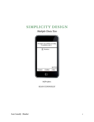
  • 1. SI MP LICITY DESIGN Multiple Choice Tests in ee spac SEAN CONNOLLY Sean Conno y Mumbai 1
  • 2. SI MP LICITY DESIGN Multiple Choice Tests Intro Simplicity for the user is damned complex for a designer. This paper will review the design solution to a multiple choice test taking interface on the Apple’s brand new iPod touch. Executive Summary As a class project, my teammate and I were tasked to design an multiple choice interface that leveraged the new power of the Apple made iPod touch. To address this assignment, we brainstormed, drank a lot of co ee, sketched personas, and user tested. The original project paper was close to 50 pages including paper prototypes . This portfolio sized reflection upon that larger project is a summary document to reflecting upon how I address such this. This reflection has five pages. Context Beloved professor, Marty Siegel, likes not only to assign contemporary design problems, he likes to flesh out real world environments within which the designing takes place: “..there were rumors flying around that Apple was to unveil a new se- ries of iPods, particularly one that include touch and Wi-Fi. And yes- terday, September 5, 2007, that’s exactly what happened.” “Our company, InteractiveFuture, knew that the iPod would inherit some of the features of the iPhone, but no one anticipated that it would come this soon. Our CEO, Marissa Sanders, called us together and told us that the quiz interface we had been developing for the web should now be for an iPod touch.” 1 That was Dr Siegel’s assignment. We had to re design the long standing multiple choice test interface to leverage any new a ordances an iPod Touch provides. We had two weeks. 1 Actually, I add the boldface on touch. Sean Conno y Mumbai 2
  • 3. Day I On Day One, we play with the iPhone because it has such a similar interface. We brain storm. We each have ideas. We decide it would help to have some personas. However, we don’t want to stop the brainstorming so we sketch two quick user profiles profiles with at tributes opposite each other and continue to run with our first inspired impressions. Step II We build out meaningful personas. My partner builds out a technophile teenager. I am stuck working on the crotchety old male persona who rejects technology yet, for some rea son, buys the cutting edge of technology iPod Touch so he can take multiple choice tests . Step III We break the multiple choice test into as many coherent pieces as possible: 1. Question & Answers : the test first breaks down into two parts: a the space within which the Question is presented, and; b the space within which the Answers are presented. 2. The Answers : Answers can be further deconstructed because they consist of two parts. a the meaningful content of the answer, and; b the signifier ‘A’,’B’, etc of the answer. 3. The Signifier : Signifiers can be broken down yet again. Signifiers are composed both: a the sign ‘A’, ‘B’, etc , and; b the selector. The selector is that which shows the audience that a choice has been made. Insight s At this point, I will refrain from adding new insights. I will talk only about events that hap pened during this project. However, after summarizing our experiences in the next few paragraphs, I would like to add my current insights into the design space of this problem: 1. The interface disappears : what distinguishes the iPhone interaction from other multiple choice tests is that you “reach out and touch” the information. You don’t bubble in an swer ‘B’ with your pencil, and, you don’t click answer ‘B’ with a mouse either. You touch it. Both of us noticed an immediate delight that arose simply from touching the informa tion directly. We realize there is no tool necessary during this action no pencil no mouse to click. Somehow that brings us enjoyment. We begin to wonder what other con ventions we might remove from the interaction, and, if removing them will bring delight. Sean Conno y Mumbai 3
  • 4. 2. Sliding around : another paradigm of the iPhone interaction is that we can slide and move information around almost at will. Because we can expand and slide and shrink and shift, we task ourselves to consider possibilities where the multiple choice test itself is no longer a stuck in static time in a static medium. 3. Multi touch : we note that we do not simply have a touch screen here. Touch screens have been around for quite awhile. What makes the iPod touch an innovation is that it reads a number of touch & gestural cues, many of which are universal action cues throughout the menus of the device. We understand that it will be helpful to leverage al ready existent cues and tendencies. Reconstruction Before reconstructing a solution, let us pause for a moment to ask, “What’s the big deal?” The multiple choice test question is harder than it originally seems. For questions with sin gle, discrete answers, like, “What is the largest city in India?”, the test is simple. There is one answer. Any user who chooses this answer gets it correct perhaps we signal correct ness to them with a flash and any user who did not choose this answer gets it wrong per haps signaling incorrectness with a large, red x mark X . But what if you can get partial credit on a question? Do you get half of flash then? Do you get a half large, half red x mark? We need a simple, meaningful way to communicate this. My partner and I would desperately like to use color. We feel that color and visuals add to a fun audience experience. However, we soon realize that appropriating common color signs will not fit our needs. We map out for ourselves common color signage: Sean Conno y Mumbai 4
  • 5. Red is always wrong. Red always signifies wrong. In contrast, green will often mean “go” when placed against red and these opposing colors sign “wrong” and “correct.” However, what is “partially correct?” Is it yellow, like a stoplight? It cannot be. Using yellow as the partially correct color means the user will still have to look at the partially correct answer and discern HOW did they get it partially correct. Did they miss an answer they should have picked? Or, did they pick an answer they should not have picked. My partner and I chart the formal logic of our answer possibilities and prove to ourselves that we will need to clearly present four di erent types of responses to the audience: x/y CORrect answer Answer NOT CORrect Answer chosen An, Cor An, - Cor Answer NOT chosen - An, Cor - An, - Cor There is no common color signage that addresses such a plurality of uses. So my partner and I know that color cannot answer this question coherently, and, seek a new direction. Space Since we have already deconstructed the problem into parts, we wonder if reassembling them in a piecemeal fashion will lead us to any new conclusions. We rearrange the multiple choice test into a wild variety of new test types all detailed in attached report : Since digital objects can move around this new innovative interface, we like playing with the idea of question “fields” and answer “fields.” We spend much of the time moving the basic, universal facets of the multiple choice test itself around. What if the Question goes in the middle? What if answers group towards corners? We like this idea of answers “grouping” because it smacks of Gestalt design and cognitive association “chunking” strategies. However, we realize that our second persona our crotchety old man won’t understand that this is a multiple choice test if the original pres Sean Conno y Mumbai 5
  • 6. entation is too unfamiliar. Because of our understanding of this user, we hesitate to change the original presentation of the multiple choice question too far from the common. However, because it is likely that our crotchety old man has had experience with the multi ple choice test framework, we KNOW he is expecting to find out whether he is right or wrong. So therefore, if we present this second step in a NEW way, he will be expecting this new way to present him with the same type of information “correct” vs “incorrect” . This is what we do. We simply group the correct answers near the question whether the user got the answer correct or not and let the user see which answers she picked in relation. User Tests We build a paper prototype complete with sliding interface and ‘selectable’ icons and run user tests in the library commons. When we run our questions by the test audience, there is no confusion as to what our questions mean, and, to what our answers mean. We do note that no one clicks “why” to find out more information about the question, but, test partici pants explained that they understood what “why” probably meant, and, since they had no interest in finding out more information on our test questions, ignored looking up “why?” Results Therefore, as every other interface in the class becomes some complex display of multi colored signage, our multiple choice interface becomes a simple presentation of what the user did right and what the user did wrong. Furthermore, by “grouping” the correct answers near the question, we hope to amplify in some small way the user’s learning curve. Furthermore, it was interesting to note how aggregating simple signs can simply convey complex information. It was interesting to note too with how much light elegance the user can di erentiate between a one pixel dotted line and a one pixel solid line. Next Steps What I do especially like about this bland, unusual interface, is that it puts no prior con straints as to what the “top level” of the interface “looks like.” Meaning, if the company wanted to do some cross promotions with this interface, they can. Imagine having the selection sign be Spider Man or Batman or Sponge Bob Square Pants. In this interface, it will present no confusion to have colorful, branded iconography replace the simple, dotted ‘A’ and ‘B’ boxes on the test. The test is still conducted and presented in the same, unique way, and, the experience of certain user groups is enhanced because they get to play with the interface “skin” iconography of their own, customizable choice. Sean Conno y Mumbai 6
  • 7. END OF SUMMARY Sean Conno y Mumbai 7
  • 8. BEGINNING OF ORIGINAL REPORT Sean Conno y Mumbai 8
  • 9. PART 1 – RESEARCH: DEVELOPING AN OBJECTIVE CRITERIA FOR DESIGN PERSONA SKETCHWORK To address the design, we wanted personas. However, when addressing the personas we contin- ued to talk about the design. Certainly our excitement for the design became a problem: it was taking our time away from crafting fully fleshed out personas. To address this problem we decided to lock-down two 'sketch' personas. We wouldn't fully de- velop their motivations for using the interface, or the context in which they used it. But we saw a value in locking-down their attitude toward technology and their past experiences with iPod Touch, as well as, similar digital artifacts. To cover our bases, we placed our 'sketch' users as far apart on the 'user' spectrum as possible. Below are the sketches we worked with: Persona #1 is a teenage techno-freak who knew everything about modern technology and who carried many mental assumptions about digital-touch artifacts. Persona #2 is a crotchety older user unfamiliar with technology in general, as well as, un- familiar with the iPod Touch touch-screen. BRAINSTORMING While the brainstorming continued over many days, and (likely) right up until the delivery of this design proposal, we will present the raw data of all the brainstorm- ing here, up front, so the reader has a clear mental model of our intentions as we progress through the iteration of this design. Because this information is “raw data” (in the Ebling & John sense), we do not seek to analyze the imagery intro- duced here, nor assess the patterns within it. We do not even attest that all the im- ages will be useful to the final design, nor to the core question we are to address. Sean Conno y Mumbai 9
  • 10. We only introduce these images here – and title them – so they may be logged in as data, and addressed by name later in the paper. A. Test at a glance Much of the original work focused on the techno-persona's need for information and flexibility. We figured this persona would want to 'bounce around' in the test and, say, skip ahead, or go back to earlier questions, or see which questions he/she had or had not answered (correctly?) in the past. To address this, we began to model our interface after the 'cover art' browsing interface of the iPod Touch. Sean Conno y Mumbai 10
  • 11. The idea was that our fickle test taker could skip ahead on the test – as say one might do on the S.A.T. test – and still be able to navigate quickly back to the first question. We assumed some color coding would be in order to signify which ques- tions were answered (say they were red), and which were unanswered (say they were white). The test taker would then just tap on the appropriate question and 'open' it. The Question piece would be placed at the top of this 'opened page,' and the an- swers would be present in a left-aligned column below it. Sean Conno y Mumbai 11
  • 12. Sean Conno y Mumbai 12
  • 13. B. Four Corner Controls Early on, we wondered if there might be some advantage to 'stabilizing' the more universal controls of the test by placing one in each of the far corners of the inter- face. While these 'four corner controls' seem to be a natural part of the iPod's already estab- lished 'cover art' search functionality, we thought we could separate this functionality into its own modular piece – no matter what our final design looked like. Sean Conno y Mumbai 13
  • 14. Again, our thought was that having four controls – say, 'preferences', 'confirm', 'ex- plain', and 'flexible' (whatever we later need it to be) – that remained stable in the fluctuating test-space would afford a sense of stability and control to the user. C. Geographically Placed Answers (Outside or Inside) Hoping to 'break free' of the traditional linear multiple-choice test format, we be- gan to play with a more geographic separation of answers. We first experimented with placing answer buttons in our four corners. We then experimented with a user interface with the answers grouped around a question at center. We felt this would be easy to thumb-touch, as well. Sean Conno y Mumbai 14
  • 15. In both of the above cases, we felt that this geographic reorganization of the test display would enable the device to show a large number of answers. Sean Conno y Mumbai 15
  • 16. D. Geometric Layout Design The following illustrates our experiments with geometric design. While the above category, (C) Geographic Layout, focuses on placing the buttons in certain unify- ing and stable “places” on the screen. The current category, (D) Geometric Layout, will focus on equitably dividing the shape of the answer fields relative to the shape (and space) of the question field. For example: Sean Conno y Mumbai 16
  • 17. We gained much insight from this experiment. First of all, using such a geometric device would allow us to clearly present many more answer choices to the user: Also, because we felt that a good answer system would respond uniquely to all four degrees of “correctness,” we could use the geometric layout design to 'group' the different classes of answers together. We could even use an animation to move from the geometrically designed ques- Sean Conno y Mumbai 17
  • 18. tions, and then provide 'feedback' on which of the answers were correct or incor- rect. Taking this approach to the extreme, we realized that we might merely place a “layer” of geometric lines over a field of “real space” with the question being the connector space in the middle of the top “layer” of geometry. This would mean that each answer field could have an infinite amount contained within it: Sean Conno y Mumbai 18
  • 19. In saying that each answer field can contain an infinite amount of information, we mean only that the answer field could be an open ended field. E. Buttons Much of our approach focused on deconstructing the mental model embedded in the mul- tiple choice quiz format itself. Were there presuppositions built into the model? What were they? What are the essential bits to a multiple choice test? What are the assumed bits? What does it mean that “the correct answer is 'B'?” What is B?? We wondered if we might erase these signifiers. We asked if it would be equally accept- able to use blank dots: Sean Conno y Mumbai 19
  • 20. Furthermore, we asked that if we didn't need letters to signify specific answer choices, did we really require numbers to specify which question is being asked? We also wondered whether this avenue had been explored before – over the history of de- signing multiple choice tests – and, if it had, were the current alpha-numeric signifiers of multiple choice tests an iterated, proven, and succinct way to organize multiple choice test information? We also wondered, is filling in a blank dot substantially equivalent to filling in any other form of boundary whether that boundary contained a letter within it or not? Sean Conno y Mumbai 20
  • 21. Sean Conno y Mumbai 21
  • 22. F. Hardware Button We also wondered if it might not be the most efficient to only use the iPod Touch hard- ware button, meaning, find some way to use the one external button for everything. G. Question and Answer Fields To help ourselves break the test apart, we broke the multiple choice test down into two basic fields. Every multiple choice test needs a place to display its question and answers. Sean Conno y Mumbai 22
  • 23. We also wanted to create a visual language for ourselves that signified 'scrolling,' so we used dotted lines extending beyond the plane of the question and answer fields. When taking paper-and-pencil multiple choice tests, the medium (paper) is static and can- not be altered by the user. However, with a dynamic digital interface, we experimented with this barrier. Perhaps “correctness” on a question could be signified by moving the correct answer OUT of the field of “multiple answers” and INTO the field with the ques- tion. Blending this idea with some of the previous notions, we experimented with moving the answer fields around the display to indicate incorrectness (on left) or correctness (at right). Sean Conno y Mumbai 23
  • 24. Essentially, we experimented with using physical proximity as a sign for correctness. H. Themes Throughout the brainstorming, we understood that we may end up with a large amount of signifiers. Being that these would be difficult to organize in a list of linear importance, we experimented with different “themes” for the visualization that would not necessarily im- pact the technical efficacy of the interface; but, that may make the combination of com- plex symbology more accessible to the new user. For example: THE BOOK In using the BOOK theme, we thought that we could cognitively persuade the user to 'flip through' the pages, and that this would coordinate to our test-at-a-glance concept. Furthermore, upon 'opening' a 'page,' the user would be cognitively accustomed to taking the test on this 'surface.' Sean Conno y Mumbai 24
  • 25. UNDERWATER We also experimented with another theme that was not as easy to draw out. The question was underwater and the answers were selected with bubbles which floated to the surface if correct and ‘popped’ if incorrect. I. Frames and Layers Lastly, because of the necessity of providing an explanation in this project, and, also in part due to our thoughts about the test-at-a-glance functionality, we thought we might at some point have to employ a series of 'frames' or borders to signify points of entry into the multiple choice test. Meaning, we strove to differentiate between when someone was ‘us- ing’ the test interface – the use of the interface being the core of the problem – and, when someone was using different pieces ‘around’ the interface – say, when the explanation was being provided (not part of the core), or when they flipped through the test-at-a-glance (not part of the core). DESIGN OF GOALS AND MANTRA MANTRA: Sean Conno y Mumbai 25
  • 26. “ Reach out and touch it.” As much as possible, we would like to minimize the number of “tools” and “signs” that might otherwise be employed. PHASES: Phase I: Reduce preconceptions of the pencil-and-paper Multiple Choice Quiz Phase II: Reduce preconceptions of the designers Phase III: Reduce preconceptions of display (reduce all tools and signs) DESIGN GOALS: To elucidate, it is goal of this design to deconstruct the presuppositions that may have be- come invisibly embedded in the multiple choice test taking “culture” after its history of use in academia and the market. After seeking the primitive concepts of multiple choice test-and-response systems, we then seek to reassemble these 'naked' pieces of sign into an elegant and simple interface that delivers all answers requested. PERSONAS PERSONA #1: JACOB BENSON Sean Conno y Mumbai 26
  • 27. Jacob Benson is a 17-year-old student in his junior year at High School North in Bloomington, Indiana. He has decided to stay in Bloomington for his undergraduate education, and has already been accepted into the computer science program at Indiana University’s School of Informatics. Jacob was exposed to computers at a very young age by his father Jeff, who was involved with several start-up software companies in the 1980s and 1990s. Jacob’s values are typical for any 17-year-old in America. He can be considerate and thoughtful, and enjoys helping others, but often exists “in his own world,” often represented by a hand-held digital device, a video game, or something that he finds interesting on the web. Jacob labels himself as a “techophile.” Since his father has the same affliction, Jacob’s knowl- edge of computers and technology was fostered at an early age, and the appropriate “gadgets” were always lying around the house. As Jacob took on a part-time job, the money he earned al- lowed him the opportunity to buy new “gadgets” for himself. He keeps himself extremely in- formed about the technology market, what new products are coming out, and when they are go- ing to be released. It is Jacob’s personal mission to be one of the first people to get these new technologies. For example, he saved his money for six months and stood in line for 16 hours in order to have a chance at getting the iPhone. Jacob was ecstatic when his math teacher at High School North informed the class that future multiple-choice tests were going to be administered on the new iPod Touch. The school received a grant through the Indiana New Technology into Classrooms program, which would provide the school with enough iPod Touch devices to distribute to each member of a particular class for the purpose of administering tests. Many of Jacob’s teachers already know that they will be the ones learning from him when it comes to using the iPod Touch. Sean Conno y Mumbai 27
  • 28. PERSONA #2: DR ARMANDO REYES Dr Reyes emigrated to the United States from Chile in 1942. He was already twelve years old and had already been working in the fields for seven years. When his family moved to the Mid- west, he saw that agriculture was already a declining industry and chose to approach the factories for work. They did not want twelve year old boys working in their factories. He dismissed their response proudly and said he could accomplish what any two grown men could accomplish. They persisted in rejecting Armando and he persisted in politely rebuffing their rejections. He showed up at the office door for seven weeks straight until they gave him a job. He was a gopher in the office. As a “go for” boy, Armando was tasked with delivering informa- tion from the boss to the managers and from the managers to the boss. On occasion, he would get special assignments which would take him to the factory floor. He loved being in the factory. He loved the big machines. He loved the fiery sparks. He loved the choreographed chaos of the factory and loved to watch the big iron machines create other big iron machines. But his job was in the office, and, most days, in the office is where stayed, running to and fro be- tween executives. But Armando soon realized that the executives never had time to read the memos he was bringing them; they always asked Armando. “Just tell me what this says,” they would say to him. Unfortunately, at that time, Armando couldn't read. But he did not let this become a short coming. And so, at nights after work, in the office and fac- tory, Armando taught himself to read. He was not successful at first and it frustrated him. He Sean Conno y Mumbai 28
  • 29. had no teacher. Yet Armando was certain that the ability to read would allow him to advance, and so, he fought through the frustration. Armando learned to read. Soon he was telling the executives what the memos said. And soon enough, Armando was so well informed that the executives would tell Armando what to say, and, Armando would transmit the new information to the other executives verbally. Armando became so aware of the affairs of the company that they began informally inviting him into the business meetings. When he had just turned sixteen, they formalized his importance to the company by making him an adminis- trative assistant. It wasn't long, though, before he was an executive. Armando continued his business learning, but his heart remained in the factory. As an executive, he convinced the boss that it was important to have a “man on the floor” in the factory to accu- rately assess the goings-on of the plant and to accurately communicate the needs of the execu- tives to the supervisors there. He would ask inquisitive questions and the supervisors and plant workers were excited to finally have someone from the office taking an interest. So they showed him everything he wanted to know about the plant. He began to love the big machines more and more – and he began to talk with the engineers. And this is how Armando became a mechanical engineer. As he aged, Dr Reyes became a very prominent figure in his industry. He helped develope the first automated machines at his factory when he brought his plant's real world problems into class, and he helped optimize the process of construction by bringing the real world problems of his plant to his school – where he had already finished his Masters degree and was now working on his Doctorate. In the late 1970s, Armando was on the top of his game. He was successful and happy. When the “new age” of computers really took hold in the 1980s, Armando was able to hire many new “computer people” from prominent colleges to work at the factory. He was always amused by them because they all believed that the simple language of computers would someday be as im- portant as the big mechanical machines that Dr Reyes knew so well. Sean Conno y Mumbai 29
  • 30. It is now the year 2007. Dr Reyes begrudgingly bought a cell phone about three years ago be- cause his granddaughter wanted to be able to call him wherever he may be. He complained at first, but enjoyed this new communication device immensely. When his granddaughter bought a new phone last year, it had a camera built into it and she wanted to send him some pictures of herself. But his outdated cell phone had no camera, and he hated the idea of spending fifty more dollars to buy a new phone just to be able to take picture. Imagine his surprise when he heard about the iPhone. When he played with it in the store, he was amazed at its functionalities: Armando proudly admits that he had never before had to use the internet to find information – he remembers things. And so, as unlikely as it may seem, Dr Reyes – who doesn't even use the Internet – bought an iPhone and brought it home the other day. He doesn't really understand much of the functionality yet, but, he has found one 'techno- gimmick' that he thinks he would like to try on this ‘techno-gimmick’ of a phone: it's a multiple choice trivia test. Armando is very proud of his memory. He has used his memory as a 'weapon' many times ver- sus the 'kids' with their computers who think they know so much. He has never used the Inter- net. However, being a very proud man, Armando is just going to force his way blindly through this obstacle and try to learn as much about its inner workings as he can. It's how he has always ap- proached new problems. PART 2 – MODELING: Sean Conno y Mumbai 30
  • 31. IMPLEMENTING AND ITERATING OUR CHOICES DESIGN GOALS AND ASSUMPTIONS Having had broken down the Multiple Choice Test as much as possible, and, having fleshed out our disparate personas, we can now begin to construct an interface for the iPod iTouch. GOALS Task: The goal of the project task is to create a universal multiple choice test inter- face for the iPod Touch that can be used in any situation Design: The goal of our design is to make this interface as simple as possible. ASSUMPTIONS we do assume that using one sign to signify an action is better than using two signs to signify an action we do assume that it is more simple to use a single sign with multiple facets than it is use multiple signs with fewer facets we do assume that by maximizing the simplicity of signifiers in this feedback signaling system, we will be able to afford the most complexity of response ROAD(S) NOT TAKEN PURPOSE The purpose of this section is to illustrate how young Jacob Benson and Dr Armando Reyes – our two fully fleshed personas – affect the choices we make as designers. LAYOUT The geometric and geographic layouts that we experimented with in our design had to be decided against because they did not accord with the conventional and established mental model of a generic Multiple Choice Question Test. The designers feel that before any us- Sean Conno y Mumbai 31
  • 32. ers begin to interact with our MCQT interface, they must first recognize that it is indeed a Multiple Choice Question Test. We feel that there must be some “Multiple Choice Ques- tion”ness to the design that communicates clearly the user is indeed about to engage in a Multiple Choice Question Test. And furthermore, that it would be correct and beneficial if the user were to pull his mental model of MCQ tests to the fore. We will use the standard mental model of the paper-and-pencil MCQ test to our advantage. Dr Armando Reyes was instrumental in making these decisions. While Jacob had a digital-cultural facility that likely would have enabled him to engage with any interface, Armando would have too difficult a time even understanding what this interface was. Not that he is not smart – he is. Not that he is not technologically inclined – he is. But he is not digitally savvy, and being a man immersed in mechanical engineering, he likely places much faith in familiar, concrete objects. But, because he does have a facility with concrete objects, and because he is familiar with manipulating concrete objects in new and familiar ways, we did figure that if we could somehow stabilize Armando and ground him in a familiar setting, then, he would be able to accept change from that point. If we could make him comfortable, and remind him that he is familiar with this MCQT interface – if we could make it an island of familiarity within this unfamiliar iPhone – then Armamdo may feel some initial reassurance that he will be able to navigate the rest of this device. Unfortunately, this meant that many of our “fun” designs were inappropriate to this mo- ment of interaction. The geographic placement of the answers at the iPod's four corners was not familiar to Armando – and so, not acceptable. The geographic placement of the answers around a question in the center of the page was not familiar to Armando – and so, it was not acceptable. The geometric placement of the answers in 'fields' around the ques- tion would not be familiar to Armando – and so, it was not acceptable. Being that our goal is to construct a simple, and universal multiple choice test that can be used in any situation, we had to dismiss most of our clever ideas. Sean Conno y Mumbai 32
  • 33. SELECTION OF ANSWERS The selection of answers actually breaks down into several parts. The user must: be able to understand that a selection needs to be made be able to understand how he is to make his selection touch (in this case) the selection understand that his selection has been made, and confirm (in this case) his selection Also, for our goals, the user must be able to select more than one answer in the appropri- ate situation and the user should be aware when such situations are presented. Because of our mantra - “to reach out and touch” - our inclination was to do away with all 'selection buttons' on the interface and let the user directly touch the answer. We hoped that allowing the user to directly touch the information would allow for a more seamless experience between questioning and answering. There were several flaws with this logic. A quick consultation with Jacob Benson will reveal that there is a pervasive functionality of the iPod touch-screen where users “touch-scroll” through linearly presented informa- tion. This “touch-scroll” ability is used widely in applications on the iPod Touch. This comes into conflict with our design because our Answers are presented to the user in an analogously linear fashion. Because this “touch-scroll will be a familiar paradigm in the mental model of iPhone-friendly people like Jacob Benson, we felt it was best not to allow our answers to be selected just by touching any portion in the answer field, for a user may accidentally choose unwanted answers every time they are scrolling through the an- swer list. Furthermore, as much as we still commit to the mantra of “reach out and touch” for this device, there is a certain part of the MCQT mental model, we feel, that actually doesn't Sean Conno y Mumbai 33
  • 34. care what the answer to the question is. Not the *user* but the *model* itself. Though a Multiple Choice Question test has concrete answers, the MCQT mental model does not have concrete answers to questions built into it. It is an abstraction. There is no answer for the mental model, there is only “A, B, or C.” The model knows the test is to be taken in this format. With Dr Reyes, we find that the familiar mental model of the MCQT is the only thing keeping him attached to this test. If the familiar parts of the layout or selection criteria veer out into unfamiliarity, we fear he may become lost. This insight also suggested that we further choose against our experiment signifying an- swers through blank dots. While our experimental analysis of a blank dot MCQT showed no test-centric reason that the answers had to be coded with additional signifiers (like “A,” “B,” or “C,”), we did feel that there was a user-centric loss of control when the buttons of choice were just blank dots. This was even more apparent when we experimented with taking away the Question numbers as well (i.e. Question #1, Question #2, etc). While for many MCQ tests, there might be no reason for the user to know which question he/she is on, there is just too much of a tremendous loss of stability, orientation, and order when no signifiers are present inside blank selection dots. After running these experiments past our personas, we were forced to choose against them as well. DISPLAY OF INTERFACE ANSWERS Our original decision was to signify correct answers with a green color, and, wrong an- swers with a red color. Because some users will be color-blind, it was decided to add a customization in our “con- trols” button that would allow color-blind users to choose a graphic-pattern signifier that would alert them as to which answers were correct and which were not. Sean Conno y Mumbai 34
  • 35. However, even though we passed this color-blind issue, we could not wrap our minds around a way to represent all the different “types of wrong” a user could be in an MCQ test situation. When displaying the answers to a multiple choice question, there are two binary issues at play. The first issue is, which answer(s) did you choose? The second is, which answer(s) is correct? Let us call the answer you chose, “An” (with the corresponding negation “- An”), and, the correct Answer being “Co” (with the corresponding negation “- Co”). The combinatorial permutations are summarized below: x/y Correct answer Answer NOT correct Answer chosen An, Cor An, - Cor Answer NOT chosen - An, Cor - An, - Cor It is easy to see in this table that there is only one case where the user picks the completely correct answer case (An, Cor). However, there are three cases where the MCQT answers are in some fashion “incorrect.” It is important to recognize further that the above table only says that there are three de- grees of wrong. It does not mean there can only be a maximum of three wrong answers. There can be as many wrong answers as there are Answers to the Question (actually, one less) – however, all of the wrong answers will be one of three different types of wrong. This is what the table states. Clearly then, more colors would be needed than just red to signify different types of wrong. However, adding additional colors to the red & green schema reduces the effectiveness of the red & green mental model. Meaning, if you put green in a field of orange, yellow, and pink, green doesn't necessarily mean “correct,” “good,” “go,” “move ahead,” and all the other things we intended to connote with our “green is correct” coloration. Likewise, red is less of a “danger,” “stop,” “wrong,” color when place among blue, white, and pink. It is Sean Conno y Mumbai 35
  • 36. only in the relative binary duality that red & green communicate “yes” and “no” effec- tively. Clearly then, adding more colors to signify which type of wrong is being addressed *weakens* the ability of the original colors to communicate effectively at all. Still though, we tried to continue using color. We experimented with putting different per- centages of red or green in the field of our Question. So if, say, the user got seventy per- cent of the Answer correct and the rest of it some types of wrong, the Question field would 'fill up' with green to seventy percent; and the rest would be the different colors or patterns that would signify different types of wrong. We saw both Mr Benson and Dr Reyes being frustrated by this onslaught of uncommon colors. However, when stuck with trying to imagine how to makes sense of displaying all these different types of wrong along with the correct answer, it occurred to us to ask: Do we really have to signify all the different types of wrong? Because no matter how hard we tried, we could not get color to work as an option in this interface. To further address this (perceived) 4-pronged division of answers, we tried using the geo- metric layout design as a 'Answer feedback' layout rather than a 'Question asking' format. This geometric approach – pushing the four different answers to four different corners – finally satisfied our goal of separating the four different types of answers (1 completely correct, and 3 different types of wrong) to four different corners of the page. The quadrant which held the completely correct response was then colored green, and, the remaining quadrants were left black. We left the “wrong” coloration out because this “field” ap- proach allowed us to visually segregate the different types of wrong that grid-quadrants dictate. Sean Conno y Mumbai 36
  • 37. Both of our personas liked this. While Jacob has an affinity for most things unusual or unconventional, Dr Reyes enjoyed the strength and breadth of feedback response. Neither persona was particularly excited by this new development, but, neither objected. Unfortunately, after doing all this work to find a way to meaningfully convey all four types of response, we began to feel it was wrong to place all of the questions and answers in an equal relationship. Meaning, we had four size-set quadrants, and every answer went into one of them. While this may indeed be a fine feedback system, it does not really connote the ideals of a “test.” There is no clear “winner” or “most correct choice” out of all of these. The interface visualization does not echo the goal of the instrument. There was the potential for cognitive dissonance to arise. So, after successfully achieving a model which could meaningfully convey all four types of “incorrectness” through geometry, we chose against using this. TEST-AT-A-GLANCE While much of our early research experiments focused on fitting the Multiple Choice Quiz format into the test-at-a-glance ability described earlier, we finally decided this functional- ity did not actually address the core needs of this particular interface. Because of this, the test-at-a-glance feature will not become a function of our final design. However, the young persona Jacob Benson reminded us that tests like the S.A.T. allow the user to skip ahead and answer questions in any order. Because they could skip ahead, he would want the functionality to show him which questions he had previously skipped. However, as discussed, this functionality was discovered to not be part of the core re- quirements and, as such, we will not comment further. ABILITY TO SEE AN EXPLANATION Sean Conno y Mumbai 37
  • 38. Regarding giving the user an ability to get an explanation about the answers to the ques- tions, there were really ever only two issues: 1.Do we impose explanations on the user? 2.If not, how do we make the ability to see an explanation apparent? Number One was quickly addressed by our persona Jacob Benson. Jacob hated having the information imposed on him. He was a technical user of the younger generation and he considers the impositions placed on him by inconsiderate digital media to be intolerable. Furthermore, in our persona world, Jacob and teenagers like him will be taking the S.A.T. on this iPod Touch interface. Given their mental state at this time, and, their need for speed, Jacob would be frustrated even more by the intrusion of unwanted explanations. Since our personas helped us choose against imposing explanations on the user, we then had to find a way to signify access to an explanation. Since we did actually end up using this approach in our initial design, we will transition now to the rationale, functionality, and design of our initial design. EXPLANATION OF INITIAL DESIGN The design of the multiple choice test interface is compatible with both the horizontal and verti- cal positioning of the iPod Touch. The display will adjust based on the position in which the de- vice is being held. If at any time during the test, the test participant wishes to change the view from vertical to horizontal, or vice versa, they can do so by physically changing the orientation of the device in their hands. Effort was made in the test’s screen layout, to make sure both orien- tations displayed the test with equal clarity and functionality. In other words, we didn’t want the vertical or horizontal orientation of the device to be a factor in how affectively the participant could take the test. To do this, we included a “control panel” on the screen that houses three but- tons; the ‘control’ button, the ‘confirm’ button, and the ‘next’ button. When the orientation of the iPod Touch is vertical, the control panel runs across the bottom of the screen. When the orienta- Sean Conno y Mumbai 38
  • 39. tion is horizontal, the control panel is in the same location, now on the left or right side of the screen, depending on whether the participant turned the iPod Touch clockwise or counterclock- wise. If the test is started with horizontal orientation, the default position for the control panel is on the right side. Initially, all touch buttons in the test consist of a letter or a word outlined with a dotted-line box, which indicates that the button is unselected (all buttons except the ‘why?’ button). When a but- ton is selected the dotted-line box becomes and solid-line box (with the exception of the ‘con- firm’ button. The confirm button automatically activates (solid-line box) after any other button is selected. The confirm button must then be touched to perform the desired function. If the par- ticipant chooses the press one or more answer choice buttons, they will activate, the confirm but- ton will activate, and then the confirm button must be touched to finalize the selection of the an- swer or answers. The same function applies to the ‘control’ and ‘next’ buttons. If the participant wishes to proceed to the next question, they must activate the ‘next’ button, which will activate the ‘confirm’ button, and then by touching the ‘confirm’ button, the screen will display the next question. The participant can select the ‘control’ button in the same manner. The importance in the ‘confirm’ button is in alleviating participant confusion or frustration with the accidental se- lection of buttons, given the nature of touch interface. The ‘control’ button will provide the test participant with a separate ‘control screen,’ where they can alter the test settings (display settings, button size, font size) and view the ‘test-at-a-glance,’ allowing them to go back to previous questions, see which questions might have been skipped, and see how many questions remain in the test. This feature is outside of the “core” of this de- sign issue, and in a real-world design setting, another team would be focusing on it. We only in- clude a brief explanation as a means to justify the placement of the ‘control’ button on our test screen. SELECTION OF ANSWER(S) In addition to the ‘control panel,’ the screen is divided into two other sections; the question field and the answer field. The question field is always located across the top of the screen (whether the iPod Touch is oriented horizontally or vertically). The answer field is always located directly Sean Conno y Mumbai 39
  • 40. below the question field. The two fields are separated by a solid line and are independent of each other with regards to touch. If the question is lengthy and is not entirely displayed, the partici- pant can navigate the question by touching the question field, without producing any response in the answer field. Similarly, if the answers are lengthy or it there are several answers and they cannot all be displayed on one screen, the participant can navigate the answer field by touching it, with no response occurring in the question field. Once the participant has read the question, they select their answer choice(s), indicated by the selected buttons becoming solid instead of dotted. It is our thinking that the difference between the dotted line and solid line is a more universal display of ‘selected’ and ‘unselected’ than the use of color, shading or symbols, particularly when addressing questions with multiple answers. For instance, in a simple multiple choice question with four answer choices (A, B, C, and D), with only one answer being the correct one, the approach is not so complicated. If one box was selected, it could be shaded, or change color, or have a symbol or icon applied to it and it would be clear which answer was the selected one. In a question with six possible answer choices (A, B, C, D, E, and F), with three correct answers, the solution is more complicated. If three answers are selected by the participant, and only indicated by a change in color or shading, the participant could become confused with which answers were selected and which answers are unselected, especially after taking time to reread the question, think about the answers, or alter the test set- tings. After the answer(s) is selected and ‘confirm’ is selected, the results are displayed. DISPLAY OF CORRECT ANSWER(S) As a question result is being displayed to the test participant, an animation moves the correct an- swer(s) (both letter button and text), to the top of the answer field, positioned directly below the question. The incorrect answer(s) (only letter button – text is dropped), move to the bottom of the answer field. Again, our goal was to alleviate the need for color or symbols to indicate right and wrong. Col- ors and symbols can be very effective when dealing with only one correct answer. In the event Sean Conno y Mumbai 40
  • 41. of multiple correct answers, the solution is more complicated. Red and green can represent a natural indicator of right and wrong, but do not stand alone when dealing with multiple answers, where answers marked correct lead to the overall question being correct. This could require ad- ditional colors or symbols. We sought to display correct and incorrect answers through a spatial relationship. Correct an- swers are elevated, and separated from the incorrect answers. When the separation takes place, the selected answers are still indicated by a solid-line box, while the unselected answers are indi- cated by a dotted-line box. The participant can clearly see the correct answer(s) elevated to the top of the answer field, the incorrect answer(s) dropped to the bottom of the answer field, and which answers from either group were selected or unselected. EXPLANATION ABILITY After the correct and incorrect answers are separated in the answer field, a button appears be- tween the two groups that simply asks ‘why?’ The ‘why?’ does not require the use of the ‘con- firm’ button and, when selected, opens a window in the answer field (positioned in the space be- tween the correct and incorrect answers) that provides an explanation of the correct answer(s). What is displayed in the window depends on the test, the specific question, and who is adminis- tering the test. The window might display a link to a Wikipedia entry on the subject, a picture or diagram that represents the correct answer(s), or some explanatory text entered by an instructor or test administrator. Selecting the ‘why?’ button is optional, and if the participant is not inter- ested in any explanation or the test is being timed and the participant feels that they need to move on quickly, they simply touch ‘next’ and ‘confirm’. PART 3 – EVALUATION: Sean Conno y Mumbai 41
  • 42. USABILITY TESTING AND RESULTS For the initial test of our design mock-up, we conducted a standard usability test on two different participants, starting with a brief description of the iPod Touch interface. We then guided them through a set of multiple choice questions, gathering feedback on the functionality of our test de- sign, and concluded with a post-test interview to gather overall user reaction and feedback. One team member facilitated the test, asking the participant to navigate the multiple choice test, prompting the participant to provide feedback, and gathering concluding insights from the par- ticipant after the multiple choice questions were completed. The other team member observed and recorded the participant’s use of the multiple choice test interface, the feedback provided during the test, and any concluding remarks. Our initial design mock-up used in usability testing was a low-fidelity paper test with graphics created in Microsoft Paint. The participant was presented with a piece of paper with a graphic of an “actual-size” iPod Touch containing the test interface on the screen. Individual buttons were cut out and placed on the interface when the participant made the decision to select (touch) a par- ticular button. Another piece of paper would be presented to show a result or reaction by the in- terface. Whenever the participant was required to scroll through lengthy questions, answers, or explanations, the appropriate part of the piece of paper was cut out, and another piece of paper with the desired information was placed underneath. This was a low-fidelity method of mimick- ing the touch interface and allowed the participant to touch the screen and scroll through infor- mation (question, answers, explanation) as they would on an actual iPod Touch. For each usability test, the participant navigated three multiple choice questions, each question representing a different question type in regards to how it was presented on the interface (please see Sketches and Mock-Up for Initial Design). The first question is very standard. It asks “The largest city in India (according to population size) is:” The question is short and fits easily into the question field. The answers choices are: A – Dehli, B – Mumbai, C – Chennai, and D – Calcutta. Again, the answers are short and fit eas- Sean Conno y Mumbai 42
  • 43. ily into the answer field. An answer is selected, the correct answer elevates to the top of the an- swer field, the incorrect answers drop to the bottom of the answer field, and the ‘why?’ button appears in the answer field between the correct answer and incorrect answers. The device orien- tation for this question is vertical, so the ‘control panel is along the bottom with the ‘control’ but- ton, ‘confirm’ button, and ‘next’ button. The second question is more complicated. The question asks: “Which is this artist’s self- portrait?” (There is a picture of Picasso in the question field, below the question. The answer field includes four (A, B, C, and D) images of paintings, all portraits. The four images of por- traits are too large to be display all at once, so the participant must scroll through the answers using the touch interface. The results of Question 2 transpire in a way similar to Question 1. The third question is perhaps the most complicated. The question asks: “The colors of the South Korean flag are (select all that apply):” In this question, there are multiple answers; A – Red, B – Blue, C – Green, D – Orange, E – Black, F – White, and G – All of the Above. Multiple answer buttons may be selected, and multiple answer buttons may remain unselected. The correct an- swer(s) still elevate to the top of the answer field and the incorrect answers still drop to the bot- tom. The spatial differential between the correct and incorrect answers, along with the indication of selected or unselected answers, not only illustrates to the participant whether the overall an- swer is correct or not, but illustrates partial correctness as well. USABILITY TEST PARTICIPANTS TEST PARTICIPANT #1: KATE Kate is an Indiana University graduate student. She exhibited an awareness of the iPhone touch interface, but was not fully familiar with its functionality. She indicated that she was comfortable and familiar with a standard multiple choice test format. Sean Conno y Mumbai 43
  • 44. TEST PARTICIPANT #2: MOLLY Molly is an Indiana University undergraduate student. She said that she had never seen an iPhone and had essentially no knowledge of its functionality. She also indicated that she was comfortable and familiar with a standard multiple choice test format. USABILITY TEST RESULTS PARTICIPANT #1: QUESTION #1 Kate reacted in a very intuitive manner when seeing the initial interface and when presented with the first question. She decided on an answer choice and immediately touched the button representing that answer choice. This action activated the ‘confirm’ button, which she promptly touched. Kate had a negative reaction to the next screen. She had answered the question incorrectly, and her answer choice dropped to the bottom of the answer field, while the correct answer elevated to the top. She was confused by this and felt that her answer choice should have elevated to the top of the answer field. She remarked that “it was confusing to have an answer that I didn’t pick highlighted by the system.” Kate showed little reaction to the ‘why?’ button. She said that, upon seeing it, she assumed that it might offer some more explanation of the answers, but she was relatively uninterested. PARTICIPANT #1: QUESTION #2 Kate also reacted in a very intuitive answer to the second question. She scrolled through the answer choices using the method that we constructed to mimic the actual movement of the touch screen. She selected her answer choice and touched the ‘confirm’ button. Kate made the correct answer choice on this question, but was still uninterested in pursuing an explanation using the ‘why?’ button. She clearly saw the button, understood its function, but remarked, “As a first-time user, I would ignore any explanations.” PARTICIPANT #1: QUESTION #3 Kate answered the third question with no trouble at all. After reading the instructions and Sean Conno y Mumbai 44
  • 45. realizing that multiple answer choices applied to the question she intuitively selected her answer choices and touched the ‘confirm’ button. In this instance, she was eager to select the ‘why?’ button because she assumed that the explanation for this question would be the form of an image, an assumption that was correct. PARTICIPANT #1: CONCLUDING REMARKS Kate’s overall impression of the multiple choice test interface was that it was “really straightforward and really simple.” She intuitively navigated the test questions with overall ease and confidence. Her level of understanding of the interface grew noticeably with each question. When we asked her for feedback on what she didn’t like and what could be improved upon, she provided us with some very insightful remarks. She didn’t initially respond well to the correct answer elevating to the top of the answer field, especially when she answered the question incorrectly. Following the first question, she understood what the elevation of an answer indicated and was no longer confused. Kate’s overall lack of interest in the ‘why?’ button was partially rooted in the term “why” itself. She indicated that a term such as “explanation” would be a better fit. Kate also remarked that she would like explanation built into the incorrect answers, not just the correct ones. PARTICIPANT #2: QUESTION #1 The multiple choice test interface was entirely intuitive to Molly. On the first question, she immediately selected an answer button and then touched the ‘confirm’ button. When the correct answer elevated to the top of the answer field (even though she selected an incorrect answer choice), she quickly understood that the spatial differential between the two sets of answers indicated which of the answer(s) were correct and which of the answer(s) were incorrect. She indicated that she understood the purpose and function of the ‘why?’ button, but was relatively uninterested in pursuing it for any further explanation. PARTICIPANT #2: QUESTION #2 On the second question, Molly very easily scrolled through the answers choices, representing the Sean Conno y Mumbai 45
  • 46. only significant formatting difference between the first and second questions. PARTICIPANT #2: QUESTION #3 The third question represented the most complicated set of answer choices, but posed no real threat to Molly’s understanding. She answered the question with partial correctness and, upon viewing the results, remarked, “There were four correct answers. The two I selected activated but there were two others that should have been selected. The wrong answers were at the bottom.” PARTICIPANT #2: CONCLUDING REMARKS Molly found our design relatively simple. When asked about the ‘why?’ button, she indicated that if the multiple choice test was a study tool, she would be more inclined to seek additional explanation. “Like the SAT prep test,” she said. Molly concluded with stating that, “anyone using this test interface already knows the iPod Touch and wouldn’t have any problems.” USABILITY TESTING ANALYSIS Overall, the user testing was successful in illustrating the straightforward and simplistic elements we had hope to achieve with this design. Both participants were able to easily navigate the test interface and felt that is was easy to understand. CONSIDERATIONS FOR DESIGN CHANGE Through the usability test results and the test participant’s concluding remarks (based on our post-test questions), as well as, collaboration with colleages, we have identified some main issues we would like to address in regards to our final design. They are as follows: We need to address the explanation function (the ‘why?’ button) and how its functionality could change, making it a more appealing feature to the user. We need to consider a means of displaying explanation for answers that are incorrect and at the bottom of the answer field. Sean Conno y Mumbai 46
  • 47. We need to further consider how the interface functions when answer choice are large, when there are multiple answer choices, and a combination of the two. PART 4 – EVALUATION: SUMMATION OF FINAL PROJECT DESIGN We have addressed, and even attacked, the core problem in question with our design. The screen layout is simple and intuitive to users, and the test-taker is provided with adequate feedback that addresses the core problem. Even in the event of a complex multiple choice question with mul- tiple answers, we succeed in signaling feedback to the test-taker about the overall correctness of the answer, signaling which of the multiple answers was correct, incorrect, or unmarked, signal- ing the correct answer(s), and providing the test-taker with a means to an explanation; within the Sean Conno y Mumbai 47
  • 48. size constraints of the iPod Touch and with a design that minimizes (and sometimes alleviates altogether) a dependency on “tools” such as color and symbols. Our usability test results suggested that we should consider a new direction for the explanation feature, represented in our interface by the ‘why?’ button. However, the issue was not with the usability of the explanation feature, but with how interested the test-taker was in pursuing any further explanation. We have decided to leave the feature in our design, relatively intact, with the hope that certain question types or testing scenarios (a study guide for example), will result in the explanation feature receiving more attention. The ‘why?’ button was a feature that was embedded in our design from the beginning. We haven’t changed it, but have opened it up to a fuller extent of possibilities. The ‘why?’ button and the window that its selection leads to, is how we have chosen to address the explanation of incorrect answers (an issue outlined by one of our user test subjects) and the explanation for complex and lengthy answers that cannot be effectively grouped and displayed in the answer field. The explanation window has become an open-ended feature, ultimately controlled by the test instructor or administrator, that displays and organizes information in a variety of ways. In our initial design, the correct answer(s) was elevated to the top of the answer field, but was still represented by both the corresponding answer button and the answer text itself. The incor- rect answers at the bottom of the answer field were only represented by the answer button, the text having disappeared. In our redesign, the ‘why?’ button will allow for explanation of the incorrect answers. Also, in the event of correct answers that are complex and lengthy and can’t effectively fit at the top of the answer field, the correct answers will only be displayed by the corresponding answer button. Explanation will be provided for those answers in the explanation feature. Thinking back to our personas, the simplicity of our design coupled with our intuitive interface to a highly-recognizable test format will lead Dr. Reyes to explore this new technological device with ease and comfort. Jacob Benson will adapt very quickly to the interface’s functionality and greatly appreciates the opportunity for this device to enter his classrooms. Sean Conno y Mumbai 48
  • 49. Any question displayed on this multiple choice test interface, no matter how simple or how com- plex, is addressed by the design in the same manner. The amount of information displayed on the screen by the test interface may vary with the complexity of the question, but how the inter- face addresses that constraint is the same method it uses to address a question that is less com- plex, and so on and so forth, until it is apparent that the simplest and the most complex questions aren’t that different from each other in the eyes of our design. We began this design process with a goal that represented, above all else, simplicity. After matching the design with our personas, conducting usability tests, analyzing usability test results, and redesigning, we can simply state that the answers to the core problem are embedded in the constraints that we placed on our design. Sean Conno y Mumbai 49