EVALUATION QUESTION 2
How do the elements of your production work together to create a
sense of "branding"?
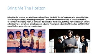
Bring Me The Horizon
Bring Me the Horizon are a British rock band from Sheffield, South Yorkshire who formed in 2004.
They are signed to RCA Records globally and Columbia Records exclusively in the United States.
The style of their early work, is primarily described as deathcore, but they started to adopt a more
eclectic style of Metalcore on subsequent albums. Their latest album BMTH marked a shift in their
sound to less aggressive rock music styles
In order to assess our own production, I wanted to first look at examples
from other Metalcore bands and examine how typical it is to directly
link websites, music videos and digipak.
I would also like to investigate how likely it is for bands to change in
order to reflect new releases.
How tightly integrated are other bands text’s?
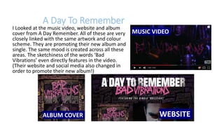
I Looked at the music video, website and album
cover from A Day Remember. All of these are very
closely linked with the same artwork and colour
scheme. They are promoting their new album and
single. The same mood is created across all these
areas. The sketchiness of the words ‘Bad
Vibrations’ even directly features in the video.
(Their website and social media also changed in
order to promote their new album!)
WEBSITEALBUM COVER
MUSIC VIDEO
A Day To Remember
Bullet For My Valentine
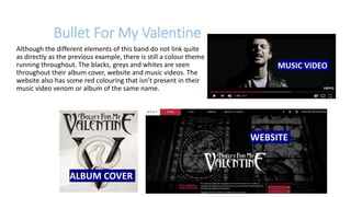
Although the different elements of this band do not link quite
as directly as the previous example, there is still a colour theme
running throughout. The blacks, greys and whites are seen
throughout their album cover, website and music videos. The
website also has some red colouring that isn’t present in their
music video venom or album of the same name.
MUSIC VIDEO
WEBSITE
ALBUM COVER
Bring Me The Horizon’s
existing branding
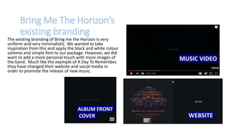
The existing branding of Bring me the Horizon is very
uniform and very minimalistic. We wanted to take
inspiration from this and apply the black and white colour
scheme and simple font to our package. However, we did
want to add a more personal touch with more images of
the band. Much like the example of A Day To Remember,
they have changed their website and social media in
order to promote the release of new music.
MUSIC VIDEO
ALBUM FRONT
COVER WEBSITE
Bring me the horizon’s existing
audience consists approximately of
60% male and 40% females of
between the ages of 16-25. To try and
understand how they appealed to each
gender, I took a look at the
merchandise available on their
website, which you can see on the next
slide.
Bring Me The Horizon’s existing audience
GUYS CLOTHING
GIRLS CLOTHING
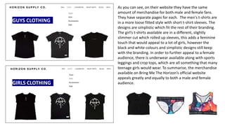
As you can see, on their website they have the same
amount of merchandise for both male and female fans.
They have separate pages for each. The men's t-shirts are
in a more loose fitted style with short t-shirt sleeves. The
designs are simplistic which fit the rest of their branding.
The girl’s t-shirts available are in a different, slightly
slimmer cut which rolled up sleeves, this adds a feminine
touch that would appeal to a lot of girls, however the
black and white colours and simplistic designs still keep
with the branding. In order to further appeal to a female
audience, there is underwear available along with sports
leggings and crop tops, which are all something that many
teenage girls would wear. To summarise, the merchandise
available on Bring Me The Horizon’s official website
appeals greatly and equally to both a male and female
audience.
Our Package for
Bring Me The Horizon
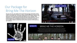
As you can see, we really stuck to the dark grungy minimalist colour
scheme and approach that is so often used by Metalcore bands. The
colour correction we used when editing the music videos allows it to
link even more with the overall dark theme of our package. The
website has a black background layered with white text, very similar
to the digipak. As I mentioned previously, we wanted a personal
touch and so added a slideshow with various picture of the band to
our website.
WEBSITE
MUSIC VIDEO
DIGIPAK
Who is our branding
aimed at? (Primary and
Secondary target audiences)
Primary Audience:
Males aged 16-25
Secondary Audience:
Females 16-25, Males and Females 25-60
Are we changing the
branding? If so, why?
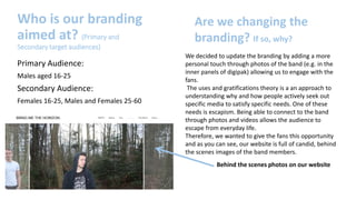
We decided to update the branding by adding a more
personal touch through photos of the band (e.g. in the
inner panels of digipak) allowing us to engage with the
fans.
The uses and gratifications theory is a an approach to
understanding why and how people actively seek out
specific media to satisfy specific needs. One of these
needs is escapism. Being able to connect to the band
through photos and videos allows the audience to
escape from everyday life.
Therefore, we wanted to give the fans this opportunity
and as you can see, our website is full of candid, behind
the scenes images of the band members.
Behind the scenes photos on our website
What role did social media
play in binding these
elements together?
Social media was a really crucial aid in binding all of our package together.
We used it to share updates (such as the music video being ‘released’),
behind the scenes content but most of all to promote and share other
aspects of the package.
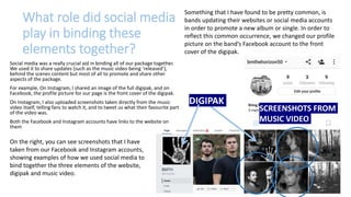
For example, On Instagram, I shared an image of the full digipak, and on
Facebook, the profile picture for our page is the front cover of the digipak.
On Instagram, I also uploaded screenshots taken directly from the music
video itself, telling fans to watch it, and to tweet us what their favourite part
of the video was.
Both the Facebook and Instagram accounts have links to the website on
them
SCREENSHOTS FROM
MUSIC VIDEO
DIGIPAK
On the right, you can see screenshots that I have
taken from our Facebook and Instagram accounts,
showing examples of how we used social media to
bind together the three elements of the website,
digipak and music video.
Something that I have found to be pretty common, is
bands updating their websites or social media accounts
in order to promote a new album or single. In order to
reflect this common occurrence, we changed our profile
picture on the band’s Facebook account to the front
cover of the digipak.
CREATED BY
Thank you for watching

Evaluation question 2

  • 1.
    EVALUATION QUESTION 2 Howdo the elements of your production work together to create a sense of "branding"?
  • 2.
    Bring Me TheHorizon Bring Me the Horizon are a British rock band from Sheffield, South Yorkshire who formed in 2004. They are signed to RCA Records globally and Columbia Records exclusively in the United States. The style of their early work, is primarily described as deathcore, but they started to adopt a more eclectic style of Metalcore on subsequent albums. Their latest album BMTH marked a shift in their sound to less aggressive rock music styles
  • 3.
    In order toassess our own production, I wanted to first look at examples from other Metalcore bands and examine how typical it is to directly link websites, music videos and digipak. I would also like to investigate how likely it is for bands to change in order to reflect new releases. How tightly integrated are other bands text’s?
  • 4.
    I Looked atthe music video, website and album cover from A Day Remember. All of these are very closely linked with the same artwork and colour scheme. They are promoting their new album and single. The same mood is created across all these areas. The sketchiness of the words ‘Bad Vibrations’ even directly features in the video. (Their website and social media also changed in order to promote their new album!) WEBSITEALBUM COVER MUSIC VIDEO A Day To Remember
  • 5.
    Bullet For MyValentine Although the different elements of this band do not link quite as directly as the previous example, there is still a colour theme running throughout. The blacks, greys and whites are seen throughout their album cover, website and music videos. The website also has some red colouring that isn’t present in their music video venom or album of the same name. MUSIC VIDEO WEBSITE ALBUM COVER
  • 6.
    Bring Me TheHorizon’s existing branding The existing branding of Bring me the Horizon is very uniform and very minimalistic. We wanted to take inspiration from this and apply the black and white colour scheme and simple font to our package. However, we did want to add a more personal touch with more images of the band. Much like the example of A Day To Remember, they have changed their website and social media in order to promote the release of new music. MUSIC VIDEO ALBUM FRONT COVER WEBSITE
  • 7.
    Bring me thehorizon’s existing audience consists approximately of 60% male and 40% females of between the ages of 16-25. To try and understand how they appealed to each gender, I took a look at the merchandise available on their website, which you can see on the next slide. Bring Me The Horizon’s existing audience
  • 8.
    GUYS CLOTHING GIRLS CLOTHING Asyou can see, on their website they have the same amount of merchandise for both male and female fans. They have separate pages for each. The men's t-shirts are in a more loose fitted style with short t-shirt sleeves. The designs are simplistic which fit the rest of their branding. The girl’s t-shirts available are in a different, slightly slimmer cut which rolled up sleeves, this adds a feminine touch that would appeal to a lot of girls, however the black and white colours and simplistic designs still keep with the branding. In order to further appeal to a female audience, there is underwear available along with sports leggings and crop tops, which are all something that many teenage girls would wear. To summarise, the merchandise available on Bring Me The Horizon’s official website appeals greatly and equally to both a male and female audience.
  • 9.
    Our Package for BringMe The Horizon As you can see, we really stuck to the dark grungy minimalist colour scheme and approach that is so often used by Metalcore bands. The colour correction we used when editing the music videos allows it to link even more with the overall dark theme of our package. The website has a black background layered with white text, very similar to the digipak. As I mentioned previously, we wanted a personal touch and so added a slideshow with various picture of the band to our website. WEBSITE MUSIC VIDEO DIGIPAK
  • 10.
    Who is ourbranding aimed at? (Primary and Secondary target audiences) Primary Audience: Males aged 16-25 Secondary Audience: Females 16-25, Males and Females 25-60 Are we changing the branding? If so, why? We decided to update the branding by adding a more personal touch through photos of the band (e.g. in the inner panels of digipak) allowing us to engage with the fans. The uses and gratifications theory is a an approach to understanding why and how people actively seek out specific media to satisfy specific needs. One of these needs is escapism. Being able to connect to the band through photos and videos allows the audience to escape from everyday life. Therefore, we wanted to give the fans this opportunity and as you can see, our website is full of candid, behind the scenes images of the band members. Behind the scenes photos on our website
  • 11.
    What role didsocial media play in binding these elements together? Social media was a really crucial aid in binding all of our package together. We used it to share updates (such as the music video being ‘released’), behind the scenes content but most of all to promote and share other aspects of the package. For example, On Instagram, I shared an image of the full digipak, and on Facebook, the profile picture for our page is the front cover of the digipak. On Instagram, I also uploaded screenshots taken directly from the music video itself, telling fans to watch it, and to tweet us what their favourite part of the video was. Both the Facebook and Instagram accounts have links to the website on them SCREENSHOTS FROM MUSIC VIDEO DIGIPAK On the right, you can see screenshots that I have taken from our Facebook and Instagram accounts, showing examples of how we used social media to bind together the three elements of the website, digipak and music video. Something that I have found to be pretty common, is bands updating their websites or social media accounts in order to promote a new album or single. In order to reflect this common occurrence, we changed our profile picture on the band’s Facebook account to the front cover of the digipak.
  • 12.