1. Ayesha Iqbal
LA109
AS MEDIA STUDIES
CASE STUDY
Analysis of Mojo Magazine
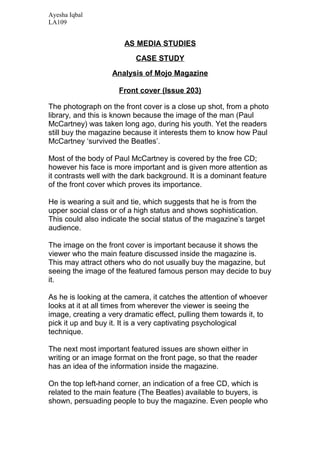
Front cover (Issue 203)
The photograph on the front cover is a close up shot, from a photo
library, and this is known because the image of the man (Paul
McCartney) was taken long ago, during his youth. Yet the readers
still buy the magazine because it interests them to know how Paul
McCartney ‘survived the Beatles’.
Most of the body of Paul McCartney is covered by the free CD;
however his face is more important and is given more attention as
it contrasts well with the dark background. It is a dominant feature
of the front cover which proves its importance.
He is wearing a suit and tie, which suggests that he is from the
upper social class or of a high status and shows sophistication.
This could also indicate the social status of the magazine’s target
audience.
The image on the front cover is important because it shows the
viewer who the main feature discussed inside the magazine is.
This may attract others who do not usually buy the magazine, but
seeing the image of the featured famous person may decide to buy
it.
As he is looking at the camera, it catches the attention of whoever
looks at it at all times from wherever the viewer is seeing the
image, creating a very dramatic effect, pulling them towards it, to
pick it up and buy it. It is a very captivating psychological
technique.
The next most important featured issues are shown either in
writing or an image format on the front page, so that the reader
has an idea of the information inside the magazine.
On the top left-hand corner, an indication of a free CD, which is
related to the main feature (The Beatles) available to buyers, is
shown, persuading people to buy the magazine. Even people who
2. Ayesha Iqbal
LA109
don’t usually buy it, they may be attracted to the ‘free’ CD and
decide to buy it, especially if it is difficult to get hold of.
The title is of the largest font type; however it is covered slightly
obscuring the magazine name. This could be interpreted as it
being targeted at a very specific and niche audience, who are
already familiar with it.
The masthead has two images of people who are also featured
inside, one of them titled ‘Unseen’, which displays mysteriousness
further encouraging the reader to buy it and reveal for themselves
the hidden components of the artist, Bob Marley.
Behind Paul McCartney is another image of the rest of the Beatles
members. It is obvious that the rest of the Beatles members are
presented as having less importance because they are standing
behind Paul McCartney.
Down the right-hand side, there is a column depicting what else is
featured, informing the reader as much as possible, to show value
of the magazine for their money.
As the magazine is targeted at a specific and niche audience (72%
male and 36% AB), it aims to specifically attract to these
audiences by presenting in a professional and appropriate way.
The main colours used are black red and white, mainly because
black and red are colours which usually associate with the way
classic rock is perceived in most of the Western world, the white
also stands out against the dark background, making the text
easily read.
The masthead, initially should attract the reader, with its colour and
information, however, in this specific issue, the masthead is black,
the same as the background, but it still makes the images stand
out as the contrast is effective.
The font used is generally standard and commonly used, as it is
aimed at the higher end of the social status; it attains the level of
professionalism required.
The magazine front cover does not refer to the website itself but a
Mojo website does exist, allowing self promotion, and benefits the
3. Ayesha Iqbal
LA109
magazine publishers, as the cost of advertising through other
companies could be very high, and decrease profits. However, it
does not have a radio station or television channel, perhaps due to
the very small number of audience, which limits it for promotion.
The magazine costs £4.50; compared to many magazines it is
quite expensive. This shows that the audience at which it is aimed
is affluent as it can afford to spend this much on a magazine.
Representational issues identified are gender, which is male. This
is obvious, as the magazine content is filled with male images and
products for males. Also, the colour schemes used attract the
mostly a male audience. A typical stereotype of rock artists is that
they take drugs; the picture of Bob Marley smoking ‘spliff’ conveys
this message as negative but almost true, as he is representing
the rock genre, by being featured in Mojo.
The language is very formal and clear, aiming to attract a niche
audience of the A/B social category.
The magazine is produced by a major corporate German
company called Bauer. This means that the magazine producers
do not have to spend so much money on advertising, but can
easily promote Mojo magazine through the other magazines part
of their company such as ‘Empire’, ‘Kerrang’ and ‘Q’. This is
because these magazines are mainly aimed at a male audience
and have similar music genres which could attract and make the
‘Kerrang’ or ‘Empire’ magazine readers aware of Mojo magazine
as well.
Institutional factors do affect the look of the magazine; as the
target audience is affluent and dominantly male, the magazine
overall is professional, informed and uses less bright colours that
are nonetheless effective. Also, there are no images on the front
cover or inside of women; this clearly suggests that it is a male
targeted magazine and the producers have the power to influence
and represent classic rock to appeal and interest males much
more than females.
Contents page
4. Ayesha Iqbal
LA109
The opening left hand side page has an advertisement of a rock
music documentary by amazon.co.uk covering the whole page.
This is advertised in the magazine because it relates to the specific
genre of Mojo. Also, through advertising, do the Mojo producers
attract their audience with relevant products, and at the same time
make money to promote other product companies. On the right, is
the contents page showing a list features discussed inside. There
is also a medium shot image of Bob Marley on the right. On top of
the page is the title of the magazine again, under it information of
the issue number and date of issue. The date is also important
because it tells the reader whether they are buying/reading the
latest issue or not.
The advertisement on the opening left hand side page is linked to
the genre of the music magazine, as it is commentated as
‘irresistible’ by Classic Rock magazine. This link between the
comment of Classic Rock magazine and the advertisement is
further evidence that Mojo is also a classic rock magazine.
There are three different font types, indicating importance, such as
the title of the magazine, colours that link for example the page
numbers and the feature titles.
An image of Bob Marley on the contents page represents him as
the second most important person to Paul McCartney discussed in
the magazine. All the images on the contents page indicate what is
featured in the magazine.
Language is targeting the audience by being clear, concise and
informative, as the audience is affluent males. E.g.: Cover Story:
‘...For Paul McCartney, it meant boozing, battling... “I survived” he
tells Tom Doyle’
The contents page has a grey background, red page numbers and
black featured titles, because these colours are generally
associated with the classic rock genre, in the West.
Double page
5. Ayesha Iqbal
LA109
The title on the double page spread ‘High times’ has a double
meaning. On the one hand, it indicates the ‘golden age of reggae
(1975-6)’ and Bob Marley ‘at the peak of his powers’ and on the
other hand the photograph of him smoking ‘spliff’ signifies him
getting ‘high’ on drugs.
The article seemingly attempts to discuss issues which are likely to
intrigue readers familiar with Bob Marley, as he seems a very
influential person who is passionate about his music. The article
also says that people have asked whether Bob Marley was Jewish
because of the ‘chai’ necklace he was wearing, but it is simply
because ‘chai’ means ‘life’ directly linking to the title and the
photograph of him and referring to his life at that point.
The picture covers most of the two pages, with some text on the
left hand side page, perhaps because his pictures are so ‘rarely
seen’, that the publishers decide to give their readers full
advantage to see it.
There are four types of fonts used, mainly to distinguish between
the title and the article. Different font types also make the article
look readable and interesting and less daunting, unless the topic
discussed is fascinating in which case, of course the reader would
prefer more text to pictures.
The register is aimed at adults so the language is formal and
informative. E.g.: ‘...intangible’.
The colours red yellow and green in the title ‘High Times’ represent
the Caribbean. This links to Bob Marley’s origin, Jamaica. His top
is green and yellow which also represents his country.
The artist (Bob Marley) is discussed, and how rare his portraits
are, so this could engage the audience who are familiar with him,
especially his fans. The fact that photos of him, which are so rare
have been collected, this would most likely intrigue readers familiar
with him.
6. Ayesha Iqbal
LA109
The title on the double page spread ‘High times’ has a double
meaning. On the one hand, it indicates the ‘golden age of reggae
(1975-6)’ and Bob Marley ‘at the peak of his powers’ and on the
other hand the photograph of him smoking ‘spliff’ signifies him
getting ‘high’ on drugs.
The article seemingly attempts to discuss issues which are likely to
intrigue readers familiar with Bob Marley, as he seems a very
influential person who is passionate about his music. The article
also says that people have asked whether Bob Marley was Jewish
because of the ‘chai’ necklace he was wearing, but it is simply
because ‘chai’ means ‘life’ directly linking to the title and the
photograph of him and referring to his life at that point.
The picture covers most of the two pages, with some text on the
left hand side page, perhaps because his pictures are so ‘rarely
seen’, that the publishers decide to give their readers full
advantage to see it.
There are four types of fonts used, mainly to distinguish between
the title and the article. Different font types also make the article
look readable and interesting and less daunting, unless the topic
discussed is fascinating in which case, of course the reader would
prefer more text to pictures.
The register is aimed at adults so the language is formal and
informative. E.g.: ‘...intangible’.
The colours red yellow and green in the title ‘High Times’ represent
the Caribbean. This links to Bob Marley’s origin, Jamaica. His top
is green and yellow which also represents his country.
The artist (Bob Marley) is discussed, and how rare his portraits
are, so this could engage the audience who are familiar with him,
especially his fans. The fact that photos of him, which are so rare
have been collected, this would most likely intrigue readers familiar
with him.