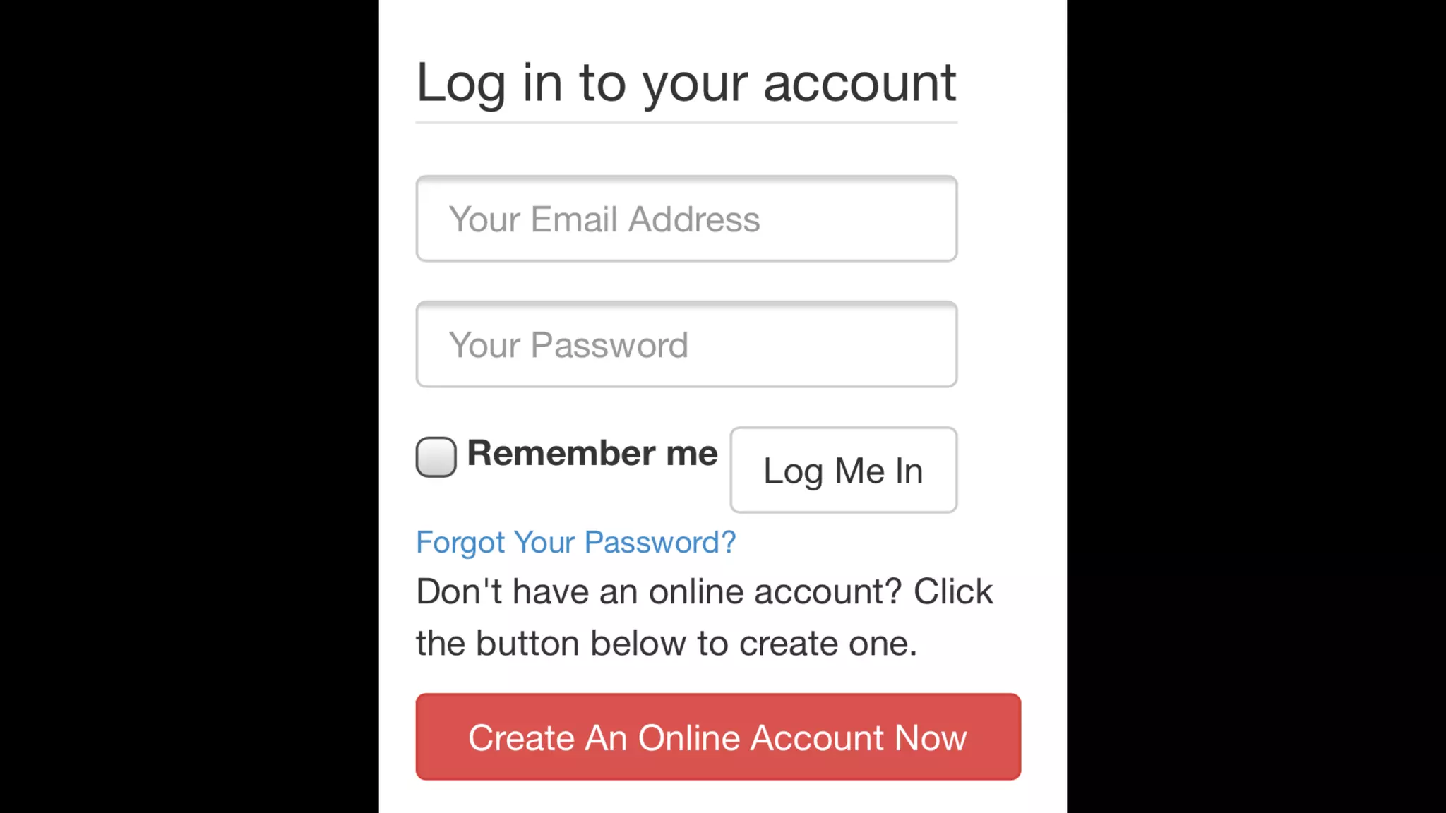
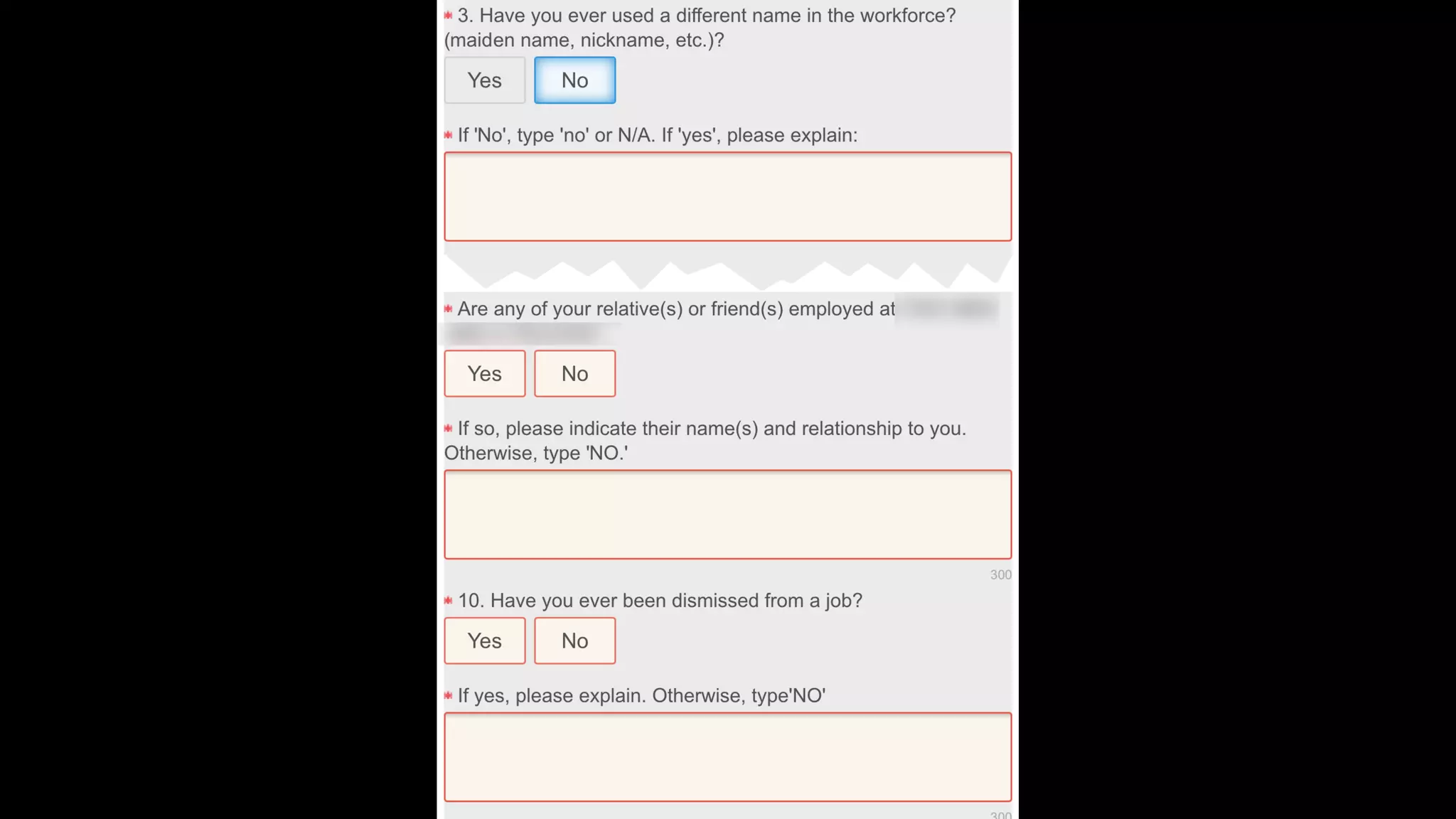
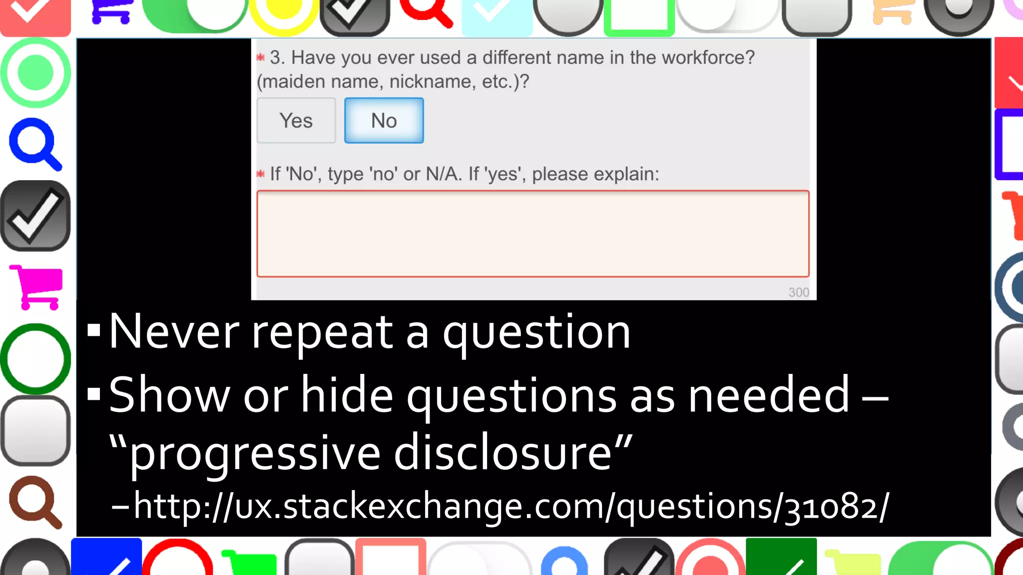
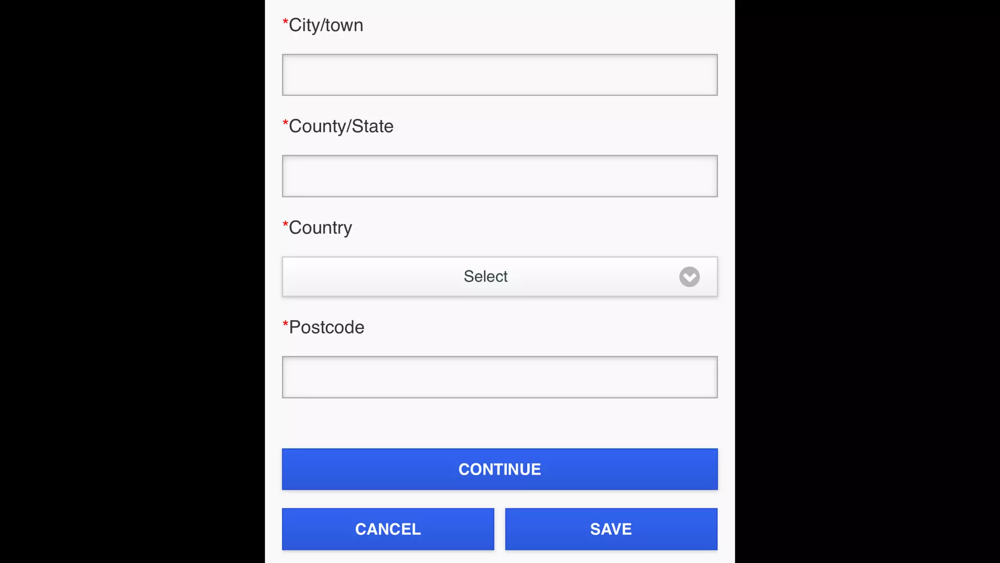
Download to read offline


![@malekontheweb
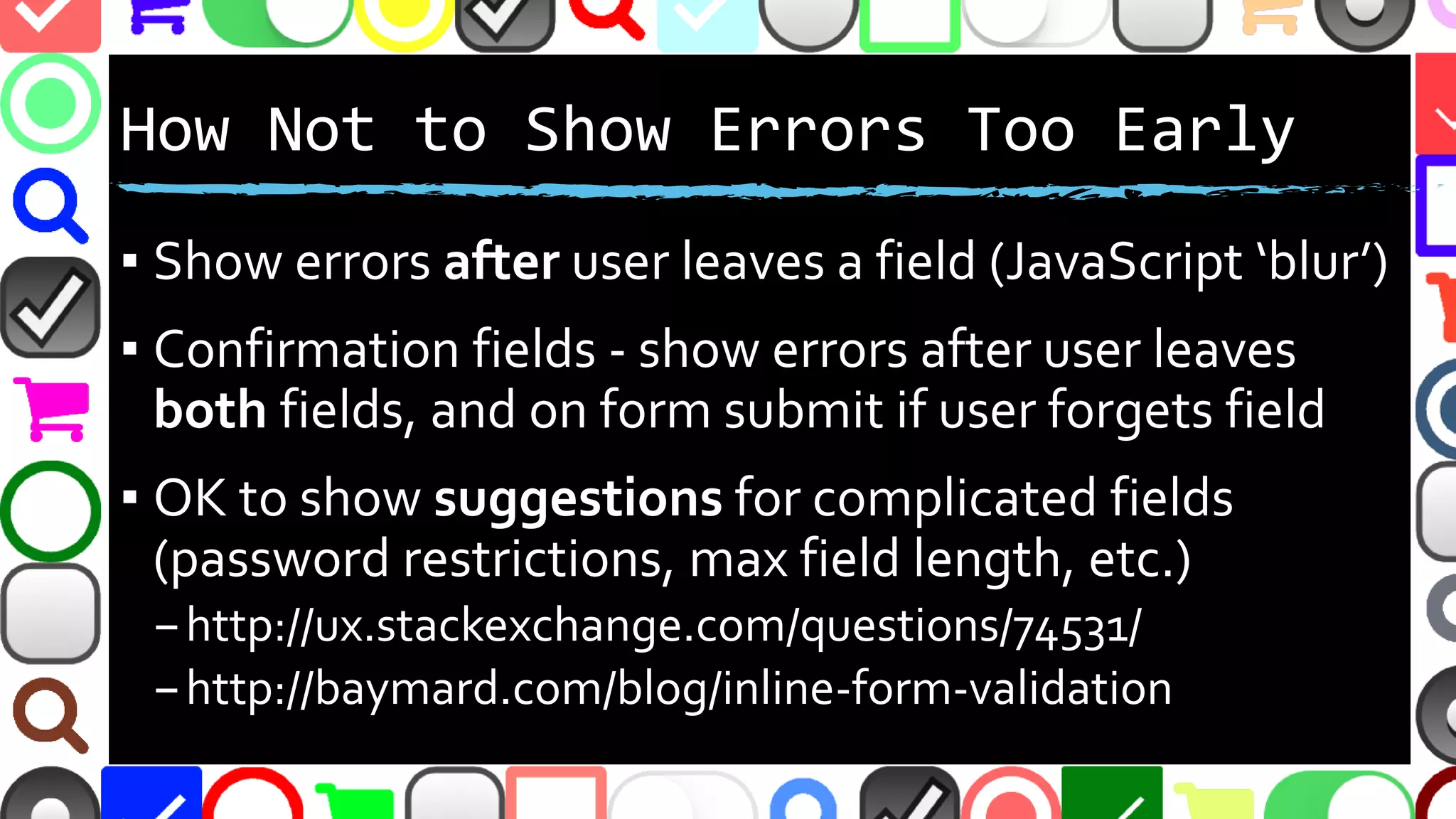
However...
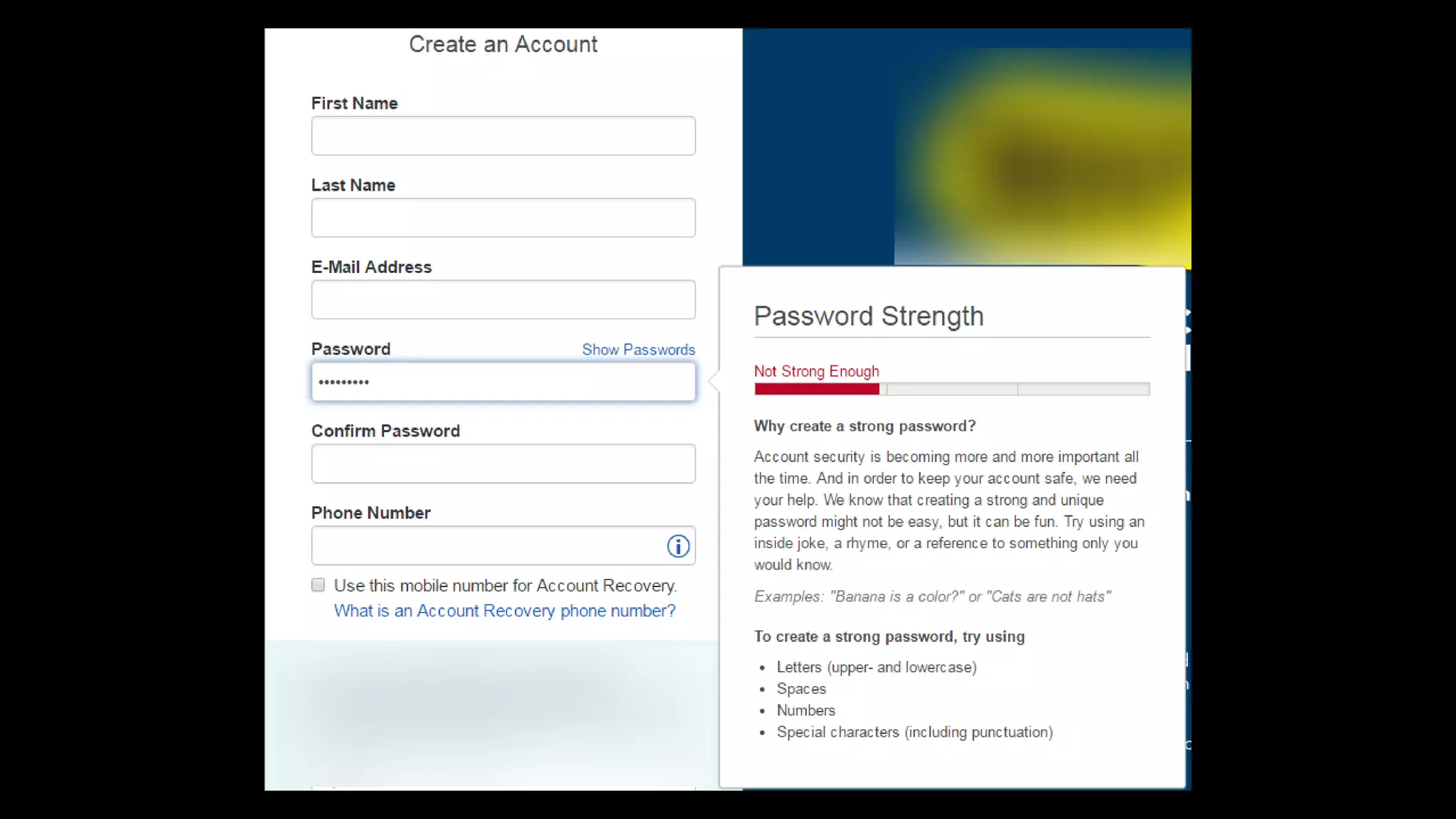
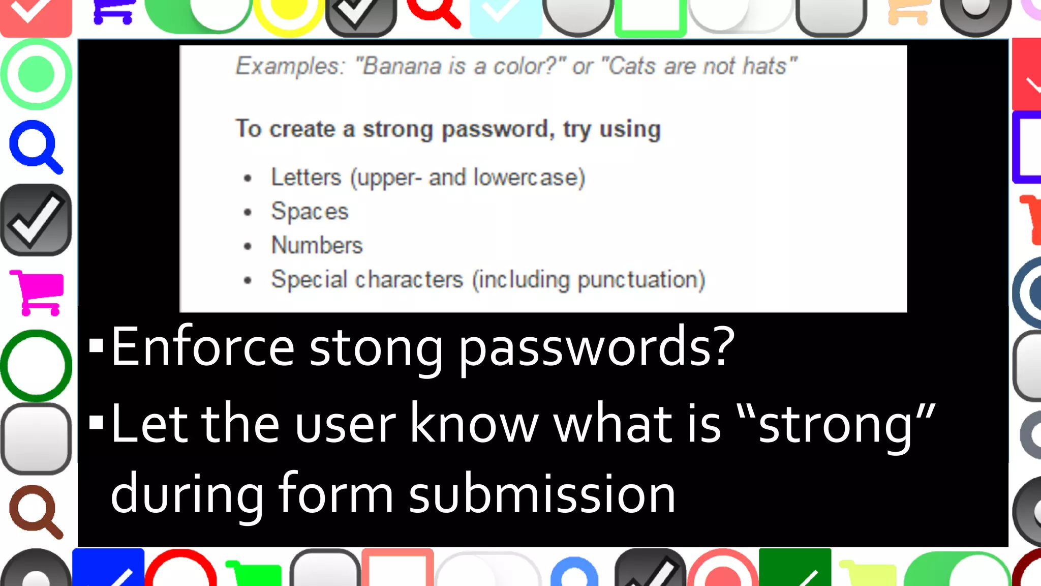
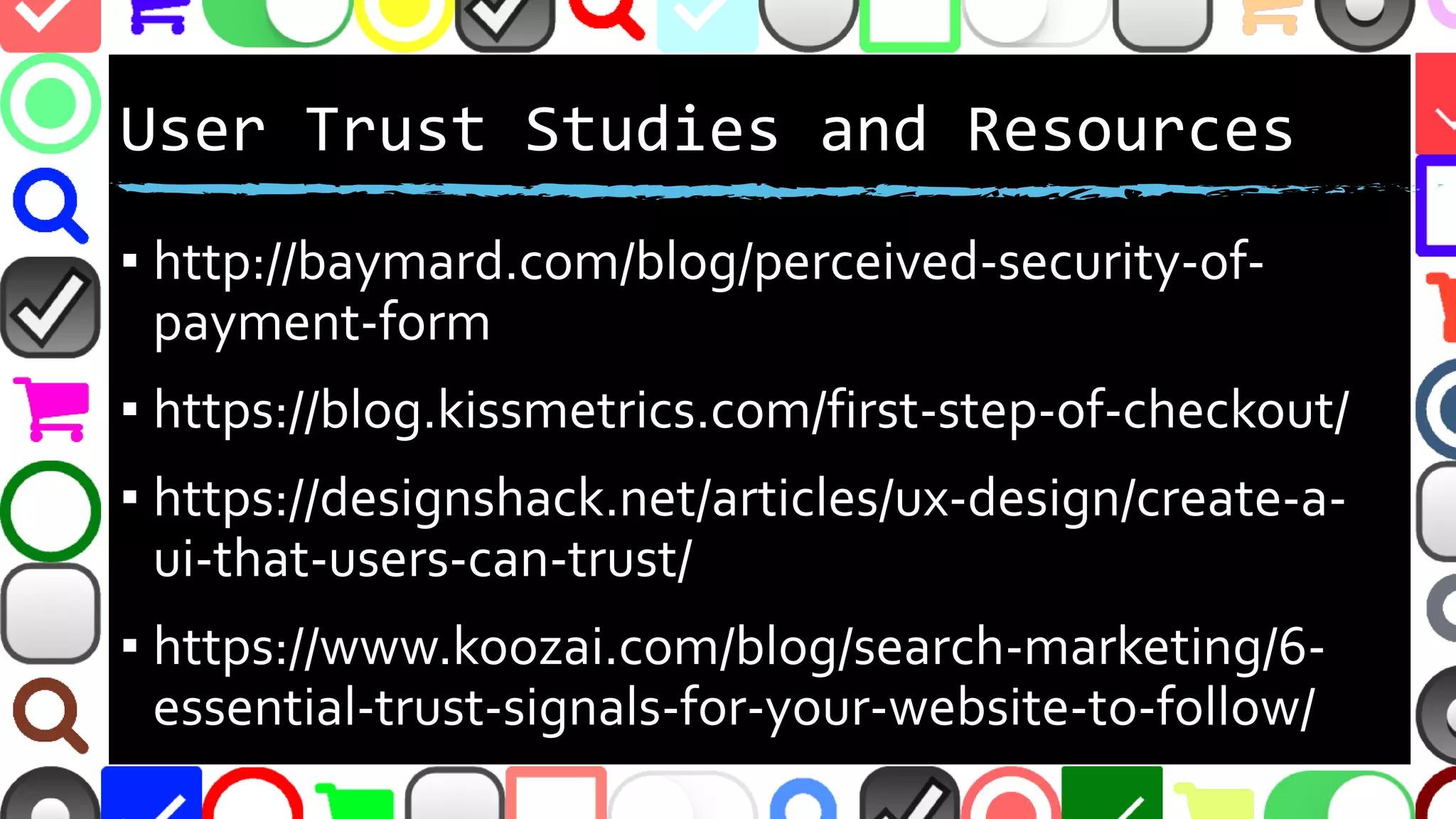
▪ “[S]trict password rules can cause an 18.75%
checkout abandonment rate among existing
account users as they try to sign in”
–Baymard Institute
–http://baymard.com/blog/password-requirements-
and-password-reset
▪ You’ll have to decide…](https://image.slidesharecdn.com/whynobodyfillsoutmyforms-161021153309/75/Why-Nobody-Fills-Out-My-Forms-42-2048.jpg)


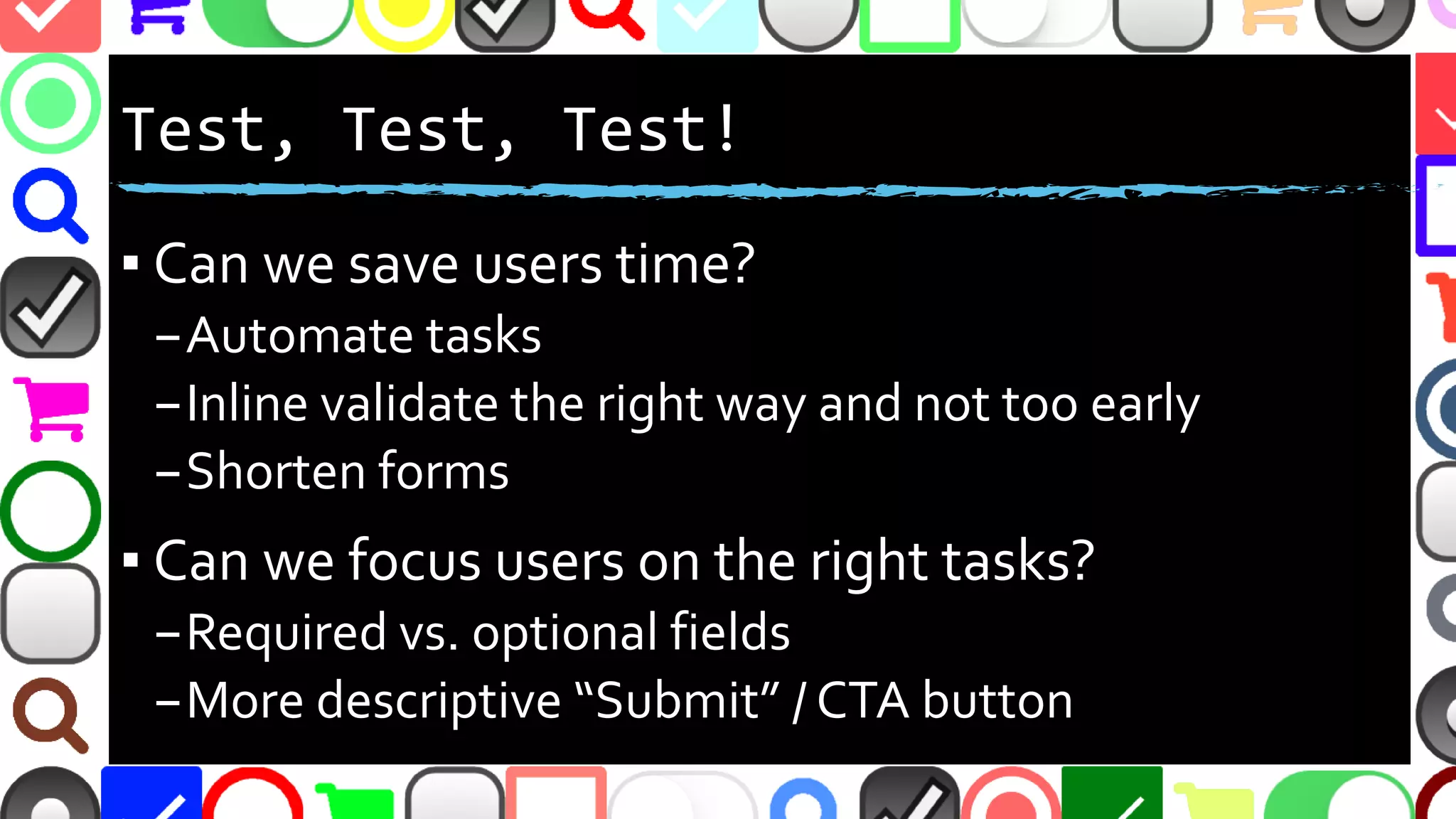
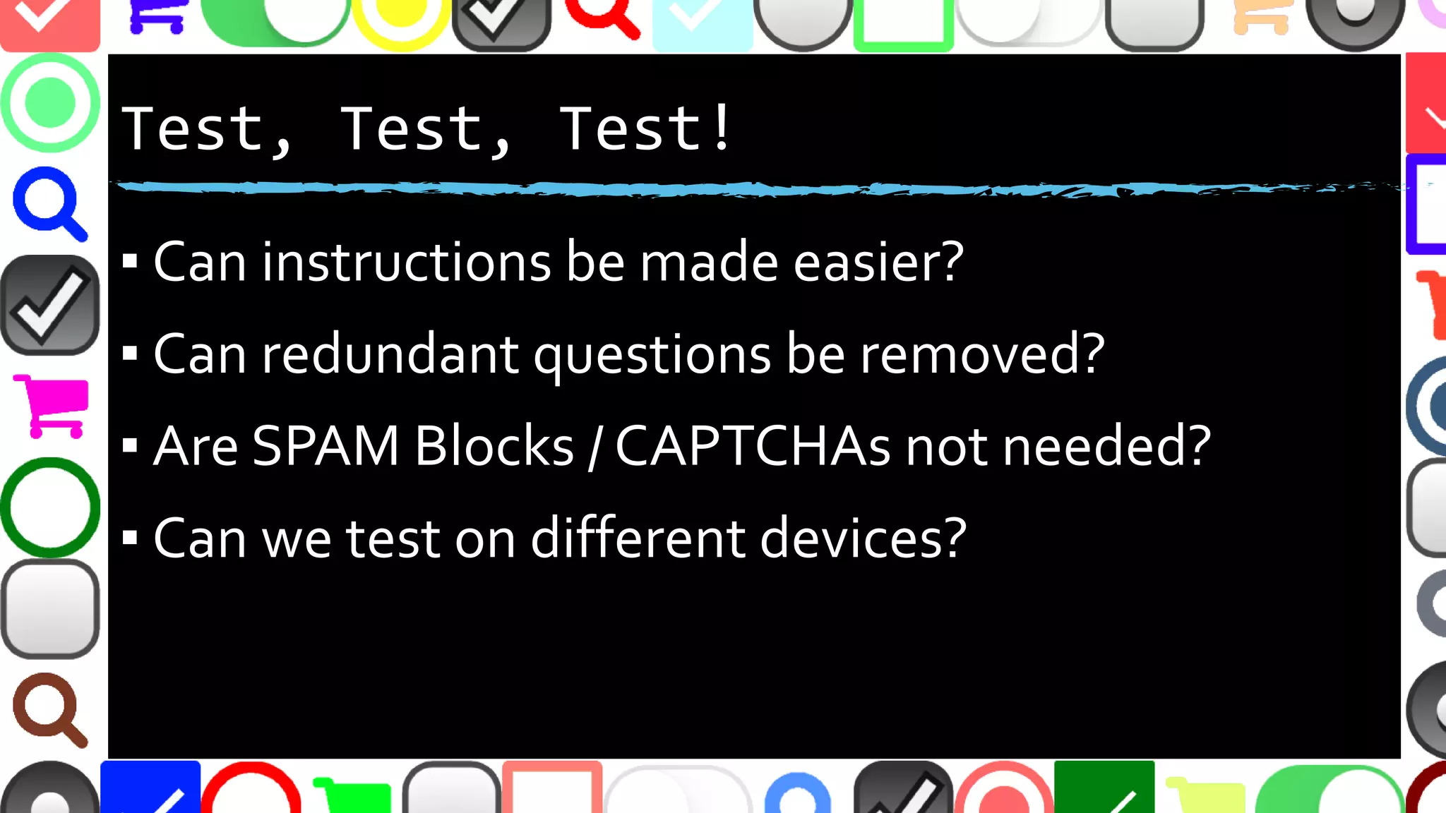


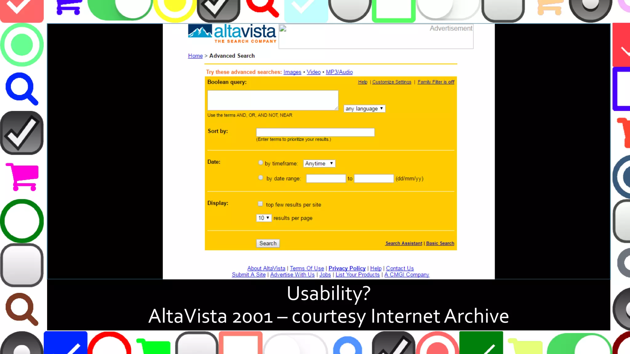
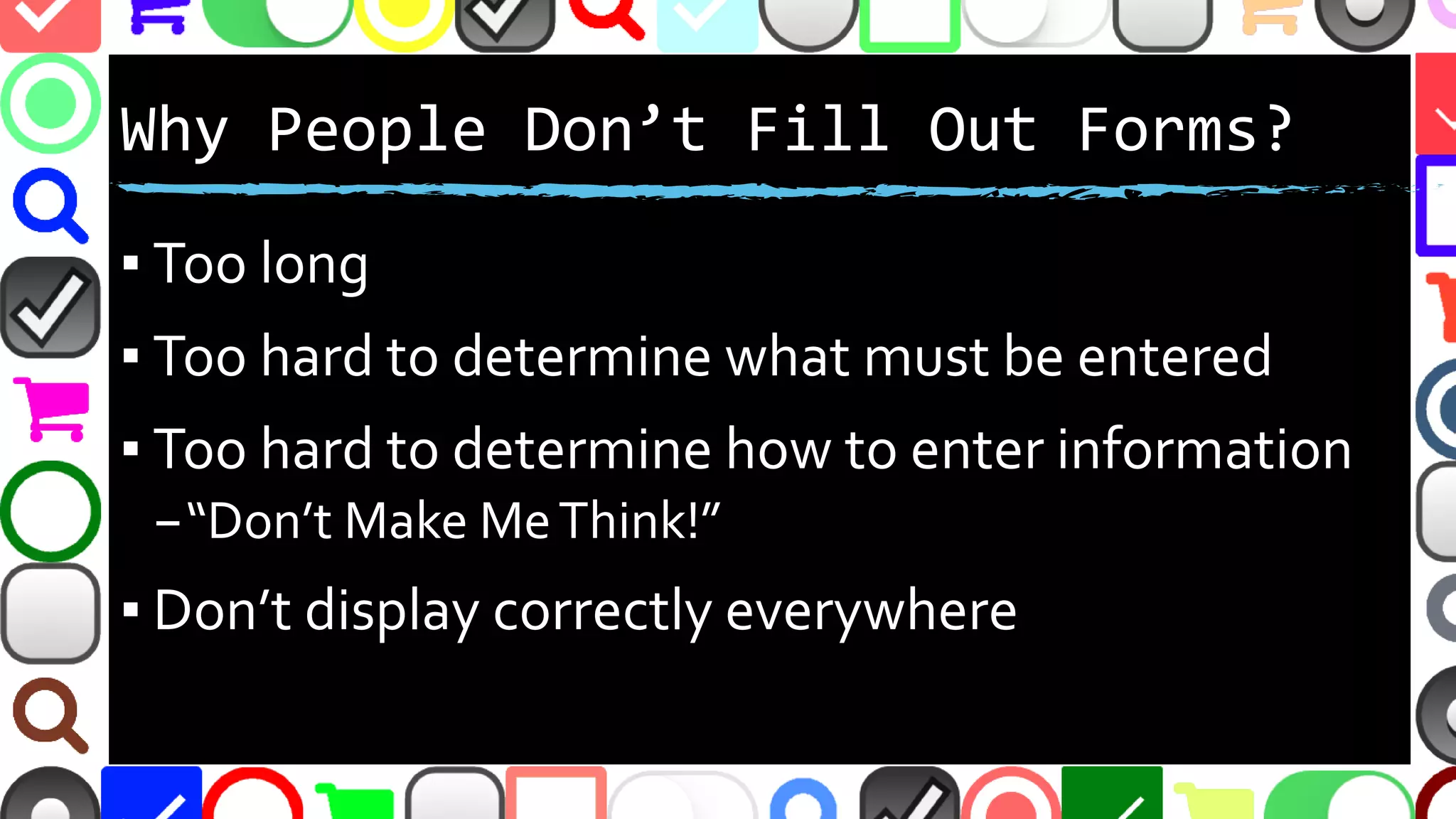
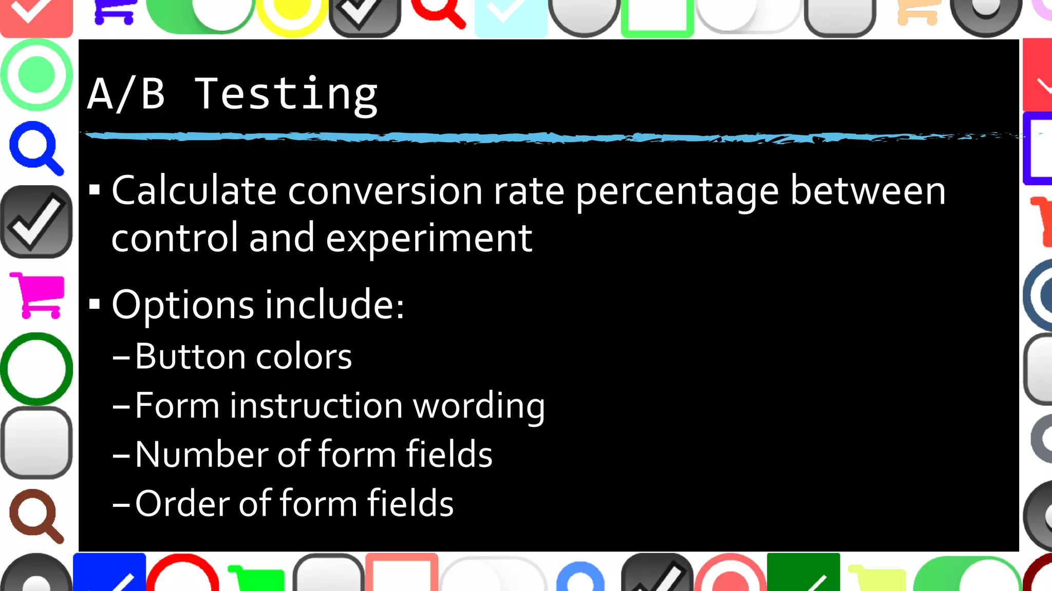
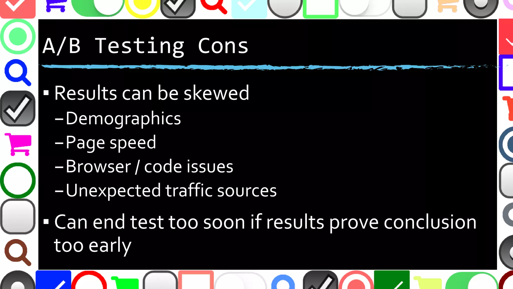
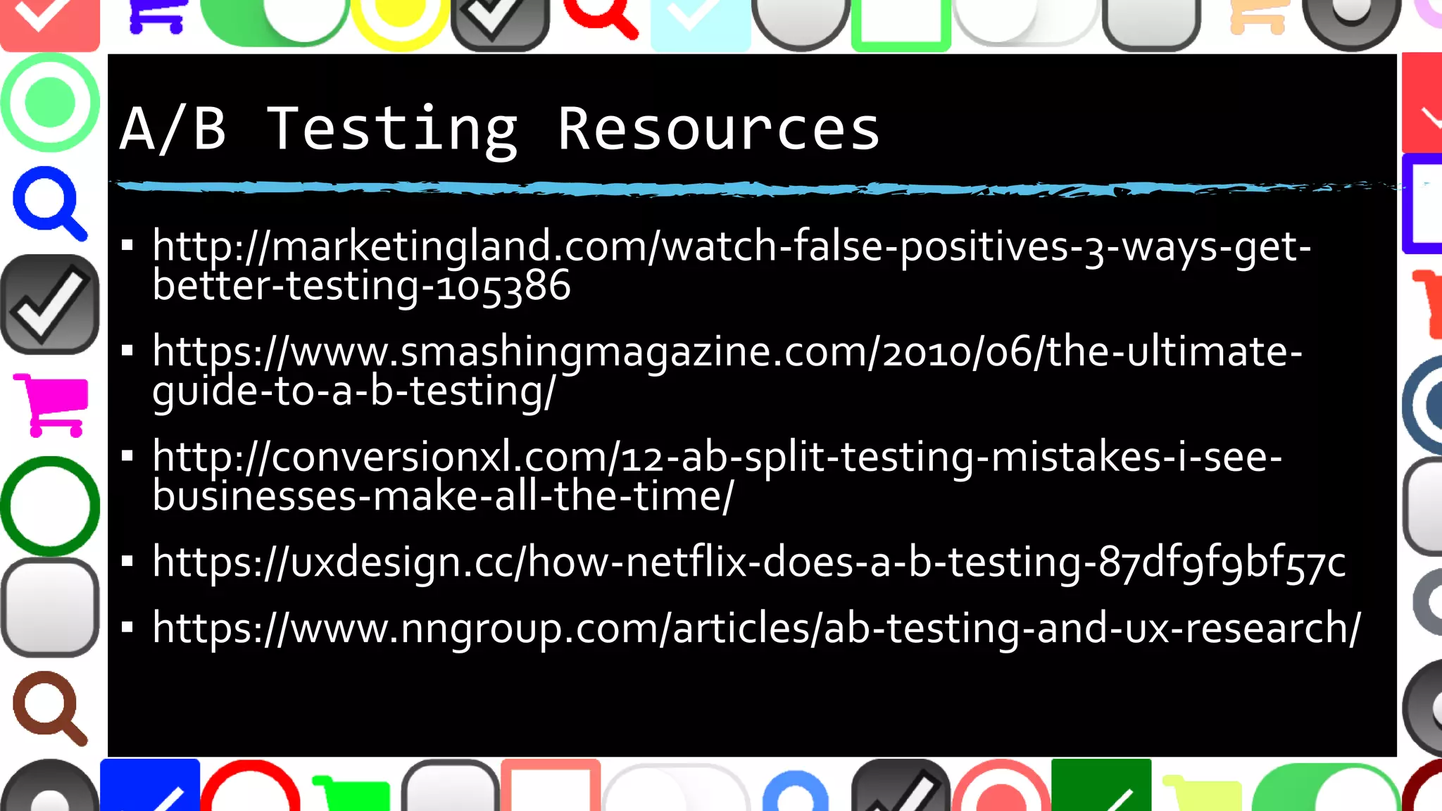
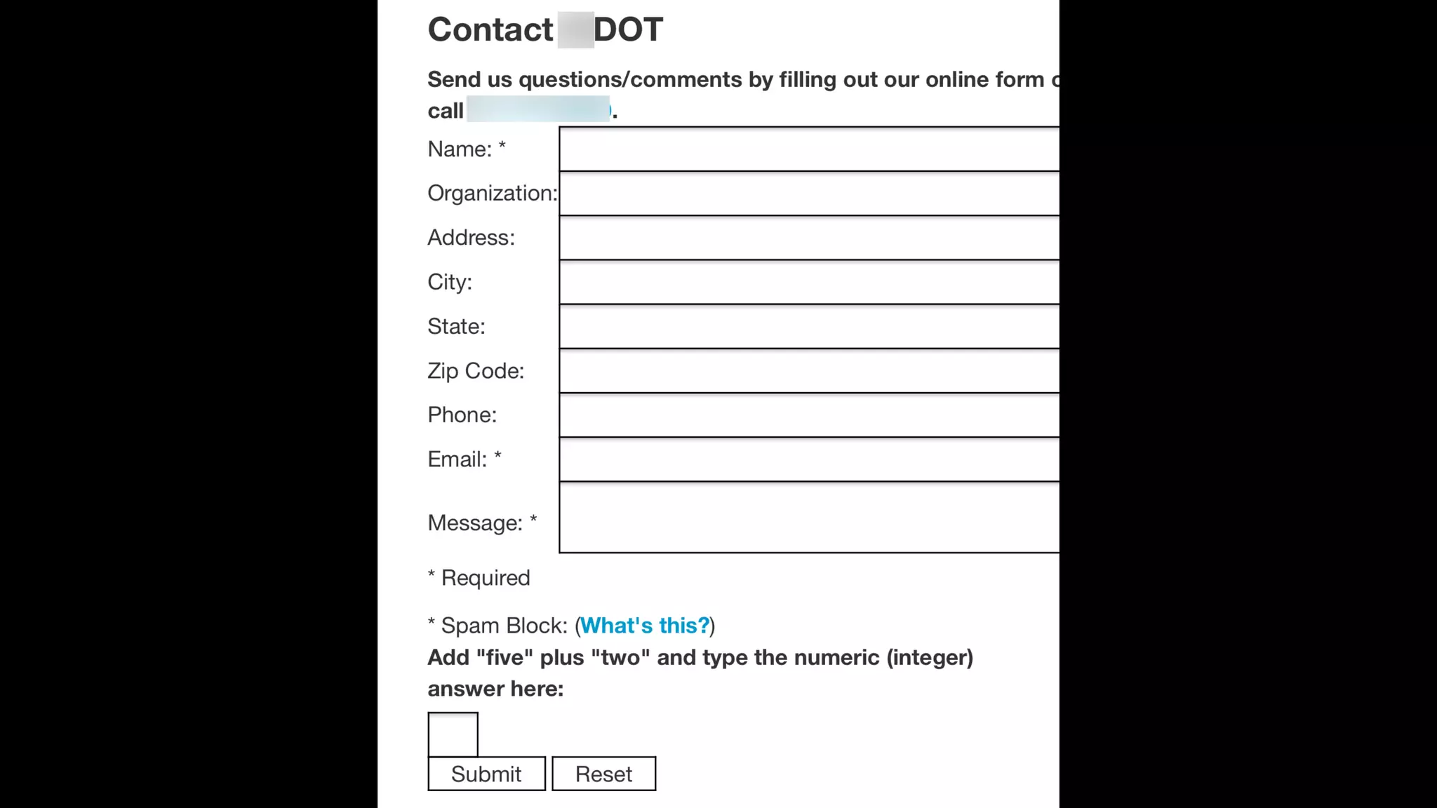
The document discusses various factors influencing the completion of web forms, emphasizing the need for usability improvements such as reducing form length, making instructions clearer, and addressing common pitfalls like the use of captchas and misleading required field indicators. It suggests conducting A/B testing and highlights resources and tools for testing to enhance form conversion rates. The text also touches on the importance of user trust and the impact of design elements on user experience.


![Driver Easy Pro Key 7.1.0.2641 Full Mac Crack Free Activated Download [2026]....](https://cdn.slidesharecdn.com/ss_thumbnails/software-251207185324-b2fb71b4-thumbnail.jpg?width=640&height=640&fit=bounds)


![CleanMyMac X v5.2.8 Crack for MacOS Full Version [Latest] pptx](https://cdn.slidesharecdn.com/ss_thumbnails/softwareoverview-251207194121-a81f0142-thumbnail.jpg?width=640&height=640&fit=bounds)
![Wondershare Filmora 15.0.11 Crack for Mac Key Full Download [Latest] pptx](https://cdn.slidesharecdn.com/ss_thumbnails/software-251207184836-1d16ba16-thumbnail.jpg?width=640&height=640&fit=bounds)


![Chapt_4[1].ppt very interseting and important](https://cdn.slidesharecdn.com/ss_thumbnails/chapt41-251208222956-7cf5e0fa-thumbnail.jpg?width=640&height=640&fit=bounds)