1. Font research
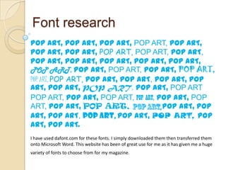
POP ART, POP ART, POP ART, POP ART, POP ART,
POP ART, POP ART, POP ART, POP ART, POP ART,
POP ART, POP ART, POP ART, POP ART, POP ART,
POP ART, POP ART, POP ART, POP ART, POP ART,
POP ART, POP ART, POP ART, POP ART, POP ART, POP
ART, POP ART, POP ART, POP ART, POP ART
POP ART, POP ART, POP ART, POP ART, POP ART, POP
ART, POP ART, POP ART, POP ART, POP
ART, POP ART, POP ART, POP ART, POP ART, POP
ART, POP ART.
I have used dafont.com for these fonts. I simply downloaded them then transferred them
onto Microsoft Word. This website has been of great use for me as it has given me a huge
variety of fonts to choose from for my magazine.
2. Masthead font
I have come to a conclusion of the three possible fonts for the masthead of my
magazine. The name of my magazine is ‘POP ART’ therefore the font needs to match
the theme. The theme of my font needs to be fun and lively. Which is why i have
chosen the following three fonts:
POP ART (HoW tO dO SoMeThInG)
POP ART (Mathematics Boredom)
POP ART (DENNE | Fuchoor)
These three fonts are exactly what I need for the genre of my magazine. I feel as though
they will appeal to the target audience much more.
3. Sell lines font
I have come to a conclusion as to what the font for my sell lines are going
to be. The font I have chosen is ‘Juice ITC’.
For example;
I have chosen this font
because it is not too
bold that it will take up
the majority of the front
cover and cover up the
main image. It is quirky
and fun which will fit in
perfectly with the
theme of my magazine
and I feel as though it
will attract my target
audience.
4. Contents font
I have come to a conclusion as to what font I have chosen for the contents
page of my music magazine. I have chosen the font JustMarker for my
contents page.
For example;
CONTENT
I have chosen this font
because it is bold and eye
catching which will make
the contents page more
S
appealing to my target
audience.