1. House Style
Rule of Thirds
Alix Kelly
Vibe magazine aims at an audience of 18-
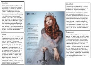
24 years old. The audience who read the In terms of the rule of thirds, the artist Nikki
magazine tend to be listeners of genres Minaj is set through two sets of lines vertical
such as RnB, hip-hop and Rap. This and horizontal. This is appealing to the
contents page has a very pale colour audience because they will see she is the main
scheme mixed with black to help the titles importance on the page. Her face is on two
of the pages stand out on the background. intersecting eyes which helps bring the
The colours represent a very vibrant audience’s attention to the image. The content
pop/RnB culture which links to the artist column also lies on the lines which creates a
used Nikki Minaj. The typeface used on this professional structure to the reader. As the
page bold for the sub titles which help to main image has been placed on the right hand
stand out from the pale background. This side of the page, it is where the reader will
helps to point out the important features immediately look because we read from left to
to the audience. The ‘V’ is in a thick black right. She is placed at a gesture which helps
typeface which is easily recognisable to the cover the key lines of the rule of thirds. These
audience and looks professional because it help to bring out the key features in her face
is similar to the typeface used in the and clothing.
column.
Design Balance
Imagery
In terms of design balance, this magazine has
balanced the page so that the column of page
The main image is of the artist Nikki Minaj.
numbers is smaller than the image and fit next
There is high key lighting used on her face
to it without overcrowding the main image.
and around her. This represents her as an
The ‘features’ have been listed evenly next to
innocent girl as she is dressed as a
the main image to help balance out the page.
princess. This is suitable to the audience
This means the page doesn’t look too
because they know she has an unusual
overcrowded by the main image or the
dress sense. As the artist is set on the right,
features. It also helps make the contents page
she creates a professional look to the
look professional and sophisticated. The
audience and fits with the house style of
features are spaced out so that they are online
the magazine. The dominant contrast of
with most of the main image which brings the
the artist helps her to stand out and
reader to look at both features. As her head is
indicates to the audience who the main
tilted to the right, it drives the reader to look in
article will be about. The medium/long
the same directions which is where the
shot helps to show more of the artist and
features are listed.
makes her more appealing to the
audience. As she is dressed so unusual it
will make the audience want to read on as
they will want to see if she is wearing
anything unusual for the article.
2. House Style Rule of Thirds
Q magazine isAlix Kelly a target audience of
aimed at In terms of the rule of thirds, the artist Adele
people aged 25 and over. This means their genre has been used to help the audience notice
of music is more sophisticated and the image as soon as they turn onto the
contemporary. Adele fits this genre perfectly and page. The close up image helps to make the
is well known for her slow contemporary music. image stand out already, but we can see that
In terms of the way this magazine has been set Adele’s eyes are on a horizontal line which
out the colours are formal and mature. They are brings the audience to the image because
dull and help make the contents page look image looks sophisticated. The intersecting
formal. The typeface is bold and stands out from lines on her eyes and face help the audience
the colours. This makes it eye catching and to understand what the main story is about.
formal as the text is sharp and stands out. The Also the picture is placed on the right hand
main image is a medium close up of the singer side of the page, this means that the
and stands out to help make it look important audience are going to be drawn to it as we
and helps to represent that she is a true talent. read from left to right. But we are more
As there is red used against white and grey, it likely to be interested in the image first then
helps to contrast and make the articles stand out read the contents page.
more. The colour becomes recognisable as well
because it is the same colour that is used on the Design Balance
masthead, so audiences will recognise the red
colour. The use of design balance is very light. The
text that is placed next to the main image
Imagery isn’t too heavy or overcrowding so it helps to
create a professional appeal to the audience
As the image is a medium close up, it helps to and sticks to the sophisticated look and the
bring out the features of the artist. We can see target audience of older people aged 25+.
she is flawless and giving a sophisticated gesture At the bottom of the page, the photograph
position. The photo has used low key and high and text are well balanced because the text
key lighting on her face to make it stand out. It is small as well as the picture and it has used
helps to create a strong image and sticks to the the same amount of text set out in columns
sophisticated and professional house style. to make it balance with the image. As the
The photograph helps to indicate who the article page has been set out in boxes, it helps to
is about. As for the imagery used at the bottom give the audience a sense of professionalism.
of the page, we can see there is low key and high
key lighting used on the two different artists.
This helps to build a professional house style and Design Symmetry
keeps balance with the imagery. As the low key
lighting is used in both images, it helps to blend It’s not symmetrical
with the dull colours that are used in the house
style. This collaboration helps to appeal to the
target audience for the magazine.