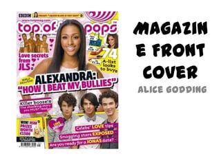
SlideShare a Scribd company logo
1 of 6
Magazin
e Front
 Cover
Alice Godding
Masthead
The Masthead of this magazine is ‘top of the pops’. The font style is fun and modern with
curved edges. This suggests a more informal target audience, which is also is portrayed by
the bright pink and white colour palette. The colour pink connotes flirtatiousness,


                                                     Central
excitement and shows the magazine is suited for a mainly girls audience.


                                                      Image
                                              The main central image is of Alexandra
                                              Burke, who is a female singer attracting
                                              the young girly audience. The camera
                                              shot of this image is an ‘eye level shot’ of
                                              a ‘Mid close up’. This gives the effect of
                                              the pop star looking into your eyes, what
                                              ever view you are looking at the
                                              magazine from. This makes the audience
                                              focus on her eyes.
Puff
The puff of the magazine is giving away the opportunity to win a prize worth £1500, this
suggests the prize would be of a high standard and worth entering. This indulges the
audiences attention and makes them more interested in purchasing the magazine.


                                                Coverlines

 There are a range of Coverlines listed on the front page of this music magazine, they
 are mainly very girly and childlike to help attract the audiences attention. The
 magazine uses many Coverlines based on romance and fashion, as stereotypically girls
 aged between 10 and 15 are interested in these topics. For example ‘Love secrets from
 JLS’, many girls would be interested in reading this article as many young girls look up
 to JLS or find them attractive.
Splash
The main story on the front page of this
magazine is based on Alexandra Burke and
how she ‘Beat her Bullies’. This may grab
the audiences attention if they are or have
had trouble with bullies and spur them
onto carry on reading. This also anchors the
image and makes the audience focus on
how such a popular, high rated woman like
Alexandra Burke could experience bullying,
this connotes equality.                                    House
                                                           style
The colour palette of this magazine is mainly Pink, white and yellow. In general these
colours connote happiness, fun, partying and a strong vibe of a ‘girliness’. The colour yellow
individually connotes joy, optimism and happiness. The colour pink connotes energy,
competition and also happiness, where as the colour white connotes youth, purity and
simplicity; which creates a simple, informal structure and approach to the magazine. These
three colours are bold and eye catching, which catches the audiences attention and
involves their attention.
Layout
The layout of this front cover is very
informal and busy, this mirrors the target
audience which is of a younger age range,
10-15 and mainly female. There is a large
central image as well as many smaller sub
images filling up the page. There isn’t
much text, which also creates an informal
approach. This suggests the people in
these images are well known and will grab
the audiences attention, with just a quick
glance. There are also small cartoon
images, for example the heart with an
arrow stabbing through it, which also
suggests the target audience is of a
younger register.
Audience
The audience of this magazine is mainly aimed at
females aged between 10 and 16. This is portrayed
by the informality of the magazine; structure, colour
palette, many small images as well as a large central
image and the choice of Coverlines. The audience
would be in full education and earning no income,
therefor advertisements and fashion being
promoted in this magazine should be at a low price.
The audience are people interested in fashion, love,
friendship and boys, which largely influences the
articles posted in this magazine. The demographics
of this magazine audience would be group E as the
audience is mainly students receiving a small, if any
income.

More Related Content

What's hot (17)

Contents page analysis 1
Contents page analysis 1Contents page analysis 1
Contents page analysis 1
 
Magazine covers
Magazine coversMagazine covers
Magazine covers
 
Presentation9
Presentation9Presentation9
Presentation9
 
Notion magazine front cover analysis
Notion magazine front cover analysis Notion magazine front cover analysis
Notion magazine front cover analysis
 
final presentation
final presentationfinal presentation
final presentation
 
Kb 427 Portfolio Presentation Ii
Kb 427 Portfolio Presentation IiKb 427 Portfolio Presentation Ii
Kb 427 Portfolio Presentation Ii
 
Front cover overview
Front cover overviewFront cover overview
Front cover overview
 
Evaluation question 5
Evaluation question 5Evaluation question 5
Evaluation question 5
 
Main Artist Profile.
Main Artist Profile.Main Artist Profile.
Main Artist Profile.
 
Question 5 How did you attract / address your audience ?
Question 5 	How did you attract / address your audience ?Question 5 	How did you attract / address your audience ?
Question 5 How did you attract / address your audience ?
 
Body language in magazines
Body language in magazinesBody language in magazines
Body language in magazines
 
Task ten
Task tenTask ten
Task ten
 
Evaluation Question 2
Evaluation Question 2Evaluation Question 2
Evaluation Question 2
 
Alexclare
AlexclareAlexclare
Alexclare
 
How did my contents page attract:address the audience
How did my contents page attract:address the audienceHow did my contents page attract:address the audience
How did my contents page attract:address the audience
 
1how did my contents page attract:address the audience
1how did my contents page attract:address the audience1how did my contents page attract:address the audience
1how did my contents page attract:address the audience
 
Mise
MiseMise
Mise
 

Viewers also liked

Front cover newspaper layout for Final Design:
Front cover newspaper layout for Final Design:Front cover newspaper layout for Final Design:
Front cover newspaper layout for Final Design:
Amber-Mariee
 
5 principles of design
5 principles of design5 principles of design
5 principles of design
jessimpuppy
 
What is the scope of graphic design
What is the scope of graphic designWhat is the scope of graphic design
What is the scope of graphic design
Myers
 
Graphic Design
Graphic DesignGraphic Design
Graphic Design
Ben Fayza
 
Graphic Design PowerPoint
Graphic Design PowerPointGraphic Design PowerPoint
Graphic Design PowerPoint
nycdoe
 
Intro to printmaking
Intro to printmakingIntro to printmaking
Intro to printmaking
mrsbauerart
 
Art Elements and Principles
Art Elements and PrinciplesArt Elements and Principles
Art Elements and Principles
meier106
 

Viewers also liked (20)

TT_Jan16
TT_Jan16TT_Jan16
TT_Jan16
 
Front cover newspaper layout for Final Design:
Front cover newspaper layout for Final Design:Front cover newspaper layout for Final Design:
Front cover newspaper layout for Final Design:
 
5 principles of design
5 principles of design5 principles of design
5 principles of design
 
Newspaper Design key terms
Newspaper Design key termsNewspaper Design key terms
Newspaper Design key terms
 
Graphic & Design
Graphic & DesignGraphic & Design
Graphic & Design
 
What is the scope of graphic design
What is the scope of graphic designWhat is the scope of graphic design
What is the scope of graphic design
 
Graphic Design
Graphic DesignGraphic Design
Graphic Design
 
DESIGNING POSTERS (Intro to GD, Wk 6)
DESIGNING POSTERS (Intro to GD, Wk 6)DESIGNING POSTERS (Intro to GD, Wk 6)
DESIGNING POSTERS (Intro to GD, Wk 6)
 
Graphic Design PowerPoint
Graphic Design PowerPointGraphic Design PowerPoint
Graphic Design PowerPoint
 
Introduction to Layouts in Graphic Design
Introduction to Layouts in Graphic DesignIntroduction to Layouts in Graphic Design
Introduction to Layouts in Graphic Design
 
Understanding Graphic Design
Understanding Graphic DesignUnderstanding Graphic Design
Understanding Graphic Design
 
Intro to printmaking
Intro to printmakingIntro to printmaking
Intro to printmaking
 
Behind The Scenes: Enacting Graphic Design In Movie Posters
Behind The Scenes: Enacting Graphic Design In Movie Posters Behind The Scenes: Enacting Graphic Design In Movie Posters
Behind The Scenes: Enacting Graphic Design In Movie Posters
 
WHAT IS GRAPHIC DESIGN? (Intro to GD, Wk 1)
WHAT IS GRAPHIC DESIGN? (Intro to GD, Wk 1)WHAT IS GRAPHIC DESIGN? (Intro to GD, Wk 1)
WHAT IS GRAPHIC DESIGN? (Intro to GD, Wk 1)
 
Elements of Design
Elements of DesignElements of Design
Elements of Design
 
Art Elements and Principles
Art Elements and PrinciplesArt Elements and Principles
Art Elements and Principles
 
Graphic Design 101 For Marketers and Business Owners
Graphic Design 101 For Marketers and Business OwnersGraphic Design 101 For Marketers and Business Owners
Graphic Design 101 For Marketers and Business Owners
 
Elements & Principles of Design
Elements & Principles of DesignElements & Principles of Design
Elements & Principles of Design
 
Graphic Design 101
Graphic Design 101Graphic Design 101
Graphic Design 101
 
History of Graphic Design
History of Graphic DesignHistory of Graphic Design
History of Graphic Design
 

Similar to Magazine front cover; top of the pops

Similar to Magazine front cover; top of the pops (20)

Front Cover Analysis
Front Cover AnalysisFront Cover Analysis
Front Cover Analysis
 
Radials
RadialsRadials
Radials
 
Radials
RadialsRadials
Radials
 
Front cover analysis
Front cover analysisFront cover analysis
Front cover analysis
 
Jessica Sheridan Unit 13
Jessica Sheridan Unit 13 Jessica Sheridan Unit 13
Jessica Sheridan Unit 13
 
Unit 13- Jess Sheridan- CTEC MEDIA.
Unit 13- Jess Sheridan- CTEC MEDIA.Unit 13- Jess Sheridan- CTEC MEDIA.
Unit 13- Jess Sheridan- CTEC MEDIA.
 
Magazine front cover analysis
Magazine front cover analysisMagazine front cover analysis
Magazine front cover analysis
 
Task four - target audience appeal
Task four - target audience appealTask four - target audience appeal
Task four - target audience appeal
 
Front Cover Analysis 1
Front Cover Analysis 1Front Cover Analysis 1
Front Cover Analysis 1
 
Front cover essay
Front cover essayFront cover essay
Front cover essay
 
Top of the pops
Top of the popsTop of the pops
Top of the pops
 
Pop magazine anaysis
Pop magazine anaysisPop magazine anaysis
Pop magazine anaysis
 
Signs and Signifiers
Signs and SignifiersSigns and Signifiers
Signs and Signifiers
 
Research for my music magazine
Research for my music magazineResearch for my music magazine
Research for my music magazine
 
Research for my music magazine
Research for my music magazineResearch for my music magazine
Research for my music magazine
 
Music magazine ananlyiss
Music magazine ananlyissMusic magazine ananlyiss
Music magazine ananlyiss
 
Media evaluation
Media evaluationMedia evaluation
Media evaluation
 
Media evaluation
Media evaluationMedia evaluation
Media evaluation
 
Media evaluation
Media evaluationMedia evaluation
Media evaluation
 
Presentation1.pptx signs and signifiers
Presentation1.pptx signs and signifiersPresentation1.pptx signs and signifiers
Presentation1.pptx signs and signifiers
 

Magazine front cover; top of the pops

  • 2. Masthead The Masthead of this magazine is ‘top of the pops’. The font style is fun and modern with curved edges. This suggests a more informal target audience, which is also is portrayed by the bright pink and white colour palette. The colour pink connotes flirtatiousness, Central excitement and shows the magazine is suited for a mainly girls audience. Image The main central image is of Alexandra Burke, who is a female singer attracting the young girly audience. The camera shot of this image is an ‘eye level shot’ of a ‘Mid close up’. This gives the effect of the pop star looking into your eyes, what ever view you are looking at the magazine from. This makes the audience focus on her eyes.
  • 3. Puff The puff of the magazine is giving away the opportunity to win a prize worth £1500, this suggests the prize would be of a high standard and worth entering. This indulges the audiences attention and makes them more interested in purchasing the magazine. Coverlines There are a range of Coverlines listed on the front page of this music magazine, they are mainly very girly and childlike to help attract the audiences attention. The magazine uses many Coverlines based on romance and fashion, as stereotypically girls aged between 10 and 15 are interested in these topics. For example ‘Love secrets from JLS’, many girls would be interested in reading this article as many young girls look up to JLS or find them attractive.
  • 4. Splash The main story on the front page of this magazine is based on Alexandra Burke and how she ‘Beat her Bullies’. This may grab the audiences attention if they are or have had trouble with bullies and spur them onto carry on reading. This also anchors the image and makes the audience focus on how such a popular, high rated woman like Alexandra Burke could experience bullying, this connotes equality. House style The colour palette of this magazine is mainly Pink, white and yellow. In general these colours connote happiness, fun, partying and a strong vibe of a ‘girliness’. The colour yellow individually connotes joy, optimism and happiness. The colour pink connotes energy, competition and also happiness, where as the colour white connotes youth, purity and simplicity; which creates a simple, informal structure and approach to the magazine. These three colours are bold and eye catching, which catches the audiences attention and involves their attention.
  • 5. Layout The layout of this front cover is very informal and busy, this mirrors the target audience which is of a younger age range, 10-15 and mainly female. There is a large central image as well as many smaller sub images filling up the page. There isn’t much text, which also creates an informal approach. This suggests the people in these images are well known and will grab the audiences attention, with just a quick glance. There are also small cartoon images, for example the heart with an arrow stabbing through it, which also suggests the target audience is of a younger register.
  • 6. Audience The audience of this magazine is mainly aimed at females aged between 10 and 16. This is portrayed by the informality of the magazine; structure, colour palette, many small images as well as a large central image and the choice of Coverlines. The audience would be in full education and earning no income, therefor advertisements and fashion being promoted in this magazine should be at a low price. The audience are people interested in fashion, love, friendship and boys, which largely influences the articles posted in this magazine. The demographics of this magazine audience would be group E as the audience is mainly students receiving a small, if any income.