SlideShare a Scribd company logo
1 of 7
Let’s Understand Graph’s
A combining form meaning “drawn,” “written”
Diagram showing the relation between variable
quantities, typically of two variables, each measured
along one of a pair of axes at right angles.
A graph drawing should not be confused with the graph itself (the abstract,
non-visual structure) as there are several ways to structure the graph drawing.
All that matters is which vertices are connected to which others by how many
edges and not the exact layout. In practice it is often difficult to decide if two
drawings represent the same graph.
Depending on the problem domain some layouts may be better suited and
easier
to understand than others.
Line Chart: The line chart is one
of the most frequently used chart
types, typically used to show
trends over a period of time. If you
need to chart changes over time,
consider using a line chart.
Column Chart: Column charts are
typically used to compare several
items in a specific range of values.
Column charts are ideal if you need to
compare a single category of data
between individual sub-items, such
as, for example, when comparing
revenue between regions.
Points to Remember :-
• Line Chart – to show the running trend of any numbers which terms is similar month
on month, Like CQ Score trend Month on Month , Attrition and so on.
• Column Chart also known as Histogram – Define historical presentation of number ,
Like Year by Year , By Correlating two data points and so on.
Clustered Column Chart: A clustered column chart
can be used if you need to compare multiple
categories of data within individual sub-items as well
as between sub-items. For instance, you can
use a clustered column chart to compare revenue for
each year within each region, as well as between
regions.
Stacked Column Chart: A stacked column chart
allows you to compare items in a specific range of
values as well as show the relationship of the
individual sub-items with the whole. For instance, a
stacked column chart can show not only the overall
revenue for each year, but also the proportion
of the total revenue made up by each region.
Points to Remember :-
• Clustered – Means Group we can compare same data range for different angles or
one group with another group.
• Collectively or total delivery of same attributes for same Year , Month/ Week.
Pie Chart: Another frequently used chart is the
old pie chart. A pie chart represents the
distribution
or proportion of each data item over a total value
(represented by the overall pie).
A pie chart is most effective when plotting no
more than three categories of data.
Bar Chart: Bar charts are typically used to
compare several categories of data. Bar charts
are ideal for visualizing the distribution or
proportion of data items when there are more
than three categories.
For instance a bar chart could be used to
compare the overall revenue distribution for a
given set of products.
Points to Remember :-
• Pie & Pie Vs Pie– Pie to narrate the contribution of data range in number or in %.
• Bar Chart – basically shows which Item is giving high revenue or loss amongst a
crowd of item list.
Area Chart: Area charts are ideal for clearly
illustrating the magnitude of change between
two or
more data points. For example, you can give
your audience a visual feel for the degree of
variance
between the high and low price for each
month.
Combination Chart: A combination chart is a
visualization that combines two or more chart
types into a single chart. Combination charts
are an ideal choice when you want to
compare two categories of
each individual sub-item. They are commonly
used to create visualizations that show the
difference
between targets versus actual results.
Points to Remember :-
• Area chart emphasize difference between several sets of data over a period of time.
• Combination chart basically where we look Historical as well as trend of different aspects all
together.
XY Scatter Plot Chart: Scatter charts in Excel (also known as XY scatter plot charts) are excellent
for showing correlations between two sets of values. For example an XY scatter plot can be used
to illustrate the correlation between employee performance and competency, demonstrating that
employee performance rises as competency improves. The x and y axes work together to represent
data plots on the chart based on the intersection of x values and y values.
Bubble Chart: A bubble chart is a variation of an XY scatter plot. Just like the XY scatter plot,
bubble charts show the correlation between two sets of data. The difference is the addition of a
third dimension that is represented by the size of each bubble in the chart. This third dimension is
typically used to show the relative impact of a quantitative data item. For instance, in addition to
showing employee performance versus competency, you can have the size of each bubble
represent years of service, allowing your audience to quickly get a sense of how years of service
may affect the relationship between competency and performance.
Points to Remember :-
• Scatter to get the precise level of any variation.
• Bubble chart shows variation along with dimension (size) which impact / effect take place.
Please search , Understand DMAIC slide shared earlier –
Any query write me – mailonajit@gmail.com
Six Sigma Green Belt Certified , Association with udemy online education portal.
The 7 Basic Tools
Check sheets
Flow chart or Process map
Histograms
Cause and Effect diagram
Pareto diagram
Scatter diagram
Control charts

More Related Content

What's hot

Simple graph types
Simple graph typesSimple graph types
Simple graph typesMahi Syama
 
Different types of charts
Different types of chartsDifferent types of charts
Different types of chartsZakaria Salim
 
Tables, Graphs, and Charts Social Studies
Tables, Graphs, and Charts Social StudiesTables, Graphs, and Charts Social Studies
Tables, Graphs, and Charts Social StudiesLyn Gile Facebook
 
Types of graphs and charts and their uses with examples and pics
Types of graphs and charts and their uses  with examples and picsTypes of graphs and charts and their uses  with examples and pics
Types of graphs and charts and their uses with examples and picsMakati Science High School
 
Types of graphs
Types of graphsTypes of graphs
Types of graphsbweldon
 
GIS Ostrava 2018 – Insights for ArGIS
GIS Ostrava 2018 – Insights for ArGISGIS Ostrava 2018 – Insights for ArGIS
GIS Ostrava 2018 – Insights for ArGISJan Novotný
 
Graphing Data
Graphing DataGraphing Data
Graphing Datashas595
 
Graphexamples how-to-do
Graphexamples how-to-doGraphexamples how-to-do
Graphexamples how-to-doMelody Teoxon
 
Top 8 Different Types Of Charts In Statistics And Their Uses
Top 8 Different Types Of Charts In Statistics And Their UsesTop 8 Different Types Of Charts In Statistics And Their Uses
Top 8 Different Types Of Charts In Statistics And Their UsesStat Analytica
 
How to visualize web analytics data and choose a graph?
How to visualize web analytics data and choose a graph?How to visualize web analytics data and choose a graph?
How to visualize web analytics data and choose a graph?Janvi Arora
 
Presenting information presentation.
Presenting information presentation.Presenting information presentation.
Presenting information presentation.danielle93
 
Vertical bar graph math 7
Vertical bar graph math 7Vertical bar graph math 7
Vertical bar graph math 7Johaina Nor
 
Basics of Educational Statistics (Graphs & its Types)
Basics of Educational Statistics (Graphs & its Types)Basics of Educational Statistics (Graphs & its Types)
Basics of Educational Statistics (Graphs & its Types)HennaAnsari
 

What's hot (20)

Simple graph types
Simple graph typesSimple graph types
Simple graph types
 
Different types of charts
Different types of chartsDifferent types of charts
Different types of charts
 
Tables, Graphs, and Charts Social Studies
Tables, Graphs, and Charts Social StudiesTables, Graphs, and Charts Social Studies
Tables, Graphs, and Charts Social Studies
 
Types of graphs and charts and their uses with examples and pics
Types of graphs and charts and their uses  with examples and picsTypes of graphs and charts and their uses  with examples and pics
Types of graphs and charts and their uses with examples and pics
 
Types of graphs
Types of graphsTypes of graphs
Types of graphs
 
GIS Ostrava 2018 – Insights for ArGIS
GIS Ostrava 2018 – Insights for ArGISGIS Ostrava 2018 – Insights for ArGIS
GIS Ostrava 2018 – Insights for ArGIS
 
Graphing Data
Graphing DataGraphing Data
Graphing Data
 
Graphexamples how-to-do
Graphexamples how-to-doGraphexamples how-to-do
Graphexamples how-to-do
 
Tableau - box plot
Tableau - box plotTableau - box plot
Tableau - box plot
 
Types of Charts
Types of ChartsTypes of Charts
Types of Charts
 
Graphing data
Graphing dataGraphing data
Graphing data
 
Top 8 Different Types Of Charts In Statistics And Their Uses
Top 8 Different Types Of Charts In Statistics And Their UsesTop 8 Different Types Of Charts In Statistics And Their Uses
Top 8 Different Types Of Charts In Statistics And Their Uses
 
Ways of presenting information
Ways of presenting informationWays of presenting information
Ways of presenting information
 
Graph ppt
Graph pptGraph ppt
Graph ppt
 
How to visualize web analytics data and choose a graph?
How to visualize web analytics data and choose a graph?How to visualize web analytics data and choose a graph?
How to visualize web analytics data and choose a graph?
 
Presenting information presentation.
Presenting information presentation.Presenting information presentation.
Presenting information presentation.
 
Vertical bar graph math 7
Vertical bar graph math 7Vertical bar graph math 7
Vertical bar graph math 7
 
Gis Mapping Examples
Gis Mapping ExamplesGis Mapping Examples
Gis Mapping Examples
 
Basics of Educational Statistics (Graphs & its Types)
Basics of Educational Statistics (Graphs & its Types)Basics of Educational Statistics (Graphs & its Types)
Basics of Educational Statistics (Graphs & its Types)
 
Tableau histogram
Tableau   histogramTableau   histogram
Tableau histogram
 

Similar to Understand Graphs and Charts for Data Visualization

BUSINESS INTELLIGENCE AND DATA ANALYTICS presentation
BUSINESS INTELLIGENCE AND DATA ANALYTICS  presentationBUSINESS INTELLIGENCE AND DATA ANALYTICS  presentation
BUSINESS INTELLIGENCE AND DATA ANALYTICS presentationMohit Negi
 
Các loại biểu đồ trình bày dữ liệu kinh doanh
Các loại biểu đồ trình bày dữ liệu kinh doanhCác loại biểu đồ trình bày dữ liệu kinh doanh
Các loại biểu đồ trình bày dữ liệu kinh doanhChng83
 
12 ways to visalize data
12 ways to visalize data12 ways to visalize data
12 ways to visalize dataSisense
 
Types of Microsoft Chart.docx
Types of Microsoft Chart.docxTypes of Microsoft Chart.docx
Types of Microsoft Chart.docxHawiyaAngin
 
Presentation de la DATA visualisation.pptx
Presentation de la DATA visualisation.pptxPresentation de la DATA visualisation.pptx
Presentation de la DATA visualisation.pptxsalmakoummich
 
Vsual analysis.pptx
Vsual analysis.pptxVsual analysis.pptx
Vsual analysis.pptxDPBarboa
 
Assignment 3 charts in excel
Assignment 3 charts in excelAssignment 3 charts in excel
Assignment 3 charts in excelktqwerty
 
Graphs and chars
Graphs and charsGraphs and chars
Graphs and charssalemhusin
 
Introduction to Business analytics unit3
Introduction to Business analytics unit3Introduction to Business analytics unit3
Introduction to Business analytics unit3jayarellirs
 
Types Of Charts
Types Of ChartsTypes Of Charts
Types Of Chartslindy23
 
Types Of Charts
Types Of ChartsTypes Of Charts
Types Of Chartslindy23
 
Types Of Charts
Types Of ChartsTypes Of Charts
Types Of Chartswmassie
 
Visual symbols by: Mary Joice T. De Jesus
Visual symbols by: Mary Joice T. De JesusVisual symbols by: Mary Joice T. De Jesus
Visual symbols by: Mary Joice T. De Jesusmary joice de jesus
 
Visual symbols by: Mary Joice T. De Jesus
Visual symbols  by: Mary Joice T. De JesusVisual symbols  by: Mary Joice T. De Jesus
Visual symbols by: Mary Joice T. De Jesusmary joice de jesus
 
From data to diagrams: an introduction to basic graphs and charts
From data to diagrams: an introduction to basic graphs and chartsFrom data to diagrams: an introduction to basic graphs and charts
From data to diagrams: an introduction to basic graphs and chartsSchool of Data
 
DAV Seperate, Align, Staked.pptx
DAV Seperate, Align, Staked.pptxDAV Seperate, Align, Staked.pptx
DAV Seperate, Align, Staked.pptxSamirSitaula1
 
Displaying data using charts and graphs
Displaying data using charts and graphsDisplaying data using charts and graphs
Displaying data using charts and graphsCharles Flynt
 
Microsoft Excel.pptx
Microsoft Excel.pptxMicrosoft Excel.pptx
Microsoft Excel.pptxSIMNchannel
 

Similar to Understand Graphs and Charts for Data Visualization (20)

BUSINESS INTELLIGENCE AND DATA ANALYTICS presentation
BUSINESS INTELLIGENCE AND DATA ANALYTICS  presentationBUSINESS INTELLIGENCE AND DATA ANALYTICS  presentation
BUSINESS INTELLIGENCE AND DATA ANALYTICS presentation
 
Các loại biểu đồ trình bày dữ liệu kinh doanh
Các loại biểu đồ trình bày dữ liệu kinh doanhCác loại biểu đồ trình bày dữ liệu kinh doanh
Các loại biểu đồ trình bày dữ liệu kinh doanh
 
12 ways to visalize data
12 ways to visalize data12 ways to visalize data
12 ways to visalize data
 
Types of Microsoft Chart.docx
Types of Microsoft Chart.docxTypes of Microsoft Chart.docx
Types of Microsoft Chart.docx
 
Presentation de la DATA visualisation.pptx
Presentation de la DATA visualisation.pptxPresentation de la DATA visualisation.pptx
Presentation de la DATA visualisation.pptx
 
Vsual analysis.pptx
Vsual analysis.pptxVsual analysis.pptx
Vsual analysis.pptx
 
Assignment 3 charts in excel
Assignment 3 charts in excelAssignment 3 charts in excel
Assignment 3 charts in excel
 
Graphs and chars
Graphs and charsGraphs and chars
Graphs and chars
 
Introduction to Business analytics unit3
Introduction to Business analytics unit3Introduction to Business analytics unit3
Introduction to Business analytics unit3
 
Types Of Charts
Types Of ChartsTypes Of Charts
Types Of Charts
 
Types Of Charts
Types Of ChartsTypes Of Charts
Types Of Charts
 
Types Of Charts
Types Of ChartsTypes Of Charts
Types Of Charts
 
Visual symbols by: Mary Joice T. De Jesus
Visual symbols by: Mary Joice T. De JesusVisual symbols by: Mary Joice T. De Jesus
Visual symbols by: Mary Joice T. De Jesus
 
Visual symbols by: Mary Joice T. De Jesus
Visual symbols  by: Mary Joice T. De JesusVisual symbols  by: Mary Joice T. De Jesus
Visual symbols by: Mary Joice T. De Jesus
 
Visualization-1
Visualization-1Visualization-1
Visualization-1
 
Data mining
Data miningData mining
Data mining
 
From data to diagrams: an introduction to basic graphs and charts
From data to diagrams: an introduction to basic graphs and chartsFrom data to diagrams: an introduction to basic graphs and charts
From data to diagrams: an introduction to basic graphs and charts
 
DAV Seperate, Align, Staked.pptx
DAV Seperate, Align, Staked.pptxDAV Seperate, Align, Staked.pptx
DAV Seperate, Align, Staked.pptx
 
Displaying data using charts and graphs
Displaying data using charts and graphsDisplaying data using charts and graphs
Displaying data using charts and graphs
 
Microsoft Excel.pptx
Microsoft Excel.pptxMicrosoft Excel.pptx
Microsoft Excel.pptx
 

Recently uploaded

PAG-UNLAD NG EKONOMIYA na dapat isaalang alang sa pag-aaral.
PAG-UNLAD NG EKONOMIYA na dapat isaalang alang sa pag-aaral.PAG-UNLAD NG EKONOMIYA na dapat isaalang alang sa pag-aaral.
PAG-UNLAD NG EKONOMIYA na dapat isaalang alang sa pag-aaral.KathleenAnnCordero2
 
call girls in delhi malviya nagar @9811711561@
call girls in delhi malviya nagar @9811711561@call girls in delhi malviya nagar @9811711561@
call girls in delhi malviya nagar @9811711561@vikas rana
 
Presentation for the Strategic Dialogue on the Future of Agriculture, Brussel...
Presentation for the Strategic Dialogue on the Future of Agriculture, Brussel...Presentation for the Strategic Dialogue on the Future of Agriculture, Brussel...
Presentation for the Strategic Dialogue on the Future of Agriculture, Brussel...Krijn Poppe
 
Genshin Impact PPT Template by EaTemp.pptx
Genshin Impact PPT Template by EaTemp.pptxGenshin Impact PPT Template by EaTemp.pptx
Genshin Impact PPT Template by EaTemp.pptxJohnree4
 
Dutch Power - 26 maart 2024 - Henk Kras - Circular Plastics
Dutch Power - 26 maart 2024 - Henk Kras - Circular PlasticsDutch Power - 26 maart 2024 - Henk Kras - Circular Plastics
Dutch Power - 26 maart 2024 - Henk Kras - Circular PlasticsDutch Power
 
Event 4 Introduction to Open Source.pptx
Event 4 Introduction to Open Source.pptxEvent 4 Introduction to Open Source.pptx
Event 4 Introduction to Open Source.pptxaryanv1753
 
Simulation-based Testing of Unmanned Aerial Vehicles with Aerialist
Simulation-based Testing of Unmanned Aerial Vehicles with AerialistSimulation-based Testing of Unmanned Aerial Vehicles with Aerialist
Simulation-based Testing of Unmanned Aerial Vehicles with AerialistSebastiano Panichella
 
SBFT Tool Competition 2024 -- Python Test Case Generation Track
SBFT Tool Competition 2024 -- Python Test Case Generation TrackSBFT Tool Competition 2024 -- Python Test Case Generation Track
SBFT Tool Competition 2024 -- Python Test Case Generation TrackSebastiano Panichella
 
Gaps, Issues and Challenges in the Implementation of Mother Tongue Based-Mult...
Gaps, Issues and Challenges in the Implementation of Mother Tongue Based-Mult...Gaps, Issues and Challenges in the Implementation of Mother Tongue Based-Mult...
Gaps, Issues and Challenges in the Implementation of Mother Tongue Based-Mult...marjmae69
 
Call Girls in Rohini Delhi 💯Call Us 🔝8264348440🔝
Call Girls in Rohini Delhi 💯Call Us 🔝8264348440🔝Call Girls in Rohini Delhi 💯Call Us 🔝8264348440🔝
Call Girls in Rohini Delhi 💯Call Us 🔝8264348440🔝soniya singh
 
Call Girls In Aerocity 🤳 Call Us +919599264170
Call Girls In Aerocity 🤳 Call Us +919599264170Call Girls In Aerocity 🤳 Call Us +919599264170
Call Girls In Aerocity 🤳 Call Us +919599264170Escort Service
 
The Ten Facts About People With Autism Presentation
The Ten Facts About People With Autism PresentationThe Ten Facts About People With Autism Presentation
The Ten Facts About People With Autism PresentationNathan Young
 
miladyskindiseases-200705210221 2.!!pptx
miladyskindiseases-200705210221 2.!!pptxmiladyskindiseases-200705210221 2.!!pptx
miladyskindiseases-200705210221 2.!!pptxCarrieButtitta
 
James Joyce, Dubliners and Ulysses.ppt !
James Joyce, Dubliners and Ulysses.ppt !James Joyce, Dubliners and Ulysses.ppt !
James Joyce, Dubliners and Ulysses.ppt !risocarla2016
 
SaaStr Workshop Wednesday w/ Kyle Norton, Owner.com
SaaStr Workshop Wednesday w/ Kyle Norton, Owner.comSaaStr Workshop Wednesday w/ Kyle Norton, Owner.com
SaaStr Workshop Wednesday w/ Kyle Norton, Owner.comsaastr
 
Mathan flower ppt.pptx slide orchids ✨🌸
Mathan flower ppt.pptx slide orchids ✨🌸Mathan flower ppt.pptx slide orchids ✨🌸
Mathan flower ppt.pptx slide orchids ✨🌸mathanramanathan2005
 
Anne Frank A Beacon of Hope amidst darkness ppt.pptx
Anne Frank A Beacon of Hope amidst darkness ppt.pptxAnne Frank A Beacon of Hope amidst darkness ppt.pptx
Anne Frank A Beacon of Hope amidst darkness ppt.pptxnoorehahmad
 
PHYSICS PROJECT BY MSC - NANOTECHNOLOGY
PHYSICS PROJECT BY MSC  - NANOTECHNOLOGYPHYSICS PROJECT BY MSC  - NANOTECHNOLOGY
PHYSICS PROJECT BY MSC - NANOTECHNOLOGYpruthirajnayak525
 
Work Remotely with Confluence ACE 2.pptx
Work Remotely with Confluence ACE 2.pptxWork Remotely with Confluence ACE 2.pptx
Work Remotely with Confluence ACE 2.pptxmavinoikein
 
The 3rd Intl. Workshop on NL-based Software Engineering
The 3rd Intl. Workshop on NL-based Software EngineeringThe 3rd Intl. Workshop on NL-based Software Engineering
The 3rd Intl. Workshop on NL-based Software EngineeringSebastiano Panichella
 

Recently uploaded (20)

PAG-UNLAD NG EKONOMIYA na dapat isaalang alang sa pag-aaral.
PAG-UNLAD NG EKONOMIYA na dapat isaalang alang sa pag-aaral.PAG-UNLAD NG EKONOMIYA na dapat isaalang alang sa pag-aaral.
PAG-UNLAD NG EKONOMIYA na dapat isaalang alang sa pag-aaral.
 
call girls in delhi malviya nagar @9811711561@
call girls in delhi malviya nagar @9811711561@call girls in delhi malviya nagar @9811711561@
call girls in delhi malviya nagar @9811711561@
 
Presentation for the Strategic Dialogue on the Future of Agriculture, Brussel...
Presentation for the Strategic Dialogue on the Future of Agriculture, Brussel...Presentation for the Strategic Dialogue on the Future of Agriculture, Brussel...
Presentation for the Strategic Dialogue on the Future of Agriculture, Brussel...
 
Genshin Impact PPT Template by EaTemp.pptx
Genshin Impact PPT Template by EaTemp.pptxGenshin Impact PPT Template by EaTemp.pptx
Genshin Impact PPT Template by EaTemp.pptx
 
Dutch Power - 26 maart 2024 - Henk Kras - Circular Plastics
Dutch Power - 26 maart 2024 - Henk Kras - Circular PlasticsDutch Power - 26 maart 2024 - Henk Kras - Circular Plastics
Dutch Power - 26 maart 2024 - Henk Kras - Circular Plastics
 
Event 4 Introduction to Open Source.pptx
Event 4 Introduction to Open Source.pptxEvent 4 Introduction to Open Source.pptx
Event 4 Introduction to Open Source.pptx
 
Simulation-based Testing of Unmanned Aerial Vehicles with Aerialist
Simulation-based Testing of Unmanned Aerial Vehicles with AerialistSimulation-based Testing of Unmanned Aerial Vehicles with Aerialist
Simulation-based Testing of Unmanned Aerial Vehicles with Aerialist
 
SBFT Tool Competition 2024 -- Python Test Case Generation Track
SBFT Tool Competition 2024 -- Python Test Case Generation TrackSBFT Tool Competition 2024 -- Python Test Case Generation Track
SBFT Tool Competition 2024 -- Python Test Case Generation Track
 
Gaps, Issues and Challenges in the Implementation of Mother Tongue Based-Mult...
Gaps, Issues and Challenges in the Implementation of Mother Tongue Based-Mult...Gaps, Issues and Challenges in the Implementation of Mother Tongue Based-Mult...
Gaps, Issues and Challenges in the Implementation of Mother Tongue Based-Mult...
 
Call Girls in Rohini Delhi 💯Call Us 🔝8264348440🔝
Call Girls in Rohini Delhi 💯Call Us 🔝8264348440🔝Call Girls in Rohini Delhi 💯Call Us 🔝8264348440🔝
Call Girls in Rohini Delhi 💯Call Us 🔝8264348440🔝
 
Call Girls In Aerocity 🤳 Call Us +919599264170
Call Girls In Aerocity 🤳 Call Us +919599264170Call Girls In Aerocity 🤳 Call Us +919599264170
Call Girls In Aerocity 🤳 Call Us +919599264170
 
The Ten Facts About People With Autism Presentation
The Ten Facts About People With Autism PresentationThe Ten Facts About People With Autism Presentation
The Ten Facts About People With Autism Presentation
 
miladyskindiseases-200705210221 2.!!pptx
miladyskindiseases-200705210221 2.!!pptxmiladyskindiseases-200705210221 2.!!pptx
miladyskindiseases-200705210221 2.!!pptx
 
James Joyce, Dubliners and Ulysses.ppt !
James Joyce, Dubliners and Ulysses.ppt !James Joyce, Dubliners and Ulysses.ppt !
James Joyce, Dubliners and Ulysses.ppt !
 
SaaStr Workshop Wednesday w/ Kyle Norton, Owner.com
SaaStr Workshop Wednesday w/ Kyle Norton, Owner.comSaaStr Workshop Wednesday w/ Kyle Norton, Owner.com
SaaStr Workshop Wednesday w/ Kyle Norton, Owner.com
 
Mathan flower ppt.pptx slide orchids ✨🌸
Mathan flower ppt.pptx slide orchids ✨🌸Mathan flower ppt.pptx slide orchids ✨🌸
Mathan flower ppt.pptx slide orchids ✨🌸
 
Anne Frank A Beacon of Hope amidst darkness ppt.pptx
Anne Frank A Beacon of Hope amidst darkness ppt.pptxAnne Frank A Beacon of Hope amidst darkness ppt.pptx
Anne Frank A Beacon of Hope amidst darkness ppt.pptx
 
PHYSICS PROJECT BY MSC - NANOTECHNOLOGY
PHYSICS PROJECT BY MSC  - NANOTECHNOLOGYPHYSICS PROJECT BY MSC  - NANOTECHNOLOGY
PHYSICS PROJECT BY MSC - NANOTECHNOLOGY
 
Work Remotely with Confluence ACE 2.pptx
Work Remotely with Confluence ACE 2.pptxWork Remotely with Confluence ACE 2.pptx
Work Remotely with Confluence ACE 2.pptx
 
The 3rd Intl. Workshop on NL-based Software Engineering
The 3rd Intl. Workshop on NL-based Software EngineeringThe 3rd Intl. Workshop on NL-based Software Engineering
The 3rd Intl. Workshop on NL-based Software Engineering
 

Understand Graphs and Charts for Data Visualization

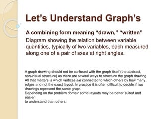
  • 1. Let’s Understand Graph’s A combining form meaning “drawn,” “written” Diagram showing the relation between variable quantities, typically of two variables, each measured along one of a pair of axes at right angles. A graph drawing should not be confused with the graph itself (the abstract, non-visual structure) as there are several ways to structure the graph drawing. All that matters is which vertices are connected to which others by how many edges and not the exact layout. In practice it is often difficult to decide if two drawings represent the same graph. Depending on the problem domain some layouts may be better suited and easier to understand than others.
  • 2. Line Chart: The line chart is one of the most frequently used chart types, typically used to show trends over a period of time. If you need to chart changes over time, consider using a line chart. Column Chart: Column charts are typically used to compare several items in a specific range of values. Column charts are ideal if you need to compare a single category of data between individual sub-items, such as, for example, when comparing revenue between regions. Points to Remember :- • Line Chart – to show the running trend of any numbers which terms is similar month on month, Like CQ Score trend Month on Month , Attrition and so on. • Column Chart also known as Histogram – Define historical presentation of number , Like Year by Year , By Correlating two data points and so on.
  • 3. Clustered Column Chart: A clustered column chart can be used if you need to compare multiple categories of data within individual sub-items as well as between sub-items. For instance, you can use a clustered column chart to compare revenue for each year within each region, as well as between regions. Stacked Column Chart: A stacked column chart allows you to compare items in a specific range of values as well as show the relationship of the individual sub-items with the whole. For instance, a stacked column chart can show not only the overall revenue for each year, but also the proportion of the total revenue made up by each region. Points to Remember :- • Clustered – Means Group we can compare same data range for different angles or one group with another group. • Collectively or total delivery of same attributes for same Year , Month/ Week.
  • 4. Pie Chart: Another frequently used chart is the old pie chart. A pie chart represents the distribution or proportion of each data item over a total value (represented by the overall pie). A pie chart is most effective when plotting no more than three categories of data. Bar Chart: Bar charts are typically used to compare several categories of data. Bar charts are ideal for visualizing the distribution or proportion of data items when there are more than three categories. For instance a bar chart could be used to compare the overall revenue distribution for a given set of products. Points to Remember :- • Pie & Pie Vs Pie– Pie to narrate the contribution of data range in number or in %. • Bar Chart – basically shows which Item is giving high revenue or loss amongst a crowd of item list.
  • 5. Area Chart: Area charts are ideal for clearly illustrating the magnitude of change between two or more data points. For example, you can give your audience a visual feel for the degree of variance between the high and low price for each month. Combination Chart: A combination chart is a visualization that combines two or more chart types into a single chart. Combination charts are an ideal choice when you want to compare two categories of each individual sub-item. They are commonly used to create visualizations that show the difference between targets versus actual results. Points to Remember :- • Area chart emphasize difference between several sets of data over a period of time. • Combination chart basically where we look Historical as well as trend of different aspects all together.
  • 6. XY Scatter Plot Chart: Scatter charts in Excel (also known as XY scatter plot charts) are excellent for showing correlations between two sets of values. For example an XY scatter plot can be used to illustrate the correlation between employee performance and competency, demonstrating that employee performance rises as competency improves. The x and y axes work together to represent data plots on the chart based on the intersection of x values and y values. Bubble Chart: A bubble chart is a variation of an XY scatter plot. Just like the XY scatter plot, bubble charts show the correlation between two sets of data. The difference is the addition of a third dimension that is represented by the size of each bubble in the chart. This third dimension is typically used to show the relative impact of a quantitative data item. For instance, in addition to showing employee performance versus competency, you can have the size of each bubble represent years of service, allowing your audience to quickly get a sense of how years of service may affect the relationship between competency and performance. Points to Remember :- • Scatter to get the precise level of any variation. • Bubble chart shows variation along with dimension (size) which impact / effect take place.
  • 7. Please search , Understand DMAIC slide shared earlier – Any query write me – mailonajit@gmail.com Six Sigma Green Belt Certified , Association with udemy online education portal. The 7 Basic Tools Check sheets Flow chart or Process map Histograms Cause and Effect diagram Pareto diagram Scatter diagram Control charts