This document describes the development of a contents page layout for a school magazine. It discusses three drafts:
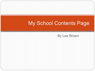
The first draft divides the page into sections for the title, contents list, and images at the bottom in a film strip style. It uses the same font and gray color scheme as the front cover.
Feedback on the second draft recommended adding more images to fill empty space. The author added three images in the center.
The final draft changes the title to white for better visibility and uses a lighter gray for the page numbers so they do not stand out as much. The author feels the industrial theme was achieved.
2. This is my idea of how
the layout of my
contents page will
look.
I have decided to divide
the page into different
sections so it is easy
to navigate.
TITL
E
Conten
ts
IMAG
ES
3. Draft 1
I decided to stick to the same style as my
front cover. I used the same shade of grey
and I used the same style font as I used on
the front page.
I have divided the page into 3 sections, one
for the title, one for the list of pages and
one for the images at the bottom of the
page.
The images at the bottom of the page have
been laid out on a film strip. I have chosen
to do this because it allows me to put
multiple images down without showing any
background, it is also relevant to some of
the titles.
In the contents section I haven’t labelled all
of the headings as I thought it would be
easy enough to navigate through the
magazine by using the ones I have given.
I have used the school colour scheme by
4. Draft 2 I asked my piers for some
improvements and they gave me some
that I considered whilst making my next
draft.
•Add more images to the page and
cover up all of the blank space.
I added 3 images into the large empty
space in the middle of the page as it
made it look boring.
5. Draft 3- Final Design
To make my design final, i decided to
made the title colour white instead of
grey as i think it stands out more and is
clearer.
I have also made the page numbers a
lighter shade of grey so they don't
stand out as more. This allows you to
focus more on the images etc.
I think that my final design is good
because it has the theme that I desire
which is an industrial feel and I think I
have achieved this.