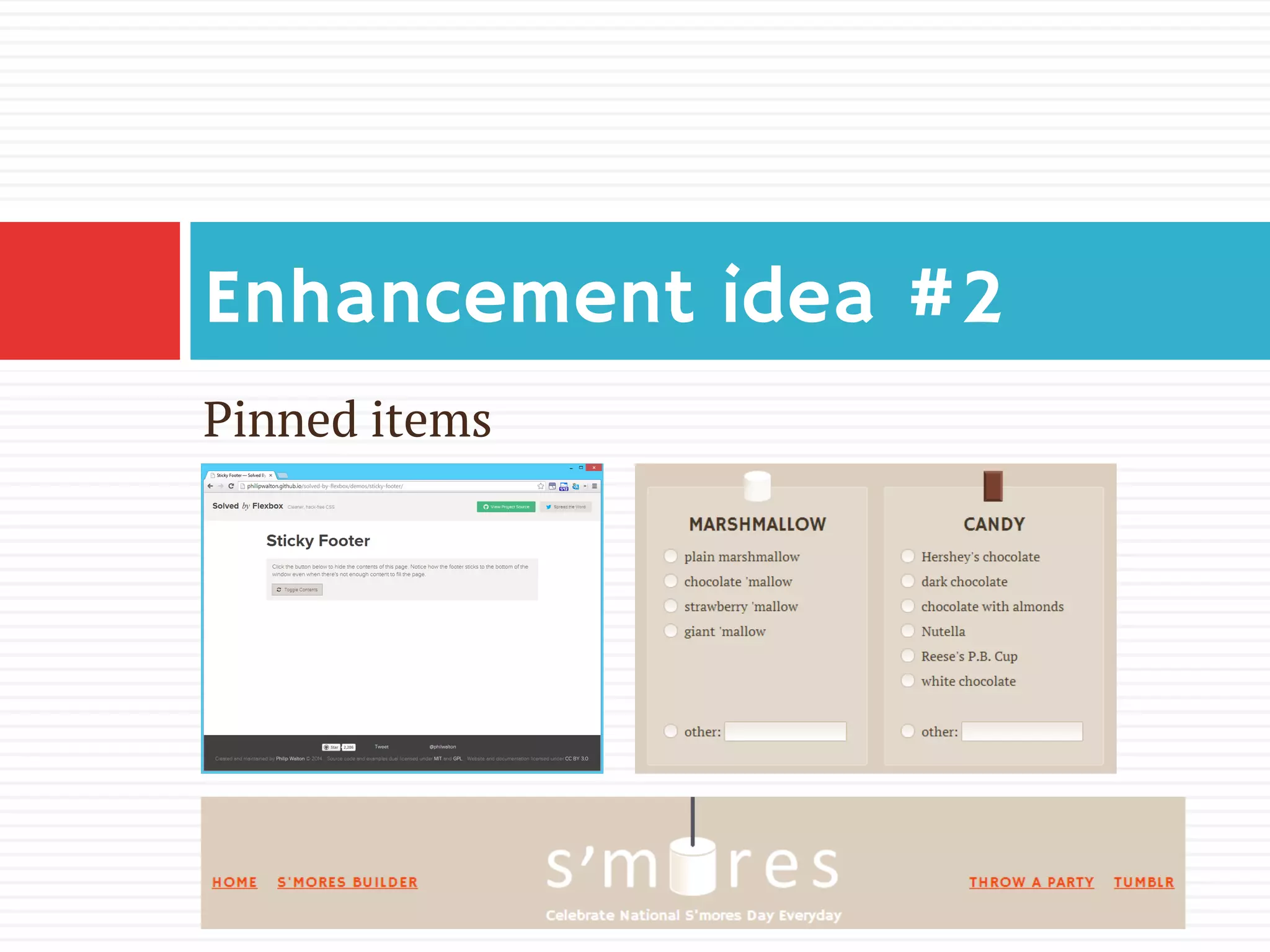
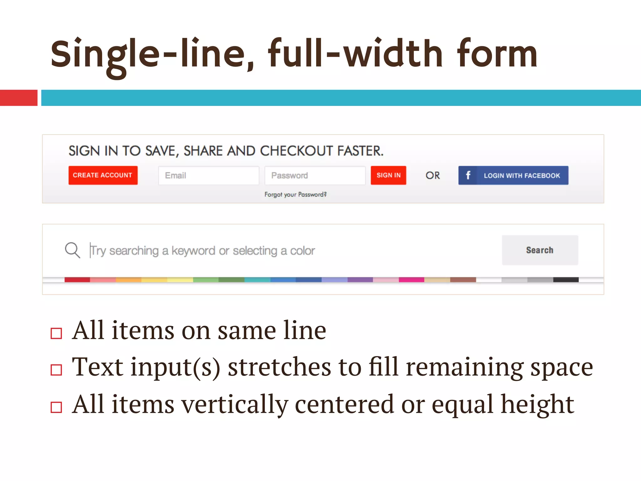
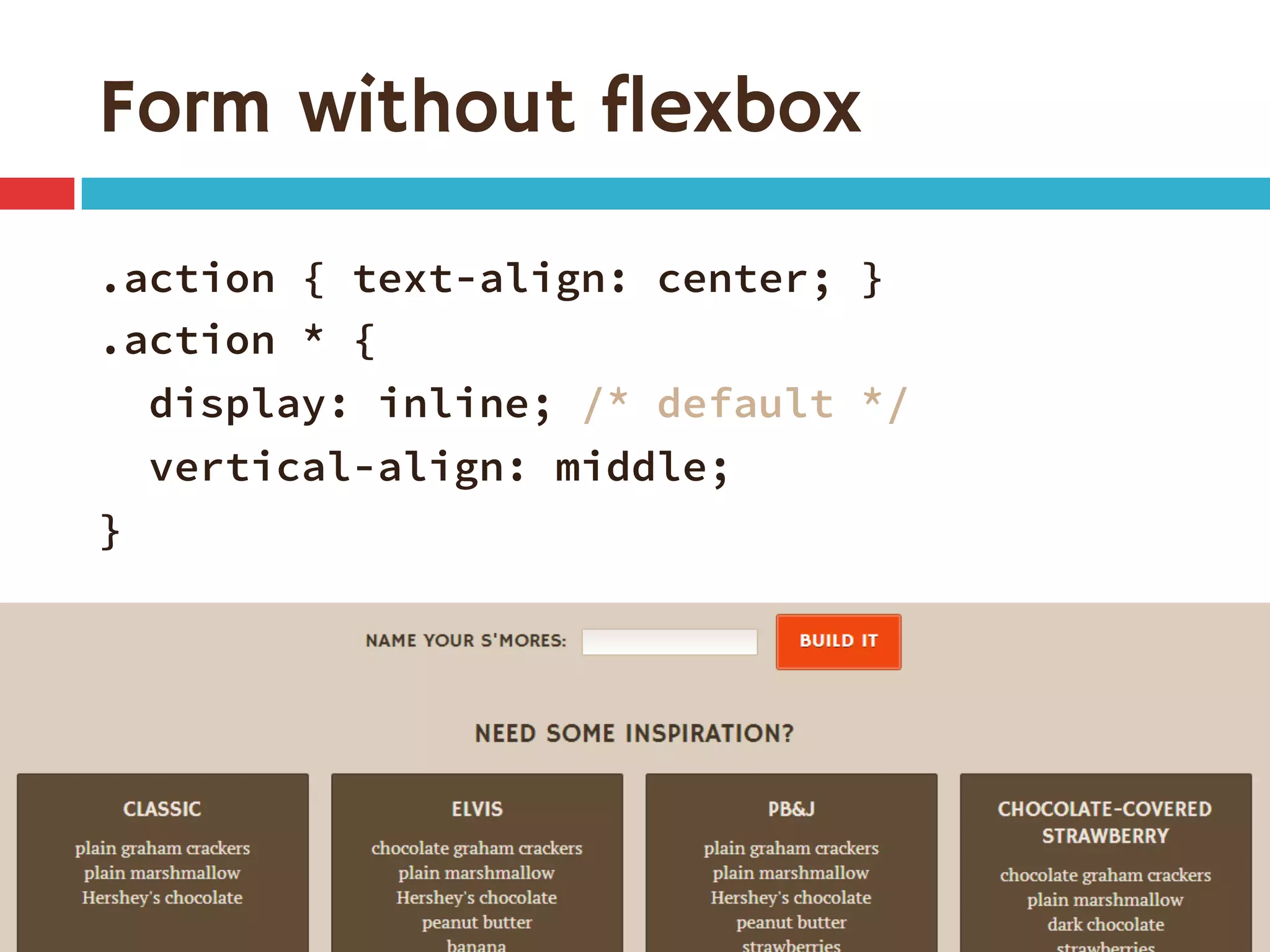
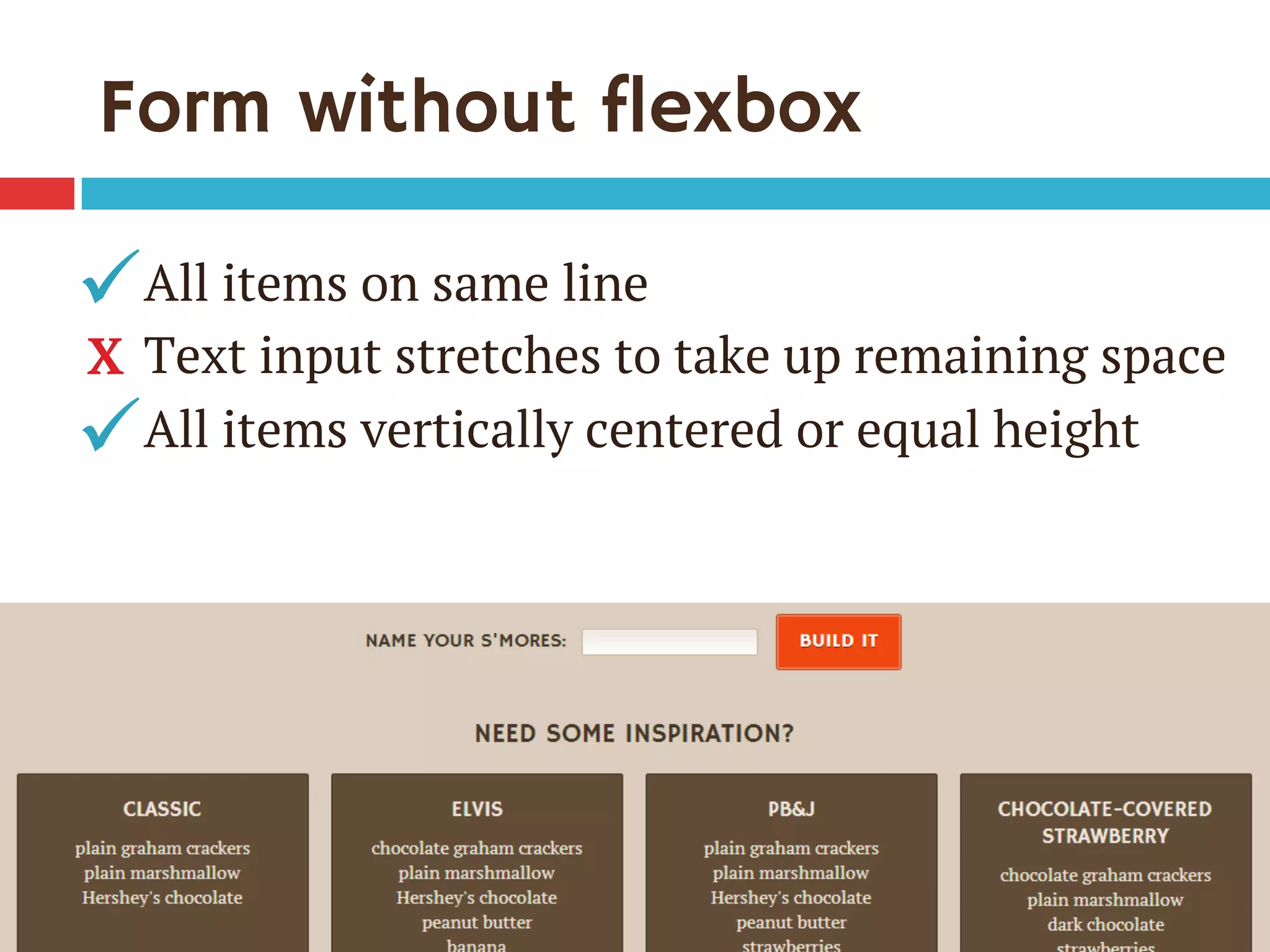
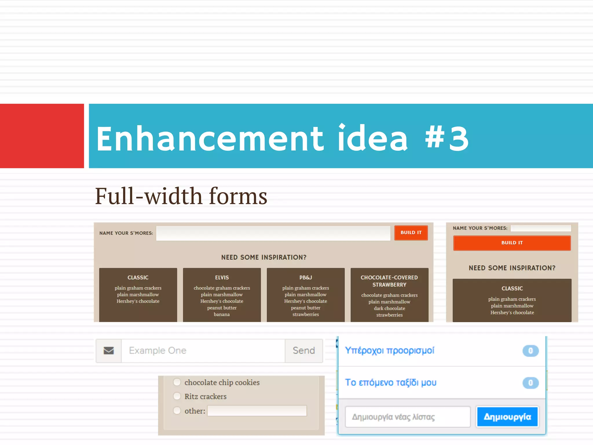
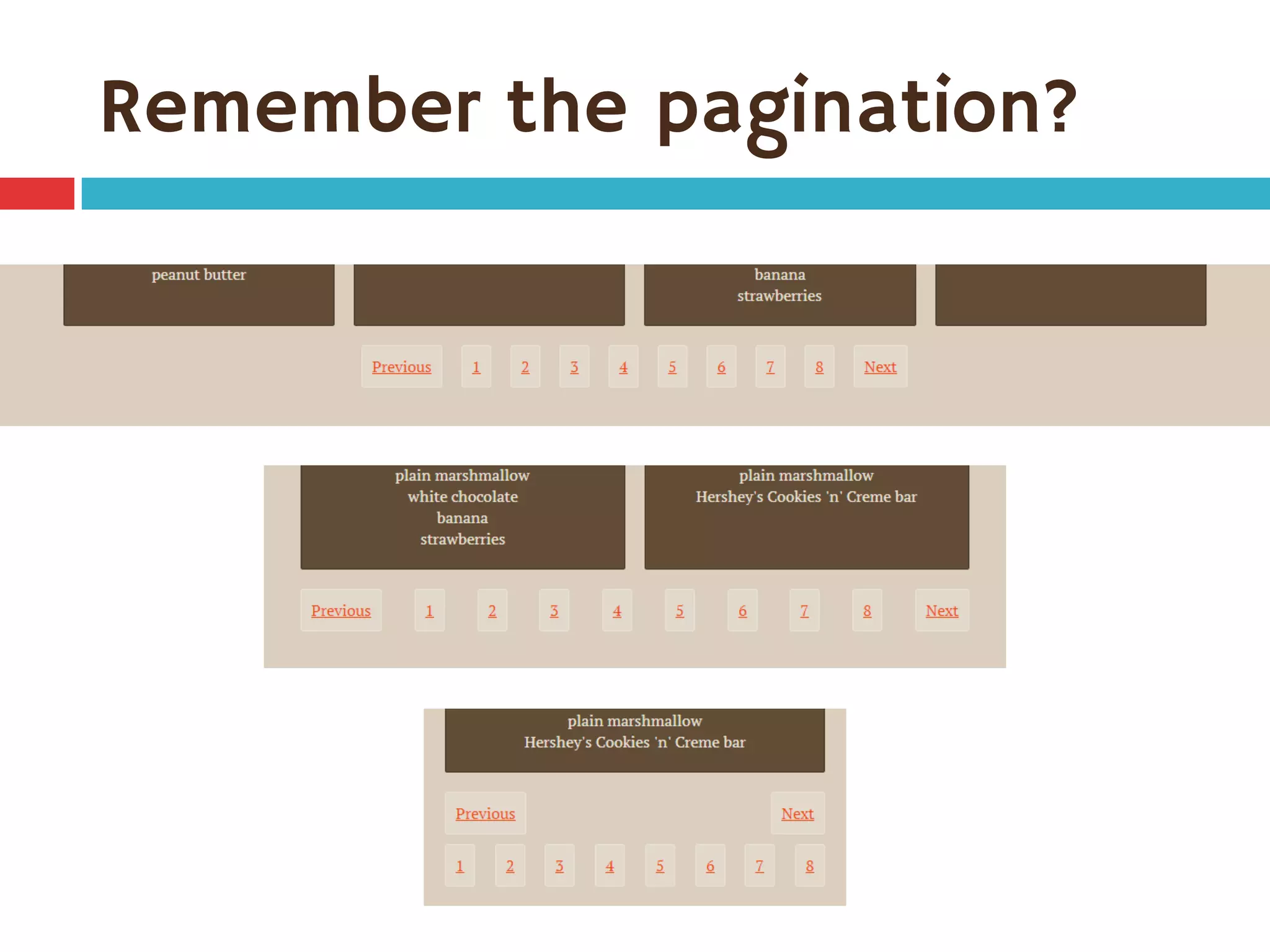
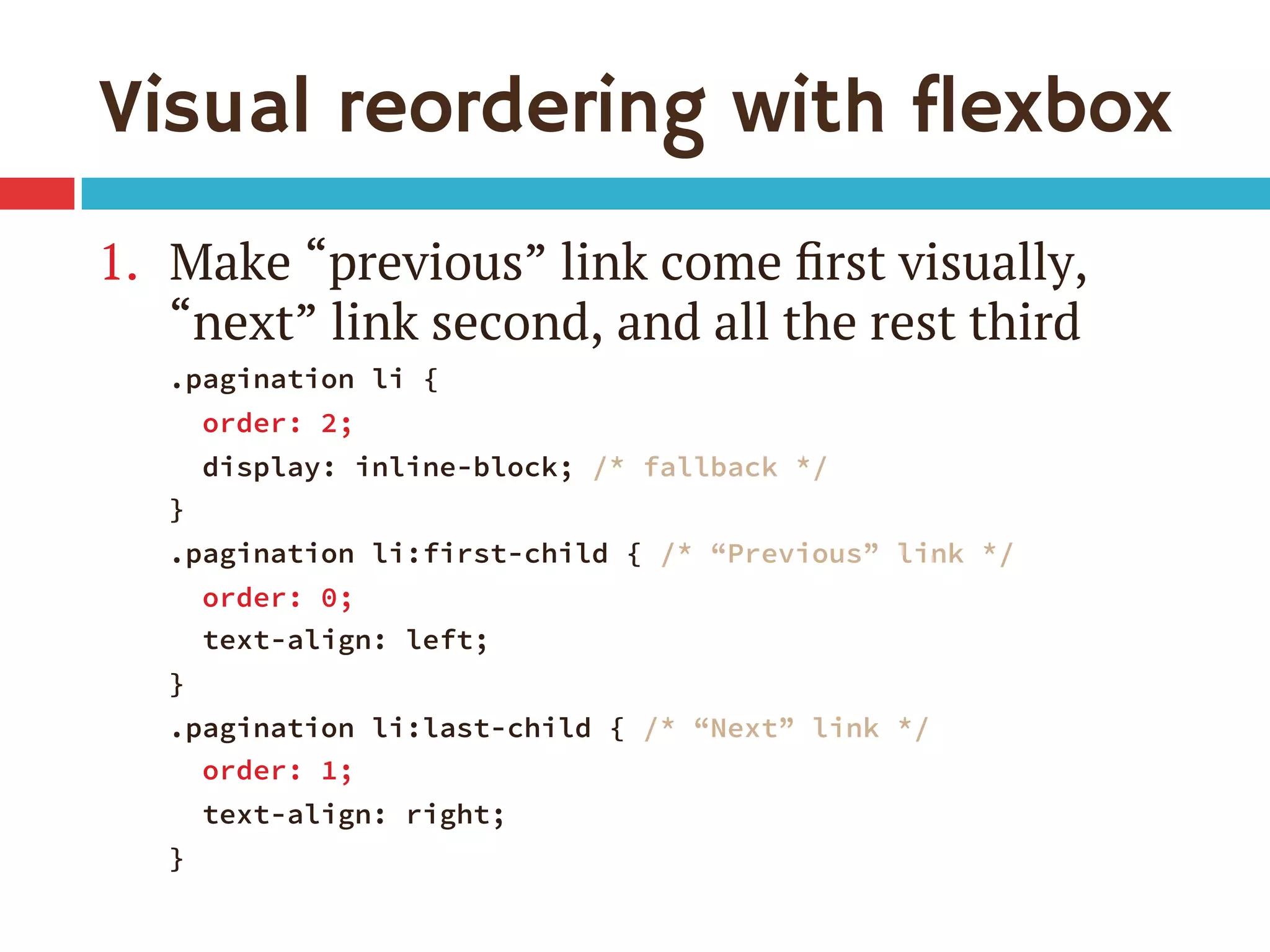
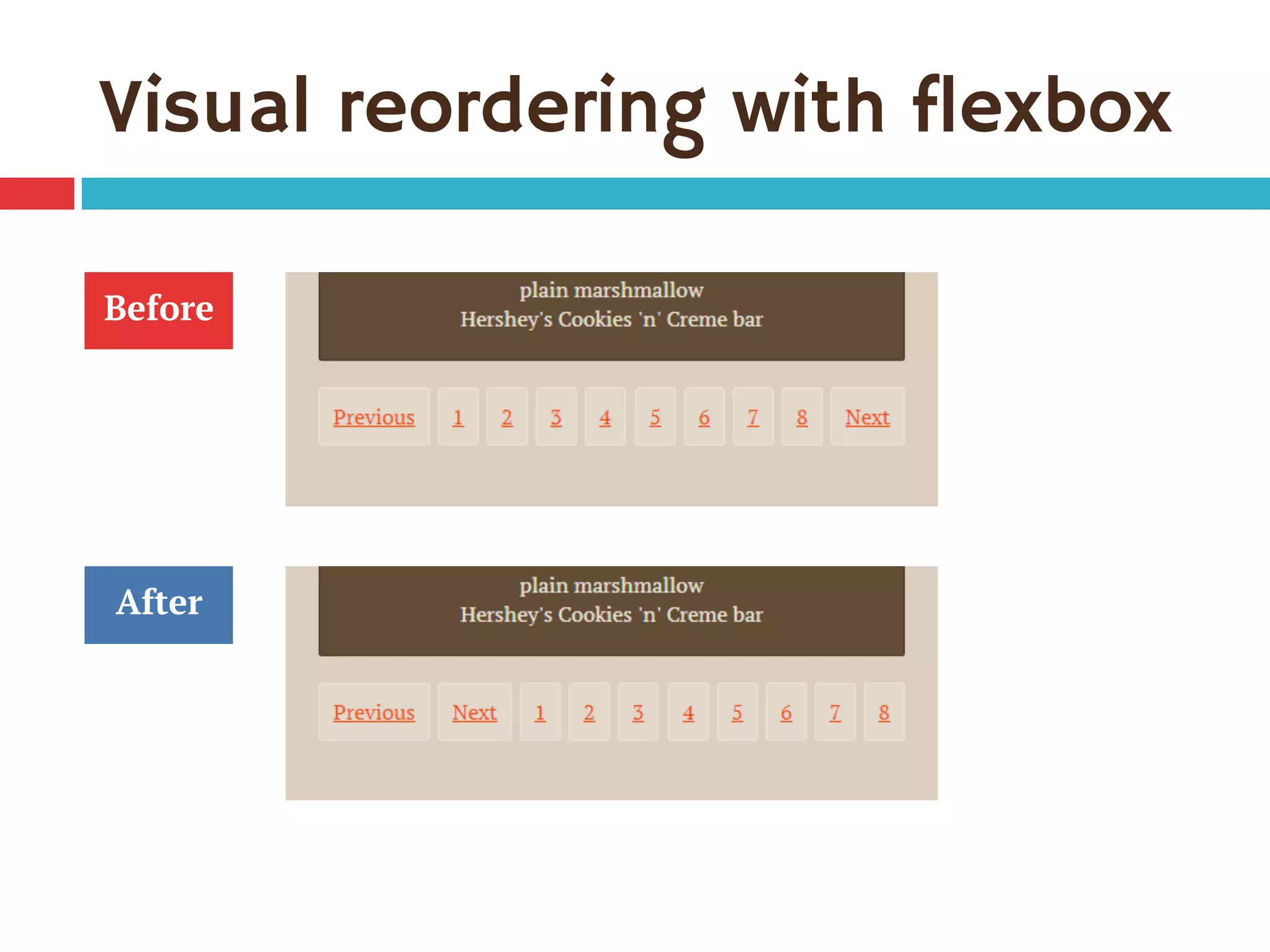
Download as PDF, PPTX


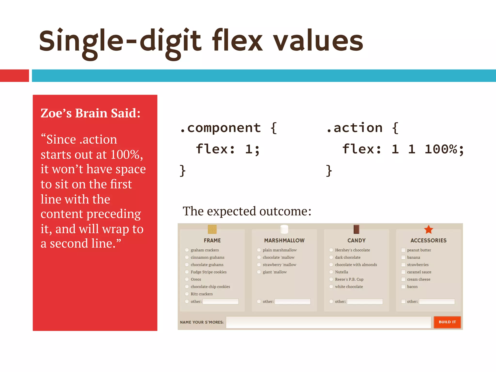
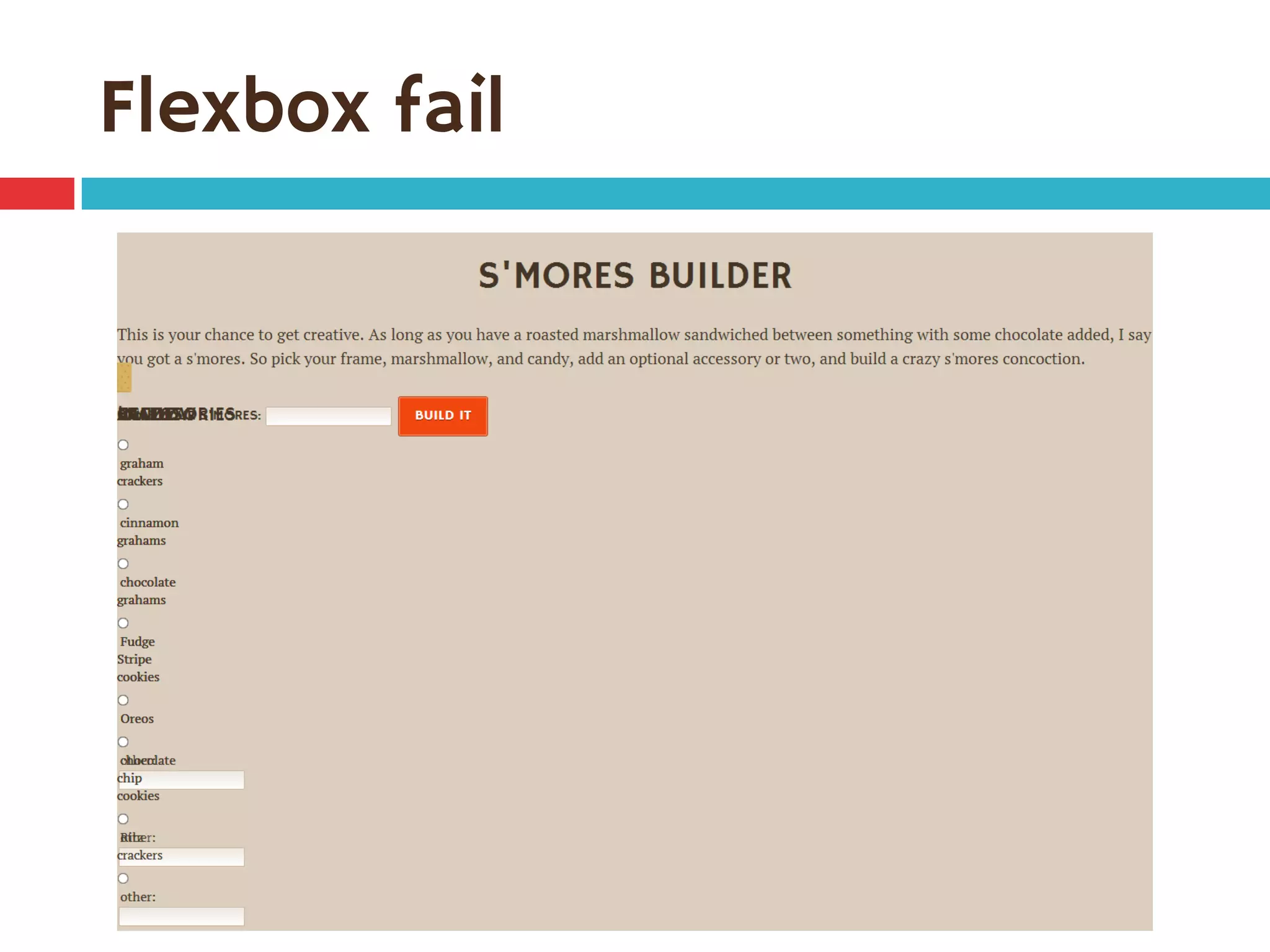
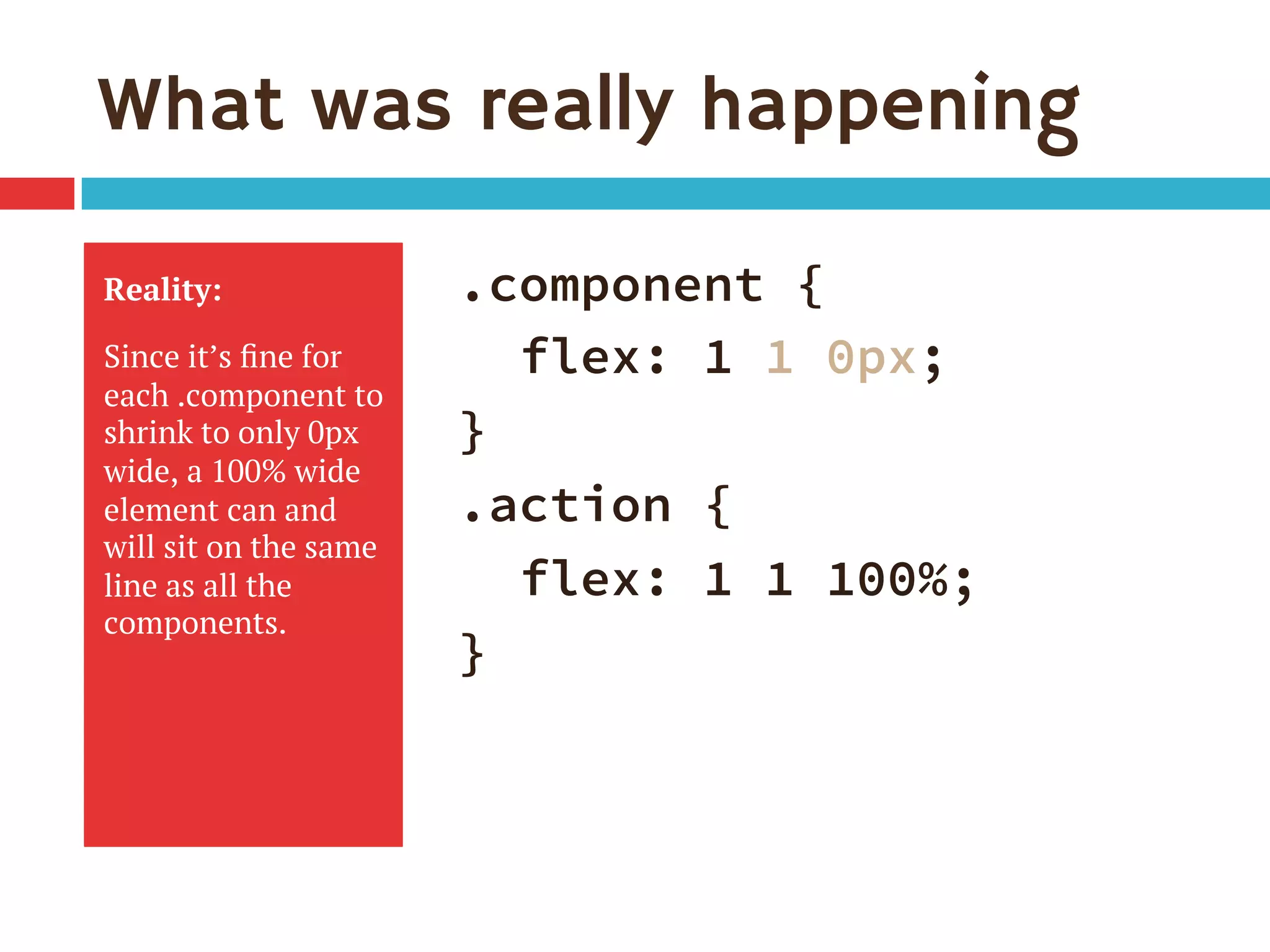
![Single-digit flex values
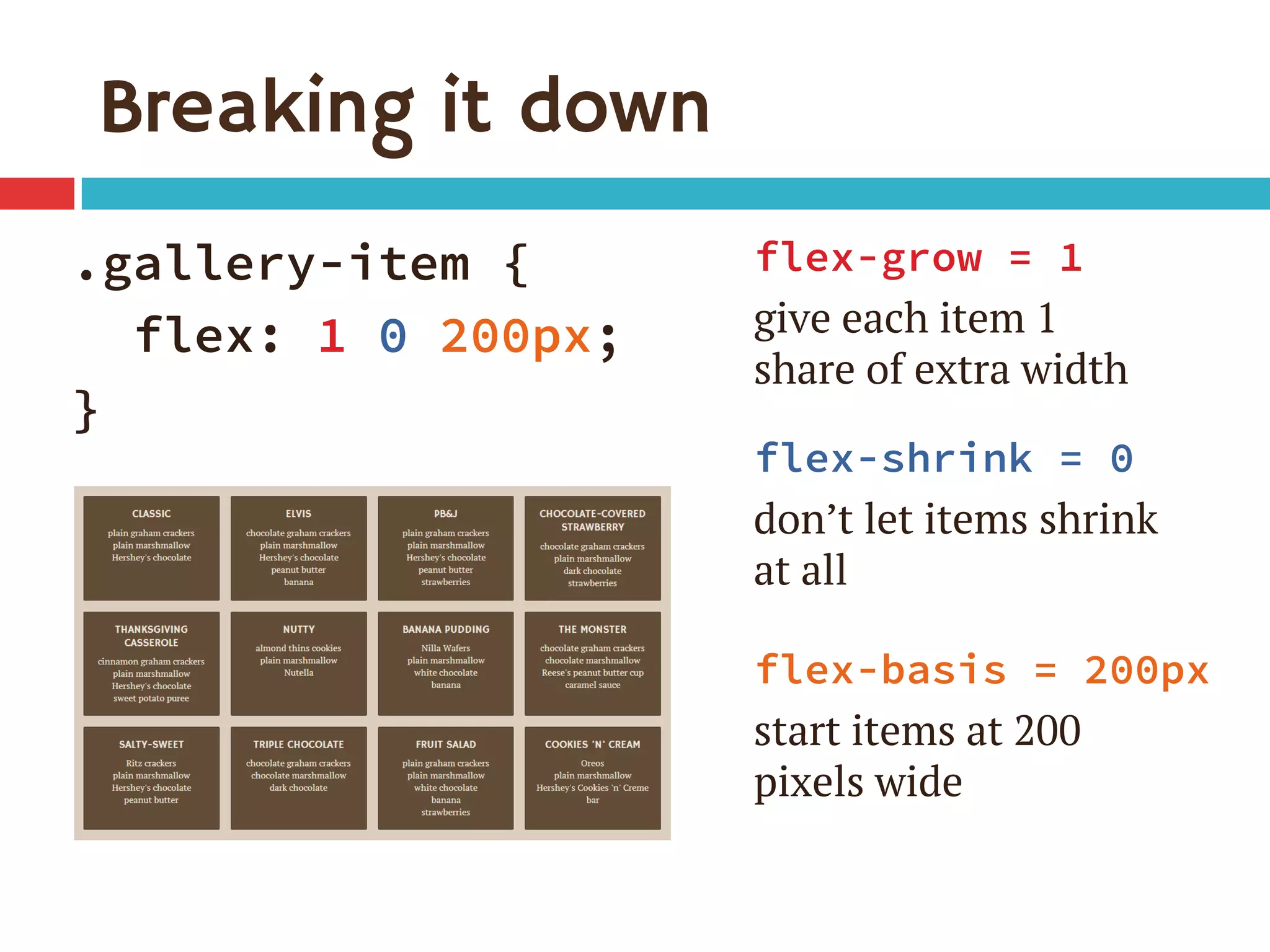
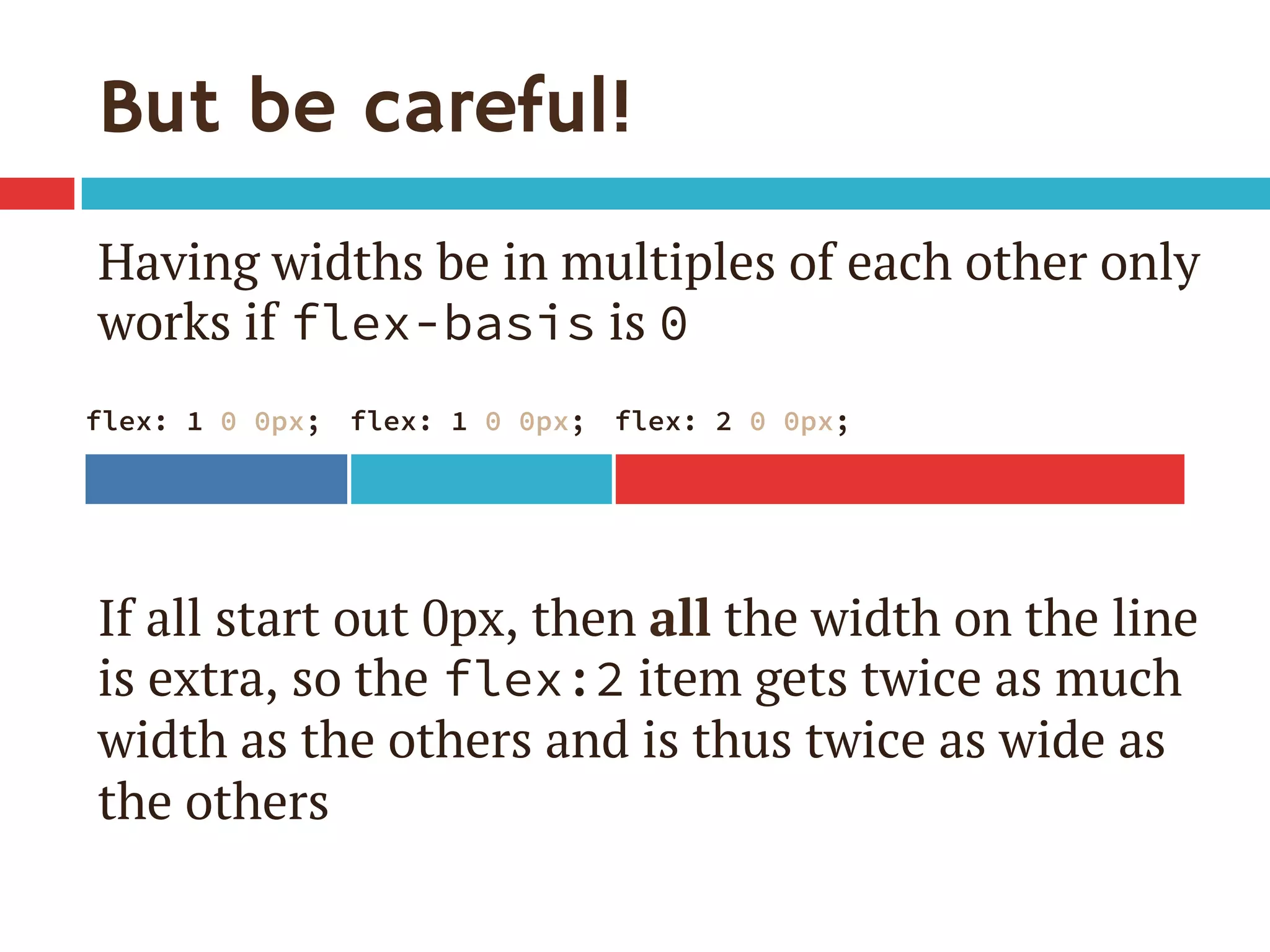
¨ Common to see flex: 1 in demos
¨ flex: [number] is equivalent to
flex: [number] 1 0px
¨ Be sure you really want flex-basis to be 0
¤ When wrap on, essentially min-width
¤ 0px therefore means items can shrink to 0px
¤ If everything can get down to 0px, nothing ever
has a reason to wrap](https://image.slidesharecdn.com/leveling-up-with-flexboxsmashingconfv3pdf-140326073329-phpapp01/75/Leveling-Up-with-Flexbox-Smashing-Conference-40-2048.jpg)

The document discusses the Flexbox CSS layout module, highlighting its syntax, browser support, and practical applications for web design. It details various configurations for creating responsive, flexible layouts, including navigation bars and stacked components, while addressing challenges posed by older browsers. Additionally, it provides examples, enhancement ideas, and describes how Flexbox simplifies layout management compared to traditional CSS methods.


![Vibe Coding vs. Spec-Driven Development [Free Meetup]](https://cdn.slidesharecdn.com/ss_thumbnails/vibecodingvsspecdrivendevelopment-251209105622-43f455e7-thumbnail.jpg?width=640&height=640&fit=bounds)


