
Recommended
Recommended
More Related Content
Recently uploaded
Recently uploaded (20)
Featured
Featured (20)
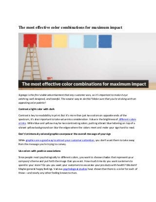
The most effective color combinations for maximum impact
- 1. The most effective color combinations for maximum impact Signage is the first visible advertisement that any customer sees, so it’s important to make it eye catching, well designed, and tasteful. The easiest way to do this? Make sure that you’re sticking with an appealing color palette! Contrast a light color with dark Contrast is key to readability in print. But it’s more than just two colors on opposite ends of the spectrum, it’s also important to take value into consideration. Value is the brightness of different colors or inks. While blue and yellow may be two contrasting colors, putting vibrant blue lettering on top of a vibrant yellow background can blur the edges where the colors meet and make your sign hard to read. Don’t let intensely colored graphics overpower the overall message of your sign While graphics are a good way to attract your customers attention, you don’t want them to take away from the message you’re trying to convey. Use colors with positive associations Since people react psychologically to different colors, you want to choose shades that represent your company’s theme and put forth the image that you want. How much time do you want customers to spend in your store? Do you you want your customers to associate your products with health? Wisdom? Maybe general happy feelings. Various psychological studies have shown that there is a color for each of those – and nearly any other feeling known to man.
- 2. Before designing your sign, get to know some popular colors used in business, and choose one that identifies with your company. In general, warm colors (reds, oranges, yellows) are associated with happy feelings and are very welcoming colors. McDonald’s uses red to make every meal a “happy meal” and make associate their food with positive feelings. Green – Associated with both wealth and a healthier, “greener” product. Purple – Can be associated with spirituality or wisdom, as well as wealth or luxury. Hallmark uses purple to show customers that they have the perfectly worded card for any occasion. Blue – Blue puts forth a message of confidence; it is strongly connected with a feeling of trust and efficiency. Pink – A feminine, loving color. Victoria’s Secret uses pink as their signature color to portray their romantic, women’s fashion. Black – Black can be seen as both sophisticated and efficient; and the good news for signage? It goes well with just about anything. Less is more No need to go crazy including every color with a positive association – while your business can be wise AND luxurious AND confident AND sophisticated, there’s no need to throw every color in the rainbow on to your sign to convey this message. Stick with 1-3 main colors for maximum. So what should you look at when choosing the best colors for your signage? Does your business already have an established brand color? If so, stick with it! You’ll want to work with already established colors to ensure that there’s no clash and give your customers a color and image to associate with your products. Work with complementary colors that contrast each other. This ensures that your message won’t appear blurred together or hard to read. Black and white is the simplest combination; in fact, both of these colors go well with nearly any other color that you’d like to choose. However, other pairs such as blue-orange, blue and yellow………… work well also. For more color inspiration check out more color palettes. Tags: color combination, color combinations, color combinations for products, color schemes, effective color scheme, effective color schemes, effective colors combinations