
Recommended
More Related Content
What's hot
What's hot (19)
Viewers also liked
Viewers also liked (13)
Similar to Q1 media
Similar to Q1 media (20)
More from milliebevan
More from milliebevan (16)
Recently uploaded
Recently uploaded (20)
Q1 media
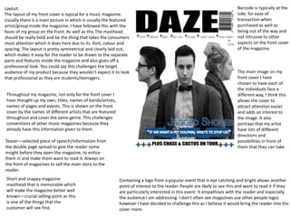
- 1. Layout: The layout of my front cover is typical for a music magazine. Usually there is a main picture in which is usually the featured artist/group inside the magazine. I have followed this with the faces of my group on the front. As well as this The masthead should be really bold and be the thing that takes the consumers most attention which it does here due to its font, colour and spacing. The layout is pretty symmetrical and clearly laid out, which makes it easy for the reader to be drawn to the separate parts and features inside the magazine and also gives off a professional look. You could say this challenges the target audience of my product because they wouldn't expect it to look that professional as they are students/teenagers. Throughout my magazine, not only for the front cover I have thought up my own, titles, names of bands/artists, names of pages and events. This is shown on the front cover by the names of different artists that are featured throughout and cover the same genre. This challenges conventions of other music magazines because they already have this information given to them. Teaser—selected piece of speech/information from the double page spread to give the reader some insight before they open the magazine, to entice them in and make them want to read it. Always on the front of magazines to sell the main story to the reader. Short and snappy magazine masthead that is memorable which will make the magazine better well known—crucial selling point as this is one of the things that the customer will see first. Barcode is typically at the side, for ease of transaction when purchased as well as being out of the way and not intrusive to other aspects on the front cover of the magazine. Containing a logo from a popular event that is eye catching and bright allows another point of interest to the reader. People are likely to see this and want to read it if they are particularly interested in this event. It empathises with the reader and especially the audience I am addressing. I don't often see magazines use other people logos however I have decided to challenge this as I believe it would bring the reader into the cover more. The main image on my front cover I have chosen to have each of the individuals face a different way, I think this allows the cover to attract attention easier and adds an interest to the image. It also portrays that my artist have lots of different directions and possibilities in front of them that they can take.
- 2. Typically on a double page spread there is usually a strong title and picture that represent the band/artist initially so that the reader gets the overall idea about them and is immediately drawn to the article/page. The main text in the page is set out in columns which strongly portrays the way in which all magazines are lay out. I have put the questions and the individuals initials in a bold font so that this allows the reader to identify the text easier, making it more pleasurable to read. I followed the conventional format of having the double page spread of my music magazine follow the format of an interview. It is what I am most interested in as a media consumer myself and what I perceive as being the most popular format inside music magazines. This format is not too heavy to read and is enjoyable also as you are constantly finding out new information about the individual/band. The background image is the bands logo and relates to their name significantly. It is important to correlate the colour schemes throughout the magazine as it reminds the reader subtly which brand they are reading as they go on. It is not often that a double page spread would have an image or shape as the background usually they just follow block colours or bright colours in which the text contrasts well with and using an image could go against the usual conventions of a double page spread. Placing images throughout the article keeps the reader interested and gives them even more of an insight into the groups personalities and vibe.
- 3. Like most contents pages of music magazines I have listed the features down one side of the page and the conventions down the other. This allows the reader to be able to identify what the special features of the magazine they are buying are and why they might want to buy it. It also allows the reader to be able to quickly scan the page to find what they might be wanting to find. Instead of just naming the page I have summarised what the page may be about underneath which some other magazines do too. Usually contents pages contain a number of small images that relate to each page whereas I just decided to use the faces of my group because it leaves more anticipation as to what they will find throughout the magazine.