The magazine front cover features a close-up shot of a band member's face and torso representing the main story inside. Near the band name is text providing insight into the magazine's content. The masthead is at the top in bold white font against a plain background. A red puff on the left announces special offers. Stories around the main image and barcodes at the bottom right are placed as expected by readers. The dark color scheme focuses on black and red with contrasting text for accessibility.
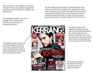
1. This is a front cover of a magazine in the heavy
metal genre this is a very popular magazine for The main image on the front cover is representing one of the
people who enjoy listening to or reading to that main stories that will be included in the magazine the image
type of music. itself is a medium close up shot featuring the face and torso of
a famous band member. There is some text near the name of
the band that gives the reader an insight into what they are
going to expect when reading the magazine for the first time.
The masthead is located at the top of
the page this is easily spotted
because the readers eyes are
automatic drawn to it.
The colour scheme of the
magazine is mainly due to the
colours of the boxes that hold the
text and the images that are
present on the front cover. They
are mainly dark colours focusing on
black and red it also features the
contrast system like with the puffs.
The magazines puff is located just
under the masthead on the left
hand side it is coloured red with
white coloured font this makes it
easier to read because the colours
are in contrast with another.
The barcode is located at
the bottom of the front
cover this is the usual
place for barcodes.
2. The masthead of the magazine front cover
is written in a bold font with the plain
white background this makes the masthead The image on the front cover of the music
stand out because it is the most brightly magazine is a close up shot just showing the
coloured thing on the front cover. head a neck of the person featured on the
front cover. It is in black and white which
makes the title further standout to the
readers eyes.
The stories that are featured in the
magazine are located on the front
cover and around the main image
they are coloured in red so like the
masthead they stand out to the
reader they are in contrast to the
background so people who have
sight difficulties can read the
information clearly on the front
cover this shows that the
magazine designers have taken The barcode is situated on the
into account the difficulties some bottom right hand corner like
people have when looking at most of the magazines out there
information so they make it stand This makes it easy to spot the
out and easy to read. barcode for the shopkeeper
because they already know what
to look for.
3. This is an example of a magazine front
cover of the classical genre
The magazine is showing special
The masthead of this magazine offers that they advertise to the
says the word music and is consumer for example the
coloured in red on the white magazine is offering a free CD that
background however the U and is included in the magazine.
S is partially covered up by the
main image on the front cover.
The main image on the magazine
front cover is of a woman holding The background of this magazine is
violin which is keeping up with the a plain white colour this doesn’t
genre of the magazine the additional confuse people with bright colours
text is spread out around the image and the only colours on the front
but there is two boxes that partially cover are in the information boxes,
cover the image one is displaying a the masthead and the main image
picture and the other id showing the this keeps the audiences attention
barcode which again is in the same on the images and information not
position as the other magazines a bright background.