1. Software Manual
On
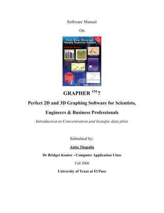
GRAPHER TM 7
Perfect 2D and 3D Graphing Software for Scientists,
Engineers & Business Professionals
Introduction to Concentration and Isotopic data plots
Submitted by:
Anita Thapalia
Dr Bridget Konter - Computer Application Class
Fall 2008
University of Texas at El Paso
2. Table of Contents
1.0 Introduction to Grapher 1
2.0 Starting Grapher 2
2.1 Title Bar 3
2.2 Toolbars 3
2.3 Menu Bar 3
2.4 Status Bar 3
2.5 Plot Window 3
2.6 Worksheet Window 3
2.7 Managers 4
3.0 Customizing Managers 5
3.1 Property Inspector 5
3.2 Object Manager 6
3.3 Worksheet Manager 7
4.0 Line/Scatter Plot 8
4.1 Tutorial for Line/Scatter plots 9
4.2 Editing Graphs 10
4.3 Saving Graphs 12
5.0 Plotting Concentrations and Isotopic data 13
6.0 Software Significance 14
3. Anita Thapalia GEO 5215
Grapher manual
1.0 Introduction to Grapher
Grapher is a type of graphing software developed by Golden Software, Inc. It is a
useful graphing package for scientists, engineers, business professionals, or anyone who
needs to generate graphs quickly. Grapher is easy to use in creating a graph because the
user can choose a graph type by selecting the data files, and clicking the open button.
There are seven different types of graphing styles created in Grapher as shown in Table 1.
The default setting is quite satisfactory and you can customize tic mark spacing, tic
labels, axis labels, axis length, grid lines, a variety of symbols, line colors that add more
flexibility to the software.
Table 1: Grapher plot types
Linear Bar Graphs Polar Graphs Specialty 3D aspect 3D XYZ Contour and
Graphs Graphs Graphs Graphs Surface Maps
Line plots Bar charts Polar plots Box-whisker Ribbon/wall 3D line/scatter XY Contour
(line/scatter) plots plots plots Data Map
Scatter plots Floating bar Polar class Bubble plots Function plots 3D class XY Contour
charts scatter plots scatter plots Grid Map
Class scatter Histograms Polar bar plots Hi-low-close Step plots 3D bar charts XZ Contour
plots graphs Data Map
Step plots Category bar Polar function Pie charts Bar charts 3D floating XZ Contour
charts plots bar charts Grid Map
Function Rose diagrams Stiff plots Floating bar 3D bubble plots Surface
plots chart Data Map
Wind charts Ternary Histograms Surface
diagrams Grid Map
Vector plots Pie charts Surface
Function Map
The cost of Grapher software is $349 which can be pre-viewed from the following
website: https://secure.hosting4less.com/goldensoftware/secureorder.shtml. The full demo
version can be obtained from software order which includes all products. Users can also
download free demos by registration at Golden Software website at
https://www.goldensoftware.com/. I am creating professional quality graphs for my thesis works
using this software.
1
4. Anita Thapalia GEO 5215
Grapher manual
Grapher is used quite often in the geologic sciences and it is beneficial for different fields
like geochemistry, structural analysis, petrology, etc. Grapher can import a Microsoft Excel data
sheet, add/make changes the datasheet, and plot the graphs without any modification in rows and
columns, which is an improvement our other graphing software programs.
2.0 Starting Grapher
The Grapher starts with a title bar, menu bar, tool bars (on the top of window), plot
window (center part of window), worksheet manager, status bar (on the bottom of window), and
managers (right part of window) as shown in Fig. 1.
Fig. 1. Grapher user interface
2
5. Anita Thapalia GEO 5215
Grapher manual
2.1 Title Bar:
The title bar displays the program name and the saved Grapher file name. In Fig. 1., it is
shown as e.g. Grapher-Zn_isotope_final. The filename with astrik (*) indicates the file has been
modified.
2.2 Toolbars :
The toolbar displays all of the Grapher tool buttons which are usually shortcuts to menu
commands.
2.3 Menu Bar:
The menu bar lists the commands used to run Grapher.
2.4 Status Bar:
The status bar shows information about activities of Grapher. It has three sections. The
left section displays selected objects such as Delta 66/64 Zn T in Fig. 1. The middle section
shows the information of the cursor coordinates for both X and Y (in inches). You can covert to
other unit system from File, choose Preferences/Default settings. The right section shows the
dimensions of the selected objects.
2.5 Plot Window:
The plot window consists of graphs and graphics as shown in Fig. 1.
2.6 Worksheet Window:
The worksheet window is used to create or import data in the program. You can import
Excel files by Selecting- All types in the file type and other different file in all recognized types
as shown in the Fig. 2.
3
6. Anita Thapalia GEO 5215
Grapher manual
Fig. 2. Grapher import file types
2.7 Managers:
Grapher contains four types of managers: object manager, property inspector, worksheet
manager, and the script manager. They are located under the Menu, then click on View and
choose Toolba rs/Managers (Fig. 3.).
4
7. Anita Thapalia GEO 5215
Grapher manual
Fig. 3. Grapher customizing Managers
3.0 Customizing Managers:
3.1 Property Inspector:
The property inspector (Fig. 4.) lists all properties for a selected object in a plot. You can
change symbol, line, fill, plot, clipping, error bars (data if available), labels, tic marks and
labels, break axis, and grid lines depending upon the object on a plot selected. Information
about object properties is available in the online help. You can uncheck the auto update box at
the bottom of the property inspector to cancel the immediate changes on the object properties.
You can use Edit/Undo for cancelling any changes that are not appropriate for use in property
inspector, if auto update is checked.
5
8. Anita Thapalia GEO 5215
Grapher manual
Fig. 4. Property Inspector
3.2 Object Manager
The object manager (Fig. 5) displays the hierarchical list of the objects in a Grapher plot
window. You can display the property of an object in the property inspector by selecting it. You
can click on ‘+’ or ‘-‘ icon to expand or collapse the list, respectively. The display order of
objects can be changed by selecting an object and dragging in a new position in the list with
mouse. It can be done by using Arrange in the menu window. The selected objects can be
renamed through Edit - Rename object from Menu command or by right clicking and choosing
Rename object. You can make the object invisible on the plot by clicking the Uncheck box in
the object manager. The object can be selected and deleted by using Delete key (Remember:
You cannot delete an axis used by a plot until the plot is on screen).
6
9. Anita Thapalia GEO 5215
Grapher manual
Fig. 5. Object Manager
3.3 Worksheet Manager
The worksheet manager (Fig. 6.) in Grapher can be opened by using File/Open to open a
data file in the worksheet window. You can directly type the data into a worksheet or copy data
from other application and paste into a worksheet. You can also choose File/New to open a new
worksheet. You can modify format, edit data, plot new graph, save and print the worksheet by
clicking right on the first row of the worksheet data. You can perform some basic calculations
choosing the Data and then Statistics, by right clicking on the data cell (Fig. 7.). Grapher can
plot data from more than one worksheet by adding different X and Y axes. The worksheet
manager allows viewing the multiple data files which can be displayed in a tabbed format. You
can also see the multiple worksheets used in the plot by scrolling the worksheet in the property
manager.
7
10. Anita Thapalia GEO 5215
Grapher manual
Fig. 6. Worksheet Manager
Fig. 7. Data modification in the Worksheet Manager
4.0 Line/Scatter Plot
Line/Scatter type of plot can be used to plot most professional appearance for the
publication purposes (Fig. 7 & 8). Grapher can easily accept data from more than one
worksheet in the same plot. As an example, in Geochemistry, it is used for plotting
concentrations vs. different steps of an experiment; concentration vs. depth of the various
metals in given a constant depth. The different steps of an experiment are Total, Organic,
Exchangeable, Fe-oxide fractions of the metals such as Zn, Cu, Fe, As, Pb, etc. can be plotted
so efficiently with the corresponding depth (of the sediment core).
8
11. Anita Thapalia GEO 5215
Grapher manual
4.1 Tutorial for Line/Scatter plots
The following steps will assist the user in creation of well labeled Line/Scatter plot for
concentration of metals vs. depth data for geochemical applications.
1. Start Grapher and a blank plot window will open, along with a worksheet manager,
property inspector and object manager windows (default). You can also start by opening
a File, choose new, select plot and click ok. You can create graphs from the plot window
Graph menu, or with graph wizard, or from the worksheet or templates. Choose plot
type line/scatter in the 2D graphs inside the Graph menu on the menu bar.
2. After clicking line/scatter, the open worksheet window will pop open and you can
import an Excel data file or other data formats as shown in Fig. 2. You can import excel
data files directly by selecting the spreadsheet and click on open. There is no need to
change the rows and columns of data as the worksheet manager will display the same
format as Excel does.
3. By default, Grapher will choose X column and Y column in property inspector as column
B and column C respectively, from the worksheet to plot the data. You can change the
position of X and Y axes, shift the tic marks by clicking position on the Axis properties
in Property Inspector.
4. Now, go ahead and change the X column by scrolling down the column number
displaying the order of column list exactly as in the data sheet. You can choose your
desired data column. As an example, Pb concentration column is selected as X axis 1.
Same applies to the depth in Y column (Fig. 8.).
5. After you specify the columns, if you wish to plot the different set of plots from the same
column, specify the worksheet rows in the property inspector. As an example, the
dataset for Pb has been entered in the same column from different data under subheading
Total, Organic, Exchangeable, Fe-oxide fractions. So, for the required plot such as Total
Pb, you have to specify the first row and last row by changing to custom and plugging the
9
12. Anita Thapalia GEO 5215
Grapher manual
number from worksheet. This way the user can plot the required set of data from one
column. If you add another plot with the Pb Organic concentrations data set, you have to
specify the worksheet rows keeping columns the same.
6. Now add another set of data to the earlier plot. To add Pb Fe-oxide data in the same plot,
you have to click on the plot area. After it ha s been selected, right click and choose add
plot and select line/scatter plot on select plot type. After that, it will ask you to choose
axes, click ok to add on the same X and Y axes of earlier plot. Then, an open worksheet
window pops open and you can import another data set in the worksheet manger if you
have data in different files. Otherwise, you can choose the same file again.
7. Upon completion, you can see a new line/scatter plot 2 added to the object manger with
the earlier X axis 1, Y axis 1 and line/scatter plot 1 under graph 1.
8. Plot the desired data on X axis by specifying the X and Y column and worksheet rows.
You can keep the constant depth and plot the different concentrations of Pb data.
9. Follow the steps 7 to 9 to add another Pb dataset with respect to the same depth.
4.2 Editing Graphs:
Each plot has separate properties and the user can specify the data columns and rows,
symbols, color, and line thickness by clicking on it and choosing from list of options and charts
in the property inspector for professional touch.
1. The Plot tab allows you to change the worksheet, axes, data column and rows.
2. The Symbol tab is very useful in changing appropriate symbol set and size, fill color.
3. The Line tab allows manipulating the lines and their thicknesses.
4. The Clipping tab helps with manipulating minimum and maximum data range for both X
and Y axes.
5. Select axis and you can edit axis, gridlines, tick marks, tick labels, break axis and line.
10
13. Anita Thapalia GEO 5215
Grapher manual
6. You can add title by clicking on the Axis tab. It will allow labeling title with the Text
Editor Box, all text functions are available. The position of the label can be customized
efficiently.
7. You can add a plot title by clicking on “A” on the left side of screen, which opens up the
Text Editor Box.
8. Select the plot and right click and choose add legend to add legend box. You can
specify name, font, and size of the legend box within the property inspector.
9. You can add more than one plot in one page by opening new plot and then copy and
paste the plots of each metal to compare their concentrations as shown in Fig. 9. You can
also add graphics, lines, and symbol from the Draw on the Menu bar to illustrate data.
Fig. 7. Worksheet for line/Scatter plot
11
14. Anita Thapalia GEO 5215
Grapher manual
Pb Concentration (ppm)
0 200 400 600 800 1000
0
10
20
Depth (cm)
30
Exchangeable
Organic
FeOxide
40 Total Digestion
50
Fig. 8. 2D Line/Scatter plot
4.3 Saving Graphs
After completion of all graphs in the plot window, you can save the graph to a Grapher
file (.GRF) or a Grapher project file (.GP). These files save all the scaling, formatting, and
parameters preserved in a file. Choose File/Save command to save and you can also Save As
for earlier saved plot. You can export graphs in portable formats commonly used for other
programs.
12
15. Anita Thapalia GEO 5215
Grapher manual
Concentration vs. Depth Plot
PPM PPM PPM PPM
0 20 40 60 80 0 1 2 3 0 200 400 600 800 0 200 400 600 800 1000
0
10
Depth (cm)
20
30
As Cu Zn Pb
40
50
Exchangeable
Organic
FeOxide
Total Digestion
Fig. 9. Example for Multiple Line/Scatter plot
5.0 Plotting Concentrations and Isotopic data:
Two different data sets of concentration and isotopic data are used in geochemistry to
show the relationship between them. This type of line/scatter plot can be used to see the
variation between two variables with respect to the constant Y axis.
The user can follow the same procedure to make scatter/line plot for concentration data
and axis by selecting the plot and right click on it. The add axis option allows the users to
choose another X or Y axis and specify the position of the axis. Following the same
procedure, you can able to plot the isotopic data. Data provided for isotopes have 2 sigma
errors which can be plotted on the Error Bars tab in the property inspector. You can specify
the bar length, color, and thickness as shown in the Fig. 9.
13
16. Anita Thapalia GEO 5215
Grapher manual
Zn Sedimentation rate (MAR) vs Isotopic data
δ66Zn
0 0.2 0.4
2000
1950
Age
1900
Zn MAR
1850 δ66/64 ZnT
1800
0 10 20 30 40
Zn MAR(µg/cm2/yr)
Fig. 10. Line/Scatter Plot for Concentration and Isotopes vs. Calculated Age
6.0 Software Significance
This manual has provided users a start up guide for Grapher software. You can clearly
visualize how much flexibility Grapher offers. Grapher is user friendly and the window is
familiar to Surfer too (most users also use Surfer software). Users can plot polar, vector and
bubble plots which are not available in all plotting software. There is no drawback for this
software. It has a lot of functions for the graphs and each property specifications. The database
14
17. Anita Thapalia GEO 5215
Grapher manual
file is same as Excel files which make the software handy rather than change the format of data
file. You can create fancy graphs within a fairly short amount of time. Diagrams/Plots using
this software provide more free space in manuscripts and much more clarity in plotting and
locating points.
Grapher is highly appreciated in the field of geochemistry; and users can manipulate their
data from other disciplines with this guide. This software is quick and fun to learn and online
help is easy to understand at http:// www.goldensoftware.com. The wide applicability of
Grapher really helps users to explore and utilize datasets in their own fields. It is worth
learning.
15