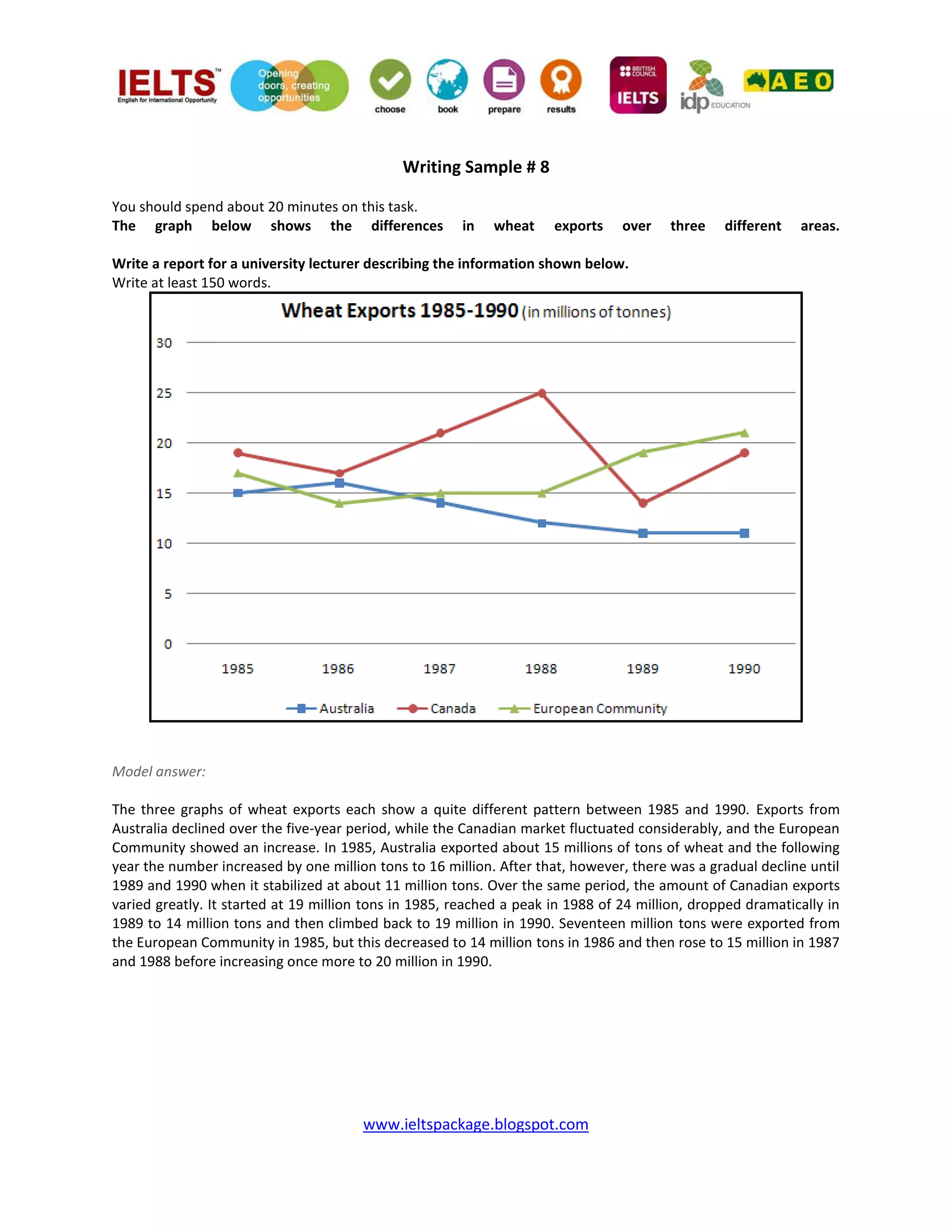
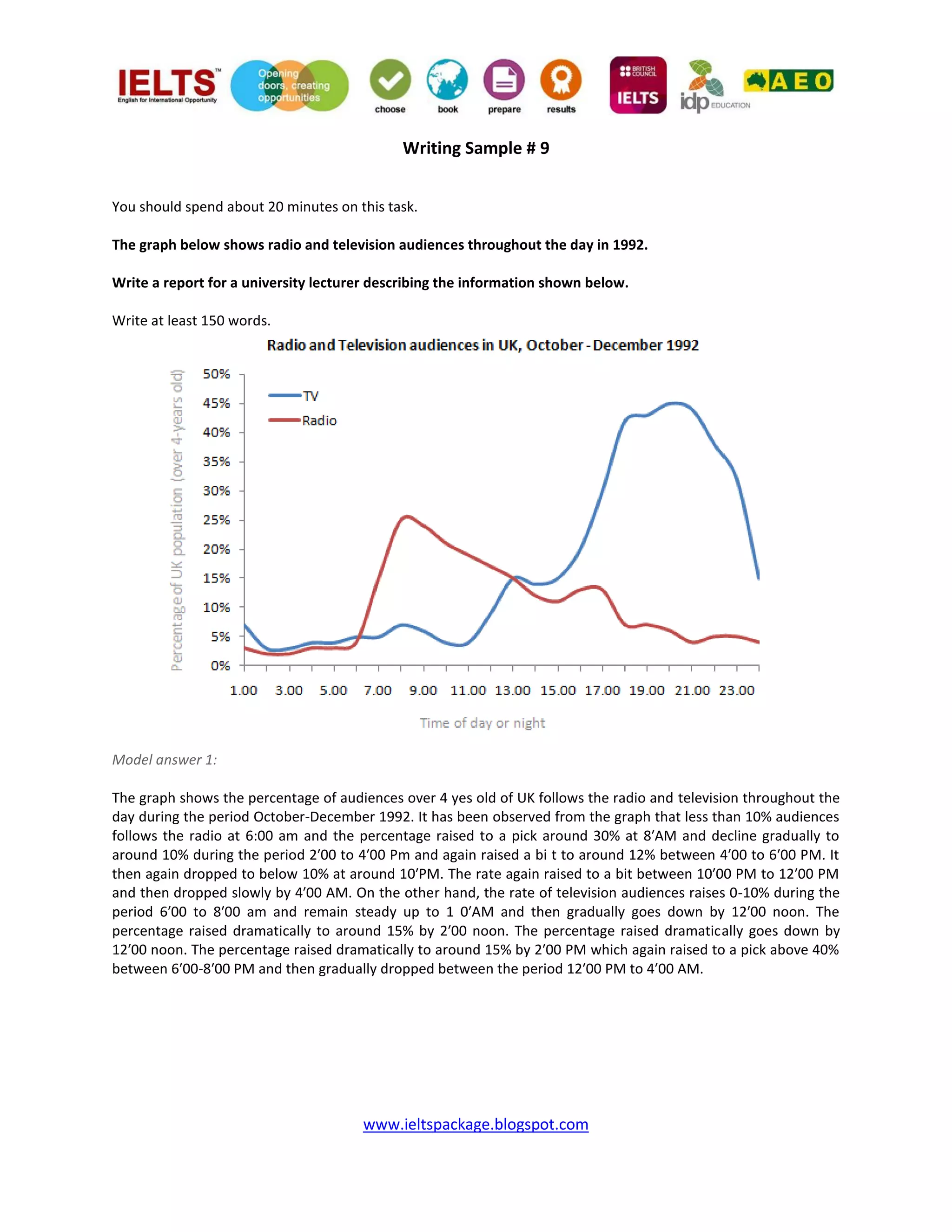
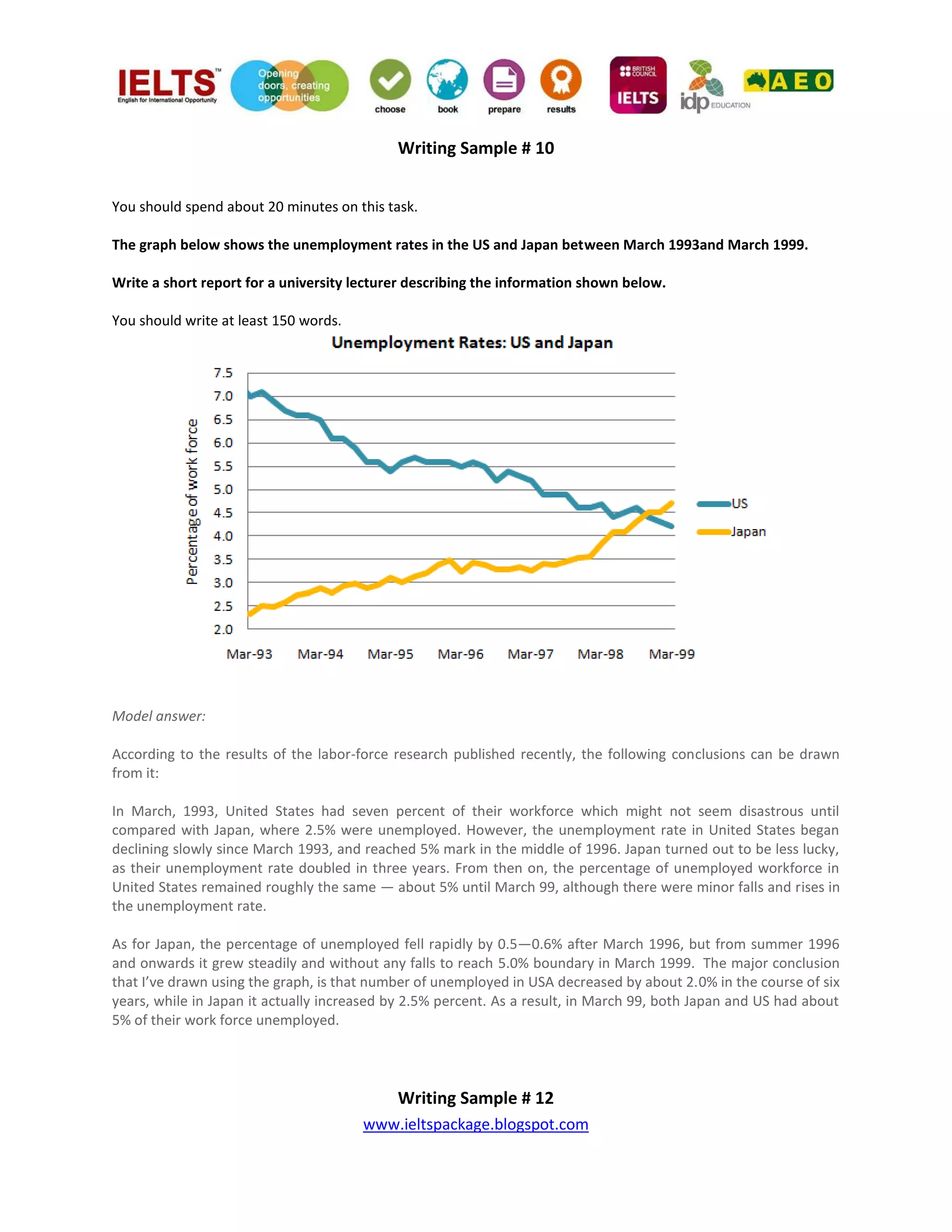
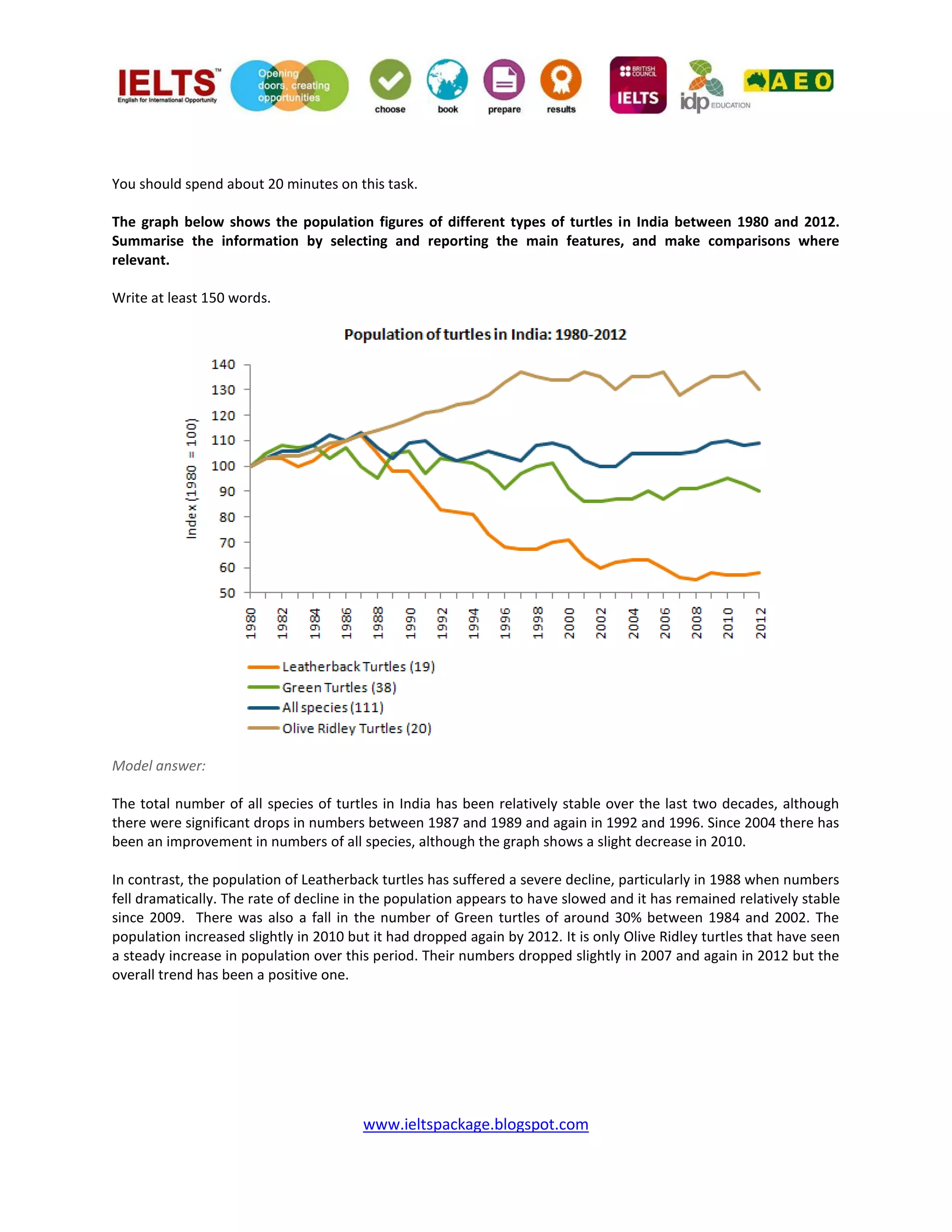
SlideShare a Scribd company logo
1 of 14
www.ieltspackage.blogspot.com
Line Graph samples: IELTS Writing Section 1
Produced by
IELTS PACKAGE
https://www.facebook.com/IeltsPackage
http://twitter.com/IELTSPackage
https://plus.google.com/107377857443940257247/posts
www.ieltspackage.blogspot.com
Writing Sample # 1
You should spend about 20 minutes on this task.
Eating sweet foods produces acid in the mouth, which can cause tooth decay. (High acid levels are measured by
low pH values)
Describe the information below and discuss the implications for dental health.
You should write at least 150 words.
Model answer:
Anyone who has visited a dentist has been told that eating excessive amounts of sweets risks harming the teeth.
This is because sweets lower pH levels in the mouth to dangerous levels. When the pH level in the mouth is kept
above 5.5, acidity is such that teeth are unlikely to be in danger of decay. Sweet foods, however, cause pH in the
mouth to drop for a time, and the longer pH levels remain below 5.5, the greater the opportunity for decay to
occur.
By comparing fruit sugar, cane sugar and honey, which are all common ingredients of sweet foods, we find that
cane sugar lowers pH levels for the longest period, thus producing the greatest risk of the three. Approximately
five minutes after consuming cane sugar, pH levels drop to as little as pH 3.5. They then begin to rise slowly, but do
not rise above pH 5.5 until at least 30 minutes have elapsed. By contrast, fruit sugar, which causes the mouth's
acidity to fall to just above pH 4, poses a danger for a shorter period: tooth decay is unlikely 20 minutes after
consumption. Honey appears an even less risky substance. Though acidity falls to about pH 4.75 within five
minutes of consumption, it returns to above pH 5.5 in under fifteen minutes.
The implications, then, are that people who insist on eating sweet foods should be aware of the ingredients, and
that fruit sugar or honey appears preferable to cane sugar
Writing Sample # 2
www.ieltspackage.blogspot.com
Write a report for a university lecturer describing the information in the graph below.
 You should write at least 150 words.
 Allow yourself 20 minutes for this task.
Model answer:
The graph compares the rate of smoking in men and women in Someland between the years 1960 and 2000. It can
be clearly seen that the rate of smoking for both men and women is currently declining and that fewer women
have smoked throughout the period. In 1960, 600 men in every 1,000 was smoking. This number decreased
gradually to 500 by 1974 and continued to decrease but more steeply to 250 in 2000. In contrast, the rate of
smoking in women in 1960 was very low at only 80 in every 1,000. By 1968 this increased to 170, and increased
again but more steeply to 320 in 1977. The rate of female smokers then remained stable at 320 until 1984 at which
point the figures began to decline and had dropped to 200 by 2000.
In conclusion we can see that the rate of smoking in men dropped throughout the whole period but was always at
a higher level than the female figures. The rate of smoking in women increased until 1977 but then decreased for
the rest of the period.
Writing Sample # 3
www.ieltspackage.blogspot.com
Write a report for a university lecturer describing the information below.
 You should write at least 150 words.
 You should spend about 20 minutes on this task.
Model answer:
The graph shows changes in the amount of fast food consumed in the UK between 1970 and 1990. Several trends
are apparent. First, Britons are eating more and more fast food. Secondly, the type of fast food has changed. In
1970, the most popular fast food was fish and chips. Over 300g were consumed each week. By 1990, however, this
had fallen to just over 200g - a 50% drop. Consumption of other fast foods such as pizza and hamburgers
increased, however. The amount of pizza eaten shot up from about 20g a week to more than 270g, overtaking fish
and chips in the late 1980s. Hamburger consumption also increased, rising from about 80g in 1970 to almost 300g
in 1990.
Accompanying this change in the choice of foods was an increase in the amount of fast food consumed. In 1970,
British consumers ate about 450g a week of fast food. In 1990, on the other hand, this had more than doubled, to
1000g.
Alternative answer:
The graph shows the amount of fast food eaten between 1970 and 1990 in grams per person per week. Overall,
the amount of fast food eaten more than doubled.
The amount of fish and chips eaten declined slightly. In 1970, the consumption was about 300g/week. This fell to
220g/week in 1990. In contrast, sales of hamburger and pizza rocketed. In 1970, very little pizza was eaten - less
than 50g/week. This rose to 280g/week by 1990. In the same period, hamburger sales shot up by more than 500%,
from 100g/week in 1970 to 500 grams in 1990. In conclusion, although there was a big increase in the
consumption of pizza and hamburger, sales of fish and chips decreased.
Writing Sample # 4
www.ieltspackage.blogspot.com
Write a report describing the information in the graph below.
 You should write at least 150 words.
 You should spend about 20 minutes on this task.
Model answer:
The line graph shows estimated sales of gold in Dubai for 12 months in 2002 in millions of dirhams. There were
two main seasons for gold sales.
The main season for sales is in the December to May period. Sales were consistently above 200 million dirhams per
month, rising sharply to a peak of 350 million dirhams in March. However, for the next four months, sales declined
steadily, reaching an annual low of 120 million dirhams in July.
In August, there was a sudden increase. Sales almost doubled, rising from 120 million dirhams in July to 210 million
dirhams in August. This was followed by a drop in September, back to the July figure.
From September to October, sales recovered, from 120 to 180 million. In October and November, sales remained
steady, and there was a small increase in December to 190 million dirhams. In conclusion, the main sales period is
in the early part of the year, slumping in the summer, except for a sudden increase in August.
www.ieltspackage.blogspot.com
Writing Sample # 5
The graph shows Underground Station Passenger Numbers in London. Summarise the information by selecting
and reporting the main features, and make comparisons where relevant.
 You should write at least 150 words.
 You should spend about 20 minutes on this task.
Model answer:
The graph shows the fluctuation in the number of people at a London underground station over the course of a
day. The busiest time of the day is in the morning. There is a sharp increase between 06:00 and 08:00, with 400
people using the station at 8 o'clock. After this the numbers drop quickly to less than 200 at 10 o'clock. Between
11 am and 3 pm the number rises, with a plateau of just under 300 people using the station.
In the afternoon, numbers decline, with less than 100 using the station at 4 pm. There is then a rapid rise to a peak
of 380 at 6pm. After 7 pm, numbers fall significantly, with only a slight increase again at 8pm, tailing off after 9 pm.
Overall, the graph shows that the station is most crowded in the early morning and early evening periods.
Writing Sample # 6
www.ieltspackage.blogspot.com
You should spend about 20 minutes on this task.
The line graph below gives information on cinema attendance in the UK. Write a report for a university lecturer
describing the information given.
You should write at least 150 words.
Model answer:
The given line graph illustrates information on the percentage of people who went to the movies in the United
Kingdom between 1990 and 2010. The people's attendance is divided into four different age groups. Overall,
younger people seemed to, and are predicted to, be more active in movie going than their older counterparts.
However, all four age groups showed a gradual increase in attendance numbers during the given period, except for
a slight drop between 1995 and 2000.
To be specific, a larger percentage of people between the ages of 24 and 34 went to, and are expected to, go to
the cinema than those in any other age group. Approximately 51% of the respondents from this age group are
expected to attend movies in 2010 compared with only 38% in 1990. Even in the group that had the smallest
number of movie goers, those between the ages of 44 and 54, there was an increase of 6% in their attendance.
(161 words)
www.ieltspackage.blogspot.com
Writing Sample # 7
You should spend about 20 minutes on this task.
The graph below compares the number of visits to two new music sites on the web.
Write a report for a university lecturer describing the information shown below.
You should write at least 150 words.
Model answer 1:
The graph shows the number of hits to two new music sites on the web, measured in thousands over a period of
fifteen days. As far as Music Choice is concerned, the number of visits to the Site fluctuated between 20,000 and
40,000 in the first eleven days, except for Day 3 when they reached 60,000. By contrast, visits to the Pop Parade
Site fell erratically from approximately 120,000 hits on Day 1 to around 40,000 on Day 7.
Between days 11 and 15 visits to Music Choice fluctuated dramatically, hitting a peak of over 120,000 on Day 14.
Despite a drop to less than 40,000 hits, Pop Parade Saw a huge increase in the number of hits between Days 9 and
11, reaching a total of over 150,000 hits on Day 11. At the end of the fifteen-day period the number of hits to Pop
Parade peaked at around 170,00, whereas those for Music Choice Showed a marked decline to around 70,000.
Model answer 2:
The graph shows people using new music places on the Internet in fifteen days period of time namely personal
choice and trendy pop music. The overall trend shows fluctuation with slight Increased towards the end of the
period. Starting with Music Choice websites; 40,000 people went on this new site on first-day. Half of them backed
out the next day. In Contrast to this Pop Parade net sites were visited by 120,000 music lovers on day one which
decreased slightly on the next day thereafter regaining the same fame on 3rd day. After 3rd day the enthusiasm
for both music lines on Internet dropped slowly- reaching maximum fall of 40,000 on 7th day. Whereas Music
www.ieltspackage.blogspot.com
choice gained popularity, slightly improving to get the original strength of 30,000 viewers on screen, but was
getting still less visitors than their opponent Pop group i.e. 40,000 on day 7.
In the beginning of the next week both gained remarkable recovery after a few fluctuations for 8th and 9th day
having 40,000 and 50,000 visitors respectively, reaching to their peaks of one and a half thousand new viewers for
Pop Parade on 11th day showing a contrast of very few people visiting Music choice for the same day. Thereafter
Music choice gained popularity on 12th day for having more than 120,000 new visitors on web.
In the end of the period Pop sites were visited by maximum viewers of 180,000 whereas sites located to Music
choice were not explored by more than 80,000 explorers on the last day of the report.
www.ieltspackage.blogspot.com
Writing Sample # 8
You should spend about 20 minutes on this task.
The graph below shows the differences in wheat exports over three different areas.
Write a report for a university lecturer describing the information shown below.
Write at least 150 words.
Model answer:
The three graphs of wheat exports each show a quite different pattern between 1985 and 1990. Exports from
Australia declined over the five-year period, while the Canadian market fluctuated considerably, and the European
Community showed an increase. In 1985, Australia exported about 15 millions of tons of wheat and the following
year the number increased by one million tons to 16 million. After that, however, there was a gradual decline until
1989 and 1990 when it stabilized at about 11 million tons. Over the same period, the amount of Canadian exports
varied greatly. It started at 19 million tons in 1985, reached a peak in 1988 of 24 million, dropped dramatically in
1989 to 14 million tons and then climbed back to 19 million in 1990. Seventeen million tons were exported from
the European Community in 1985, but this decreased to 14 million tons in 1986 and then rose to 15 million in 1987
and 1988 before increasing once more to 20 million in 1990.
www.ieltspackage.blogspot.com
Writing Sample # 9
You should spend about 20 minutes on this task.
The graph below shows radio and television audiences throughout the day in 1992.
Write a report for a university lecturer describing the information shown below.
Write at least 150 words.
Model answer 1:
The graph shows the percentage of audiences over 4 yes old of UK follows the radio and television throughout the
day during the period October-December 1992. It has been observed from the graph that less than 10% audiences
follows the radio at 6:00 am and the percentage raised to a pick around 30% at 8′AM and decline gradually to
around 10% during the period 2′00 to 4′00 Pm and again raised a bi t to around 12% between 4′00 to 6′00 PM. It
then again dropped to below 10% at around 10′PM. The rate again raised to a bit between 10′00 PM to 12′00 PM
and then dropped slowly by 4′00 AM. On the other hand, the rate of television audiences raises 0-10% during the
period 6′00 to 8′00 am and remain steady up to 1 0′AM and then gradually goes down by 12′00 noon. The
percentage raised dramatically to around 15% by 2′00 noon. The percentage raised dramatically goes down by
12′00 noon. The percentage raised dramatically to around 15% by 2′00 PM which again raised to a pick above 40%
between 6′00-8′00 PM and then gradually dropped between the period 12′00 PM to 4′00 AM.
www.ieltspackage.blogspot.com
Writing Sample # 10
You should spend about 20 minutes on this task.
The graph below shows the unemployment rates in the US and Japan between March 1993and March 1999.
Write a short report for a university lecturer describing the information shown below.
You should write at least 150 words.
Model answer:
According to the results of the labor-force research published recently, the following conclusions can be drawn
from it:
In March, 1993, United States had seven percent of their workforce which might not seem disastrous until
compared with Japan, where 2.5% were unemployed. However, the unemployment rate in United States began
declining slowly since March 1993, and reached 5% mark in the middle of 1996. Japan turned out to be less lucky,
as their unemployment rate doubled in three years. From then on, the percentage of unemployed workforce in
United States remained roughly the same — about 5% until March 99, although there were minor falls and rises in
the unemployment rate.
As for Japan, the percentage of unemployed fell rapidly by 0.5—0.6% after March 1996, but from summer 1996
and onwards it grew steadily and without any falls to reach 5.0% boundary in March 1999. The major conclusion
that I’ve drawn using the graph, is that number of unemployed in USA decreased by about 2.0% in the course of six
years, while in Japan it actually increased by 2.5% percent. As a result, in March 99, both Japan and US had about
5% of their work force unemployed.
Writing Sample # 12
www.ieltspackage.blogspot.com
You should spend about 20 minutes on this task.
The graph below shows the population figures of different types of turtles in India between 1980 and 2012.
Summarise the information by selecting and reporting the main features, and make comparisons where
relevant.
Write at least 150 words.
Model answer:
The total number of all species of turtles in India has been relatively stable over the last two decades, although
there were significant drops in numbers between 1987 and 1989 and again in 1992 and 1996. Since 2004 there has
been an improvement in numbers of all species, although the graph shows a slight decrease in 2010.
In contrast, the population of Leatherback turtles has suffered a severe decline, particularly in 1988 when numbers
fell dramatically. The rate of decline in the population appears to have slowed and it has remained relatively stable
since 2009. There was also a fall in the number of Green turtles of around 30% between 1984 and 2002. The
population increased slightly in 2010 but it had dropped again by 2012. It is only Olive Ridley turtles that have seen
a steady increase in population over this period. Their numbers dropped slightly in 2007 and again in 2012 but the
overall trend has been a positive one.
www.ieltspackage.blogspot.com
Writing Sample # 13
You should spend about 20 minutes on this task.
The graph below gives information about international tourist arrivals in five countries.
Summarise the information by selecting and reporting the main features, and make comparisons where
relevant.
Write at least 150 words.
Model answer:
The graph shows the overall numbers of tourist arrivals in five countries between 1995 and 2010. In 1995 over 70
million tourists visited the United States, more than twice as many as the next most popular destination shown,
France. However, between 2005 and 2010 there was a decrease of approximately 1,500,000 in the numbers going
to the United States whereas there was an increase of nearly 20 million tourists visiting France. The result was that
in 2010 the number of tourists arriving in the United States and France was almost equal at around 90 million
each.
The number of tourists visiting Malaysia rose steadily over the whole period but by 2010 the total was still under
50 million. The countries with the fewest tourist arrivals were Brazil and Egypt. The number of tourists going there
was similar between 1995 and 2000 but after that there was a greater increase in tourists going to Egypt than to
Brazil.

More Related Content

What's hot

Ielts writing task 1 - graph sample 20
Ielts writing task 1 - graph sample 20Ielts writing task 1 - graph sample 20
Ielts writing task 1 - graph sample 20ieltsboxcom
 
IELTS Writing Task 1 Academic line graphs sample questions
IELTS Writing Task 1 Academic line graphs sample questionsIELTS Writing Task 1 Academic line graphs sample questions
IELTS Writing Task 1 Academic line graphs sample questionsBen Worthington
 
IELTS Writing Task 1 - Prepositions for IELTS Writing Task 1 Graphs
IELTS Writing Task 1 - Prepositions for IELTS Writing Task 1 GraphsIELTS Writing Task 1 - Prepositions for IELTS Writing Task 1 Graphs
IELTS Writing Task 1 - Prepositions for IELTS Writing Task 1 GraphsIELTSBackup
 
Paraphrasing for IELTS - writing task 1
Paraphrasing for IELTS - writing task 1Paraphrasing for IELTS - writing task 1
Paraphrasing for IELTS - writing task 1David Wills
 
Ielts writing task 1 - chart sample 23
Ielts writing task 1 - chart  sample 23Ielts writing task 1 - chart  sample 23
Ielts writing task 1 - chart sample 23IELTSbox.com
 
IELTS Writing Task 1 - Describing Numbers in Task 1
IELTS Writing Task 1 - Describing Numbers in Task 1IELTS Writing Task 1 - Describing Numbers in Task 1
IELTS Writing Task 1 - Describing Numbers in Task 1IELTSBackup
 
IELTS – WRITE RIGHT by Julian Charles (Retyped by Hội các sĩ tử luyện thi IEL...
IELTS – WRITE RIGHT by Julian Charles (Retyped by Hội các sĩ tử luyện thi IEL...IELTS – WRITE RIGHT by Julian Charles (Retyped by Hội các sĩ tử luyện thi IEL...
IELTS – WRITE RIGHT by Julian Charles (Retyped by Hội các sĩ tử luyện thi IEL...Linh Pham
 
How to Organise Your Answer - IELTS writing task 1
How to Organise Your Answer - IELTS writing task 1How to Organise Your Answer - IELTS writing task 1
How to Organise Your Answer - IELTS writing task 1Afiani Astuti
 
Ielts journal
Ielts journal   Ielts journal
Ielts journal S.yv
 
Ielts writing task 1 - graph sample 22
Ielts writing task 1 - graph sample 22Ielts writing task 1 - graph sample 22
Ielts writing task 1 - graph sample 22IELTSbox.com
 
Ielts writing task 1 chart
Ielts writing task 1 chartIelts writing task 1 chart
Ielts writing task 1 chartAshak Hossan
 
Writing task 1 band 9 collection
Writing task 1   band 9 collectionWriting task 1   band 9 collection
Writing task 1 band 9 collectiontrang3t
 
IELTS Writing Task 1 Academic bar graphs sample questions
IELTS Writing Task 1 Academic bar graphs sample questionsIELTS Writing Task 1 Academic bar graphs sample questions
IELTS Writing Task 1 Academic bar graphs sample questionsBen Worthington
 
Ielts writing task 1 - graph sample 20
Ielts writing task 1 - graph sample 20Ielts writing task 1 - graph sample 20
Ielts writing task 1 - graph sample 20IELTSbox.com
 
ielts-writing-task-1-writing.pdf
ielts-writing-task-1-writing.pdfielts-writing-task-1-writing.pdf
ielts-writing-task-1-writing.pdfssuser85a8ea
 
IELTS Writing Task 1 - Six possible ways of writing the introduction
IELTS Writing Task 1 - Six possible ways  of writing the introductionIELTS Writing Task 1 - Six possible ways  of writing the introduction
IELTS Writing Task 1 - Six possible ways of writing the introductionIELTSBackup
 
How to organise your answer ielts writing task 1
How to organise your answer ielts writing task 1How to organise your answer ielts writing task 1
How to organise your answer ielts writing task 1Afiani Astuti
 
A Complete Guide to the IELTS Writing Test - GT
A Complete Guide to the IELTS Writing Test - GTA Complete Guide to the IELTS Writing Test - GT
A Complete Guide to the IELTS Writing Test - GTIELTSBackup
 
IELTS Writing Task 1 Charts Lesson
IELTS Writing Task 1 Charts Lesson IELTS Writing Task 1 Charts Lesson
IELTS Writing Task 1 Charts Lesson British Council
 

What's hot (20)

Ielts writing task 1 - graph sample 20
Ielts writing task 1 - graph sample 20Ielts writing task 1 - graph sample 20
Ielts writing task 1 - graph sample 20
 
IELTS Writing Task 1 Academic line graphs sample questions
IELTS Writing Task 1 Academic line graphs sample questionsIELTS Writing Task 1 Academic line graphs sample questions
IELTS Writing Task 1 Academic line graphs sample questions
 
IELTS Writing Task 1 - Prepositions for IELTS Writing Task 1 Graphs
IELTS Writing Task 1 - Prepositions for IELTS Writing Task 1 GraphsIELTS Writing Task 1 - Prepositions for IELTS Writing Task 1 Graphs
IELTS Writing Task 1 - Prepositions for IELTS Writing Task 1 Graphs
 
Paraphrasing for IELTS - writing task 1
Paraphrasing for IELTS - writing task 1Paraphrasing for IELTS - writing task 1
Paraphrasing for IELTS - writing task 1
 
Ielts writing task 1 - chart sample 23
Ielts writing task 1 - chart  sample 23Ielts writing task 1 - chart  sample 23
Ielts writing task 1 - chart sample 23
 
IELTS Writing Task 1 - Describing Numbers in Task 1
IELTS Writing Task 1 - Describing Numbers in Task 1IELTS Writing Task 1 - Describing Numbers in Task 1
IELTS Writing Task 1 - Describing Numbers in Task 1
 
IELTS – WRITE RIGHT by Julian Charles (Retyped by Hội các sĩ tử luyện thi IEL...
IELTS – WRITE RIGHT by Julian Charles (Retyped by Hội các sĩ tử luyện thi IEL...IELTS – WRITE RIGHT by Julian Charles (Retyped by Hội các sĩ tử luyện thi IEL...
IELTS – WRITE RIGHT by Julian Charles (Retyped by Hội các sĩ tử luyện thi IEL...
 
How to Organise Your Answer - IELTS writing task 1
How to Organise Your Answer - IELTS writing task 1How to Organise Your Answer - IELTS writing task 1
How to Organise Your Answer - IELTS writing task 1
 
Line graph
Line graphLine graph
Line graph
 
Ielts journal
Ielts journal   Ielts journal
Ielts journal
 
Ielts writing task 1 - graph sample 22
Ielts writing task 1 - graph sample 22Ielts writing task 1 - graph sample 22
Ielts writing task 1 - graph sample 22
 
Ielts writing task 1 chart
Ielts writing task 1 chartIelts writing task 1 chart
Ielts writing task 1 chart
 
Writing task 1 band 9 collection
Writing task 1   band 9 collectionWriting task 1   band 9 collection
Writing task 1 band 9 collection
 
IELTS Writing Task 1 Academic bar graphs sample questions
IELTS Writing Task 1 Academic bar graphs sample questionsIELTS Writing Task 1 Academic bar graphs sample questions
IELTS Writing Task 1 Academic bar graphs sample questions
 
Ielts writing task 1 - graph sample 20
Ielts writing task 1 - graph sample 20Ielts writing task 1 - graph sample 20
Ielts writing task 1 - graph sample 20
 
ielts-writing-task-1-writing.pdf
ielts-writing-task-1-writing.pdfielts-writing-task-1-writing.pdf
ielts-writing-task-1-writing.pdf
 
IELTS Writing Task 1 - Six possible ways of writing the introduction
IELTS Writing Task 1 - Six possible ways  of writing the introductionIELTS Writing Task 1 - Six possible ways  of writing the introduction
IELTS Writing Task 1 - Six possible ways of writing the introduction
 
How to organise your answer ielts writing task 1
How to organise your answer ielts writing task 1How to organise your answer ielts writing task 1
How to organise your answer ielts writing task 1
 
A Complete Guide to the IELTS Writing Test - GT
A Complete Guide to the IELTS Writing Test - GTA Complete Guide to the IELTS Writing Test - GT
A Complete Guide to the IELTS Writing Test - GT
 
IELTS Writing Task 1 Charts Lesson
IELTS Writing Task 1 Charts Lesson IELTS Writing Task 1 Charts Lesson
IELTS Writing Task 1 Charts Lesson
 

Similar to IELTS Writing Task 1Line graph samples

Two-line graph
Two-line graphTwo-line graph
Two-line graphnevinkamal
 
Bar Chart Samples.pdf
Bar Chart Samples.pdfBar Chart Samples.pdf
Bar Chart Samples.pdfZoay7I6
 
IELTS Academic Module
IELTS Academic ModuleIELTS Academic Module
IELTS Academic ModuleTEInstitute
 
How To Write A Conclusion And Introduction - Beclila
How To Write A Conclusion And Introduction - BeclilaHow To Write A Conclusion And Introduction - Beclila
How To Write A Conclusion And Introduction - BeclilaLindsey Sais
 
Lecture 6 measuring the cost of living
Lecture 6 measuring the cost of livingLecture 6 measuring the cost of living
Lecture 6 measuring the cost of livingGale Pooley
 
How will India's escalating Price Rise be controlled?
How will India's escalating Price Rise be controlled?How will India's escalating Price Rise be controlled?
How will India's escalating Price Rise be controlled?Yogesh Upadhyaya
 
4Th Grade Essay Prompt. Online assignment writing service.
4Th Grade Essay Prompt. Online assignment writing service.4Th Grade Essay Prompt. Online assignment writing service.
4Th Grade Essay Prompt. Online assignment writing service.Vanessa Perkins
 
4Th Grade Essay Prompt
4Th Grade Essay Prompt4Th Grade Essay Prompt
4Th Grade Essay PromptFelicia Clark
 
4Th Grade Essay Prompt. Online assignment writing service.
4Th Grade Essay Prompt. Online assignment writing service.4Th Grade Essay Prompt. Online assignment writing service.
4Th Grade Essay Prompt. Online assignment writing service.Susan Green
 
Soccer Fans Essay. Online assignment writing service.
Soccer Fans Essay. Online assignment writing service.Soccer Fans Essay. Online assignment writing service.
Soccer Fans Essay. Online assignment writing service.Elizabeth Johnson
 
Perceptions, Reality and Devolution
Perceptions, Reality and DevolutionPerceptions, Reality and Devolution
Perceptions, Reality and DevolutionIpsos UK
 
HAPPY BEE 20.08.2023.pptx
HAPPY BEE 20.08.2023.pptxHAPPY BEE 20.08.2023.pptx
HAPPY BEE 20.08.2023.pptxFransErasmus4
 
002 Proposal Essay Examples Example That
002 Proposal Essay Examples Example That002 Proposal Essay Examples Example That
002 Proposal Essay Examples Example ThatSheila Brooks
 
Essay Rough Draft Sample. Online assignment writing service.
Essay Rough Draft Sample. Online assignment writing service.Essay Rough Draft Sample. Online assignment writing service.
Essay Rough Draft Sample. Online assignment writing service.Christine Muller
 
10 IELTS Academic 1 Answers / essays.
10 IELTS Academic 1 Answers / essays. 10 IELTS Academic 1 Answers / essays.
10 IELTS Academic 1 Answers / essays. Ben Worthington
 
Factual Audience Research Fanzine
Factual Audience Research FanzineFactual Audience Research Fanzine
Factual Audience Research FanzineOliviaWaller2
 
Writing Paper Raised Line Writing Paper Red And B
Writing Paper Raised Line Writing Paper Red And BWriting Paper Raised Line Writing Paper Red And B
Writing Paper Raised Line Writing Paper Red And BSamantha Caldwell
 

Similar to IELTS Writing Task 1Line graph samples (20)

Double line graphs
Double line graphsDouble line graphs
Double line graphs
 
Two-line graph
Two-line graphTwo-line graph
Two-line graph
 
Bar Chart Samples.pdf
Bar Chart Samples.pdfBar Chart Samples.pdf
Bar Chart Samples.pdf
 
Contoh task 1 2
Contoh task 1 2Contoh task 1 2
Contoh task 1 2
 
IELTS Academic Module
IELTS Academic ModuleIELTS Academic Module
IELTS Academic Module
 
How To Write A Conclusion And Introduction - Beclila
How To Write A Conclusion And Introduction - BeclilaHow To Write A Conclusion And Introduction - Beclila
How To Write A Conclusion And Introduction - Beclila
 
Lecture 6 measuring the cost of living
Lecture 6 measuring the cost of livingLecture 6 measuring the cost of living
Lecture 6 measuring the cost of living
 
How will India's escalating Price Rise be controlled?
How will India's escalating Price Rise be controlled?How will India's escalating Price Rise be controlled?
How will India's escalating Price Rise be controlled?
 
4Th Grade Essay Prompt. Online assignment writing service.
4Th Grade Essay Prompt. Online assignment writing service.4Th Grade Essay Prompt. Online assignment writing service.
4Th Grade Essay Prompt. Online assignment writing service.
 
4Th Grade Essay Prompt
4Th Grade Essay Prompt4Th Grade Essay Prompt
4Th Grade Essay Prompt
 
4Th Grade Essay Prompt. Online assignment writing service.
4Th Grade Essay Prompt. Online assignment writing service.4Th Grade Essay Prompt. Online assignment writing service.
4Th Grade Essay Prompt. Online assignment writing service.
 
Soccer Fans Essay. Online assignment writing service.
Soccer Fans Essay. Online assignment writing service.Soccer Fans Essay. Online assignment writing service.
Soccer Fans Essay. Online assignment writing service.
 
Perceptions, Reality and Devolution
Perceptions, Reality and DevolutionPerceptions, Reality and Devolution
Perceptions, Reality and Devolution
 
HAPPY BEE 20.08.2023.pptx
HAPPY BEE 20.08.2023.pptxHAPPY BEE 20.08.2023.pptx
HAPPY BEE 20.08.2023.pptx
 
002 Proposal Essay Examples Example That
002 Proposal Essay Examples Example That002 Proposal Essay Examples Example That
002 Proposal Essay Examples Example That
 
Hyperinflation
HyperinflationHyperinflation
Hyperinflation
 
Essay Rough Draft Sample. Online assignment writing service.
Essay Rough Draft Sample. Online assignment writing service.Essay Rough Draft Sample. Online assignment writing service.
Essay Rough Draft Sample. Online assignment writing service.
 
10 IELTS Academic 1 Answers / essays.
10 IELTS Academic 1 Answers / essays. 10 IELTS Academic 1 Answers / essays.
10 IELTS Academic 1 Answers / essays.
 
Factual Audience Research Fanzine
Factual Audience Research FanzineFactual Audience Research Fanzine
Factual Audience Research Fanzine
 
Writing Paper Raised Line Writing Paper Red And B
Writing Paper Raised Line Writing Paper Red And BWriting Paper Raised Line Writing Paper Red And B
Writing Paper Raised Line Writing Paper Red And B
 

Recently uploaded

General Principles of Intellectual Property: Concepts of Intellectual Proper...
General Principles of Intellectual Property: Concepts of Intellectual  Proper...General Principles of Intellectual Property: Concepts of Intellectual  Proper...
General Principles of Intellectual Property: Concepts of Intellectual Proper...Poonam Aher Patil
 
80 ĐỀ THI THỬ TUYỂN SINH TIẾNG ANH VÀO 10 SỞ GD – ĐT THÀNH PHỐ HỒ CHÍ MINH NĂ...
80 ĐỀ THI THỬ TUYỂN SINH TIẾNG ANH VÀO 10 SỞ GD – ĐT THÀNH PHỐ HỒ CHÍ MINH NĂ...80 ĐỀ THI THỬ TUYỂN SINH TIẾNG ANH VÀO 10 SỞ GD – ĐT THÀNH PHỐ HỒ CHÍ MINH NĂ...
80 ĐỀ THI THỬ TUYỂN SINH TIẾNG ANH VÀO 10 SỞ GD – ĐT THÀNH PHỐ HỒ CHÍ MINH NĂ...Nguyen Thanh Tu Collection
 
Unit 3 Emotional Intelligence and Spiritual Intelligence.pdf
Unit 3 Emotional Intelligence and Spiritual Intelligence.pdfUnit 3 Emotional Intelligence and Spiritual Intelligence.pdf
Unit 3 Emotional Intelligence and Spiritual Intelligence.pdfDr Vijay Vishwakarma
 
How to Manage Global Discount in Odoo 17 POS
How to Manage Global Discount in Odoo 17 POSHow to Manage Global Discount in Odoo 17 POS
How to Manage Global Discount in Odoo 17 POSCeline George
 
HMCS Vancouver Pre-Deployment Brief - May 2024 (Web Version).pptx
HMCS Vancouver Pre-Deployment Brief - May 2024 (Web Version).pptxHMCS Vancouver Pre-Deployment Brief - May 2024 (Web Version).pptx
HMCS Vancouver Pre-Deployment Brief - May 2024 (Web Version).pptxmarlenawright1
 
2024-NATIONAL-LEARNING-CAMP-AND-OTHER.pptx
2024-NATIONAL-LEARNING-CAMP-AND-OTHER.pptx2024-NATIONAL-LEARNING-CAMP-AND-OTHER.pptx
2024-NATIONAL-LEARNING-CAMP-AND-OTHER.pptxMaritesTamaniVerdade
 
Application orientated numerical on hev.ppt
Application orientated numerical on hev.pptApplication orientated numerical on hev.ppt
Application orientated numerical on hev.pptRamjanShidvankar
 
Fostering Friendships - Enhancing Social Bonds in the Classroom
Fostering Friendships - Enhancing Social Bonds  in the ClassroomFostering Friendships - Enhancing Social Bonds  in the Classroom
Fostering Friendships - Enhancing Social Bonds in the ClassroomPooky Knightsmith
 
Graduate Outcomes Presentation Slides - English
Graduate Outcomes Presentation Slides - EnglishGraduate Outcomes Presentation Slides - English
Graduate Outcomes Presentation Slides - Englishneillewis46
 
Understanding Accommodations and Modifications
Understanding  Accommodations and ModificationsUnderstanding  Accommodations and Modifications
Understanding Accommodations and ModificationsMJDuyan
 
Google Gemini An AI Revolution in Education.pptx
Google Gemini An AI Revolution in Education.pptxGoogle Gemini An AI Revolution in Education.pptx
Google Gemini An AI Revolution in Education.pptxDr. Sarita Anand
 
Salient Features of India constitution especially power and functions
Salient Features of India constitution especially power and functionsSalient Features of India constitution especially power and functions
Salient Features of India constitution especially power and functionsKarakKing
 
This PowerPoint helps students to consider the concept of infinity.
This PowerPoint helps students to consider the concept of infinity.This PowerPoint helps students to consider the concept of infinity.
This PowerPoint helps students to consider the concept of infinity.christianmathematics
 
Sensory_Experience_and_Emotional_Resonance_in_Gabriel_Okaras_The_Piano_and_Th...
Sensory_Experience_and_Emotional_Resonance_in_Gabriel_Okaras_The_Piano_and_Th...Sensory_Experience_and_Emotional_Resonance_in_Gabriel_Okaras_The_Piano_and_Th...
Sensory_Experience_and_Emotional_Resonance_in_Gabriel_Okaras_The_Piano_and_Th...Pooja Bhuva
 
Making communications land - Are they received and understood as intended? we...
Making communications land - Are they received and understood as intended? we...Making communications land - Are they received and understood as intended? we...
Making communications land - Are they received and understood as intended? we...Association for Project Management
 
Accessible Digital Futures project (20/03/2024)
Accessible Digital Futures project (20/03/2024)Accessible Digital Futures project (20/03/2024)
Accessible Digital Futures project (20/03/2024)Jisc
 
Key note speaker Neum_Admir Softic_ENG.pdf
Key note speaker Neum_Admir Softic_ENG.pdfKey note speaker Neum_Admir Softic_ENG.pdf
Key note speaker Neum_Admir Softic_ENG.pdfAdmir Softic
 
Sociology 101 Demonstration of Learning Exhibit
Sociology 101 Demonstration of Learning ExhibitSociology 101 Demonstration of Learning Exhibit
Sociology 101 Demonstration of Learning Exhibitjbellavia9
 
Python Notes for mca i year students osmania university.docx
Python Notes for mca i year students osmania university.docxPython Notes for mca i year students osmania university.docx
Python Notes for mca i year students osmania university.docxRamakrishna Reddy Bijjam
 
REMIFENTANIL: An Ultra short acting opioid.pptx
REMIFENTANIL: An Ultra short acting opioid.pptxREMIFENTANIL: An Ultra short acting opioid.pptx
REMIFENTANIL: An Ultra short acting opioid.pptxDr. Ravikiran H M Gowda
 

Recently uploaded (20)

General Principles of Intellectual Property: Concepts of Intellectual Proper...
General Principles of Intellectual Property: Concepts of Intellectual  Proper...General Principles of Intellectual Property: Concepts of Intellectual  Proper...
General Principles of Intellectual Property: Concepts of Intellectual Proper...
 
80 ĐỀ THI THỬ TUYỂN SINH TIẾNG ANH VÀO 10 SỞ GD – ĐT THÀNH PHỐ HỒ CHÍ MINH NĂ...
80 ĐỀ THI THỬ TUYỂN SINH TIẾNG ANH VÀO 10 SỞ GD – ĐT THÀNH PHỐ HỒ CHÍ MINH NĂ...80 ĐỀ THI THỬ TUYỂN SINH TIẾNG ANH VÀO 10 SỞ GD – ĐT THÀNH PHỐ HỒ CHÍ MINH NĂ...
80 ĐỀ THI THỬ TUYỂN SINH TIẾNG ANH VÀO 10 SỞ GD – ĐT THÀNH PHỐ HỒ CHÍ MINH NĂ...
 
Unit 3 Emotional Intelligence and Spiritual Intelligence.pdf
Unit 3 Emotional Intelligence and Spiritual Intelligence.pdfUnit 3 Emotional Intelligence and Spiritual Intelligence.pdf
Unit 3 Emotional Intelligence and Spiritual Intelligence.pdf
 
How to Manage Global Discount in Odoo 17 POS
How to Manage Global Discount in Odoo 17 POSHow to Manage Global Discount in Odoo 17 POS
How to Manage Global Discount in Odoo 17 POS
 
HMCS Vancouver Pre-Deployment Brief - May 2024 (Web Version).pptx
HMCS Vancouver Pre-Deployment Brief - May 2024 (Web Version).pptxHMCS Vancouver Pre-Deployment Brief - May 2024 (Web Version).pptx
HMCS Vancouver Pre-Deployment Brief - May 2024 (Web Version).pptx
 
2024-NATIONAL-LEARNING-CAMP-AND-OTHER.pptx
2024-NATIONAL-LEARNING-CAMP-AND-OTHER.pptx2024-NATIONAL-LEARNING-CAMP-AND-OTHER.pptx
2024-NATIONAL-LEARNING-CAMP-AND-OTHER.pptx
 
Application orientated numerical on hev.ppt
Application orientated numerical on hev.pptApplication orientated numerical on hev.ppt
Application orientated numerical on hev.ppt
 
Fostering Friendships - Enhancing Social Bonds in the Classroom
Fostering Friendships - Enhancing Social Bonds  in the ClassroomFostering Friendships - Enhancing Social Bonds  in the Classroom
Fostering Friendships - Enhancing Social Bonds in the Classroom
 
Graduate Outcomes Presentation Slides - English
Graduate Outcomes Presentation Slides - EnglishGraduate Outcomes Presentation Slides - English
Graduate Outcomes Presentation Slides - English
 
Understanding Accommodations and Modifications
Understanding  Accommodations and ModificationsUnderstanding  Accommodations and Modifications
Understanding Accommodations and Modifications
 
Google Gemini An AI Revolution in Education.pptx
Google Gemini An AI Revolution in Education.pptxGoogle Gemini An AI Revolution in Education.pptx
Google Gemini An AI Revolution in Education.pptx
 
Salient Features of India constitution especially power and functions
Salient Features of India constitution especially power and functionsSalient Features of India constitution especially power and functions
Salient Features of India constitution especially power and functions
 
This PowerPoint helps students to consider the concept of infinity.
This PowerPoint helps students to consider the concept of infinity.This PowerPoint helps students to consider the concept of infinity.
This PowerPoint helps students to consider the concept of infinity.
 
Sensory_Experience_and_Emotional_Resonance_in_Gabriel_Okaras_The_Piano_and_Th...
Sensory_Experience_and_Emotional_Resonance_in_Gabriel_Okaras_The_Piano_and_Th...Sensory_Experience_and_Emotional_Resonance_in_Gabriel_Okaras_The_Piano_and_Th...
Sensory_Experience_and_Emotional_Resonance_in_Gabriel_Okaras_The_Piano_and_Th...
 
Making communications land - Are they received and understood as intended? we...
Making communications land - Are they received and understood as intended? we...Making communications land - Are they received and understood as intended? we...
Making communications land - Are they received and understood as intended? we...
 
Accessible Digital Futures project (20/03/2024)
Accessible Digital Futures project (20/03/2024)Accessible Digital Futures project (20/03/2024)
Accessible Digital Futures project (20/03/2024)
 
Key note speaker Neum_Admir Softic_ENG.pdf
Key note speaker Neum_Admir Softic_ENG.pdfKey note speaker Neum_Admir Softic_ENG.pdf
Key note speaker Neum_Admir Softic_ENG.pdf
 
Sociology 101 Demonstration of Learning Exhibit
Sociology 101 Demonstration of Learning ExhibitSociology 101 Demonstration of Learning Exhibit
Sociology 101 Demonstration of Learning Exhibit
 
Python Notes for mca i year students osmania university.docx
Python Notes for mca i year students osmania university.docxPython Notes for mca i year students osmania university.docx
Python Notes for mca i year students osmania university.docx
 
REMIFENTANIL: An Ultra short acting opioid.pptx
REMIFENTANIL: An Ultra short acting opioid.pptxREMIFENTANIL: An Ultra short acting opioid.pptx
REMIFENTANIL: An Ultra short acting opioid.pptx
 

IELTS Writing Task 1Line graph samples

  • 1. www.ieltspackage.blogspot.com Line Graph samples: IELTS Writing Section 1 Produced by IELTS PACKAGE https://www.facebook.com/IeltsPackage http://twitter.com/IELTSPackage https://plus.google.com/107377857443940257247/posts
  • 2. www.ieltspackage.blogspot.com Writing Sample # 1 You should spend about 20 minutes on this task. Eating sweet foods produces acid in the mouth, which can cause tooth decay. (High acid levels are measured by low pH values) Describe the information below and discuss the implications for dental health. You should write at least 150 words. Model answer: Anyone who has visited a dentist has been told that eating excessive amounts of sweets risks harming the teeth. This is because sweets lower pH levels in the mouth to dangerous levels. When the pH level in the mouth is kept above 5.5, acidity is such that teeth are unlikely to be in danger of decay. Sweet foods, however, cause pH in the mouth to drop for a time, and the longer pH levels remain below 5.5, the greater the opportunity for decay to occur. By comparing fruit sugar, cane sugar and honey, which are all common ingredients of sweet foods, we find that cane sugar lowers pH levels for the longest period, thus producing the greatest risk of the three. Approximately five minutes after consuming cane sugar, pH levels drop to as little as pH 3.5. They then begin to rise slowly, but do not rise above pH 5.5 until at least 30 minutes have elapsed. By contrast, fruit sugar, which causes the mouth's acidity to fall to just above pH 4, poses a danger for a shorter period: tooth decay is unlikely 20 minutes after consumption. Honey appears an even less risky substance. Though acidity falls to about pH 4.75 within five minutes of consumption, it returns to above pH 5.5 in under fifteen minutes. The implications, then, are that people who insist on eating sweet foods should be aware of the ingredients, and that fruit sugar or honey appears preferable to cane sugar Writing Sample # 2
  • 3. www.ieltspackage.blogspot.com Write a report for a university lecturer describing the information in the graph below.  You should write at least 150 words.  Allow yourself 20 minutes for this task. Model answer: The graph compares the rate of smoking in men and women in Someland between the years 1960 and 2000. It can be clearly seen that the rate of smoking for both men and women is currently declining and that fewer women have smoked throughout the period. In 1960, 600 men in every 1,000 was smoking. This number decreased gradually to 500 by 1974 and continued to decrease but more steeply to 250 in 2000. In contrast, the rate of smoking in women in 1960 was very low at only 80 in every 1,000. By 1968 this increased to 170, and increased again but more steeply to 320 in 1977. The rate of female smokers then remained stable at 320 until 1984 at which point the figures began to decline and had dropped to 200 by 2000. In conclusion we can see that the rate of smoking in men dropped throughout the whole period but was always at a higher level than the female figures. The rate of smoking in women increased until 1977 but then decreased for the rest of the period. Writing Sample # 3
  • 4. www.ieltspackage.blogspot.com Write a report for a university lecturer describing the information below.  You should write at least 150 words.  You should spend about 20 minutes on this task. Model answer: The graph shows changes in the amount of fast food consumed in the UK between 1970 and 1990. Several trends are apparent. First, Britons are eating more and more fast food. Secondly, the type of fast food has changed. In 1970, the most popular fast food was fish and chips. Over 300g were consumed each week. By 1990, however, this had fallen to just over 200g - a 50% drop. Consumption of other fast foods such as pizza and hamburgers increased, however. The amount of pizza eaten shot up from about 20g a week to more than 270g, overtaking fish and chips in the late 1980s. Hamburger consumption also increased, rising from about 80g in 1970 to almost 300g in 1990. Accompanying this change in the choice of foods was an increase in the amount of fast food consumed. In 1970, British consumers ate about 450g a week of fast food. In 1990, on the other hand, this had more than doubled, to 1000g. Alternative answer: The graph shows the amount of fast food eaten between 1970 and 1990 in grams per person per week. Overall, the amount of fast food eaten more than doubled. The amount of fish and chips eaten declined slightly. In 1970, the consumption was about 300g/week. This fell to 220g/week in 1990. In contrast, sales of hamburger and pizza rocketed. In 1970, very little pizza was eaten - less than 50g/week. This rose to 280g/week by 1990. In the same period, hamburger sales shot up by more than 500%, from 100g/week in 1970 to 500 grams in 1990. In conclusion, although there was a big increase in the consumption of pizza and hamburger, sales of fish and chips decreased. Writing Sample # 4
  • 5. www.ieltspackage.blogspot.com Write a report describing the information in the graph below.  You should write at least 150 words.  You should spend about 20 minutes on this task. Model answer: The line graph shows estimated sales of gold in Dubai for 12 months in 2002 in millions of dirhams. There were two main seasons for gold sales. The main season for sales is in the December to May period. Sales were consistently above 200 million dirhams per month, rising sharply to a peak of 350 million dirhams in March. However, for the next four months, sales declined steadily, reaching an annual low of 120 million dirhams in July. In August, there was a sudden increase. Sales almost doubled, rising from 120 million dirhams in July to 210 million dirhams in August. This was followed by a drop in September, back to the July figure. From September to October, sales recovered, from 120 to 180 million. In October and November, sales remained steady, and there was a small increase in December to 190 million dirhams. In conclusion, the main sales period is in the early part of the year, slumping in the summer, except for a sudden increase in August.
  • 6. www.ieltspackage.blogspot.com Writing Sample # 5 The graph shows Underground Station Passenger Numbers in London. Summarise the information by selecting and reporting the main features, and make comparisons where relevant.  You should write at least 150 words.  You should spend about 20 minutes on this task. Model answer: The graph shows the fluctuation in the number of people at a London underground station over the course of a day. The busiest time of the day is in the morning. There is a sharp increase between 06:00 and 08:00, with 400 people using the station at 8 o'clock. After this the numbers drop quickly to less than 200 at 10 o'clock. Between 11 am and 3 pm the number rises, with a plateau of just under 300 people using the station. In the afternoon, numbers decline, with less than 100 using the station at 4 pm. There is then a rapid rise to a peak of 380 at 6pm. After 7 pm, numbers fall significantly, with only a slight increase again at 8pm, tailing off after 9 pm. Overall, the graph shows that the station is most crowded in the early morning and early evening periods. Writing Sample # 6
  • 7. www.ieltspackage.blogspot.com You should spend about 20 minutes on this task. The line graph below gives information on cinema attendance in the UK. Write a report for a university lecturer describing the information given. You should write at least 150 words. Model answer: The given line graph illustrates information on the percentage of people who went to the movies in the United Kingdom between 1990 and 2010. The people's attendance is divided into four different age groups. Overall, younger people seemed to, and are predicted to, be more active in movie going than their older counterparts. However, all four age groups showed a gradual increase in attendance numbers during the given period, except for a slight drop between 1995 and 2000. To be specific, a larger percentage of people between the ages of 24 and 34 went to, and are expected to, go to the cinema than those in any other age group. Approximately 51% of the respondents from this age group are expected to attend movies in 2010 compared with only 38% in 1990. Even in the group that had the smallest number of movie goers, those between the ages of 44 and 54, there was an increase of 6% in their attendance. (161 words)
  • 8. www.ieltspackage.blogspot.com Writing Sample # 7 You should spend about 20 minutes on this task. The graph below compares the number of visits to two new music sites on the web. Write a report for a university lecturer describing the information shown below. You should write at least 150 words. Model answer 1: The graph shows the number of hits to two new music sites on the web, measured in thousands over a period of fifteen days. As far as Music Choice is concerned, the number of visits to the Site fluctuated between 20,000 and 40,000 in the first eleven days, except for Day 3 when they reached 60,000. By contrast, visits to the Pop Parade Site fell erratically from approximately 120,000 hits on Day 1 to around 40,000 on Day 7. Between days 11 and 15 visits to Music Choice fluctuated dramatically, hitting a peak of over 120,000 on Day 14. Despite a drop to less than 40,000 hits, Pop Parade Saw a huge increase in the number of hits between Days 9 and 11, reaching a total of over 150,000 hits on Day 11. At the end of the fifteen-day period the number of hits to Pop Parade peaked at around 170,00, whereas those for Music Choice Showed a marked decline to around 70,000. Model answer 2: The graph shows people using new music places on the Internet in fifteen days period of time namely personal choice and trendy pop music. The overall trend shows fluctuation with slight Increased towards the end of the period. Starting with Music Choice websites; 40,000 people went on this new site on first-day. Half of them backed out the next day. In Contrast to this Pop Parade net sites were visited by 120,000 music lovers on day one which decreased slightly on the next day thereafter regaining the same fame on 3rd day. After 3rd day the enthusiasm for both music lines on Internet dropped slowly- reaching maximum fall of 40,000 on 7th day. Whereas Music
  • 9. www.ieltspackage.blogspot.com choice gained popularity, slightly improving to get the original strength of 30,000 viewers on screen, but was getting still less visitors than their opponent Pop group i.e. 40,000 on day 7. In the beginning of the next week both gained remarkable recovery after a few fluctuations for 8th and 9th day having 40,000 and 50,000 visitors respectively, reaching to their peaks of one and a half thousand new viewers for Pop Parade on 11th day showing a contrast of very few people visiting Music choice for the same day. Thereafter Music choice gained popularity on 12th day for having more than 120,000 new visitors on web. In the end of the period Pop sites were visited by maximum viewers of 180,000 whereas sites located to Music choice were not explored by more than 80,000 explorers on the last day of the report.
  • 10. www.ieltspackage.blogspot.com Writing Sample # 8 You should spend about 20 minutes on this task. The graph below shows the differences in wheat exports over three different areas. Write a report for a university lecturer describing the information shown below. Write at least 150 words. Model answer: The three graphs of wheat exports each show a quite different pattern between 1985 and 1990. Exports from Australia declined over the five-year period, while the Canadian market fluctuated considerably, and the European Community showed an increase. In 1985, Australia exported about 15 millions of tons of wheat and the following year the number increased by one million tons to 16 million. After that, however, there was a gradual decline until 1989 and 1990 when it stabilized at about 11 million tons. Over the same period, the amount of Canadian exports varied greatly. It started at 19 million tons in 1985, reached a peak in 1988 of 24 million, dropped dramatically in 1989 to 14 million tons and then climbed back to 19 million in 1990. Seventeen million tons were exported from the European Community in 1985, but this decreased to 14 million tons in 1986 and then rose to 15 million in 1987 and 1988 before increasing once more to 20 million in 1990.
  • 11. www.ieltspackage.blogspot.com Writing Sample # 9 You should spend about 20 minutes on this task. The graph below shows radio and television audiences throughout the day in 1992. Write a report for a university lecturer describing the information shown below. Write at least 150 words. Model answer 1: The graph shows the percentage of audiences over 4 yes old of UK follows the radio and television throughout the day during the period October-December 1992. It has been observed from the graph that less than 10% audiences follows the radio at 6:00 am and the percentage raised to a pick around 30% at 8′AM and decline gradually to around 10% during the period 2′00 to 4′00 Pm and again raised a bi t to around 12% between 4′00 to 6′00 PM. It then again dropped to below 10% at around 10′PM. The rate again raised to a bit between 10′00 PM to 12′00 PM and then dropped slowly by 4′00 AM. On the other hand, the rate of television audiences raises 0-10% during the period 6′00 to 8′00 am and remain steady up to 1 0′AM and then gradually goes down by 12′00 noon. The percentage raised dramatically to around 15% by 2′00 noon. The percentage raised dramatically goes down by 12′00 noon. The percentage raised dramatically to around 15% by 2′00 PM which again raised to a pick above 40% between 6′00-8′00 PM and then gradually dropped between the period 12′00 PM to 4′00 AM.
  • 12. www.ieltspackage.blogspot.com Writing Sample # 10 You should spend about 20 minutes on this task. The graph below shows the unemployment rates in the US and Japan between March 1993and March 1999. Write a short report for a university lecturer describing the information shown below. You should write at least 150 words. Model answer: According to the results of the labor-force research published recently, the following conclusions can be drawn from it: In March, 1993, United States had seven percent of their workforce which might not seem disastrous until compared with Japan, where 2.5% were unemployed. However, the unemployment rate in United States began declining slowly since March 1993, and reached 5% mark in the middle of 1996. Japan turned out to be less lucky, as their unemployment rate doubled in three years. From then on, the percentage of unemployed workforce in United States remained roughly the same — about 5% until March 99, although there were minor falls and rises in the unemployment rate. As for Japan, the percentage of unemployed fell rapidly by 0.5—0.6% after March 1996, but from summer 1996 and onwards it grew steadily and without any falls to reach 5.0% boundary in March 1999. The major conclusion that I’ve drawn using the graph, is that number of unemployed in USA decreased by about 2.0% in the course of six years, while in Japan it actually increased by 2.5% percent. As a result, in March 99, both Japan and US had about 5% of their work force unemployed. Writing Sample # 12
  • 13. www.ieltspackage.blogspot.com You should spend about 20 minutes on this task. The graph below shows the population figures of different types of turtles in India between 1980 and 2012. Summarise the information by selecting and reporting the main features, and make comparisons where relevant. Write at least 150 words. Model answer: The total number of all species of turtles in India has been relatively stable over the last two decades, although there were significant drops in numbers between 1987 and 1989 and again in 1992 and 1996. Since 2004 there has been an improvement in numbers of all species, although the graph shows a slight decrease in 2010. In contrast, the population of Leatherback turtles has suffered a severe decline, particularly in 1988 when numbers fell dramatically. The rate of decline in the population appears to have slowed and it has remained relatively stable since 2009. There was also a fall in the number of Green turtles of around 30% between 1984 and 2002. The population increased slightly in 2010 but it had dropped again by 2012. It is only Olive Ridley turtles that have seen a steady increase in population over this period. Their numbers dropped slightly in 2007 and again in 2012 but the overall trend has been a positive one.
  • 14. www.ieltspackage.blogspot.com Writing Sample # 13 You should spend about 20 minutes on this task. The graph below gives information about international tourist arrivals in five countries. Summarise the information by selecting and reporting the main features, and make comparisons where relevant. Write at least 150 words. Model answer: The graph shows the overall numbers of tourist arrivals in five countries between 1995 and 2010. In 1995 over 70 million tourists visited the United States, more than twice as many as the next most popular destination shown, France. However, between 2005 and 2010 there was a decrease of approximately 1,500,000 in the numbers going to the United States whereas there was an increase of nearly 20 million tourists visiting France. The result was that in 2010 the number of tourists arriving in the United States and France was almost equal at around 90 million each. The number of tourists visiting Malaysia rose steadily over the whole period but by 2010 the total was still under 50 million. The countries with the fewest tourist arrivals were Brazil and Egypt. The number of tourists going there was similar between 1995 and 2000 but after that there was a greater increase in tourists going to Egypt than to Brazil.