The student created a folk music magazine that challenged conventions in some ways but followed them in others. While the masthead was placed differently than typical magazines, the contents page layout matched real magazines. Photographs of folk musicians and their instruments helped portray the genre. A variety of fonts, colors like green, and rustic photographs captured the folk style throughout the magazine.
9 (nine) Mistakes Bangladeshi Brands are Making OnlineShakib Rahman
Bangladesh has experienced a huge burst of social media marketing in 2013, and it is predicted that 2014 will see multi-channel approaches to digital marketing by Bangladeshi brands. However, a few basics need to be improved before we take the next big steps.
Acetabularia Information For Class 9 .docxvaibhavrinwa19
Acetabularia acetabulum is a single-celled green alga that in its vegetative state is morphologically differentiated into a basal rhizoid and an axially elongated stalk, which bears whorls of branching hairs. The single diploid nucleus resides in the rhizoid.
Unit 8 - Information and Communication Technology (Paper I).pdfThiyagu K
This slides describes the basic concepts of ICT, basics of Email, Emerging Technology and Digital Initiatives in Education. This presentations aligns with the UGC Paper I syllabus.
Instructions for Submissions thorugh G- Classroom.pptxJheel Barad
This presentation provides a briefing on how to upload submissions and documents in Google Classroom. It was prepared as part of an orientation for new Sainik School in-service teacher trainees. As a training officer, my goal is to ensure that you are comfortable and proficient with this essential tool for managing assignments and fostering student engagement.
Operation “Blue Star” is the only event in the history of Independent India where the state went into war with its own people. Even after about 40 years it is not clear if it was culmination of states anger over people of the region, a political game of power or start of dictatorial chapter in the democratic setup.
The people of Punjab felt alienated from main stream due to denial of their just demands during a long democratic struggle since independence. As it happen all over the word, it led to militant struggle with great loss of lives of military, police and civilian personnel. Killing of Indira Gandhi and massacre of innocent Sikhs in Delhi and other India cities was also associated with this movement.
Welcome to TechSoup New Member Orientation and Q&A (May 2024).pdfTechSoup
In this webinar you will learn how your organization can access TechSoup's wide variety of product discount and donation programs. From hardware to software, we'll give you a tour of the tools available to help your nonprofit with productivity, collaboration, financial management, donor tracking, security, and more.
Palestine last event orientationfvgnh .pptxRaedMohamed3
An EFL lesson about the current events in Palestine. It is intended to be for intermediate students who wish to increase their listening skills through a short lesson in power point.
Francesca Gottschalk - How can education support child empowerment.pptxEduSkills OECD
Francesca Gottschalk from the OECD’s Centre for Educational Research and Innovation presents at the Ask an Expert Webinar: How can education support child empowerment?
1.4 modern child centered education - mahatma gandhi-2.pptx
Media 1
1. In what ways does your media product use, develop or
challenge forms and conventions of real media products?
(i.e of music magazines)
As we went through the research and planning stages, we were shown magazines that have been produced over
the years and in recent months along with magazines created by students that had been successful with this
task in past years. As no other student had challenged the style of Folk I wanted to portray. I found it slightly
harder than other students to come up with a design and colour scheme also a name that would be appropriate.
It was a big help to look at older magazine such as Rolling Stones and Spex to get an idea of what I could aim
towards.
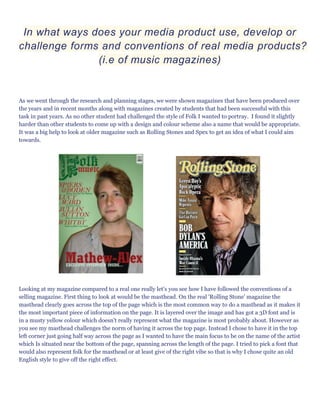
Looking at my magazine compared to a real one really let's you see how I have followed the conventions of a
selling magazine. First thing to look at would be the masthead. On the real 'Rolling Stone' magazine the
masthead clearly goes across the top of the page which is the most common way to do a masthead as it makes it
the most important piece of information on the page. It is layered over the image and has got a 3D font and is
in a musty yellow colour which doesn't really represent what the magazine is most probably about. However as
you see my masthead challenges the norm of having it across the top page. Instead I chose to have it in the top
left corner just going half way across the page as I wanted to have the main focus to be on the name of the artist
which Is situated near the bottom of the page, spanning across the length of the page. I tried to pick a font that
would also represent folk for the masthead or at least give of the right vibe so that is why I chose quite an old
English style to give off the right effect.
2. The graphology of the contents page is the main aspect I worked on most to follow the conventions of other
contents pages of music magazines I have seen during my research. Looking at both contents pages shows how
similar they are. Mine uses a similar sort of layout to the real magazine contents page. My magazine clearly
shows an 'F model' with the column on the left hand side and the column in the middle. Similarly the 'Rolling
Stone' magazine uses a similar layout with the column down the left hand side and with a piece of writing
across the bottom. Both magazines have the name of the magazine shown to let you know it's all part of the
same one. I used the masthead whereas the other shortened it to 'RS. I would say my colour scheme is
conventional as the main colour I have used is green which is an extremely favoured colour within the Folk
community. Whereas the Rolling Stones magazine keep it pretty plain and simple without using colours to give
any idea on what the genre might be.
To represent the genre of my magazine I tried to pick the right props and costume to portray the right image.
As you can see on my front cover I have got my model in quite a creased shirt with just a plain black top
underneath. The creased shirt, beard and chest hair gives off a rugged sort of folk festival look which is what I
was aiming for. Also on the contents page I have got the same model sat on the floor with an acoustic guitar
and a melodeon, both which are popular within the folk community so I thought they'd be good to use.
I tried to get a variety of different camera angles throughout my magazine. My front cover uses a mid-shot of
my model which is the usual angle to use on a front cover as it wants to be eye-catching and be clear to see if it
was on a shop shelf. My contents page uses a variety of mid shots and long shots which again is the usual thing
to do on a contents page as you want to keep it looking interesting. As you can see above on my double page
spread I use a long shot photo so that you can see the guitar clearly and get a good size patch of grass to get the
greenness.
I tried to fit a variety of different fonts in my magazine to keep it looking interesting. On the front cover I used a
very old style English font to represent folk and to fit with the genre. I used that font throughout but only on
3. the name of the magazine on each of the pages. I then use another 2 different fonts on the front cover to keep it
from looking boring. On the contents page I use a new font for the title and the little sub headings and then
another font for the page information. Again on my contents page I use a new style font for the artists name
and another for the article. I used a nice, clear font for the article to make it easy to read.
I used a variety of different techniques to make sure the folk genre was being shown throughout the magazine.
For the masthead like I've said before I chose an old style font to fit with the stereotypical folk look. For the
front cover photo I had my model looking quite rugged to give off the festival style and to fit in with the typical
folk lad. On the contents page I used a collection of photo's to fit with the folk genre and show it off. I have a
model holding up a Guinness Bodhran over their face, as picture of a Morris dancing team and then my front
cover model with an acoustic guitar and a melodeon. All photos connect well with the genre of folk as they all
play a big part in it.
Finally on my DPS I have used a long shot photo of my model with his guitar in a field which is supposed to
represent being at a festival or maybe just a photoshoot for an album cover. This sort of position showing the
instrument with an old wall or fence behind is very common when it comes to artist album covers with Folk
Musicians. This is the look I was trying to go for. I have also used a conventional DPS style by using 3 even
columns of writing with a paragraph and the artists name above it. It is also very common to put a quote from
the artist on the picture as well which I followed.
The colour scheme I chosen also I think fits very well with the representation of Folk. Throughout the
magazine I used a range of greens, white and black. Green is the main colour focus I wanted to have throughout
the magazine as most people stereotypically put the colour green and folk together.