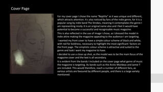
2. For my cover page I chose the name “Reptilia” as it was unique and different,
which attracts attention. It s also noticed by fans of the indie genre, for it is a
popular song by indie band The Strokes, meaning it contemplates the genre I
am representing nicely. It is an original name also and I feel it would have
potential to become a successful and recognisable music magazine.
This is also reflected in the use of image I chose, as I dressed the model in
indie attire making the magazine appealing to the audience I am targeting.
I wanted my front cover to have a simple colour scheme of black and white,
with red for boldness, necessary to highlight the most significant factors on
the front page. The simplistic colour scheme is attractive and suited to the
genre and look I want my magazine to have.
I decided to use a close up shot, as the model was to be the main focus of the
magazine cover and the text is all secondary.
It is evident from the bands I included on the cover page what genre of music
the magazine is targeting. As bands such as the Arctic Monkeys and Jamie T
are included. This would therefore, reach a number of different fans, as
various artists are favoured by different people, and there is a large variety
mentioned.
Cover Page
3. For my contents page I kept the same colour scheme as I wanted it to be
the same the entire way through my magazine.
The background of the page is being kept white, similar to the front
cover page. I then decided to do the bars black with white text on top to
cause it to stand out. The band index is going to be in red, a well as the
masthead which will be displayed at the top of the page in a black box,
beside the heading “This Week”. I will also present on my contents
page, my main model from the cover in a different pose, holding a
guitar, and make it appear as if was taken after a gig she just preformed.
I will also include images I took myself at gigs in the past, of members
on stage and of the audiences. I will include arrows to point out main
stories that were on the cover, and to highlight the fact there is a gig
guide inside the issue.
These features all compliment the genre of my magazine, as they would
be things of interest to the target audience. Along with relevant images
that I will include, of indie bands and my indie model dressed and styled
appropriately, the wide range of bands that have been mentioned on
my contents page will also be attractive to the audience I want, as they
are all appropriate and fitting of the genre I have chosen to represent.
Contents Page
4. On my double page spread, I decided to use the medium
close up of Iesha Burke, the cover model for my magazine
also. Her name is displayed right next to the image on the
opposite page in large and bold font. The title of the
magazine is relevant to the image taken, which is a fake gun
pose. This matches the title of the article, being “Eesha Takes
Aim”, as she is aiming using her fingers. I also included a side
note stating it is an Interview, clearly at the top of the page.
Following the same scheme as the front cover and contents
page, I used the colours red, black and white.
The image is used compliments the indie music genre again,
as the model wears a high neck, associated with the style of
this genre. The model would also demonstrate a messy and
effortless hairstyle to reflect on the fact she is down to earth,
new and upcoming.
The pull quote furtherly compliments the gene, as it states
there's a lot of friction in the music industry she is involved
in, which is well known in the indie genre, which has very
controversial advocates.
Double Page Spread